'%3e%3cpath%20fill-rule='evenodd'%20clip-rule='evenodd'%20d='M51.1303%2019.2492C50.7278%2019.913%2050.1346%2020.4426%2049.3508%2020.838C48.5669%2021.2335%2047.6172%2021.4312%2046.5014%2021.4312C44.8208%2021.4312%2043.4367%2021.0216%2042.3492%2020.2025C41.2617%2019.3833%2040.6686%2018.2394%2040.5697%2016.7706H44.4253C44.4818%2017.3355%2044.6831%2017.7804%2045.0291%2018.1052C45.3751%2018.43%2045.8164%2018.5924%2046.3531%2018.5924C46.8192%2018.5924%2047.1864%2018.4653%2047.4547%2018.2111C47.7231%2017.9569%2047.8572%2017.618%2047.8572%2017.1943C47.8572%2016.8129%2047.7337%2016.4952%2047.4865%2016.241C47.2393%2015.9867%2046.9322%2015.7784%2046.565%2015.616C46.1978%2015.4536%2045.6893%2015.2594%2045.0397%2015.0334C44.0934%2014.7086%2043.3202%2014.3944%2042.72%2014.0907C42.1197%2013.7871%2041.6042%2013.3351%2041.1735%2012.7349C40.7427%2012.1347%2040.5273%2011.3544%2040.5273%2010.394C40.5273%209.50418%2040.7533%208.73448%2041.2053%208.08481C41.6572%207.43515%2042.2821%206.93731%2043.0801%206.5913C43.8781%206.24528%2044.7925%206.07227%2045.8235%206.07227C47.49%206.07227%2048.8141%206.46771%2049.7956%207.25861C50.7772%208.04951%2051.3315%209.13698%2051.4586%2010.5211H47.5395C47.4689%2010.0268%2047.2888%209.63483%2046.9993%209.3453C46.7097%209.05578%2046.3178%208.91102%2045.8235%208.91102C45.3998%208.91102%2045.0573%209.024%2044.7961%209.24997C44.5348%209.47594%2044.4041%209.80783%2044.4041%2010.2457C44.4041%2010.5988%2044.5207%2010.8989%2044.7537%2011.146C44.9867%2011.3932%2045.2798%2011.5944%2045.6328%2011.7498C45.9859%2011.9052%2046.4944%2012.1029%2047.1581%2012.343C48.1185%2012.6678%2048.9023%2012.9891%2049.5096%2013.3069C50.1169%2013.6246%2050.6395%2014.0872%2051.0773%2014.6945C51.5151%2015.3018%2051.734%2016.0927%2051.734%2017.0672C51.734%2017.8581%2051.5328%2018.5854%2051.1303%2019.2492ZM59.0242%206.3053V21.2829H55.4016V6.3053H59.0242ZM73.9409%206.3053V9.18642H69.8734V21.2829H66.2296V9.18642H62.2046V6.3053H73.9409ZM80.7438%209.18642V12.3218H85.8069V15.0546H80.7438V18.3806H86.4425V21.2829H77.1212V6.3053H86.4425V9.18642H80.7438ZM99.667%2016.0291V21.2829H96.0444V6.3053H101.913C103.692%206.3053%20105.048%206.74665%20105.98%207.62934C106.912%208.51204%20107.378%209.7019%20107.378%2011.199C107.378%2012.1311%20107.17%2012.9609%20106.753%2013.6882C106.337%2014.4155%20105.719%2014.9875%20104.9%2015.4042C104.08%2015.8208%20103.085%2016.0291%20101.913%2016.0291H99.667ZM103.692%2011.199C103.692%209.8855%20102.965%209.22879%20101.51%209.22879H99.667V13.1268H101.51C102.965%2013.1268%20103.692%2012.4842%20103.692%2011.199ZM120.092%2018.5501H114.478L113.546%2021.2829H109.732L115.219%206.41123H119.393L124.879%2021.2829H121.024L120.092%2018.5501ZM119.16%2015.7961L117.295%2010.2881L115.41%2015.7961H119.16ZM131.555%2018.5077H136.385V21.2829H127.933V6.3053H131.555V18.5077ZM143.337%209.18642V12.3218H148.4V15.0546H143.337V18.3806H149.035V21.2829H139.714V6.3053H149.035V9.18642H143.337ZM163.507%206.3053V9.18642H159.44V21.2829H155.796V9.18642H151.771V6.3053H163.507ZM177.449%206.3053V9.18642H173.382V21.2829H169.738V9.18642H165.713V6.3053H177.449ZM184.252%209.18642V12.3218H189.315V15.0546H184.252V18.3806H189.951V21.2829H180.629V6.3053H189.951V9.18642H184.252Z'%20fill='%23EEF0ED'/%3e%3cmask%20id='mask0_3101_7327'%20style='mask-type:alpha'%20maskUnits='userSpaceOnUse'%20x='0'%20y='0'%20width='27'%20height='28'%3e%3cpath%20d='M23.8328%200.759766H2.64808C1.18559%200.759766%200%201.94535%200%203.40785V24.5925C0%2026.055%201.18559%2027.2406%202.64808%2027.2406H23.8328C25.2952%2027.2406%2026.4808%2026.055%2026.4808%2024.5925V3.40785C26.4808%201.94535%2025.2952%200.759766%2023.8328%200.759766Z'%20fill='white'/%3e%3c/mask%3e%3cg%20mask='url(%23mask0_3101_7327)'%3e%3cpath%20d='M23.8328%200.759766H2.64808C1.18559%200.759766%200%201.94535%200%203.40785V24.5925C0%2026.055%201.18559%2027.2406%202.64808%2027.2406H23.8328C25.2952%2027.2406%2026.4808%2026.055%2026.4808%2024.5925V3.40785C26.4808%201.94535%2025.2952%200.759766%2023.8328%200.759766Z'%20fill='%23D8D8D8'/%3e%3cpath%20d='M13.2404%200.759766H0V14.0001H13.2404V0.759766Z'%20fill='%238C61FF'/%3e%3cpath%20d='M13.2404%2014H0V27.2404H13.2404V14Z'%20fill='%2336C3FE'/%3e%3cpath%20d='M26.4806%2014H13.2402V27.2404H26.4806V14Z'%20fill='%236592FE'/%3e%3cpath%20d='M26.4806%200.759766H13.2402V14.0002H26.4806V0.759766Z'%20fill='%236059F7'/%3e%3c/g%3e%3c/g%3e%3cdefs%3e%3cclipPath%20id='clip0_3101_7327'%3e%3crect%20width='190'%20height='28'%20fill='white'/%3e%3c/clipPath%3e%3c/defs%3e%3c/svg%3e)
'%3e%3cpath%20d='M23.8328%200.759521H2.64808C1.18559%200.759521%200%201.94511%200%203.40761V24.5923C0%2026.0548%201.18559%2027.2404%202.64808%2027.2404H23.8328C25.2952%2027.2404%2026.4808%2026.0548%2026.4808%2024.5923V3.40761C26.4808%201.94511%2025.2952%200.759521%2023.8328%200.759521Z'%20fill='%23D8D8D8'/%3e%3cpath%20d='M13.2404%200.759521H0V13.9999H13.2404V0.759521Z'%20fill='%238C61FF'/%3e%3cpath%20d='M13.2404%2013.9998H0V27.2402H13.2404V13.9998Z'%20fill='%2336C3FE'/%3e%3cpath%20d='M26.4809%2013.9998H13.2405V27.2402H26.4809V13.9998Z'%20fill='%236592FE'/%3e%3cpath%20d='M26.4809%200.759277H13.2405V13.9997H26.4809V0.759277Z'%20fill='%236059F7'/%3e%3c/g%3e%3c/svg%3e)
Natural Earth Tone Color Palettes in High-End Sportswear
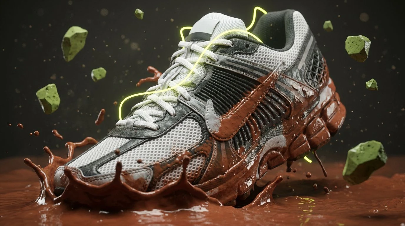
· 5 min readFor decades, the athletic apparel industry relied on highly concentrated, artificial neon pigments to signal speed and visibility. These blinding yellows and synthetic pinks hijacked the human visual system, pushing our optical fatigue limits to demand immediate attention. However, a massive shift is occurring in visual merchandising and performance psychology. High-end running brands are abandoning laboratory-born fluorescents for the grounded, mineral-rich wavelengths of muddy terracotta and deep clay. This transition reflects a deeper understanding of human visual cognition. Rather than bombarding the retina with jarring artificial light, earth tones trigger biological associations with soil, heat, and natural endurance. By utilizing hues that mimic raw, unrefined minerals, designers are tapping into a psychological state of persistent, competitive drive. The modern runner is no longer positioned as a frantic blur on a city street, but as a biological engine performing against the raw backdrop of the physical world.
Thermal Clay 🏜️
When humans observe the rich, medium-wavelength reflectances of Sunbaked Terracotta and Kinetic Orange, the brain processes these stimuli through neural pathways associated with thermal regulation and physical exertion. This specific color grouping operates by creating a stark visual contrast comparable to harsh, direct sunlight hitting clay tracks. The inclusion of neutral, high-albedo backgrounds like Magnesium White and Silt Gray prevents visual fatigue while allowing the warmer active colors to push forward in the visual field. This optical behavior mimics how we perceive heat radiating off a sunlit trail. Grounding the arrangement with a dense Cacao Earth stabilizes the aggressive reds and oranges, resulting in a visual environment that promotes sustained motivation rather than fleeting energetic spikes. Athletes wearing these pigments signal a raw, physical readiness tied entirely to biological mechanisms rather than synthetic enhancements.
Biosphere Sprint 🌿
The human eye is exquisitely adapted to distinguish minute variations in natural environments, a trait heavily stimulated by this specific array of botanical and mineral pigments. Oxide Red and Chlorophyll Green sit near opposite ends of our color processing channels, producing a striking physiological tension that commands attention without relying on artificial brilliance. High-end athletic gear utilizing this combination appeals to our biological preference for resource-rich habitats. A dark foundation provided by Obsidian Void and Loam Brown mimics the deep shadows of an old-growth forest floor, allowing lighter transitional tones like Mineral Peach and Chalk Dust to stand out sharply under intense studio lighting. This setup establishes a visual rhythm that corresponds with physical pacing. The runner clothed in these botanical hues adopts a psychological stance of raw, sustained power, moving through the environment as an active participant rather than an alienated spectator.
Photosynthetic Drive 🏃
To understand the psychological impact of this luminous, mineral-heavy grouping, one must consider how our visual cortex naturally prioritizes the warm, rusted frequencies of Iron Oxide Red against the cool, vegetative signaling of Sprout Yellow and Lichen Green. Such pairings occur regularly in nature during periods of chemical transition, such as the shifting of seasons or the exposure of fresh mineral deposits. By framing these organic active colors against the stark, overexposed brilliance of Glacial White and the dense weight of Granite Carbon, athletic apparel designers artificially recreate the lighting conditions of a high-altitude run at midday. The resulting visual footprint is aggressive but distinctly terrestrial. Runners interacting with these hues often report feeling a grounded sense of determination, as the colors visually communicate the absorption and expenditure of natural energy rather than the jittery, nervous stimulation previously associated with artificial sportswear dyes.
Stratosphere Trail ⛰️
Replacing high-visibility synthetics with muted, complex wavelengths demands a recalibration of how we perceive athletic readiness. This particular grouping leans heavily into the psychology of environmental adaptation. Sandstone Ochre and Peat Moss absorb light in a manner identical to raw, untreated textiles, instantly communicating a commitment to ecological awareness. Unlike standard athletic palettes that attempt to separate the human form from the landscape, these hues visually submerge the runner into the terrain. The inclusion of Alpine Sage introduces a soothing, mid-spectrum frequency that lowers localized visual stress, promoting a mindset geared for ultra-distance pacing. Grounded by the total light absorption of Vantablack Matter and framed by a sterile Silica White, the array manages to look highly engineered under direct focal lighting while retaining its organic origins. It speaks to a competitive drive that relies on pacing, endurance, and deep physiological fortitude.
Sedimentary Adrenaline 🌋
Perceiving temperature through color is an established physiological phenomenon, and this arrangement pushes that boundary by mimicking the intense, active heat of geological forces. Magma Orange and Coral Dust dominate the visual field, stimulating the same optic receptors that fire when we observe a burning flame or a heated surface. This visual warmth translates directly into a heightened psychological state of arousal, preparing the human nervous system for intense physical output. However, to prevent this optical intensity from becoming overwhelming, Umber Trench and Aluminum Gray provide necessary neurological resting points. These neutral shadow tones mimic the rocky, uneven shadows found on a steep trail ascent, allowing the vibrant oranges to function as bursts of biological warning. Accented slightly by Peridot Moss, the overall effect is one of raw athletic combustion perfectly contained within a natural framework, driving performance through our innate response to terrestrial extremes.
The transition from blinding artificial pigments to mineral-based color strategies marks a significant milestone in our understanding of athletic psychology and visual ergonomics. By mimicking the natural light absorption of soil, leaves, and oxidized iron, these earthen selections interact with the human optic nerve in a manner that feels incredibly grounding rather than exhaustingly urgent. They replace the nervous, synthetic energy of past decades with a deep, persistent biological drive. This movement ultimately transforms high-level athletic wear from a visual disruption into a logical extension of the human body moving through its environment. The resulting aesthetic supports a sustainable, endurance-focused mentality, proving that the most neon-heavy colors are not always the most powerful motivators for physical achievement.