'%3e%3cpath%20fill-rule='evenodd'%20clip-rule='evenodd'%20d='M51.1303%2019.2492C50.7278%2019.913%2050.1346%2020.4426%2049.3508%2020.838C48.5669%2021.2335%2047.6172%2021.4312%2046.5014%2021.4312C44.8208%2021.4312%2043.4367%2021.0216%2042.3492%2020.2025C41.2617%2019.3833%2040.6686%2018.2394%2040.5697%2016.7706H44.4253C44.4818%2017.3355%2044.6831%2017.7804%2045.0291%2018.1052C45.3751%2018.43%2045.8164%2018.5924%2046.3531%2018.5924C46.8192%2018.5924%2047.1864%2018.4653%2047.4547%2018.2111C47.7231%2017.9569%2047.8572%2017.618%2047.8572%2017.1943C47.8572%2016.8129%2047.7337%2016.4952%2047.4865%2016.241C47.2393%2015.9867%2046.9322%2015.7784%2046.565%2015.616C46.1978%2015.4536%2045.6893%2015.2594%2045.0397%2015.0334C44.0934%2014.7086%2043.3202%2014.3944%2042.72%2014.0907C42.1197%2013.7871%2041.6042%2013.3351%2041.1735%2012.7349C40.7427%2012.1347%2040.5273%2011.3544%2040.5273%2010.394C40.5273%209.50418%2040.7533%208.73448%2041.2053%208.08481C41.6572%207.43515%2042.2821%206.93731%2043.0801%206.5913C43.8781%206.24528%2044.7925%206.07227%2045.8235%206.07227C47.49%206.07227%2048.8141%206.46771%2049.7956%207.25861C50.7772%208.04951%2051.3315%209.13698%2051.4586%2010.5211H47.5395C47.4689%2010.0268%2047.2888%209.63483%2046.9993%209.3453C46.7097%209.05578%2046.3178%208.91102%2045.8235%208.91102C45.3998%208.91102%2045.0573%209.024%2044.7961%209.24997C44.5348%209.47594%2044.4041%209.80783%2044.4041%2010.2457C44.4041%2010.5988%2044.5207%2010.8989%2044.7537%2011.146C44.9867%2011.3932%2045.2798%2011.5944%2045.6328%2011.7498C45.9859%2011.9052%2046.4944%2012.1029%2047.1581%2012.343C48.1185%2012.6678%2048.9023%2012.9891%2049.5096%2013.3069C50.1169%2013.6246%2050.6395%2014.0872%2051.0773%2014.6945C51.5151%2015.3018%2051.734%2016.0927%2051.734%2017.0672C51.734%2017.8581%2051.5328%2018.5854%2051.1303%2019.2492ZM59.0242%206.3053V21.2829H55.4016V6.3053H59.0242ZM73.9409%206.3053V9.18642H69.8734V21.2829H66.2296V9.18642H62.2046V6.3053H73.9409ZM80.7438%209.18642V12.3218H85.8069V15.0546H80.7438V18.3806H86.4425V21.2829H77.1212V6.3053H86.4425V9.18642H80.7438ZM99.667%2016.0291V21.2829H96.0444V6.3053H101.913C103.692%206.3053%20105.048%206.74665%20105.98%207.62934C106.912%208.51204%20107.378%209.7019%20107.378%2011.199C107.378%2012.1311%20107.17%2012.9609%20106.753%2013.6882C106.337%2014.4155%20105.719%2014.9875%20104.9%2015.4042C104.08%2015.8208%20103.085%2016.0291%20101.913%2016.0291H99.667ZM103.692%2011.199C103.692%209.8855%20102.965%209.22879%20101.51%209.22879H99.667V13.1268H101.51C102.965%2013.1268%20103.692%2012.4842%20103.692%2011.199ZM120.092%2018.5501H114.478L113.546%2021.2829H109.732L115.219%206.41123H119.393L124.879%2021.2829H121.024L120.092%2018.5501ZM119.16%2015.7961L117.295%2010.2881L115.41%2015.7961H119.16ZM131.555%2018.5077H136.385V21.2829H127.933V6.3053H131.555V18.5077ZM143.337%209.18642V12.3218H148.4V15.0546H143.337V18.3806H149.035V21.2829H139.714V6.3053H149.035V9.18642H143.337ZM163.507%206.3053V9.18642H159.44V21.2829H155.796V9.18642H151.771V6.3053H163.507ZM177.449%206.3053V9.18642H173.382V21.2829H169.738V9.18642H165.713V6.3053H177.449ZM184.252%209.18642V12.3218H189.315V15.0546H184.252V18.3806H189.951V21.2829H180.629V6.3053H189.951V9.18642H184.252Z'%20fill='%23EEF0ED'/%3e%3cmask%20id='mask0_3101_7327'%20style='mask-type:alpha'%20maskUnits='userSpaceOnUse'%20x='0'%20y='0'%20width='27'%20height='28'%3e%3cpath%20d='M23.8328%200.759766H2.64808C1.18559%200.759766%200%201.94535%200%203.40785V24.5925C0%2026.055%201.18559%2027.2406%202.64808%2027.2406H23.8328C25.2952%2027.2406%2026.4808%2026.055%2026.4808%2024.5925V3.40785C26.4808%201.94535%2025.2952%200.759766%2023.8328%200.759766Z'%20fill='white'/%3e%3c/mask%3e%3cg%20mask='url(%23mask0_3101_7327)'%3e%3cpath%20d='M23.8328%200.759766H2.64808C1.18559%200.759766%200%201.94535%200%203.40785V24.5925C0%2026.055%201.18559%2027.2406%202.64808%2027.2406H23.8328C25.2952%2027.2406%2026.4808%2026.055%2026.4808%2024.5925V3.40785C26.4808%201.94535%2025.2952%200.759766%2023.8328%200.759766Z'%20fill='%23D8D8D8'/%3e%3cpath%20d='M13.2404%200.759766H0V14.0001H13.2404V0.759766Z'%20fill='%238C61FF'/%3e%3cpath%20d='M13.2404%2014H0V27.2404H13.2404V14Z'%20fill='%2336C3FE'/%3e%3cpath%20d='M26.4806%2014H13.2402V27.2404H26.4806V14Z'%20fill='%236592FE'/%3e%3cpath%20d='M26.4806%200.759766H13.2402V14.0002H26.4806V0.759766Z'%20fill='%236059F7'/%3e%3c/g%3e%3c/g%3e%3cdefs%3e%3cclipPath%20id='clip0_3101_7327'%3e%3crect%20width='190'%20height='28'%20fill='white'/%3e%3c/clipPath%3e%3c/defs%3e%3c/svg%3e)
'%3e%3cpath%20d='M23.8328%200.759521H2.64808C1.18559%200.759521%200%201.94511%200%203.40761V24.5923C0%2026.0548%201.18559%2027.2404%202.64808%2027.2404H23.8328C25.2952%2027.2404%2026.4808%2026.0548%2026.4808%2024.5923V3.40761C26.4808%201.94511%2025.2952%200.759521%2023.8328%200.759521Z'%20fill='%23D8D8D8'/%3e%3cpath%20d='M13.2404%200.759521H0V13.9999H13.2404V0.759521Z'%20fill='%238C61FF'/%3e%3cpath%20d='M13.2404%2013.9998H0V27.2402H13.2404V13.9998Z'%20fill='%2336C3FE'/%3e%3cpath%20d='M26.4809%2013.9998H13.2405V27.2402H26.4809V13.9998Z'%20fill='%236592FE'/%3e%3cpath%20d='M26.4809%200.759277H13.2405V13.9997H26.4809V0.759277Z'%20fill='%236059F7'/%3e%3c/g%3e%3c/svg%3e)
8 Calming Forest Green Color Palettes for Video Editors
· 5 min readThe modern video editing suite is a space defined by relentless artificial light and high-stakes deadlines. Editors spend countless hours staring into the harsh glare of dual monitors, their eyes strained by high-contrast timelines and hyper-saturated footage. In these demanding, windowless rooms, the psychological and physiological toll of visual fatigue becomes a formidable obstacle to creative efficiency. Introducing a specific spectrum of colors, particularly deep greens and cool teals bathed in neon accents, offers a profound antidote to this modern exhaustion. Rooted in both optical science and architectural psychology, these shades provide a visual resting place, lowering heart rates and encouraging sustained focus. They transform the sterile, highly technical atmosphere of a post-production studio into a restorative environment where innovation can flourish without the accompanying burnout.
Edit Bay Sanctuary 🌿
The Edit Bay Sanctuary arrangement addresses the immediate visual shock of transitioning between glaring screens and the surrounding room. Studio Pristine and Console Gray establish a neutral, non-distracting foundation typical of professional media workstations. Against this austere background, Terracotta Proofing introduces a grounding warmth reminiscent of traditional acoustic treatments, anchoring the human element in an otherwise digital space. The sudden appearance of Render Lime mimics the active glow of a software interface, demanding attention only when necessary. Providing the crucial counterweight to this brightness is Deep Monitor Green. This rich, light-absorbing tone allows the eye muscles to relax after holding focus on harsh, flickering pixels. By surrounding the peripheral vision with this stabilizing shade, the editing space actively combats the ocular strain that typically sets in during marathon post-production sessions.
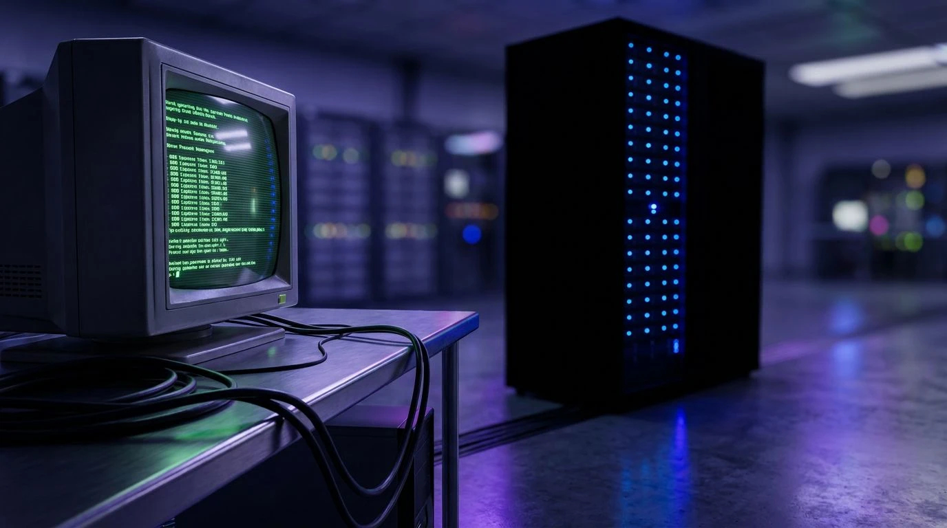
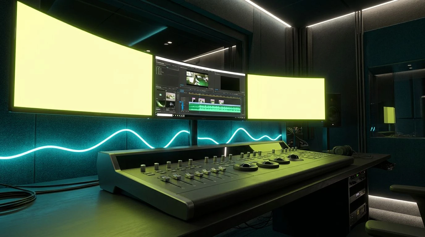
Fluorescent Canopy 🖥️
Within the high-pressure walls of a modern production house, the Fluorescent Canopy sequence deliberately mimics the tension between technological advancement and biological necessity. Acid Glare and Timeline Green capture the artificial, hyper-alert state required to slice through hours of dense raw footage, mirroring the glowing indicators of rendering software and audio peaks. To prevent these intense, luminous colors from overwhelming the editor, Graphite Housing provides a necessary optical boundary, absorbing excess light and reducing unwanted reflections on the monitor bezels. The true intervention occurs through the steadying presence of Midnight Teal and Cyan Waveform. These deeper aquatic tones operate like a visual cooling system for the exhausted eye. When placed behind monitors or along baseboards, they absorb the scattered neon light, effectively lowering the perceived temperature of the room and establishing an atmosphere of quiet, efficient concentration required for complex narrative decisions.
Director's Cut 🎬
The demanding physical reality of a film editing bay requires colors that can bridge the stark machinery of the trade with the organic needs of the professional seated at the desk. The Director's Cut grouping addresses this duality directly. Script White and Charcoal Bezel replicate the standard hardware environment, while Recording Red serves as the universal, high-stress visual indicator of active capture or rendering. To offset the anxiety traditionally associated with that glowing red indicator, Roasted Coffee, Acoustic Mauve, and Oak Surface bring the reassuring, tactile quality of physical materials into the room. It is the addition of Screen Emerald and Playback Jade that ultimately rescues the tired retina. These specific greens possess a unique wavelength that requires almost no adjustment from the human eye, offering immediate visual relief. Painting a back wall or selecting interface themes in these shades minimizes the physiological labor of sight, allowing the editor to maintain judgment and precision late into the night.
Midnight Render 🌃
For those who work during the quiet, isolated hours of post-production, the Midnight Render collection creates a specialized environment optimized for low-light concentration. Aluminum Chassis and Shadowed Cable represent the dim, metallic reality of server racks and editing hardware operating in the dark. Tungsten Glow introduces a faint, necessary warmth, preventing the workspace from feeling entirely sterile or alienating. The sharp, demanding presence of Electric Scrubber and Toxic Phosphor reflects the unforgiving reality of timeline markers and interface alerts, which are vital for navigation but harsh on the nervous system over prolonged periods. To counteract this relentless digital assault, Forest Glade and Cool Screen Blue offer an expansive, calming field of vision. When the eyes inevitably drift from the glaring monitors, these natural, deeply saturated tones act as a soft landing pad. They trick the mind into perceiving open space and natural foliage, effectively lowering stress hormones and sustaining a steady rhythm of work.
Cybernetic Flora 🔌
The final sophisticated approach to the stressful editing environment is found in the Cybernetic Flora arrangement, which entirely discards the notion of a sterile workspace in favor of a technologically enhanced greenhouse aesthetic. Frosted Glass and Neon Cyan capture the unmistakable, vibrant signature of modern media suites, where LED lighting often dominates the peripheral vision. Instead of fighting this artificial glow, deeply resting tones like Canopy Shadow and Digital Moss absorb and naturally diffuse the sharp lighting. They recreate the optical experience of looking into a dense forest under a bright sky. Abyssal Navy introduces a profound depth to the room, pushing walls visually outward and curing the claustrophobia common in windowless post-production facilities. Together, these shades allow the creative professional to function within a highly advanced, neon-lit digital space while continually reaping the psychological benefits of natural, restorative greenery, proving that efficiency need not come at the cost of personal well-being.
Addressing the psychological and physical weariness of media professionals requires more than ergonomic chairs or upgraded software. The tactical application of color within a workspace serves as an unseen mechanism for sustaining human attention and health. Introducing specific wavelengths of deep green and teal into spaces dominated by artificial neon alters the fundamental experience of the room. It transforms an environment built entirely for computing machines into one designed specifically for the biological needs of the artist. By strategically managing light absorption and optical strain, these targeted palettes ensure that the grueling demands of the modern editing process are met with environments that support, rather than deplete, the human mind.