'%3e%3cpath%20fill-rule='evenodd'%20clip-rule='evenodd'%20d='M51.1303%2019.2492C50.7278%2019.913%2050.1346%2020.4426%2049.3508%2020.838C48.5669%2021.2335%2047.6172%2021.4312%2046.5014%2021.4312C44.8208%2021.4312%2043.4367%2021.0216%2042.3492%2020.2025C41.2617%2019.3833%2040.6686%2018.2394%2040.5697%2016.7706H44.4253C44.4818%2017.3355%2044.6831%2017.7804%2045.0291%2018.1052C45.3751%2018.43%2045.8164%2018.5924%2046.3531%2018.5924C46.8192%2018.5924%2047.1864%2018.4653%2047.4547%2018.2111C47.7231%2017.9569%2047.8572%2017.618%2047.8572%2017.1943C47.8572%2016.8129%2047.7337%2016.4952%2047.4865%2016.241C47.2393%2015.9867%2046.9322%2015.7784%2046.565%2015.616C46.1978%2015.4536%2045.6893%2015.2594%2045.0397%2015.0334C44.0934%2014.7086%2043.3202%2014.3944%2042.72%2014.0907C42.1197%2013.7871%2041.6042%2013.3351%2041.1735%2012.7349C40.7427%2012.1347%2040.5273%2011.3544%2040.5273%2010.394C40.5273%209.50418%2040.7533%208.73448%2041.2053%208.08481C41.6572%207.43515%2042.2821%206.93731%2043.0801%206.5913C43.8781%206.24528%2044.7925%206.07227%2045.8235%206.07227C47.49%206.07227%2048.8141%206.46771%2049.7956%207.25861C50.7772%208.04951%2051.3315%209.13698%2051.4586%2010.5211H47.5395C47.4689%2010.0268%2047.2888%209.63483%2046.9993%209.3453C46.7097%209.05578%2046.3178%208.91102%2045.8235%208.91102C45.3998%208.91102%2045.0573%209.024%2044.7961%209.24997C44.5348%209.47594%2044.4041%209.80783%2044.4041%2010.2457C44.4041%2010.5988%2044.5207%2010.8989%2044.7537%2011.146C44.9867%2011.3932%2045.2798%2011.5944%2045.6328%2011.7498C45.9859%2011.9052%2046.4944%2012.1029%2047.1581%2012.343C48.1185%2012.6678%2048.9023%2012.9891%2049.5096%2013.3069C50.1169%2013.6246%2050.6395%2014.0872%2051.0773%2014.6945C51.5151%2015.3018%2051.734%2016.0927%2051.734%2017.0672C51.734%2017.8581%2051.5328%2018.5854%2051.1303%2019.2492ZM59.0242%206.3053V21.2829H55.4016V6.3053H59.0242ZM73.9409%206.3053V9.18642H69.8734V21.2829H66.2296V9.18642H62.2046V6.3053H73.9409ZM80.7438%209.18642V12.3218H85.8069V15.0546H80.7438V18.3806H86.4425V21.2829H77.1212V6.3053H86.4425V9.18642H80.7438ZM99.667%2016.0291V21.2829H96.0444V6.3053H101.913C103.692%206.3053%20105.048%206.74665%20105.98%207.62934C106.912%208.51204%20107.378%209.7019%20107.378%2011.199C107.378%2012.1311%20107.17%2012.9609%20106.753%2013.6882C106.337%2014.4155%20105.719%2014.9875%20104.9%2015.4042C104.08%2015.8208%20103.085%2016.0291%20101.913%2016.0291H99.667ZM103.692%2011.199C103.692%209.8855%20102.965%209.22879%20101.51%209.22879H99.667V13.1268H101.51C102.965%2013.1268%20103.692%2012.4842%20103.692%2011.199ZM120.092%2018.5501H114.478L113.546%2021.2829H109.732L115.219%206.41123H119.393L124.879%2021.2829H121.024L120.092%2018.5501ZM119.16%2015.7961L117.295%2010.2881L115.41%2015.7961H119.16ZM131.555%2018.5077H136.385V21.2829H127.933V6.3053H131.555V18.5077ZM143.337%209.18642V12.3218H148.4V15.0546H143.337V18.3806H149.035V21.2829H139.714V6.3053H149.035V9.18642H143.337ZM163.507%206.3053V9.18642H159.44V21.2829H155.796V9.18642H151.771V6.3053H163.507ZM177.449%206.3053V9.18642H173.382V21.2829H169.738V9.18642H165.713V6.3053H177.449ZM184.252%209.18642V12.3218H189.315V15.0546H184.252V18.3806H189.951V21.2829H180.629V6.3053H189.951V9.18642H184.252Z'%20fill='%23EEF0ED'/%3e%3cmask%20id='mask0_3101_7327'%20style='mask-type:alpha'%20maskUnits='userSpaceOnUse'%20x='0'%20y='0'%20width='27'%20height='28'%3e%3cpath%20d='M23.8328%200.759766H2.64808C1.18559%200.759766%200%201.94535%200%203.40785V24.5925C0%2026.055%201.18559%2027.2406%202.64808%2027.2406H23.8328C25.2952%2027.2406%2026.4808%2026.055%2026.4808%2024.5925V3.40785C26.4808%201.94535%2025.2952%200.759766%2023.8328%200.759766Z'%20fill='white'/%3e%3c/mask%3e%3cg%20mask='url(%23mask0_3101_7327)'%3e%3cpath%20d='M23.8328%200.759766H2.64808C1.18559%200.759766%200%201.94535%200%203.40785V24.5925C0%2026.055%201.18559%2027.2406%202.64808%2027.2406H23.8328C25.2952%2027.2406%2026.4808%2026.055%2026.4808%2024.5925V3.40785C26.4808%201.94535%2025.2952%200.759766%2023.8328%200.759766Z'%20fill='%23D8D8D8'/%3e%3cpath%20d='M13.2404%200.759766H0V14.0001H13.2404V0.759766Z'%20fill='%238C61FF'/%3e%3cpath%20d='M13.2404%2014H0V27.2404H13.2404V14Z'%20fill='%2336C3FE'/%3e%3cpath%20d='M26.4806%2014H13.2402V27.2404H26.4806V14Z'%20fill='%236592FE'/%3e%3cpath%20d='M26.4806%200.759766H13.2402V14.0002H26.4806V0.759766Z'%20fill='%236059F7'/%3e%3c/g%3e%3c/g%3e%3cdefs%3e%3cclipPath%20id='clip0_3101_7327'%3e%3crect%20width='190'%20height='28'%20fill='white'/%3e%3c/clipPath%3e%3c/defs%3e%3c/svg%3e)
'%3e%3cpath%20d='M23.8328%200.759521H2.64808C1.18559%200.759521%200%201.94511%200%203.40761V24.5923C0%2026.0548%201.18559%2027.2404%202.64808%2027.2404H23.8328C25.2952%2027.2404%2026.4808%2026.0548%2026.4808%2024.5923V3.40761C26.4808%201.94511%2025.2952%200.759521%2023.8328%200.759521Z'%20fill='%23D8D8D8'/%3e%3cpath%20d='M13.2404%200.759521H0V13.9999H13.2404V0.759521Z'%20fill='%238C61FF'/%3e%3cpath%20d='M13.2404%2013.9998H0V27.2402H13.2404V13.9998Z'%20fill='%2336C3FE'/%3e%3cpath%20d='M26.4809%2013.9998H13.2405V27.2402H26.4809V13.9998Z'%20fill='%236592FE'/%3e%3cpath%20d='M26.4809%200.759277H13.2405V13.9997H26.4809V0.759277Z'%20fill='%236059F7'/%3e%3c/g%3e%3c/svg%3e)
Modern Color Palette Trends: Why Blue and Orange are Dead
· 6 min readFor the better part of a decade, the pairing of cool, corporate slate blue with a burst of energetic tangerine has been the default visual language of progress. It was a failsafe shortcut to signaling that a brand was simultaneously trustworthy and disruptive. Yet, as we stare down a cultural moment increasingly dominated by artificial intelligence, this familiar chromatic safety net feels suspiciously artificial. The relentless cheerfulness of contrasting warm and cool tones now reads like a forced smile. We are seeking authenticity in our digital spaces, questioning whether the slick, highly engineered visual strategies of yesterday can survive our current craving for stripped back honesty. The tech forward aesthetic is suddenly looking in the mirror, wondering if its favorite wardrobe staple has simply run out of things to say.
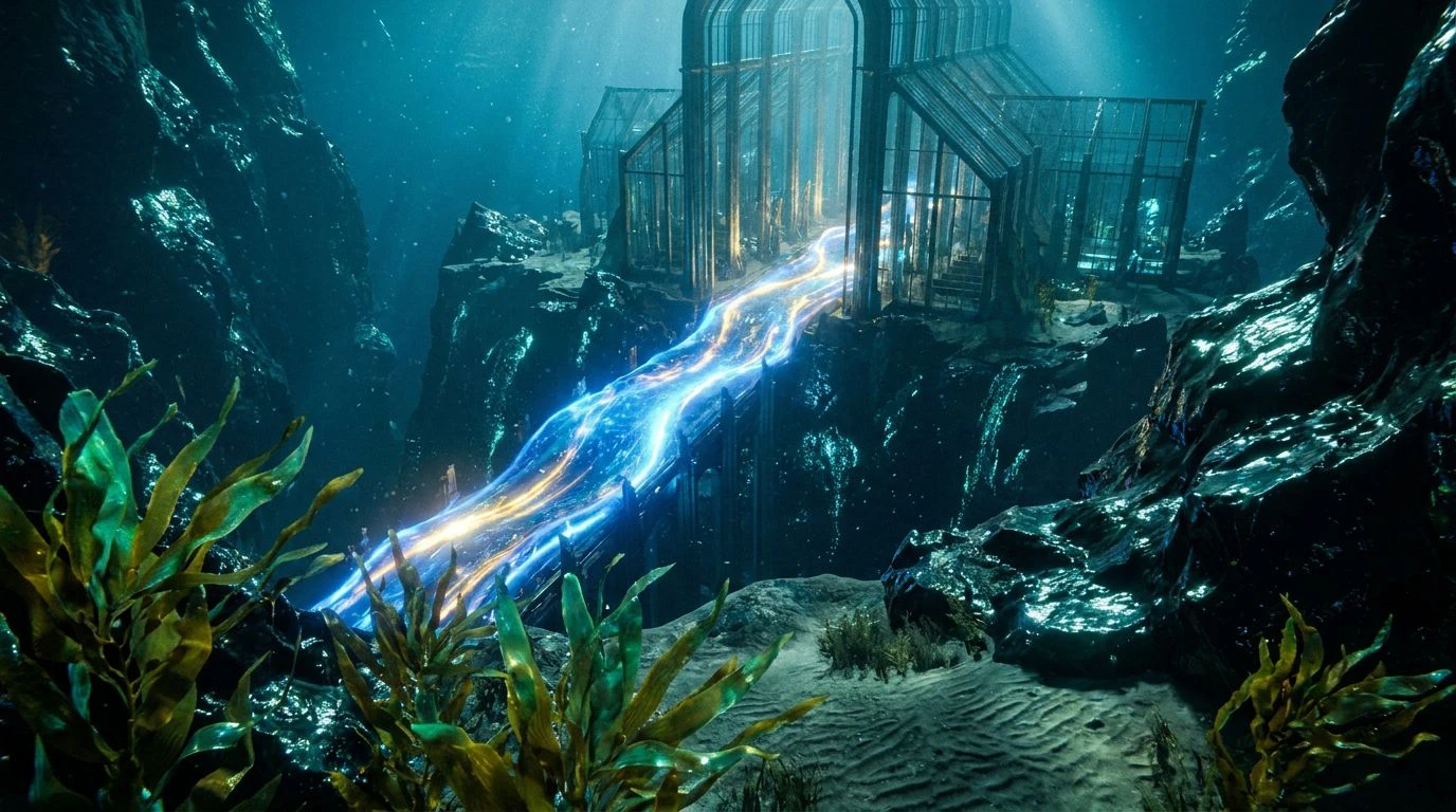
Artificial Sunrise 🌅
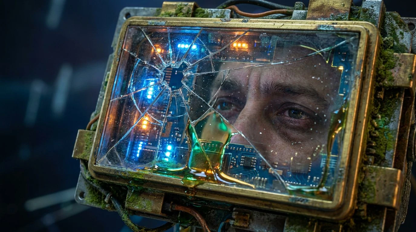
Looking at Artificial Sunrise feels like witnessing the slow collapse of the corporate optimism that defined the early two thousands. We are presented with Tarnished Brass and Acidic Moss, muddy and uncertain tones that drag the aggressively cheerful Synthetic Sunbeam back down to earth. The predictable tech forward sensation is supposedly anchored by Screen Glare Blue and Hyperlink Blue, but instead of projecting boundless innovation, these shades feel oddly melancholic against the crushing weight of Deep Void. The presence of Mariana Trench adds a shadowy chill to what should be an energetic contrast. It perfectly captures the anxiety of the modern internet, where the old tricks of pairing sunshine with deep sea reliability no longer trick the eye. Consumers are suddenly acutely aware of the staging. The once comforting contrast now looks like a theatrical set after the actors have gone home, leaving behind only the cold realization that our favorite digital spaces are constructed by machines trying desperately to approximate human warmth.
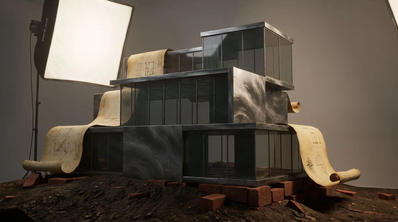
Broken Metrics 📉
The tension in Broken Metrics is palpable, pitting the demanding nature of Alert Badge Orange against the rigid, unfeeling chill of Slate Shadow and Ashen Concrete. We are deeply accustomed to seeing Apricot Glow and Burnt Umber used as friendly, humanizing elements in user interfaces, desperate attempts to make software feel like a cozy living room. Yet here, interrupted by the harsh, clinical strike of Algorithm Blue, the warmth feels entirely manufactured. Pastel Static offers a fleeting softness, but it is ultimately swallowed by the overall mechanical cold. This combination lays bare the exact problem with relying on this classic contrast to feign approachability today. When every notification demands our attention with loud citrus tones while the actual machinery remains coldly opaque, the visual disconnect breeds profound distrust. It reads as a plea for attention from an application that has fundamentally forgotten how real people actually communicate, mistaking loud color theory for genuine connection.
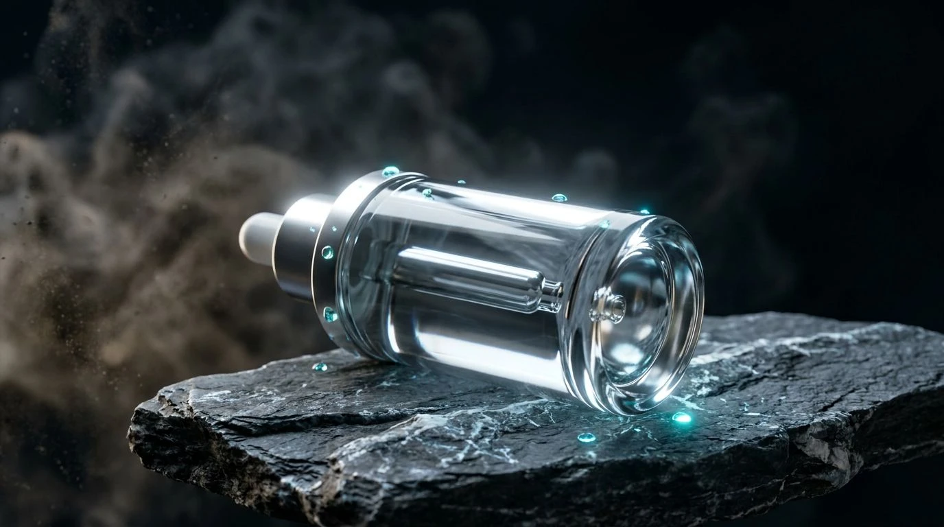
Silicon Rust 🤖
Silicon Rust reads like a visual confession that the endless march of technology eventually creates its own aesthetic decay. The vibrant energy of Silicon Sunset and the piercing shock of Electric Cyan try valiantly to uphold the illusion of perpetual motion and pristine innovation. However, the heavy, oxidized presence of Iron Oxide and the muted, almost exhausted tone of Faded Brass drag the entire scheme into a distinctly analog reality. Set against the terrifyingly empty Charcoal Abyss, these colors look like abandoned server towers left to the elements. Glacial Interface offers a frozen, distant coolness that does nothing to comfort the viewer. It effectively deconstructs the once beloved contrast, revealing that even the loudest digital promises are subject to wear and tear over time. By letting the decay sit right next to the artificial glare, it forces a realization that true digital sincerity might actually require acknowledging the rot, rather than simply painting over it with another thick coat of aggressively cheerful code.
Sincerity By Design 🪞
It is genuinely telling that Sincerity By Design abandons the expected energetic warmth entirely, tossing the citrus tones overboard in favor of an unapologetically clinical approach. Without a hint of artificial sunrise to soften the blow, Sterile White and Aluminum Casing establish a landscape of pure, unvarnished reality. The starkness of Vantablack and Muted Steel provides a heavy, immovable foundation that feels almost brutally honest. The only bursts of excitement arrive through Holographic Blue and Plasma Violet, colors that belong entirely to the realm of glowing diodes and unseen machinery rather than trying to mimic organic life. This is the visual language of a system that finally stops pretending to be your friend. In discarding the fiery half of the traditional contrast, it achieves a strange new form of trust simply by refusing to put on a show. The viewer is left with a stark, luminous environment that feels shockingly refreshing, proving that dropping the tired act altogether might be the most genuine move a brand can make right now.
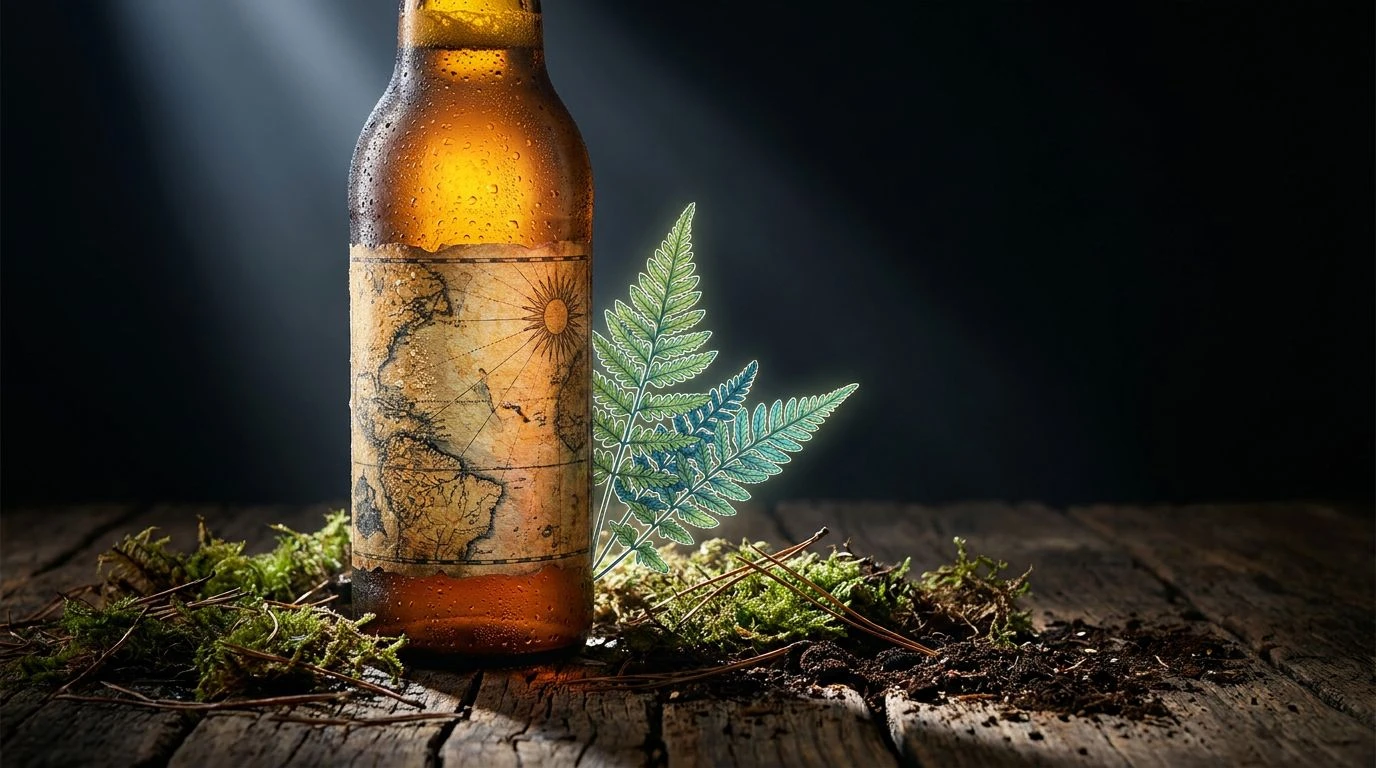
Algorithmic Empathy 🤝
Algorithmic Empathy is perhaps the most uncomfortable arrangement of the group because it still believes it can fool us. The desperate cheeriness of Urgent Tangerine and the cloying sweetness of Soft Yolk attempt to manufacture a sunny, approachable disposition. These are colors engineered in a boardroom to make automated customer service seem deeply human. But when placed next to the unfeeling administrative slate of Neutral Wire, the curtain drops. The rigid reliability promised by Button Blue and Deep Sea Cable feels totally out of step with the forced excitement of the warm tones, creating an emotional whiplash. Even the tranquil addition of Periwinkle Glow cannot fix the creeping sensation that we are conversing with a cleverly disguised script. It perfectly captures the failure point of the classic contrast when used without a trace of self awareness. The harder the warm colors try to convince us of their humanity, the more artificial the entire construction feels, leaving behind an environment that is glowing, loud, and entirely hollow.
The visual vocabulary that built the modern web has finally collided with an audience overly familiar with its tricks. We are no longer charmed by the aggressive collision of fire and ice, mostly because we know precisely the boardroom decisions that put them there. The push for artificial warmth against cool technical authority now reads as defensive, a slick barrier keeping the actual mechanics out of plain sight. As artificial intelligence forces us to continually renegotiate what feels real, our tolerance for packaged, focus grouped chromatic cheerfulness is rapidly expiring. Moving forward demands visual honesty rather than rehearsed contrast, choosing colors that admit what they are instead of constantly trying to sell us a feeling we entirely stopped believing in.