'%3e%3cpath%20fill-rule='evenodd'%20clip-rule='evenodd'%20d='M51.1303%2019.2492C50.7278%2019.913%2050.1346%2020.4426%2049.3508%2020.838C48.5669%2021.2335%2047.6172%2021.4312%2046.5014%2021.4312C44.8208%2021.4312%2043.4367%2021.0216%2042.3492%2020.2025C41.2617%2019.3833%2040.6686%2018.2394%2040.5697%2016.7706H44.4253C44.4818%2017.3355%2044.6831%2017.7804%2045.0291%2018.1052C45.3751%2018.43%2045.8164%2018.5924%2046.3531%2018.5924C46.8192%2018.5924%2047.1864%2018.4653%2047.4547%2018.2111C47.7231%2017.9569%2047.8572%2017.618%2047.8572%2017.1943C47.8572%2016.8129%2047.7337%2016.4952%2047.4865%2016.241C47.2393%2015.9867%2046.9322%2015.7784%2046.565%2015.616C46.1978%2015.4536%2045.6893%2015.2594%2045.0397%2015.0334C44.0934%2014.7086%2043.3202%2014.3944%2042.72%2014.0907C42.1197%2013.7871%2041.6042%2013.3351%2041.1735%2012.7349C40.7427%2012.1347%2040.5273%2011.3544%2040.5273%2010.394C40.5273%209.50418%2040.7533%208.73448%2041.2053%208.08481C41.6572%207.43515%2042.2821%206.93731%2043.0801%206.5913C43.8781%206.24528%2044.7925%206.07227%2045.8235%206.07227C47.49%206.07227%2048.8141%206.46771%2049.7956%207.25861C50.7772%208.04951%2051.3315%209.13698%2051.4586%2010.5211H47.5395C47.4689%2010.0268%2047.2888%209.63483%2046.9993%209.3453C46.7097%209.05578%2046.3178%208.91102%2045.8235%208.91102C45.3998%208.91102%2045.0573%209.024%2044.7961%209.24997C44.5348%209.47594%2044.4041%209.80783%2044.4041%2010.2457C44.4041%2010.5988%2044.5207%2010.8989%2044.7537%2011.146C44.9867%2011.3932%2045.2798%2011.5944%2045.6328%2011.7498C45.9859%2011.9052%2046.4944%2012.1029%2047.1581%2012.343C48.1185%2012.6678%2048.9023%2012.9891%2049.5096%2013.3069C50.1169%2013.6246%2050.6395%2014.0872%2051.0773%2014.6945C51.5151%2015.3018%2051.734%2016.0927%2051.734%2017.0672C51.734%2017.8581%2051.5328%2018.5854%2051.1303%2019.2492ZM59.0242%206.3053V21.2829H55.4016V6.3053H59.0242ZM73.9409%206.3053V9.18642H69.8734V21.2829H66.2296V9.18642H62.2046V6.3053H73.9409ZM80.7438%209.18642V12.3218H85.8069V15.0546H80.7438V18.3806H86.4425V21.2829H77.1212V6.3053H86.4425V9.18642H80.7438ZM99.667%2016.0291V21.2829H96.0444V6.3053H101.913C103.692%206.3053%20105.048%206.74665%20105.98%207.62934C106.912%208.51204%20107.378%209.7019%20107.378%2011.199C107.378%2012.1311%20107.17%2012.9609%20106.753%2013.6882C106.337%2014.4155%20105.719%2014.9875%20104.9%2015.4042C104.08%2015.8208%20103.085%2016.0291%20101.913%2016.0291H99.667ZM103.692%2011.199C103.692%209.8855%20102.965%209.22879%20101.51%209.22879H99.667V13.1268H101.51C102.965%2013.1268%20103.692%2012.4842%20103.692%2011.199ZM120.092%2018.5501H114.478L113.546%2021.2829H109.732L115.219%206.41123H119.393L124.879%2021.2829H121.024L120.092%2018.5501ZM119.16%2015.7961L117.295%2010.2881L115.41%2015.7961H119.16ZM131.555%2018.5077H136.385V21.2829H127.933V6.3053H131.555V18.5077ZM143.337%209.18642V12.3218H148.4V15.0546H143.337V18.3806H149.035V21.2829H139.714V6.3053H149.035V9.18642H143.337ZM163.507%206.3053V9.18642H159.44V21.2829H155.796V9.18642H151.771V6.3053H163.507ZM177.449%206.3053V9.18642H173.382V21.2829H169.738V9.18642H165.713V6.3053H177.449ZM184.252%209.18642V12.3218H189.315V15.0546H184.252V18.3806H189.951V21.2829H180.629V6.3053H189.951V9.18642H184.252Z'%20fill='%23EEF0ED'/%3e%3cmask%20id='mask0_3101_7327'%20style='mask-type:alpha'%20maskUnits='userSpaceOnUse'%20x='0'%20y='0'%20width='27'%20height='28'%3e%3cpath%20d='M23.8328%200.759766H2.64808C1.18559%200.759766%200%201.94535%200%203.40785V24.5925C0%2026.055%201.18559%2027.2406%202.64808%2027.2406H23.8328C25.2952%2027.2406%2026.4808%2026.055%2026.4808%2024.5925V3.40785C26.4808%201.94535%2025.2952%200.759766%2023.8328%200.759766Z'%20fill='white'/%3e%3c/mask%3e%3cg%20mask='url(%23mask0_3101_7327)'%3e%3cpath%20d='M23.8328%200.759766H2.64808C1.18559%200.759766%200%201.94535%200%203.40785V24.5925C0%2026.055%201.18559%2027.2406%202.64808%2027.2406H23.8328C25.2952%2027.2406%2026.4808%2026.055%2026.4808%2024.5925V3.40785C26.4808%201.94535%2025.2952%200.759766%2023.8328%200.759766Z'%20fill='%23D8D8D8'/%3e%3cpath%20d='M13.2404%200.759766H0V14.0001H13.2404V0.759766Z'%20fill='%238C61FF'/%3e%3cpath%20d='M13.2404%2014H0V27.2404H13.2404V14Z'%20fill='%2336C3FE'/%3e%3cpath%20d='M26.4806%2014H13.2402V27.2404H26.4806V14Z'%20fill='%236592FE'/%3e%3cpath%20d='M26.4806%200.759766H13.2402V14.0002H26.4806V0.759766Z'%20fill='%236059F7'/%3e%3c/g%3e%3c/g%3e%3cdefs%3e%3cclipPath%20id='clip0_3101_7327'%3e%3crect%20width='190'%20height='28'%20fill='white'/%3e%3c/clipPath%3e%3c/defs%3e%3c/svg%3e)
'%3e%3cpath%20d='M23.8328%200.759521H2.64808C1.18559%200.759521%200%201.94511%200%203.40761V24.5923C0%2026.0548%201.18559%2027.2404%202.64808%2027.2404H23.8328C25.2952%2027.2404%2026.4808%2026.0548%2026.4808%2024.5923V3.40761C26.4808%201.94511%2025.2952%200.759521%2023.8328%200.759521Z'%20fill='%23D8D8D8'/%3e%3cpath%20d='M13.2404%200.759521H0V13.9999H13.2404V0.759521Z'%20fill='%238C61FF'/%3e%3cpath%20d='M13.2404%2013.9998H0V27.2402H13.2404V13.9998Z'%20fill='%2336C3FE'/%3e%3cpath%20d='M26.4809%2013.9998H13.2405V27.2402H26.4809V13.9998Z'%20fill='%236592FE'/%3e%3cpath%20d='M26.4809%200.759277H13.2405V13.9997H26.4809V0.759277Z'%20fill='%236059F7'/%3e%3c/g%3e%3c/svg%3e)
High-Energy Color Palettes for Early Childhood Learning
· 5 min readThe modern nursery is often a study in muted tones, where pale sage and dusty rose signal a quiet, perhaps overly cautious approach to early childhood education. Yet, a growing body of psychological observation suggests that the highly charged atmosphere of a traveling circus offers an alternative educational environment, one driven by electric excitement. When young minds encounter the startling contrasts of brilliant yellows, sharp reds, and electric turquoise, they do not necessarily retreat. Instead, these bold optical inputs can act as visual anchors, holding a toddler's attention long enough to transform mere observation into active learning. By embracing this lively vibrancy, educators can build spaces that command focus without tipping into chaos, proving that a high-voltage aesthetic might just be the key to early cognitive engagement.
Electric Menagerie 🎪
The Electric Menagerie palette constructs an environment where visual excitement serves a distinct pedagogical purpose. Moving away from the conventional wisdom that calm spaces produce focused children, this selection introduces Sunburst Yellow and Vanilla Cream as primary attractors, instantly capturing a toddler's wandering gaze. The transition into Spring Sprout and Carousel Turquoise provides a lively yet structured path for the eye to follow, mimicking the organized spectacle of a festival ground. Deep Lagoon grounds these lighter, faster shades, offering momentary relief before the eye jumps to Wild Violet and Cotton Candy Pink. This calculated fluctuation of intensity mimics the pacing of a well-executed circus act, providing moments of high drama followed by gentle resolution. Such an environment holds infants captivated, turning playrooms into spaces where visual stimulation directly supports sustained attention and joyful discovery.
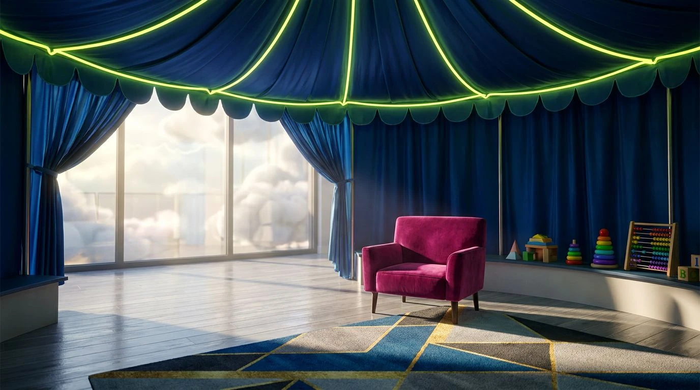
Midway Marvel 🎡
With Midway Marvel, the conversation around sensory input in early education moves toward the structural scale of a lively fairground. The sudden shock of Electric Chartreuse works alongside the clear, piercing note of Sky Pavilion to awaken the senses immediately upon entering a room. Rather than overwhelming a young learner, these high-energy shades are carefully anchored by the sobering presence of Midway Azure and Midnight Tent. This allows toddlers to experience the thrill of bold visuals while always having a dark, quiet destination for their eyes to rest. Dove Grey acts as a neutral space between these extremes, preventing visual exhaustion. The strategic flash of Calliope Magenta serves as a reward, something brilliant and unexpected that draws attention to specific educational tools or toys. This carefully balanced excitement proves that sharp contrasts can guide a child's focus exactly where it needs to go without causing fatigue.
Roving Spectacle 🤹
The Roving Spectacle collection confronts the traditional fear of overstimulation head-on by daring to employ an expansive range of striking pigments alongside absolute darkness. Pitch Black and Asphalt Grey create an unusual foundation for an infant's space, serving as the night sky behind a dazzling fireworks display. Against this sober backdrop, Neon Lemon and Acrobat Turquoise appear with striking clarity, offering distinct targets for developing vision to lock onto and track. Meadow Sprite and Forest Canopy offer naturalistic grounding, while Berry Sorbet and Crimson Velvet introduce the classic warmth and urgency of a big top tent. By placing these extraordinarily vivid tones against stark, heavy neutrals, the sensory noise is sharply managed. Toddlers are able to single out shapes and objects with remarkable ease, turning a seemingly chaotic environment into a meticulously organized map of cognitive challenges and cognitive rewards.
Kinetic Canopy 🎟️
An intentional use of visual tension defines the Kinetic Canopy arrangement, drawing heavily on the raw emotional power of a traveling festival to keep young learners entirely present. High Voltage Yellow and Electric Grass demand an immediate physical reaction, echoing the thrill of stepping into a bustling carnival midway. This aggressive brightness is critical for cutting through the distraction often common in young children. However, the introduction of Daybreak Blue provides necessary breathing room, a cooling breeze amid a heated atmosphere. The deep, heavy weight of Slate Shadow and Storm Cloud offers profound contrast, ensuring the lighter colors pop with maximum efficiency without blinding the observer. Ringmaster Purple rounds out the selection by adding an element of theatrical flair. Within this space, children learn to navigate a wide spectrum of visual information confidently, developing their ability to process complex environments without shutting down.
Ferris Wheel Flora 🎠
Ferris Wheel Flora presents a highly curated approach to playful education, selecting only the most joyful and communicative colors to build an atmosphere of electric vibrancy. Golden Ticket stands as a beacon of warmth and accessibility, inviting toddlers to engage freely with their surroundings and instructional materials. Springtime Leaf acts as a bridge to natural growth, a familiar and comforting sight amidst the artificial thrill of the fairground theme. Deep Ocean Wave and Frosted Cyan work together to create an expansive, energetic backdrop that feels both vast and meticulously contained, much like the physical limits of a carnival ride. Finally, Tarnished Silver offers a muted, reflective surface that gives the eyes a temporary pause before the excitement begins again. This specific grouping demonstrates that a room can maintain the lively, infectious spirit of a circus while remaining highly legible to a developing brain, fostering an environment where intense color supports rapid early learning.
The debate over appropriate visual stimulation in early childhood development often centers on minimizing distraction, yet a closer examination of festival-inspired environments reveals a different truth. Bright, demanding colors do not merely scatter an infant's attention; they actively direct it. By utilizing the startling reds, brilliant yellows, and vivid turquoises of the big top, educators and designers can build spaces that command focus through sheer aesthetic force. When these intense shades are anchored by deep shadows and structured neutrals, the result is neither overwhelming nor chaotic. It is a highly legible, deeply engaging space that invites young minds to participate, observe, and learn with newly found vigor.