'%3e%3cpath%20fill-rule='evenodd'%20clip-rule='evenodd'%20d='M51.1303%2019.2492C50.7278%2019.913%2050.1346%2020.4426%2049.3508%2020.838C48.5669%2021.2335%2047.6172%2021.4312%2046.5014%2021.4312C44.8208%2021.4312%2043.4367%2021.0216%2042.3492%2020.2025C41.2617%2019.3833%2040.6686%2018.2394%2040.5697%2016.7706H44.4253C44.4818%2017.3355%2044.6831%2017.7804%2045.0291%2018.1052C45.3751%2018.43%2045.8164%2018.5924%2046.3531%2018.5924C46.8192%2018.5924%2047.1864%2018.4653%2047.4547%2018.2111C47.7231%2017.9569%2047.8572%2017.618%2047.8572%2017.1943C47.8572%2016.8129%2047.7337%2016.4952%2047.4865%2016.241C47.2393%2015.9867%2046.9322%2015.7784%2046.565%2015.616C46.1978%2015.4536%2045.6893%2015.2594%2045.0397%2015.0334C44.0934%2014.7086%2043.3202%2014.3944%2042.72%2014.0907C42.1197%2013.7871%2041.6042%2013.3351%2041.1735%2012.7349C40.7427%2012.1347%2040.5273%2011.3544%2040.5273%2010.394C40.5273%209.50418%2040.7533%208.73448%2041.2053%208.08481C41.6572%207.43515%2042.2821%206.93731%2043.0801%206.5913C43.8781%206.24528%2044.7925%206.07227%2045.8235%206.07227C47.49%206.07227%2048.8141%206.46771%2049.7956%207.25861C50.7772%208.04951%2051.3315%209.13698%2051.4586%2010.5211H47.5395C47.4689%2010.0268%2047.2888%209.63483%2046.9993%209.3453C46.7097%209.05578%2046.3178%208.91102%2045.8235%208.91102C45.3998%208.91102%2045.0573%209.024%2044.7961%209.24997C44.5348%209.47594%2044.4041%209.80783%2044.4041%2010.2457C44.4041%2010.5988%2044.5207%2010.8989%2044.7537%2011.146C44.9867%2011.3932%2045.2798%2011.5944%2045.6328%2011.7498C45.9859%2011.9052%2046.4944%2012.1029%2047.1581%2012.343C48.1185%2012.6678%2048.9023%2012.9891%2049.5096%2013.3069C50.1169%2013.6246%2050.6395%2014.0872%2051.0773%2014.6945C51.5151%2015.3018%2051.734%2016.0927%2051.734%2017.0672C51.734%2017.8581%2051.5328%2018.5854%2051.1303%2019.2492ZM59.0242%206.3053V21.2829H55.4016V6.3053H59.0242ZM73.9409%206.3053V9.18642H69.8734V21.2829H66.2296V9.18642H62.2046V6.3053H73.9409ZM80.7438%209.18642V12.3218H85.8069V15.0546H80.7438V18.3806H86.4425V21.2829H77.1212V6.3053H86.4425V9.18642H80.7438ZM99.667%2016.0291V21.2829H96.0444V6.3053H101.913C103.692%206.3053%20105.048%206.74665%20105.98%207.62934C106.912%208.51204%20107.378%209.7019%20107.378%2011.199C107.378%2012.1311%20107.17%2012.9609%20106.753%2013.6882C106.337%2014.4155%20105.719%2014.9875%20104.9%2015.4042C104.08%2015.8208%20103.085%2016.0291%20101.913%2016.0291H99.667ZM103.692%2011.199C103.692%209.8855%20102.965%209.22879%20101.51%209.22879H99.667V13.1268H101.51C102.965%2013.1268%20103.692%2012.4842%20103.692%2011.199ZM120.092%2018.5501H114.478L113.546%2021.2829H109.732L115.219%206.41123H119.393L124.879%2021.2829H121.024L120.092%2018.5501ZM119.16%2015.7961L117.295%2010.2881L115.41%2015.7961H119.16ZM131.555%2018.5077H136.385V21.2829H127.933V6.3053H131.555V18.5077ZM143.337%209.18642V12.3218H148.4V15.0546H143.337V18.3806H149.035V21.2829H139.714V6.3053H149.035V9.18642H143.337ZM163.507%206.3053V9.18642H159.44V21.2829H155.796V9.18642H151.771V6.3053H163.507ZM177.449%206.3053V9.18642H173.382V21.2829H169.738V9.18642H165.713V6.3053H177.449ZM184.252%209.18642V12.3218H189.315V15.0546H184.252V18.3806H189.951V21.2829H180.629V6.3053H189.951V9.18642H184.252Z'%20fill='%23EEF0ED'/%3e%3cmask%20id='mask0_3101_7327'%20style='mask-type:alpha'%20maskUnits='userSpaceOnUse'%20x='0'%20y='0'%20width='27'%20height='28'%3e%3cpath%20d='M23.8328%200.759766H2.64808C1.18559%200.759766%200%201.94535%200%203.40785V24.5925C0%2026.055%201.18559%2027.2406%202.64808%2027.2406H23.8328C25.2952%2027.2406%2026.4808%2026.055%2026.4808%2024.5925V3.40785C26.4808%201.94535%2025.2952%200.759766%2023.8328%200.759766Z'%20fill='white'/%3e%3c/mask%3e%3cg%20mask='url(%23mask0_3101_7327)'%3e%3cpath%20d='M23.8328%200.759766H2.64808C1.18559%200.759766%200%201.94535%200%203.40785V24.5925C0%2026.055%201.18559%2027.2406%202.64808%2027.2406H23.8328C25.2952%2027.2406%2026.4808%2026.055%2026.4808%2024.5925V3.40785C26.4808%201.94535%2025.2952%200.759766%2023.8328%200.759766Z'%20fill='%23D8D8D8'/%3e%3cpath%20d='M13.2404%200.759766H0V14.0001H13.2404V0.759766Z'%20fill='%238C61FF'/%3e%3cpath%20d='M13.2404%2014H0V27.2404H13.2404V14Z'%20fill='%2336C3FE'/%3e%3cpath%20d='M26.4806%2014H13.2402V27.2404H26.4806V14Z'%20fill='%236592FE'/%3e%3cpath%20d='M26.4806%200.759766H13.2402V14.0002H26.4806V0.759766Z'%20fill='%236059F7'/%3e%3c/g%3e%3c/g%3e%3cdefs%3e%3cclipPath%20id='clip0_3101_7327'%3e%3crect%20width='190'%20height='28'%20fill='white'/%3e%3c/clipPath%3e%3c/defs%3e%3c/svg%3e)
'%3e%3cpath%20d='M23.8328%200.759521H2.64808C1.18559%200.759521%200%201.94511%200%203.40761V24.5923C0%2026.0548%201.18559%2027.2404%202.64808%2027.2404H23.8328C25.2952%2027.2404%2026.4808%2026.0548%2026.4808%2024.5923V3.40761C26.4808%201.94511%2025.2952%200.759521%2023.8328%200.759521Z'%20fill='%23D8D8D8'/%3e%3cpath%20d='M13.2404%200.759521H0V13.9999H13.2404V0.759521Z'%20fill='%238C61FF'/%3e%3cpath%20d='M13.2404%2013.9998H0V27.2402H13.2404V13.9998Z'%20fill='%2336C3FE'/%3e%3cpath%20d='M26.4809%2013.9998H13.2405V27.2402H26.4809V13.9998Z'%20fill='%236592FE'/%3e%3cpath%20d='M26.4809%200.759277H13.2405V13.9997H26.4809V0.759277Z'%20fill='%236059F7'/%3e%3c/g%3e%3c/svg%3e)
Pop Art Color Palettes Redefine Modern Organic Farm Design
· 5 min readFor decades, the visual vocabulary of environmental awareness has relied on a predictable and politely restrained selection of muted greens, soft browns, and unbleached whites. Today, a striking aesthetic shift is taking place across the agricultural sector. The most competitive organic farms are purposefully discarding these familiar rustic cues in favor of a surprisingly loud alternative. By laying claim to high-contrast yellows, saturated fruit tones, and the bold, flat graphics traditionally allied with twentieth-century pop art, these agricultural operations signal a sharp departure from pastoral nostalgia. This vivid approach reframes ecological stewardship not as a quiet aesthetic of preservation or rural asceticism, but as a modern and highly active enterprise. By turning to the energetic visual language of commercial art, sustainable agriculture finally demands attention on crowded retail shelves, proposing that responsible farming is an entirely contemporary and forward-looking endeavor.
Orchard Pop 🍋
A decisive pivot away from the sleepy pastoral imagery of conventional organic branding occurs within Orchard Pop. The commanding presence of Electric Lemon against the anchoring depth of Midnight Soil creates an immediate visual tension reminiscent of screen-printed advertising. Rather than whispering about nature, Tangerine Burst and Roasted Crimson shout with the intensity of ripe, unadulterated produce ready for market. This particular color strategy functions brilliantly for agricultural brands seeking to position their harvests as premium, highly desirable commodities. The grounding presence of Earthen Loam and a stark swipe of Kelly Pop ensure the agricultural roots remain legible, yet the overall impression is distinctly urban and contemporary. Farms adopting this sharp, high-contrast aesthetic communicate vitality and confidence, demonstrating that soil health and crop diversity are urgent, modern priorities rather than passive traditions.
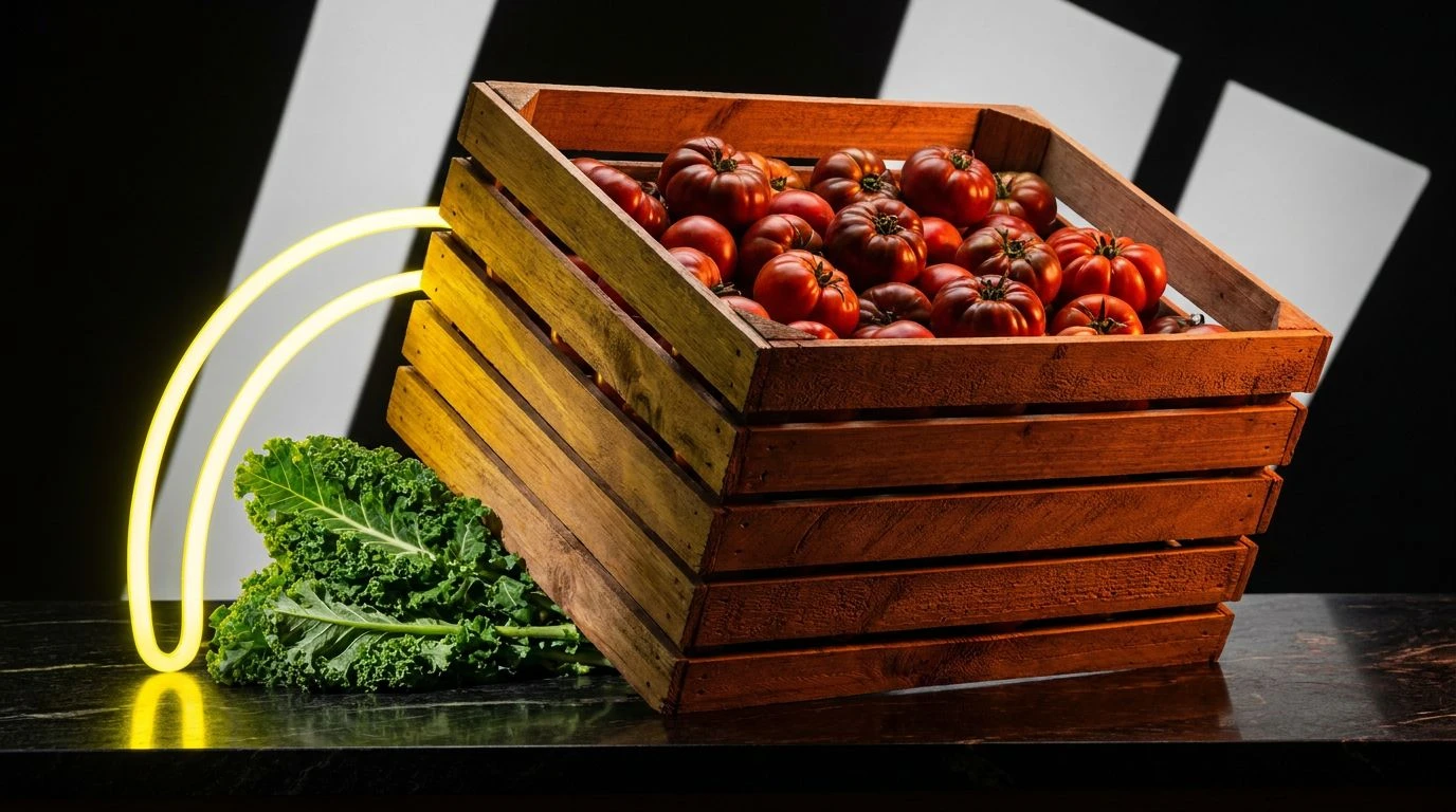
Summer Harvest Pop 🍅
The visual vocabulary of Summer Harvest Pop draws direct inspiration from the commercial exuberance of mid-century advertising, applying that same unapologetic brightness to organic agriculture. A foundation of warm Oat Milk and deep Charcoal Void allows the intense, fruit-inspired tones of Tomato Splash and Mango Sun to command the foreground. This aggressive prioritization of color transforms the typical farmer's market offering into a bold graphic statement. When placed alongside the cooling influences of Celery Snap and Orchard Canopy, alongside sweeping accents of Cerulean Glaze and Cobalt Wave, the resulting visual experience feels exceptionally fresh and loudly optimistic. Agricultural enterprises utilizing this broad, cheerful spectrum are successfully moving sustainable farming out of a niche, alternative market and into the mainstream consumer consciousness. The striking combination promises an energetic lifestyle, framing organic eating as a joyful and modern choice rather than a restrictive dietary mandate.
Hyperfruit Ecology 🍉
Nowhere is the departure from traditional ecological branding more apparent than in the startling brilliance of Hyperfruit Ecology. This selection entirely rejects the muted tones of traditional environmentalism, substituting them with the brazen, artificial-leaning intensity of Dragonfruit Neon and Neon Mint. The juxtaposition of these electric hues against the solemnity of Deep Midnight, Slate Shadow, and Pacific Ink creates a dramatic, almost cinematic quality that feels uniquely sophisticated. Bright accents like Copper Rind, Banana Peel, and Electric Aqua push the boundary of what consumers expect from natural foods, aligning organic produce with the polished, high-definition visuals of modern art and technology sectors. For a progressive farm, this unexpected combination signals a commitment to cutting-edge agricultural science and climate adaptability. It paints a picture of sustainability that is bold, technologically advanced, and entirely unapologetic about its place in the modern commercial landscape.
Citrus Rebellion 🍊
Citrus Rebellion strips the agricultural aesthetic down to a highly concentrated, visually arresting system of contrasts. The absolute darkness of Obsidian Earth serves as a theatrical backdrop, allowing the acidic brightness of Lime Shock and the urgent heat of Atomic Orange to jump forward with remarkable force. Deeply rooted in the visual traditions of poster art, this approach demands immediate consumer attention. The inclusion of Dusted Apricot provides a necessary moment of visual rest, while Forest Depth anchors the entire composition firmly in the natural world. Modern farming initiatives applying this severe, high-contrast styling are actively rejecting the soft, unpolished look of legacy organic brands. Instead, they position their produce as premium, high-performance fuel for the human body. The striking visual weight of these colors transforms the humble act of growing food into an assertive, highly visible rebellion against the tired conventions of both conventional farming and standard ecological branding.
Electric Apiary 🐝
A focused, almost industrial interpretation of agricultural branding emerges through the severe and striking tones of Electric Apiary. The relentless brightness of Cyber Yellow functions as an immediate visual alarm, capturing attention with the same urgency as a street sign or a piece of modern pop art. This intense primary tone is dramatically offset by the cooling restraint of Vanilla Frost and the stark, utilitarian presence of Gunmetal Cloud. A sharp intervention of Ultramarine Flash against the darkened expanse of Abyssal Blue adds a layer of absolute modernism to the visual field. When applied to sustainable farming operations, this highly controlled, almost synthetic color strategy speaks to precision agriculture, controlled environments, and scientific rigor. It strips away all romanticized notions of the agrarian past, offering consumers a vision of ecology that is highly designed, strictly managed, and built to survive the unpredictable conditions of a changing global climate.
The migration toward vivid, pop-art-inspired color schemes represents a profound maturation in the marketing of ecological responsibility. By pointedly trading sleepy pastoral greens for aggressive yellow tones and highly saturated fruit colors, modern agricultural enterprises are reclaiming their visibility in a notoriously crowded retail environment. This aesthetic pivot achieves something far more significant than mere shelf appeal; it fundamentally alters the public perception of sustainable farming. Wrapping organic agriculture in a loud, commercially forceful visual language effectively distances the sector from outdated stereotypes of passive, rural asceticism. Ultimately, this striking approach proves that responsible environmental stewardship can be presented as a highly active, culturally relevant, and fiercely modern enterprise, fully capable of holding its own in the contemporary marketplace.