'%3e%3cpath%20fill-rule='evenodd'%20clip-rule='evenodd'%20d='M51.1303%2019.2492C50.7278%2019.913%2050.1346%2020.4426%2049.3508%2020.838C48.5669%2021.2335%2047.6172%2021.4312%2046.5014%2021.4312C44.8208%2021.4312%2043.4367%2021.0216%2042.3492%2020.2025C41.2617%2019.3833%2040.6686%2018.2394%2040.5697%2016.7706H44.4253C44.4818%2017.3355%2044.6831%2017.7804%2045.0291%2018.1052C45.3751%2018.43%2045.8164%2018.5924%2046.3531%2018.5924C46.8192%2018.5924%2047.1864%2018.4653%2047.4547%2018.2111C47.7231%2017.9569%2047.8572%2017.618%2047.8572%2017.1943C47.8572%2016.8129%2047.7337%2016.4952%2047.4865%2016.241C47.2393%2015.9867%2046.9322%2015.7784%2046.565%2015.616C46.1978%2015.4536%2045.6893%2015.2594%2045.0397%2015.0334C44.0934%2014.7086%2043.3202%2014.3944%2042.72%2014.0907C42.1197%2013.7871%2041.6042%2013.3351%2041.1735%2012.7349C40.7427%2012.1347%2040.5273%2011.3544%2040.5273%2010.394C40.5273%209.50418%2040.7533%208.73448%2041.2053%208.08481C41.6572%207.43515%2042.2821%206.93731%2043.0801%206.5913C43.8781%206.24528%2044.7925%206.07227%2045.8235%206.07227C47.49%206.07227%2048.8141%206.46771%2049.7956%207.25861C50.7772%208.04951%2051.3315%209.13698%2051.4586%2010.5211H47.5395C47.4689%2010.0268%2047.2888%209.63483%2046.9993%209.3453C46.7097%209.05578%2046.3178%208.91102%2045.8235%208.91102C45.3998%208.91102%2045.0573%209.024%2044.7961%209.24997C44.5348%209.47594%2044.4041%209.80783%2044.4041%2010.2457C44.4041%2010.5988%2044.5207%2010.8989%2044.7537%2011.146C44.9867%2011.3932%2045.2798%2011.5944%2045.6328%2011.7498C45.9859%2011.9052%2046.4944%2012.1029%2047.1581%2012.343C48.1185%2012.6678%2048.9023%2012.9891%2049.5096%2013.3069C50.1169%2013.6246%2050.6395%2014.0872%2051.0773%2014.6945C51.5151%2015.3018%2051.734%2016.0927%2051.734%2017.0672C51.734%2017.8581%2051.5328%2018.5854%2051.1303%2019.2492ZM59.0242%206.3053V21.2829H55.4016V6.3053H59.0242ZM73.9409%206.3053V9.18642H69.8734V21.2829H66.2296V9.18642H62.2046V6.3053H73.9409ZM80.7438%209.18642V12.3218H85.8069V15.0546H80.7438V18.3806H86.4425V21.2829H77.1212V6.3053H86.4425V9.18642H80.7438ZM99.667%2016.0291V21.2829H96.0444V6.3053H101.913C103.692%206.3053%20105.048%206.74665%20105.98%207.62934C106.912%208.51204%20107.378%209.7019%20107.378%2011.199C107.378%2012.1311%20107.17%2012.9609%20106.753%2013.6882C106.337%2014.4155%20105.719%2014.9875%20104.9%2015.4042C104.08%2015.8208%20103.085%2016.0291%20101.913%2016.0291H99.667ZM103.692%2011.199C103.692%209.8855%20102.965%209.22879%20101.51%209.22879H99.667V13.1268H101.51C102.965%2013.1268%20103.692%2012.4842%20103.692%2011.199ZM120.092%2018.5501H114.478L113.546%2021.2829H109.732L115.219%206.41123H119.393L124.879%2021.2829H121.024L120.092%2018.5501ZM119.16%2015.7961L117.295%2010.2881L115.41%2015.7961H119.16ZM131.555%2018.5077H136.385V21.2829H127.933V6.3053H131.555V18.5077ZM143.337%209.18642V12.3218H148.4V15.0546H143.337V18.3806H149.035V21.2829H139.714V6.3053H149.035V9.18642H143.337ZM163.507%206.3053V9.18642H159.44V21.2829H155.796V9.18642H151.771V6.3053H163.507ZM177.449%206.3053V9.18642H173.382V21.2829H169.738V9.18642H165.713V6.3053H177.449ZM184.252%209.18642V12.3218H189.315V15.0546H184.252V18.3806H189.951V21.2829H180.629V6.3053H189.951V9.18642H184.252Z'%20fill='%23EEF0ED'/%3e%3cmask%20id='mask0_3101_7327'%20style='mask-type:alpha'%20maskUnits='userSpaceOnUse'%20x='0'%20y='0'%20width='27'%20height='28'%3e%3cpath%20d='M23.8328%200.759766H2.64808C1.18559%200.759766%200%201.94535%200%203.40785V24.5925C0%2026.055%201.18559%2027.2406%202.64808%2027.2406H23.8328C25.2952%2027.2406%2026.4808%2026.055%2026.4808%2024.5925V3.40785C26.4808%201.94535%2025.2952%200.759766%2023.8328%200.759766Z'%20fill='white'/%3e%3c/mask%3e%3cg%20mask='url(%23mask0_3101_7327)'%3e%3cpath%20d='M23.8328%200.759766H2.64808C1.18559%200.759766%200%201.94535%200%203.40785V24.5925C0%2026.055%201.18559%2027.2406%202.64808%2027.2406H23.8328C25.2952%2027.2406%2026.4808%2026.055%2026.4808%2024.5925V3.40785C26.4808%201.94535%2025.2952%200.759766%2023.8328%200.759766Z'%20fill='%23D8D8D8'/%3e%3cpath%20d='M13.2404%200.759766H0V14.0001H13.2404V0.759766Z'%20fill='%238C61FF'/%3e%3cpath%20d='M13.2404%2014H0V27.2404H13.2404V14Z'%20fill='%2336C3FE'/%3e%3cpath%20d='M26.4806%2014H13.2402V27.2404H26.4806V14Z'%20fill='%236592FE'/%3e%3cpath%20d='M26.4806%200.759766H13.2402V14.0002H26.4806V0.759766Z'%20fill='%236059F7'/%3e%3c/g%3e%3c/g%3e%3cdefs%3e%3cclipPath%20id='clip0_3101_7327'%3e%3crect%20width='190'%20height='28'%20fill='white'/%3e%3c/clipPath%3e%3c/defs%3e%3c/svg%3e)
'%3e%3cpath%20d='M23.8328%200.759521H2.64808C1.18559%200.759521%200%201.94511%200%203.40761V24.5923C0%2026.0548%201.18559%2027.2404%202.64808%2027.2404H23.8328C25.2952%2027.2404%2026.4808%2026.0548%2026.4808%2024.5923V3.40761C26.4808%201.94511%2025.2952%200.759521%2023.8328%200.759521Z'%20fill='%23D8D8D8'/%3e%3cpath%20d='M13.2404%200.759521H0V13.9999H13.2404V0.759521Z'%20fill='%238C61FF'/%3e%3cpath%20d='M13.2404%2013.9998H0V27.2402H13.2404V13.9998Z'%20fill='%2336C3FE'/%3e%3cpath%20d='M26.4809%2013.9998H13.2405V27.2402H26.4809V13.9998Z'%20fill='%236592FE'/%3e%3cpath%20d='M26.4809%200.759277H13.2405V13.9997H26.4809V0.759277Z'%20fill='%236059F7'/%3e%3c/g%3e%3c/svg%3e)
Industrial Color Palettes: Using Mustard Yellow in Design
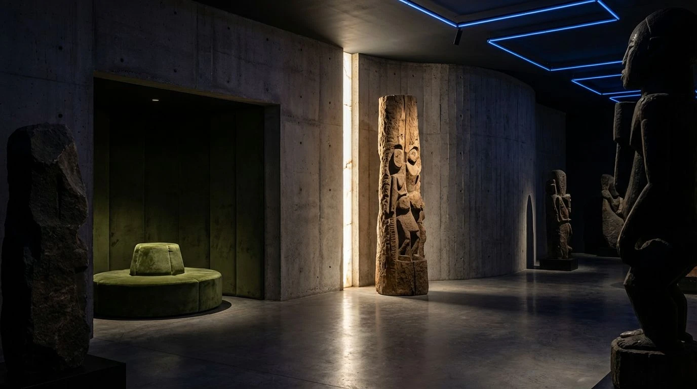
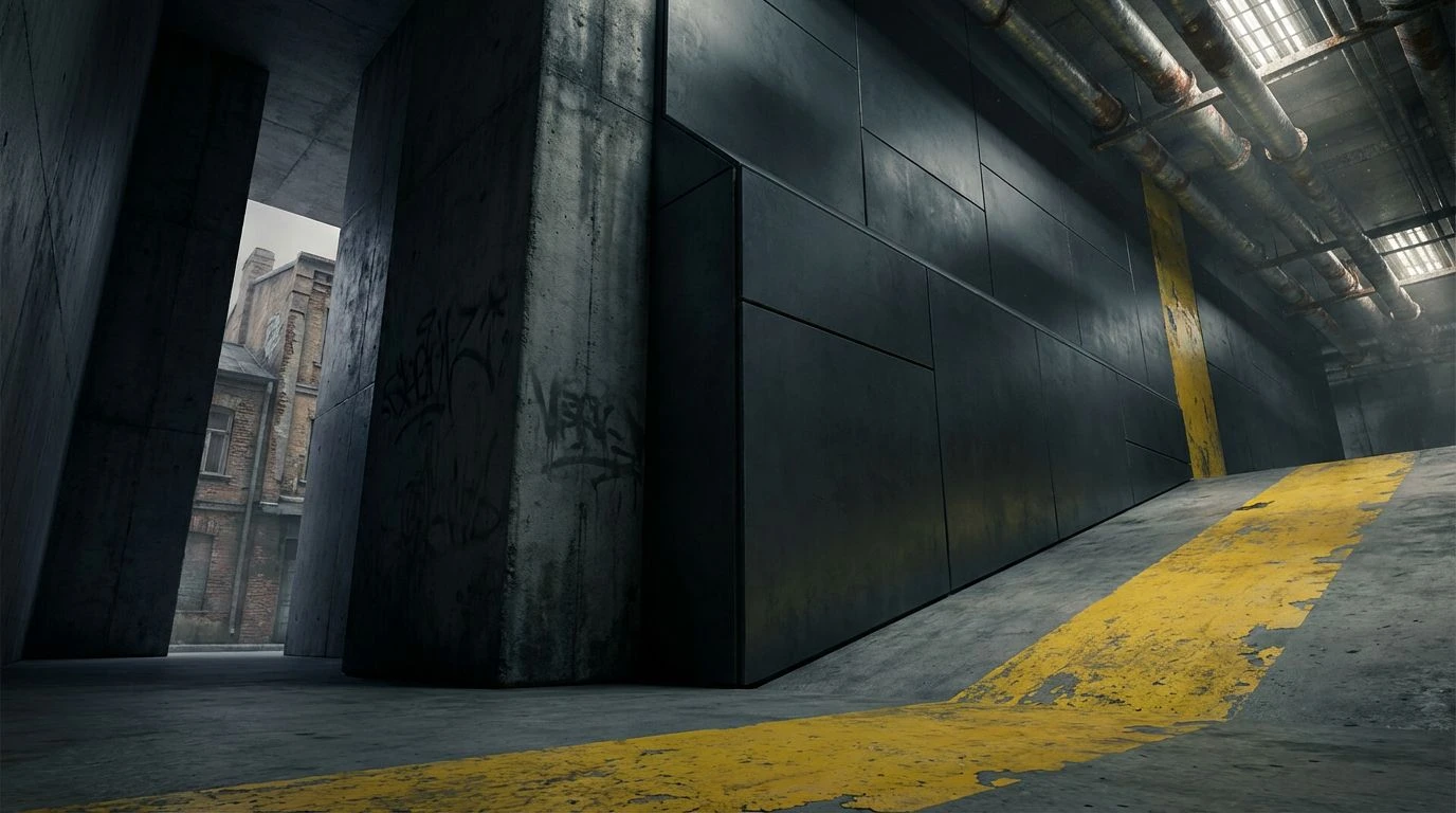
· 5 min readThe modern metropolis reveals itself not in sweeping vistas, but in the sudden and sharp language of its navigation. Walls of brutalist concrete and corridors of cold steel dictate movement with unyielding authority. Yet amid this sprawling severity, an abrupt interruption forces the wandering gaze to halt. A flash of dusty mustard yellow cuts across the charcoal void. It is a rebellion against the monochrome, an intentional disturbance placed exactly where footfalls falter. This vintage hue serves a severe purpose. It directs, warns, and guides without surrendering the rough urban edge. Color here is not decoration. It is a strict vocabulary of survival and orientation within an architectural wasteland.
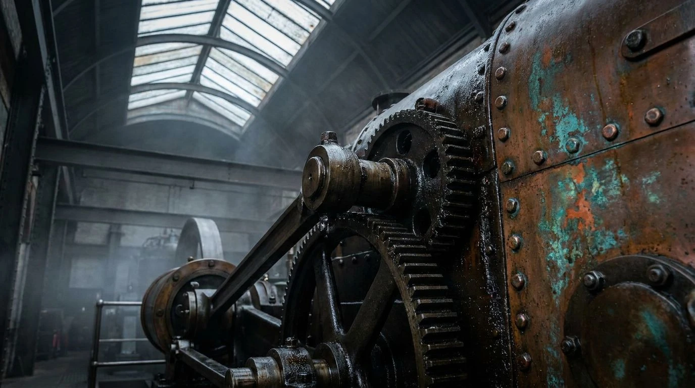
Rust and Warning 🚧
Within the palette titled Rust and Warning, the transition from Ash Shadow to Fossilized Amber tracks the trajectory of a city waking up to decay. Concrete Weathering coats the background in unending gloom, forming a brutalist stage where human presence feels accidental. Then, Signal Flare flashes across the visual plane, stripping away all comfort, demanding absolute attention. This sudden burst of severe urgency bleeds into Oxblood Orange, like painted steel girders exposed to decades of salt and rain. Finally, Fossilized Amber provides the navigational punch, a rusted yet luminous hue that guides travelers through subway corridors and underground brutalist monuments. It speaks of vintage municipal signage, forgotten but newly restored to direct traffic through the dark. The colors do not comfort the eye. They act as strict supervisors, establishing order amid cavernous architectural voids.
Acidic Intrusions 🍋
Acidic Intrusions acts as a visceral shock to the optical senses, pairing the lifeless quiet of Bleached Mortar with an agonizing pulse of bright energy. Aluminum Fog and Iron Slag construct the scaffolding of this visual space, laying down an oppressive, industrial silence. You can almost feel the chill of winter on bare metal. Suddenly, Voltage Strike fractures the scene. It is a loud, unapologetic shriek of direction, a painted line along a factory floor that forbids wandering steps. Tarnished Brass grounds that electric jolt, turning the blinding shock back into an older, earthier industrial reality. When applied to physical space, this collection relies on jarring contrast. The highly charged surge forces the mind into high alert, ensuring that whoever wanders the sprawling urban grid knows exactly where the danger lies, and exactly where the exit waits.
Sudden Directional Shift 🛑
There is an undeniable severity to Sudden Directional Shift, a palette that commands movement rather than merely suggesting it. Deep Asphalt swallows the light entirely, setting a threatening backdrop of endless night, while Urban Grit offers the faintest textural relief, like the scarred surface of a loading dock. Chalk Dust and Battered Oxide build the skeletal structure of transit stations and parking garages. Against this heavy, oppressive atmosphere, Dried Arterial Red issues a severe warning, an aggressive physical stop built into the architecture itself. But it is Antique Ochre that provides the path forward. This precise pigment feels weathered by years of exhaust fumes, yet it cuts through the shadows with brutal efficiency. It guides the lost traveler past the imposing blackness, carving a bright, purposeful corridor through a city that otherwise refuses to yield space.
Neon Against Shadows 🔦
Midnight Tarmac sets an intimidating stage for Neon Against Shadows. The absolute darkness of the foundation refuses to forgive mistakes, threatening to consume the careless pedestrian. Ghosted Stucco and Smoked Glass offer fleeting moments of architectural relief, shapes vaguely recognized in the dim light of an alleyway. Then comes Emergency Brake, catching the eye with the violence of a flashing siren. Yet the true navigational anchor is found in the interplay between Muted Sulfur and Halogen Glare. This is the pale, dirty tone of old traffic lines fighting against the blinding flash of modern signage. Together, they form a strict visual hierarchy. The dusty vintage pigment pulls the mind back to simpler times of painted brick and tin signs, while the sudden neon surge insists on immediate movement. This collection thrives in the underbelly of the city, directing hurried steps through forgotten subterranean walkways.
Fading Infrastructure 🏚️
The quiet decay hidden within Fading Infrastructure speaks of a metropolis slowly surrendering to time. Smudged Lead and Matte Zinc wrap the environment in overcast skies, a dreary reflection of heavy industry grinding to a halt. Void Pitch creates bottomless corners and unreachable shadows, forming a backdrop that feels both expansive and deeply claustrophobic. Against this quiet sorrow, Faded Brickwork and Rusted Iron bloom like lichen on cold stone walling. They offer warmth, but it is a rough, abrasive heat. The saving grace arrives in the form of Sunbleached Caution. This tired yet resolute shade marks the stairs and handrails, carrying the memory of severe, urgent warnings now softened by decades of sun exposure. In a vast geometric maze, this pale and dusty hue continues to guide wayward souls, offering a solitary thread of direction through the sprawling urban cemetery.
A strict architectural environment demands equally rigorous methods of navigation. The brightest visual markers, particularly in their rusted and weathered forms, serve as inescapable directives over a landscape of shadows and stone. They command attention without resorting to frivolous decoration. Each of these chromatic studies reveals how a single burst of intense warning can interrupt the endless gray expanses of concrete and steel. These precise shocks of ochre and heavy amber transform vast monumental spaces from confusing labyrinths into readable, walkable routes. The raw urban edge is preserved, not softened, by this vintage application of light. Ultimately, this specific disturbance proves that color is a critical language, speaking loudly in places where silence otherwise reigns.