'%3e%3cpath%20fill-rule='evenodd'%20clip-rule='evenodd'%20d='M51.1303%2019.2492C50.7278%2019.913%2050.1346%2020.4426%2049.3508%2020.838C48.5669%2021.2335%2047.6172%2021.4312%2046.5014%2021.4312C44.8208%2021.4312%2043.4367%2021.0216%2042.3492%2020.2025C41.2617%2019.3833%2040.6686%2018.2394%2040.5697%2016.7706H44.4253C44.4818%2017.3355%2044.6831%2017.7804%2045.0291%2018.1052C45.3751%2018.43%2045.8164%2018.5924%2046.3531%2018.5924C46.8192%2018.5924%2047.1864%2018.4653%2047.4547%2018.2111C47.7231%2017.9569%2047.8572%2017.618%2047.8572%2017.1943C47.8572%2016.8129%2047.7337%2016.4952%2047.4865%2016.241C47.2393%2015.9867%2046.9322%2015.7784%2046.565%2015.616C46.1978%2015.4536%2045.6893%2015.2594%2045.0397%2015.0334C44.0934%2014.7086%2043.3202%2014.3944%2042.72%2014.0907C42.1197%2013.7871%2041.6042%2013.3351%2041.1735%2012.7349C40.7427%2012.1347%2040.5273%2011.3544%2040.5273%2010.394C40.5273%209.50418%2040.7533%208.73448%2041.2053%208.08481C41.6572%207.43515%2042.2821%206.93731%2043.0801%206.5913C43.8781%206.24528%2044.7925%206.07227%2045.8235%206.07227C47.49%206.07227%2048.8141%206.46771%2049.7956%207.25861C50.7772%208.04951%2051.3315%209.13698%2051.4586%2010.5211H47.5395C47.4689%2010.0268%2047.2888%209.63483%2046.9993%209.3453C46.7097%209.05578%2046.3178%208.91102%2045.8235%208.91102C45.3998%208.91102%2045.0573%209.024%2044.7961%209.24997C44.5348%209.47594%2044.4041%209.80783%2044.4041%2010.2457C44.4041%2010.5988%2044.5207%2010.8989%2044.7537%2011.146C44.9867%2011.3932%2045.2798%2011.5944%2045.6328%2011.7498C45.9859%2011.9052%2046.4944%2012.1029%2047.1581%2012.343C48.1185%2012.6678%2048.9023%2012.9891%2049.5096%2013.3069C50.1169%2013.6246%2050.6395%2014.0872%2051.0773%2014.6945C51.5151%2015.3018%2051.734%2016.0927%2051.734%2017.0672C51.734%2017.8581%2051.5328%2018.5854%2051.1303%2019.2492ZM59.0242%206.3053V21.2829H55.4016V6.3053H59.0242ZM73.9409%206.3053V9.18642H69.8734V21.2829H66.2296V9.18642H62.2046V6.3053H73.9409ZM80.7438%209.18642V12.3218H85.8069V15.0546H80.7438V18.3806H86.4425V21.2829H77.1212V6.3053H86.4425V9.18642H80.7438ZM99.667%2016.0291V21.2829H96.0444V6.3053H101.913C103.692%206.3053%20105.048%206.74665%20105.98%207.62934C106.912%208.51204%20107.378%209.7019%20107.378%2011.199C107.378%2012.1311%20107.17%2012.9609%20106.753%2013.6882C106.337%2014.4155%20105.719%2014.9875%20104.9%2015.4042C104.08%2015.8208%20103.085%2016.0291%20101.913%2016.0291H99.667ZM103.692%2011.199C103.692%209.8855%20102.965%209.22879%20101.51%209.22879H99.667V13.1268H101.51C102.965%2013.1268%20103.692%2012.4842%20103.692%2011.199ZM120.092%2018.5501H114.478L113.546%2021.2829H109.732L115.219%206.41123H119.393L124.879%2021.2829H121.024L120.092%2018.5501ZM119.16%2015.7961L117.295%2010.2881L115.41%2015.7961H119.16ZM131.555%2018.5077H136.385V21.2829H127.933V6.3053H131.555V18.5077ZM143.337%209.18642V12.3218H148.4V15.0546H143.337V18.3806H149.035V21.2829H139.714V6.3053H149.035V9.18642H143.337ZM163.507%206.3053V9.18642H159.44V21.2829H155.796V9.18642H151.771V6.3053H163.507ZM177.449%206.3053V9.18642H173.382V21.2829H169.738V9.18642H165.713V6.3053H177.449ZM184.252%209.18642V12.3218H189.315V15.0546H184.252V18.3806H189.951V21.2829H180.629V6.3053H189.951V9.18642H184.252Z'%20fill='%23EEF0ED'/%3e%3cmask%20id='mask0_3101_7327'%20style='mask-type:alpha'%20maskUnits='userSpaceOnUse'%20x='0'%20y='0'%20width='27'%20height='28'%3e%3cpath%20d='M23.8328%200.759766H2.64808C1.18559%200.759766%200%201.94535%200%203.40785V24.5925C0%2026.055%201.18559%2027.2406%202.64808%2027.2406H23.8328C25.2952%2027.2406%2026.4808%2026.055%2026.4808%2024.5925V3.40785C26.4808%201.94535%2025.2952%200.759766%2023.8328%200.759766Z'%20fill='white'/%3e%3c/mask%3e%3cg%20mask='url(%23mask0_3101_7327)'%3e%3cpath%20d='M23.8328%200.759766H2.64808C1.18559%200.759766%200%201.94535%200%203.40785V24.5925C0%2026.055%201.18559%2027.2406%202.64808%2027.2406H23.8328C25.2952%2027.2406%2026.4808%2026.055%2026.4808%2024.5925V3.40785C26.4808%201.94535%2025.2952%200.759766%2023.8328%200.759766Z'%20fill='%23D8D8D8'/%3e%3cpath%20d='M13.2404%200.759766H0V14.0001H13.2404V0.759766Z'%20fill='%238C61FF'/%3e%3cpath%20d='M13.2404%2014H0V27.2404H13.2404V14Z'%20fill='%2336C3FE'/%3e%3cpath%20d='M26.4806%2014H13.2402V27.2404H26.4806V14Z'%20fill='%236592FE'/%3e%3cpath%20d='M26.4806%200.759766H13.2402V14.0002H26.4806V0.759766Z'%20fill='%236059F7'/%3e%3c/g%3e%3c/g%3e%3cdefs%3e%3cclipPath%20id='clip0_3101_7327'%3e%3crect%20width='190'%20height='28'%20fill='white'/%3e%3c/clipPath%3e%3c/defs%3e%3c/svg%3e)
'%3e%3cpath%20d='M23.8328%200.759521H2.64808C1.18559%200.759521%200%201.94511%200%203.40761V24.5923C0%2026.0548%201.18559%2027.2404%202.64808%2027.2404H23.8328C25.2952%2027.2404%2026.4808%2026.0548%2026.4808%2024.5923V3.40761C26.4808%201.94511%2025.2952%200.759521%2023.8328%200.759521Z'%20fill='%23D8D8D8'/%3e%3cpath%20d='M13.2404%200.759521H0V13.9999H13.2404V0.759521Z'%20fill='%238C61FF'/%3e%3cpath%20d='M13.2404%2013.9998H0V27.2402H13.2404V13.9998Z'%20fill='%2336C3FE'/%3e%3cpath%20d='M26.4809%2013.9998H13.2405V27.2402H26.4809V13.9998Z'%20fill='%236592FE'/%3e%3cpath%20d='M26.4809%200.759277H13.2405V13.9997H26.4809V0.759277Z'%20fill='%236059F7'/%3e%3c/g%3e%3c/svg%3e)
Red Color Palettes for Stormy and Moody Interior Design
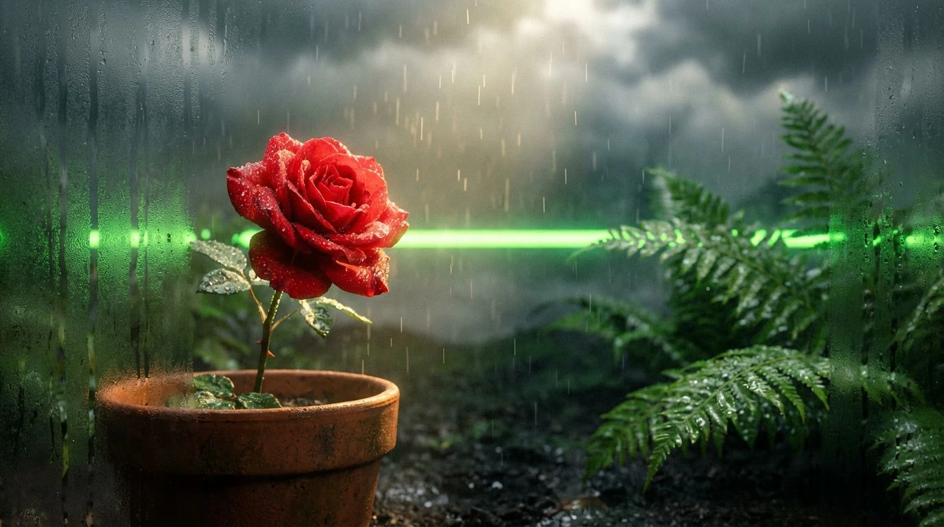
· 5 min readThere is a distinct visual tension that occurs when high-intensity colors meet the muted, brooding filters of a storm-heavy atmosphere. Picture the stark flash of a neon tail-light cutting through an overcast afternoon downpour. Red, an aggressive and demanding hue, typically insists on absolute attention. Yet, when placed against the quiet wash of greys and shadows typical of a rainy stretch, its urgency softens. This interaction creates an unexpected visual arc, moving from an outright demand for focus toward a softer, more compassionate glow. Designers are increasingly exploring this exact relationship, placing relentless, hyper-visible scarlet tones within foggy, desaturated environments to craft spatial and graphic narratives that feel both deeply urgent and quietly restorative. By treating storm clouds not as a blank backdrop but as an active participant, the piercing heat of red finds a new way to exist, calming its own frenetic pace as the rain falls.
Downpour Warning 🚨
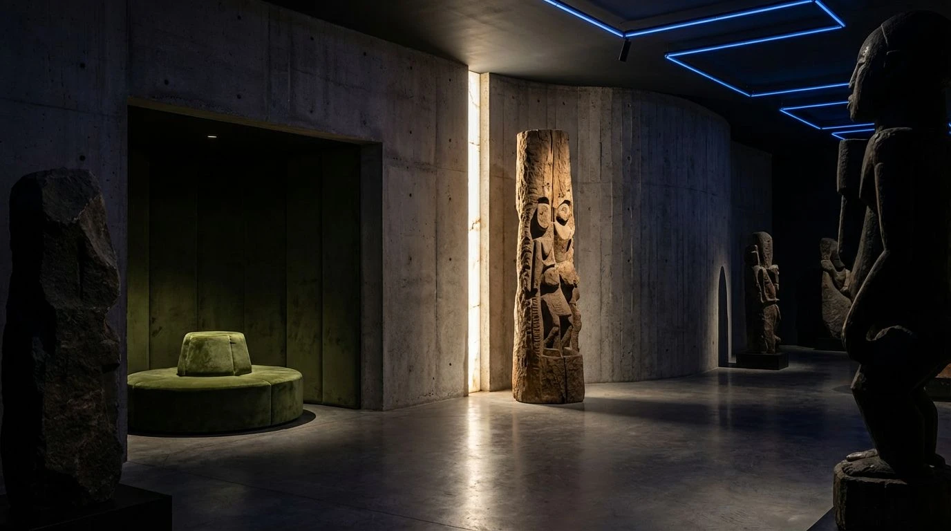
Downpour Warning captures the exact moment a severe weather alert flashes across a minimalist, concrete-clad transit station. The tension here relies on the striking contrast between heavy, rain-slicked neutrals like Wet Concrete and Overcast Shadow, and the blaring alarm of Hazard Red. In graphic applications and wayfinding systems, this demanding color commands immediate action, cutting straight through the visual fog. As the eye settles on the softer companions, such as Diluted Vermilion and the muted glow of Streetlamp Amber, the initial alarm gives way to a sense of sheltered safety. The palette shifts the user experience from sudden panic to guided reassurance, simulating the feeling of stepping out of a torrential downpour into a warm, wood-paneled vestibule. It proves that a loud visual cue can actually guide viewers toward a state of calm, using overcast greys to pad the landing completely.
Cold Front Contrast 🌧️
Even when swapping out a traditional crimson for the biting warmth of Rusting Fire Escape, Cold Front Contrast maintains a gripping narrative of survival against the elements. This spectrum mirrors the slick, high-contrast photography of urban streetscapes during the wettest months of the year. The heavy foundation of Iron Sky and Wet Asphalt creates a moody, isolating environment, setting the stage for a dramatic visual intervention. When that burst of orange flares up alongside the erratic flashes of Deep Puddle Blue and Break in the Clouds, it acts as a lifeline rather than an assault. In branding or interface design, this specific weighting turns what could be a harsh layout into a highly navigable, considerate experience. Sharp flashes of color serve to guide the user gently through an otherwise somber digital space, proving that aggressive contrast can ultimately function as a tool of supreme user compassion when bracketed by a stormy grayscale.
Rusted Sanctuary 🏚️
Rusted Sanctuary moves away from artificial alarms and grounds the aggressive energy of red in the natural decay of a forest weathering a long, damp season. The pairing of Oxidized Crimson and Soil and Cinder feels earthen and raw, carrying a quiet heat that smolders rather than burns. Set against the cool, vegetative wash of Stormy Eucalyptus and Midnight Moss, this arrangement builds a spatial environment that feels incredibly secure. Interior styling centered on this collection uses the rich, rusty tones to provide localized warmth, wrapping the inhabitant in a protective visual layer against the chill of Matte Alabaster and Dewy Sage. The urgency here is quieted, transforming into a steadfast, enduring presence. The architectural use of these deep, natural reds invites an immediate sense of slow living and care, showing how intense colors mature and settle when subjected to the prolonged, brooding quiet of an endless drizzle.
Urban Greenhouse 🪴
Operating on a knife edge between artificial intensity and organic relief, Urban Greenhouse places the absolute aggression of Thorny Scarlet directly into a lush, rain-battered conservatory environment. The loudest, most forward color here functions as a focal point, much like a singular blooming flower demanding attention amidst an overwhelming expanse of damp greenery. Fogged Glass and Dark Loam create a muted, heavy atmosphere that physically weighs down the composition, absorbing the sheer optic noise of Neon Sprout and Weak Sunbeam. For editorial layouts and packaging, adopting this configuration allows designers to grab attention immediately with the stark red, then hold it by rewarding the viewer with the soothing, restorative properties of Soaked Fern. The viewer is drawn in by a shout and then comforted by a whisper, tracking a psychological shift from a loud warning toward a nurturing, protective calm inside the glass walls.
Neon Drizzle ☂️
Neon Drizzle treats the stormy atmosphere not as a natural phenomenon, but as a hyper-modern, cinematic backdrop. This collection completely leans into the aggressive urgency of Panic Button Red, situating it in an almost dystopian night-time downpour defined by Pitch Black Void and Midnight Evergreen. The inclusion of jarring, acidic tones like Raindrop Cyan and Ultra Violet simulates the fractured, frantic reflections of city signs on a wet street. When applied to digital motion graphics or avant-garde fashion campaigns, this aggressive array initially overwhelms the senses. However, the sheer density of the dark, brooding background colors eventually absorbs that shock. The heavy teal and black tones pull the aggressive red back down to earth, turning a frenetic glitch into a steady, controlled pulse. It becomes a design statement about finding humanity and warmth within the coldest, most chaotic, and brutally wet urban environments imaginable.
Observing intense, uncompromising colors operating within the restrained framework of a rain-swept atmosphere fundamentally shifts how we approach high-impact visual design. Instead of simply turning down the volume of an aggressive red, placing it alongside the moody, isolating tones of a weather-beaten sky reframes its purpose. Harsh warnings soften into guiding lights, and strict demands for attention give way to comforting beacons in the gloom. These collections establish that visual urgency does not have to remain loud or abrasive to be effective. By embracing the quiet gravity of a storm, designers can map a distinct emotional journey for the user, one that begins with a sharp, unavoidable alert and beautifully resolves into a quiet, sheltering embrace.