'%3e%3cpath%20fill-rule='evenodd'%20clip-rule='evenodd'%20d='M51.1303%2019.2492C50.7278%2019.913%2050.1346%2020.4426%2049.3508%2020.838C48.5669%2021.2335%2047.6172%2021.4312%2046.5014%2021.4312C44.8208%2021.4312%2043.4367%2021.0216%2042.3492%2020.2025C41.2617%2019.3833%2040.6686%2018.2394%2040.5697%2016.7706H44.4253C44.4818%2017.3355%2044.6831%2017.7804%2045.0291%2018.1052C45.3751%2018.43%2045.8164%2018.5924%2046.3531%2018.5924C46.8192%2018.5924%2047.1864%2018.4653%2047.4547%2018.2111C47.7231%2017.9569%2047.8572%2017.618%2047.8572%2017.1943C47.8572%2016.8129%2047.7337%2016.4952%2047.4865%2016.241C47.2393%2015.9867%2046.9322%2015.7784%2046.565%2015.616C46.1978%2015.4536%2045.6893%2015.2594%2045.0397%2015.0334C44.0934%2014.7086%2043.3202%2014.3944%2042.72%2014.0907C42.1197%2013.7871%2041.6042%2013.3351%2041.1735%2012.7349C40.7427%2012.1347%2040.5273%2011.3544%2040.5273%2010.394C40.5273%209.50418%2040.7533%208.73448%2041.2053%208.08481C41.6572%207.43515%2042.2821%206.93731%2043.0801%206.5913C43.8781%206.24528%2044.7925%206.07227%2045.8235%206.07227C47.49%206.07227%2048.8141%206.46771%2049.7956%207.25861C50.7772%208.04951%2051.3315%209.13698%2051.4586%2010.5211H47.5395C47.4689%2010.0268%2047.2888%209.63483%2046.9993%209.3453C46.7097%209.05578%2046.3178%208.91102%2045.8235%208.91102C45.3998%208.91102%2045.0573%209.024%2044.7961%209.24997C44.5348%209.47594%2044.4041%209.80783%2044.4041%2010.2457C44.4041%2010.5988%2044.5207%2010.8989%2044.7537%2011.146C44.9867%2011.3932%2045.2798%2011.5944%2045.6328%2011.7498C45.9859%2011.9052%2046.4944%2012.1029%2047.1581%2012.343C48.1185%2012.6678%2048.9023%2012.9891%2049.5096%2013.3069C50.1169%2013.6246%2050.6395%2014.0872%2051.0773%2014.6945C51.5151%2015.3018%2051.734%2016.0927%2051.734%2017.0672C51.734%2017.8581%2051.5328%2018.5854%2051.1303%2019.2492ZM59.0242%206.3053V21.2829H55.4016V6.3053H59.0242ZM73.9409%206.3053V9.18642H69.8734V21.2829H66.2296V9.18642H62.2046V6.3053H73.9409ZM80.7438%209.18642V12.3218H85.8069V15.0546H80.7438V18.3806H86.4425V21.2829H77.1212V6.3053H86.4425V9.18642H80.7438ZM99.667%2016.0291V21.2829H96.0444V6.3053H101.913C103.692%206.3053%20105.048%206.74665%20105.98%207.62934C106.912%208.51204%20107.378%209.7019%20107.378%2011.199C107.378%2012.1311%20107.17%2012.9609%20106.753%2013.6882C106.337%2014.4155%20105.719%2014.9875%20104.9%2015.4042C104.08%2015.8208%20103.085%2016.0291%20101.913%2016.0291H99.667ZM103.692%2011.199C103.692%209.8855%20102.965%209.22879%20101.51%209.22879H99.667V13.1268H101.51C102.965%2013.1268%20103.692%2012.4842%20103.692%2011.199ZM120.092%2018.5501H114.478L113.546%2021.2829H109.732L115.219%206.41123H119.393L124.879%2021.2829H121.024L120.092%2018.5501ZM119.16%2015.7961L117.295%2010.2881L115.41%2015.7961H119.16ZM131.555%2018.5077H136.385V21.2829H127.933V6.3053H131.555V18.5077ZM143.337%209.18642V12.3218H148.4V15.0546H143.337V18.3806H149.035V21.2829H139.714V6.3053H149.035V9.18642H143.337ZM163.507%206.3053V9.18642H159.44V21.2829H155.796V9.18642H151.771V6.3053H163.507ZM177.449%206.3053V9.18642H173.382V21.2829H169.738V9.18642H165.713V6.3053H177.449ZM184.252%209.18642V12.3218H189.315V15.0546H184.252V18.3806H189.951V21.2829H180.629V6.3053H189.951V9.18642H184.252Z'%20fill='%23EEF0ED'/%3e%3cmask%20id='mask0_3101_7327'%20style='mask-type:alpha'%20maskUnits='userSpaceOnUse'%20x='0'%20y='0'%20width='27'%20height='28'%3e%3cpath%20d='M23.8328%200.759766H2.64808C1.18559%200.759766%200%201.94535%200%203.40785V24.5925C0%2026.055%201.18559%2027.2406%202.64808%2027.2406H23.8328C25.2952%2027.2406%2026.4808%2026.055%2026.4808%2024.5925V3.40785C26.4808%201.94535%2025.2952%200.759766%2023.8328%200.759766Z'%20fill='white'/%3e%3c/mask%3e%3cg%20mask='url(%23mask0_3101_7327)'%3e%3cpath%20d='M23.8328%200.759766H2.64808C1.18559%200.759766%200%201.94535%200%203.40785V24.5925C0%2026.055%201.18559%2027.2406%202.64808%2027.2406H23.8328C25.2952%2027.2406%2026.4808%2026.055%2026.4808%2024.5925V3.40785C26.4808%201.94535%2025.2952%200.759766%2023.8328%200.759766Z'%20fill='%23D8D8D8'/%3e%3cpath%20d='M13.2404%200.759766H0V14.0001H13.2404V0.759766Z'%20fill='%238C61FF'/%3e%3cpath%20d='M13.2404%2014H0V27.2404H13.2404V14Z'%20fill='%2336C3FE'/%3e%3cpath%20d='M26.4806%2014H13.2402V27.2404H26.4806V14Z'%20fill='%236592FE'/%3e%3cpath%20d='M26.4806%200.759766H13.2402V14.0002H26.4806V0.759766Z'%20fill='%236059F7'/%3e%3c/g%3e%3c/g%3e%3cdefs%3e%3cclipPath%20id='clip0_3101_7327'%3e%3crect%20width='190'%20height='28'%20fill='white'/%3e%3c/clipPath%3e%3c/defs%3e%3c/svg%3e)
'%3e%3cpath%20d='M23.8328%200.759521H2.64808C1.18559%200.759521%200%201.94511%200%203.40761V24.5923C0%2026.0548%201.18559%2027.2404%202.64808%2027.2404H23.8328C25.2952%2027.2404%2026.4808%2026.0548%2026.4808%2024.5923V3.40761C26.4808%201.94511%2025.2952%200.759521%2023.8328%200.759521Z'%20fill='%23D8D8D8'/%3e%3cpath%20d='M13.2404%200.759521H0V13.9999H13.2404V0.759521Z'%20fill='%238C61FF'/%3e%3cpath%20d='M13.2404%2013.9998H0V27.2402H13.2404V13.9998Z'%20fill='%2336C3FE'/%3e%3cpath%20d='M26.4809%2013.9998H13.2405V27.2402H26.4809V13.9998Z'%20fill='%236592FE'/%3e%3cpath%20d='M26.4809%200.759277H13.2405V13.9997H26.4809V0.759277Z'%20fill='%236059F7'/%3e%3c/g%3e%3c/svg%3e)
Chiaroscuro Color Palettes for African Heritage Design
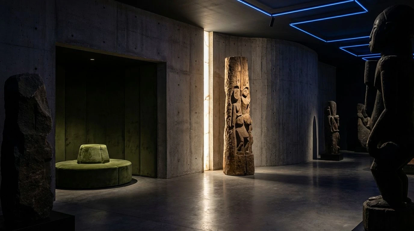
· 5 min readEntering a space defined by stark shadows and sudden pools of light immediately changes how we process scale and form. When designing a sculpture gallery dedicated to African heritage, treating light and shadow as active materials creates a profound dialogue between the artwork and the viewer. The quiet weight of darkened corridors sets the stage for moments of sharp visual intensity. Suddenly, a flash of deep rose or an expanse of earthen green catches the spotlight, grounding the historical narratives in raw, organic materiality. By introducing striking accents, particularly unexpected cuts of royal blue, the spatial narrative shifts from mere observation to active participation. This specific approach to lighting and color transforms a static architectural footprint into a communal environment, framing sacred artifacts and contemporary forms not as relics, but as living, breathing presences demanding attention.
Obsidian Whispers 🗿
Exploring Obsidian Whispers reveals how stark contrasts can dictate spatial pacing within a brutalist gallery setting. The heavy presence of Void Black acts as the primary architectural envelop, swallowing excess light to focus the eye entirely on the curated forms. Against this dense background, sudden structural details picked out in Sacred Moss offer a restorative groundedness, referencing the biological and organic matters essential to ancestral storytelling. Poured Concrete serves as an industrial, quiet transitional tone between the extremes, allowing the viewer's eyes to rest while walking between exhibits. When a beam of Alabaster Light strikes a bronze or wooden form, it carves out the volume of the piece, turning the absence of color into a sculptural material of its own. The starkness shapes a quiet, meditative zone perfectly aligned with monumental, ancestral works.
Ritual Shadows 🏺
The complexity of Ritual Shadows mirrors the layered, multidimensional stories held within traditional and contemporary African artifacts. Resting heavily on a steady base of Plinth Grey and Charred Wood, the darker tones construct a deeply grounded environment that mimics the protective, enclosed feeling of sacred spaces. Breaking through this darkness, Ancestral Clay and Golden Dust bring immediate warmth, acting as visual anchors meant to guide visitors naturally through winding gallery pathways. The sudden introduction of Forest Canopy and Cyan Glaze adds unexpected, vibrant flashes of the natural world, breathing vitality into static exhibits. Capping off the visual experience is Cobalt Crown, a striking, commanding hue that draws attention to high-priority focal points. This combination turns a standard viewing experience into an engaging, multi-sensory journey through culture and inherited memory.
Earth and Ancestry 🌿
Earth and Ancestry shifts the focus toward the physical materiality of the sculptures themselves, relying on organic pigments to tell a story of craft and origin. The foundational Gallery White paired with Mist Over Stone creates a vast, open backdrop, acting as a clean slate that allows the richer, earth-bound pigments to dominate the visual field. Muted Crimson and Terracotta Flesh are introduced not as flat wall paints, but rather closely tied to the textiles, clays, and carved woods typical of historical artifacts. These tones provide grounded, tactile aesthetics that make large gallery halls feel intimate and human-scaled. Cutting across the heavy reds, Sprouting Leaf acts as a sharp, refreshing palate cleanser, offering a burst of biological energy. This method highlights the living tradition behind the art, ensuring the space feels both historically grounded and strictly connected to ongoing natural cycles.
Carved Heritage 🪘
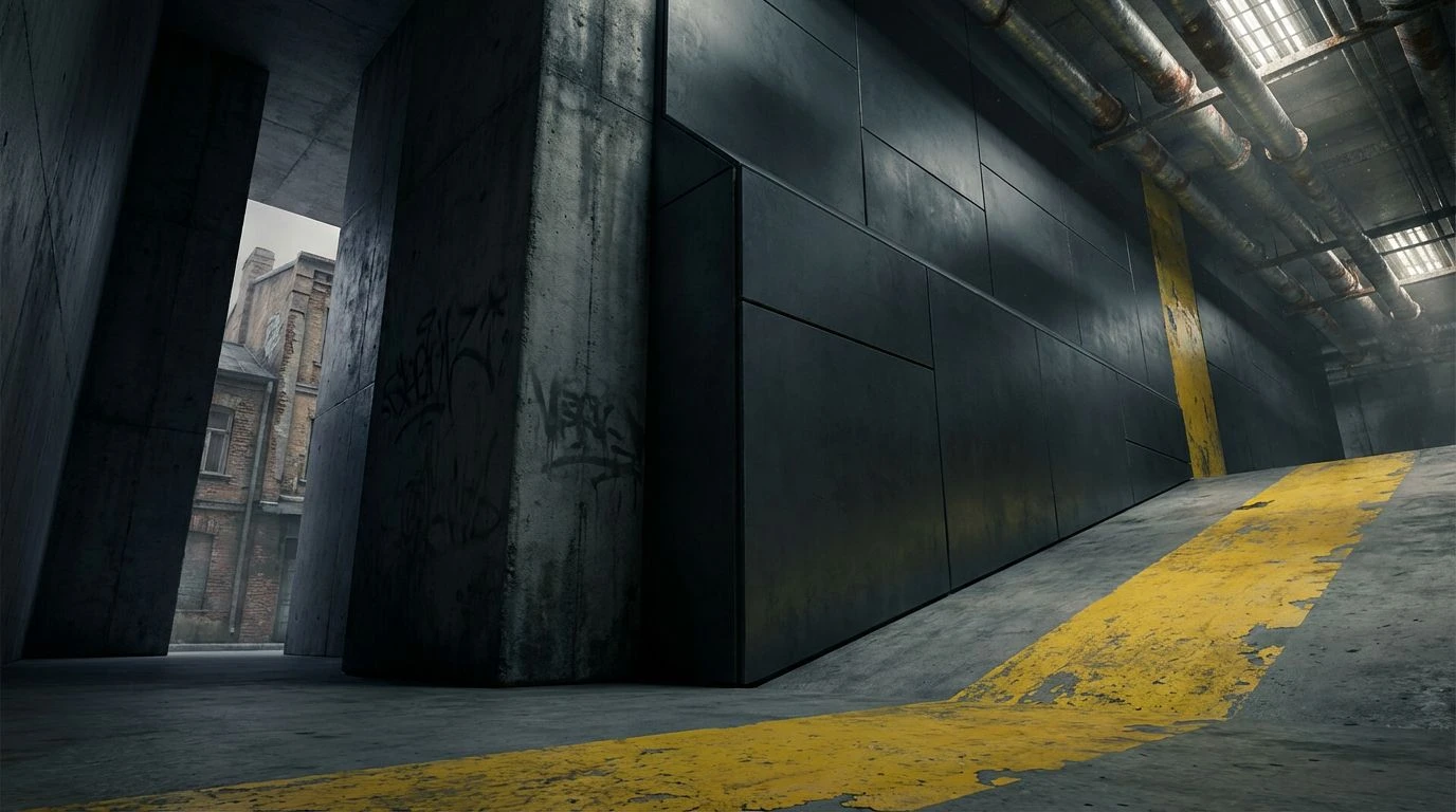
There is an undeniable theatricality embedded within Carved Heritage, relying heavily on the stark, dramatic shifts characteristic of true chiaroscuro environments. Harsh Spotlight acts exactly as its name suggests, acting as the primary source of visibility against the overwhelming, consuming weight of Midnight Bronze. This creates deep, mysterious pockets of negative space around each exhibit, keeping the audience focused on the lit forms. Within the light, Burnt Sienna brings a deeply human, blood-warmth back into the gallery, softening the aggressive contrast between light and dark. Weathered Stone forms the subtle flooring and pedestals, offering a neutral resting ground that does not compete for attention. The addition of Deep Flora brings a highly specific, lush quality to the environment, linking the interior spatial design directly to the dense, living landscapes that inform the continent's artistic legacy.
Royal Chiaroscuro 👑
Royal Chiaroscuro introduces a distinct, regal vocabulary to the gallery space, utilizing bold, saturated bursts of color against rich, dark backgrounds. The interplay starts with Mahogany Shadow, establishing a dense, moody perimeter that shrinks the room and creates a deeply personal viewing setting. Against this, Crimson Pigment and Faded Rose provide a layered, textural warmth, recalling dyed fabrics and natural ochres used in historical ceremonies. Sunlit Brass combined with Earthen Ochre injects an undeniable sense of prestige, catching whatever artificial light is available and throwing a metallic glow across the room. The true anchor of the aesthetic, however, is Midnight Indigo. This striking blue tone breaks the traditional earthen mold, offering a crisp, highly contemporary edge that elevates the entire layout. Supported by minimal touches of Chalk Dust, the setup feels highly intentional and undeniably modern.
Designing an architectural footprint that balances immense cultural weight with modern spatial sensibilities requires strict attention to light, shadow, and pigment. The featured selections demonstrate how dense, light-absorbing darks combined with deeply saturated earth and gem tones shape an environment that commands respect while encouraging communal gathering. By moving away from sterile, evenly lit rooms and instead embracing dramatic, high-contrast visual narratives, galleries transform into places of active participation. Bold flashes of cobalt, rich ochre, and dense forest greens act as wayfinding tools, guiding visitors through complex spatial progressions. Ultimately, pairing biological, earthy materiality with stark, theatrical lighting strategies creates a meaningful physical experience, proving that spatial curation is as crucial to storytelling as the artifacts themselves.