'%3e%3cpath%20fill-rule='evenodd'%20clip-rule='evenodd'%20d='M51.1303%2019.2492C50.7278%2019.913%2050.1346%2020.4426%2049.3508%2020.838C48.5669%2021.2335%2047.6172%2021.4312%2046.5014%2021.4312C44.8208%2021.4312%2043.4367%2021.0216%2042.3492%2020.2025C41.2617%2019.3833%2040.6686%2018.2394%2040.5697%2016.7706H44.4253C44.4818%2017.3355%2044.6831%2017.7804%2045.0291%2018.1052C45.3751%2018.43%2045.8164%2018.5924%2046.3531%2018.5924C46.8192%2018.5924%2047.1864%2018.4653%2047.4547%2018.2111C47.7231%2017.9569%2047.8572%2017.618%2047.8572%2017.1943C47.8572%2016.8129%2047.7337%2016.4952%2047.4865%2016.241C47.2393%2015.9867%2046.9322%2015.7784%2046.565%2015.616C46.1978%2015.4536%2045.6893%2015.2594%2045.0397%2015.0334C44.0934%2014.7086%2043.3202%2014.3944%2042.72%2014.0907C42.1197%2013.7871%2041.6042%2013.3351%2041.1735%2012.7349C40.7427%2012.1347%2040.5273%2011.3544%2040.5273%2010.394C40.5273%209.50418%2040.7533%208.73448%2041.2053%208.08481C41.6572%207.43515%2042.2821%206.93731%2043.0801%206.5913C43.8781%206.24528%2044.7925%206.07227%2045.8235%206.07227C47.49%206.07227%2048.8141%206.46771%2049.7956%207.25861C50.7772%208.04951%2051.3315%209.13698%2051.4586%2010.5211H47.5395C47.4689%2010.0268%2047.2888%209.63483%2046.9993%209.3453C46.7097%209.05578%2046.3178%208.91102%2045.8235%208.91102C45.3998%208.91102%2045.0573%209.024%2044.7961%209.24997C44.5348%209.47594%2044.4041%209.80783%2044.4041%2010.2457C44.4041%2010.5988%2044.5207%2010.8989%2044.7537%2011.146C44.9867%2011.3932%2045.2798%2011.5944%2045.6328%2011.7498C45.9859%2011.9052%2046.4944%2012.1029%2047.1581%2012.343C48.1185%2012.6678%2048.9023%2012.9891%2049.5096%2013.3069C50.1169%2013.6246%2050.6395%2014.0872%2051.0773%2014.6945C51.5151%2015.3018%2051.734%2016.0927%2051.734%2017.0672C51.734%2017.8581%2051.5328%2018.5854%2051.1303%2019.2492ZM59.0242%206.3053V21.2829H55.4016V6.3053H59.0242ZM73.9409%206.3053V9.18642H69.8734V21.2829H66.2296V9.18642H62.2046V6.3053H73.9409ZM80.7438%209.18642V12.3218H85.8069V15.0546H80.7438V18.3806H86.4425V21.2829H77.1212V6.3053H86.4425V9.18642H80.7438ZM99.667%2016.0291V21.2829H96.0444V6.3053H101.913C103.692%206.3053%20105.048%206.74665%20105.98%207.62934C106.912%208.51204%20107.378%209.7019%20107.378%2011.199C107.378%2012.1311%20107.17%2012.9609%20106.753%2013.6882C106.337%2014.4155%20105.719%2014.9875%20104.9%2015.4042C104.08%2015.8208%20103.085%2016.0291%20101.913%2016.0291H99.667ZM103.692%2011.199C103.692%209.8855%20102.965%209.22879%20101.51%209.22879H99.667V13.1268H101.51C102.965%2013.1268%20103.692%2012.4842%20103.692%2011.199ZM120.092%2018.5501H114.478L113.546%2021.2829H109.732L115.219%206.41123H119.393L124.879%2021.2829H121.024L120.092%2018.5501ZM119.16%2015.7961L117.295%2010.2881L115.41%2015.7961H119.16ZM131.555%2018.5077H136.385V21.2829H127.933V6.3053H131.555V18.5077ZM143.337%209.18642V12.3218H148.4V15.0546H143.337V18.3806H149.035V21.2829H139.714V6.3053H149.035V9.18642H143.337ZM163.507%206.3053V9.18642H159.44V21.2829H155.796V9.18642H151.771V6.3053H163.507ZM177.449%206.3053V9.18642H173.382V21.2829H169.738V9.18642H165.713V6.3053H177.449ZM184.252%209.18642V12.3218H189.315V15.0546H184.252V18.3806H189.951V21.2829H180.629V6.3053H189.951V9.18642H184.252Z'%20fill='%23EEF0ED'/%3e%3cmask%20id='mask0_3101_7327'%20style='mask-type:alpha'%20maskUnits='userSpaceOnUse'%20x='0'%20y='0'%20width='27'%20height='28'%3e%3cpath%20d='M23.8328%200.759766H2.64808C1.18559%200.759766%200%201.94535%200%203.40785V24.5925C0%2026.055%201.18559%2027.2406%202.64808%2027.2406H23.8328C25.2952%2027.2406%2026.4808%2026.055%2026.4808%2024.5925V3.40785C26.4808%201.94535%2025.2952%200.759766%2023.8328%200.759766Z'%20fill='white'/%3e%3c/mask%3e%3cg%20mask='url(%23mask0_3101_7327)'%3e%3cpath%20d='M23.8328%200.759766H2.64808C1.18559%200.759766%200%201.94535%200%203.40785V24.5925C0%2026.055%201.18559%2027.2406%202.64808%2027.2406H23.8328C25.2952%2027.2406%2026.4808%2026.055%2026.4808%2024.5925V3.40785C26.4808%201.94535%2025.2952%200.759766%2023.8328%200.759766Z'%20fill='%23D8D8D8'/%3e%3cpath%20d='M13.2404%200.759766H0V14.0001H13.2404V0.759766Z'%20fill='%238C61FF'/%3e%3cpath%20d='M13.2404%2014H0V27.2404H13.2404V14Z'%20fill='%2336C3FE'/%3e%3cpath%20d='M26.4806%2014H13.2402V27.2404H26.4806V14Z'%20fill='%236592FE'/%3e%3cpath%20d='M26.4806%200.759766H13.2402V14.0002H26.4806V0.759766Z'%20fill='%236059F7'/%3e%3c/g%3e%3c/g%3e%3cdefs%3e%3cclipPath%20id='clip0_3101_7327'%3e%3crect%20width='190'%20height='28'%20fill='white'/%3e%3c/clipPath%3e%3c/defs%3e%3c/svg%3e)
'%3e%3cpath%20d='M23.8328%200.759521H2.64808C1.18559%200.759521%200%201.94511%200%203.40761V24.5923C0%2026.0548%201.18559%2027.2404%202.64808%2027.2404H23.8328C25.2952%2027.2404%2026.4808%2026.0548%2026.4808%2024.5923V3.40761C26.4808%201.94511%2025.2952%200.759521%2023.8328%200.759521Z'%20fill='%23D8D8D8'/%3e%3cpath%20d='M13.2404%200.759521H0V13.9999H13.2404V0.759521Z'%20fill='%238C61FF'/%3e%3cpath%20d='M13.2404%2013.9998H0V27.2402H13.2404V13.9998Z'%20fill='%2336C3FE'/%3e%3cpath%20d='M26.4809%2013.9998H13.2405V27.2402H26.4809V13.9998Z'%20fill='%236592FE'/%3e%3cpath%20d='M26.4809%200.759277H13.2405V13.9997H26.4809V0.759277Z'%20fill='%236059F7'/%3e%3c/g%3e%3c/svg%3e)
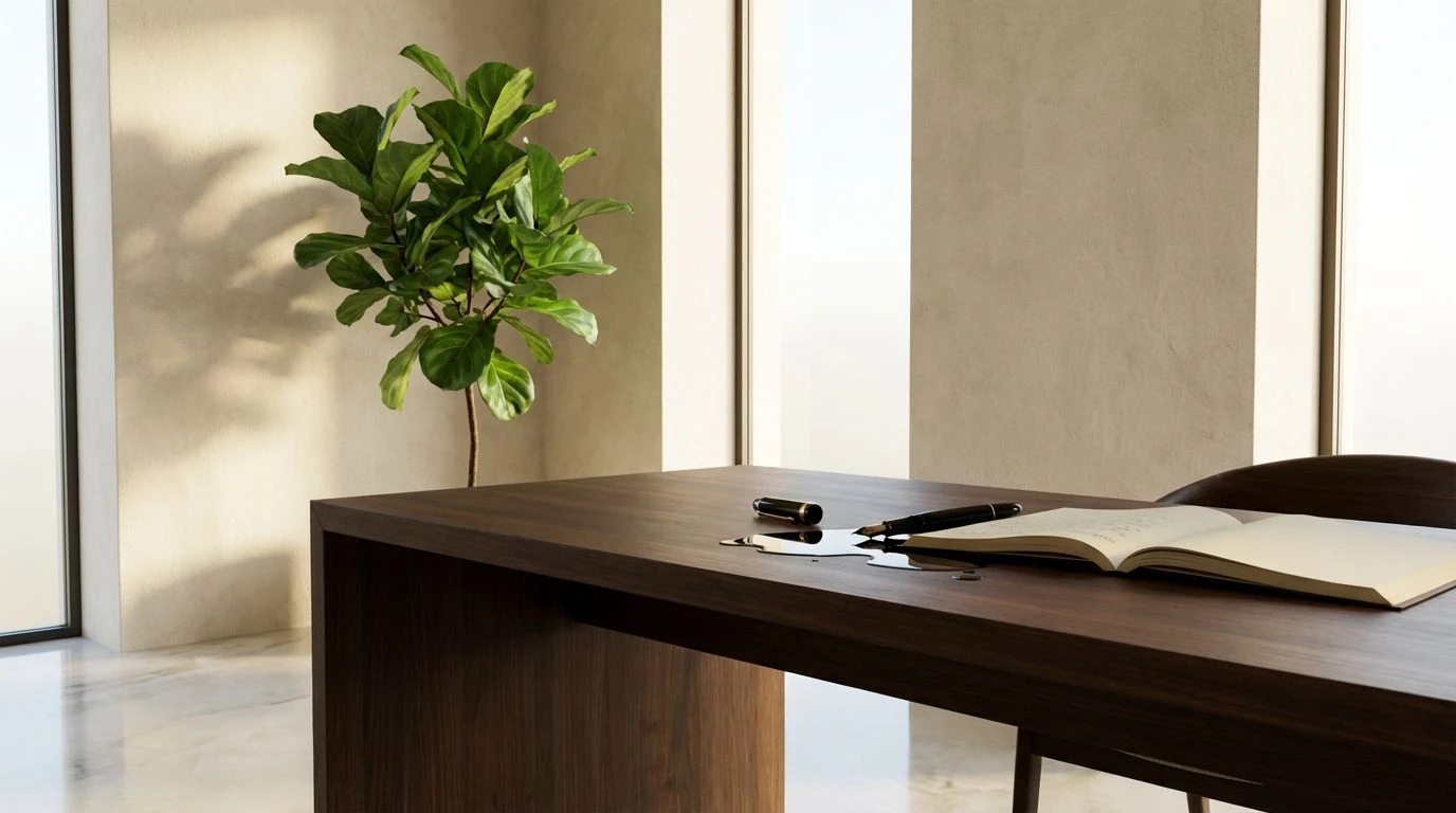
Soft Parchment Color Palettes Replace Sterile White Design
· 6 min readFor years, the visual language of the wellness sector leaned hard into an inescapable, glaring bright white space, signaling a kind of clinical purity that ultimately left users feeling scrutinized rather than supported. Executive coaching and self-care spaces are currently undergoing a distinct visual shift, abandoning the sterile laboratory aesthetic for something much more grounded and forgiving. The emergence of soft parchment tones paired with earth greens signals a turn toward the Caretaker persona, offering a visual hug rather than a diagnostic glare. This organic warmth turns digital interfaces and studio interiors into spaces of quiet refuge, acknowledging that real personal growth requires a feeling of safety and lived-in authenticity rather than an intimidating, spotless vacuum.
Grounded Conservatory 🪴
Grounded Conservatory acts as a direct response to the anxiety-inducing starkness of past wellness spaces. By anchoring its visual weight in Baked Clay and Weathered Terracotta, the collection establishes an immediate sense of human touch, entirely bypassing the sterile clinic waiting room association. Sunlit Parchment acts as the primary backdrop, a warm, forgiving neutral that catches the light like raw linen rather than glossy tile. When paired with the lively energy of Moss Sprout and Deep Ficus, the tone feels distinctly like stepping into a well-tended greenhouse, a space specifically designed to shelter and grow. The sudden punctuation of Muted Teal and Pool Water adds a necessary breath of fresh air to the composition, keeping the overall effect from feeling heavy or weighed down by its earthen base. In the context of executive coaching, this combination creates an environment that feels both professional and deeply empathetic, wrapping the user in a visual language of steadfast support and steady, organic growth.
Brutalist Apothecary 🌿
Leaning firmly into a sophisticated architectural mood, Brutalist Apothecary balances industrial grounding with profound botanical softness. Forged Iron provides a sharp anchoring contrast that prevents the softer tones from washing out, lending a necessary gravity relevant to high-end executive coaching. Crushed Chalk operates as the foundational parchment tone here, shedding the blinding glare of pure white for a textured, matte finish that feels like unbleached paper. When placed alongside Polished Concrete, the spatial experience mimics a modern wellness retreat where raw materials meet refined practices. Spiced Bark brings an essential timber-like warmth to the forefront, acting as an organic bridge between the stark darks and the soft lights. The introduction of Forest Canopy injects the vital caretaker energy, an earth green that suggests deep roots and natural healing without resorting to literal or playful brights. This specific arrangement commands respect while still offering a deeply comforting, tactile sanctuary away from the noise of modern life.
Alpine Retreat 🏔️
Alpine Retreat captures the crisp, clearing sensation of a restorative mountain escape, trading artificial clinic lighting for the feeling of early morning sunlight streaming through timber slats. Morning Frost serves as the gentle, fibrous off-white base, providing a resting place for the eye that feels genuinely restorative rather than demanding. Wild Oats adds a layer of woven texture, bringing the quiet comfort of natural fibers and raw grain into the visual mix. The transition into the greens is where the caretaker narrative truly takes hold. Pine Shadow grounds the experience with ancient, rooted depth, while Glacial River and Alpine Mint offer a refreshing wash that feels akin to cold plunges and fresh air. Slate Blue and Stone Path finish the composition by adding cool, rocky undertones. For an executive coaching brand, this sequence visually constructs a space for clear-headed reflection and steady breathing, rejecting modern sterility in favor of a landscape that feels wild, rugged, and deeply healing.
Modernist Greenhouse 🥒
Modernist Greenhouse plays an interesting game by keeping a sliver of that old clinical brightness but heavily tempering it with dense, organic richness. Optic Alabaster remains as a crisp highlighter, yet it is quickly softened by Unbleached Linen, which serves as the true parchment anchor, dialing down the visual noise and signaling an approachable ethos. Obsidian Ink drops in for maximum typographic contrast, grounding the softer tones in a framework of serious, editorial professionalism suitable for top-tier coaching. Roasted Pecan provides the tactile, comforting warmth that the caretaker persona demands, reminiscent of polished wood furniture in an intimate consulting room. What truly shifts the layout away from standard corporate aesthetics is the jolt of Vivid Chlorophyll. This striking earth green acts as a pulse of pure life, transforming a potentially austere layout into an active, breathing environment. It is a calculated move that balances the need for sharp clarity with the profound human craving for nature, making the resulting space feel highly effective.
Sunbaked Studio 🏺
Sunbaked Studio leans away from conventional wellness greens to explore the sun-drenched, textural qualities of a maker space or a desert sanctuary. Raw Canvas establishes an immediate foundation of warm, tactile parchment, providing a background that practically begs to be touched, completely bypassing the cold sheen of typical digital interfaces. Golden Ochre expands on this warmth, projecting a nurturing, sun-wrought glow that aligns perfectly with the protective, guiding nature of the caretaker. Charred Wood adds the necessary structural framing, anchoring the lighter tones with a rich organic dark that feels like scorched timber rather than synthetic black. The splash of Citrine Spore brings an unexpected mossy brightness, a weird and wonderful hue that signals life breaking through dry earth. Paired with Bleached Cotton for highlights and the dual aquatic tones of Frosted Glass and Deep Cyan, the sequence feels like an oasis. It builds an inviting environment for brands that want to communicate quiet confidence and deep restorative care without falling back on tired tropes.
The movement away from aggressive, absolute brightness is much more than a fleeting aesthetic preference; it represents a fundamental reevaluation of what it means to heal and grow. By embracing the textured warmth of unbleached paper tones and the steady presence of natural earth greens, modern coaching and wellness practices are redefining professional care as something grounded and highly personal. These carefully calibrated schemes strip away the intimidating gloss of the past decade, replacing it with environments that feel lived-in, safe, and profoundly human. They prove that true professionalism does not require an absence of character, but rather a deliberate, thoughtful space where people actually feel comfortable enough to do the real work.