'%3e%3cpath%20fill-rule='evenodd'%20clip-rule='evenodd'%20d='M51.1303%2019.2492C50.7278%2019.913%2050.1346%2020.4426%2049.3508%2020.838C48.5669%2021.2335%2047.6172%2021.4312%2046.5014%2021.4312C44.8208%2021.4312%2043.4367%2021.0216%2042.3492%2020.2025C41.2617%2019.3833%2040.6686%2018.2394%2040.5697%2016.7706H44.4253C44.4818%2017.3355%2044.6831%2017.7804%2045.0291%2018.1052C45.3751%2018.43%2045.8164%2018.5924%2046.3531%2018.5924C46.8192%2018.5924%2047.1864%2018.4653%2047.4547%2018.2111C47.7231%2017.9569%2047.8572%2017.618%2047.8572%2017.1943C47.8572%2016.8129%2047.7337%2016.4952%2047.4865%2016.241C47.2393%2015.9867%2046.9322%2015.7784%2046.565%2015.616C46.1978%2015.4536%2045.6893%2015.2594%2045.0397%2015.0334C44.0934%2014.7086%2043.3202%2014.3944%2042.72%2014.0907C42.1197%2013.7871%2041.6042%2013.3351%2041.1735%2012.7349C40.7427%2012.1347%2040.5273%2011.3544%2040.5273%2010.394C40.5273%209.50418%2040.7533%208.73448%2041.2053%208.08481C41.6572%207.43515%2042.2821%206.93731%2043.0801%206.5913C43.8781%206.24528%2044.7925%206.07227%2045.8235%206.07227C47.49%206.07227%2048.8141%206.46771%2049.7956%207.25861C50.7772%208.04951%2051.3315%209.13698%2051.4586%2010.5211H47.5395C47.4689%2010.0268%2047.2888%209.63483%2046.9993%209.3453C46.7097%209.05578%2046.3178%208.91102%2045.8235%208.91102C45.3998%208.91102%2045.0573%209.024%2044.7961%209.24997C44.5348%209.47594%2044.4041%209.80783%2044.4041%2010.2457C44.4041%2010.5988%2044.5207%2010.8989%2044.7537%2011.146C44.9867%2011.3932%2045.2798%2011.5944%2045.6328%2011.7498C45.9859%2011.9052%2046.4944%2012.1029%2047.1581%2012.343C48.1185%2012.6678%2048.9023%2012.9891%2049.5096%2013.3069C50.1169%2013.6246%2050.6395%2014.0872%2051.0773%2014.6945C51.5151%2015.3018%2051.734%2016.0927%2051.734%2017.0672C51.734%2017.8581%2051.5328%2018.5854%2051.1303%2019.2492ZM59.0242%206.3053V21.2829H55.4016V6.3053H59.0242ZM73.9409%206.3053V9.18642H69.8734V21.2829H66.2296V9.18642H62.2046V6.3053H73.9409ZM80.7438%209.18642V12.3218H85.8069V15.0546H80.7438V18.3806H86.4425V21.2829H77.1212V6.3053H86.4425V9.18642H80.7438ZM99.667%2016.0291V21.2829H96.0444V6.3053H101.913C103.692%206.3053%20105.048%206.74665%20105.98%207.62934C106.912%208.51204%20107.378%209.7019%20107.378%2011.199C107.378%2012.1311%20107.17%2012.9609%20106.753%2013.6882C106.337%2014.4155%20105.719%2014.9875%20104.9%2015.4042C104.08%2015.8208%20103.085%2016.0291%20101.913%2016.0291H99.667ZM103.692%2011.199C103.692%209.8855%20102.965%209.22879%20101.51%209.22879H99.667V13.1268H101.51C102.965%2013.1268%20103.692%2012.4842%20103.692%2011.199ZM120.092%2018.5501H114.478L113.546%2021.2829H109.732L115.219%206.41123H119.393L124.879%2021.2829H121.024L120.092%2018.5501ZM119.16%2015.7961L117.295%2010.2881L115.41%2015.7961H119.16ZM131.555%2018.5077H136.385V21.2829H127.933V6.3053H131.555V18.5077ZM143.337%209.18642V12.3218H148.4V15.0546H143.337V18.3806H149.035V21.2829H139.714V6.3053H149.035V9.18642H143.337ZM163.507%206.3053V9.18642H159.44V21.2829H155.796V9.18642H151.771V6.3053H163.507ZM177.449%206.3053V9.18642H173.382V21.2829H169.738V9.18642H165.713V6.3053H177.449ZM184.252%209.18642V12.3218H189.315V15.0546H184.252V18.3806H189.951V21.2829H180.629V6.3053H189.951V9.18642H184.252Z'%20fill='%23EEF0ED'/%3e%3cmask%20id='mask0_3101_7327'%20style='mask-type:alpha'%20maskUnits='userSpaceOnUse'%20x='0'%20y='0'%20width='27'%20height='28'%3e%3cpath%20d='M23.8328%200.759766H2.64808C1.18559%200.759766%200%201.94535%200%203.40785V24.5925C0%2026.055%201.18559%2027.2406%202.64808%2027.2406H23.8328C25.2952%2027.2406%2026.4808%2026.055%2026.4808%2024.5925V3.40785C26.4808%201.94535%2025.2952%200.759766%2023.8328%200.759766Z'%20fill='white'/%3e%3c/mask%3e%3cg%20mask='url(%23mask0_3101_7327)'%3e%3cpath%20d='M23.8328%200.759766H2.64808C1.18559%200.759766%200%201.94535%200%203.40785V24.5925C0%2026.055%201.18559%2027.2406%202.64808%2027.2406H23.8328C25.2952%2027.2406%2026.4808%2026.055%2026.4808%2024.5925V3.40785C26.4808%201.94535%2025.2952%200.759766%2023.8328%200.759766Z'%20fill='%23D8D8D8'/%3e%3cpath%20d='M13.2404%200.759766H0V14.0001H13.2404V0.759766Z'%20fill='%238C61FF'/%3e%3cpath%20d='M13.2404%2014H0V27.2404H13.2404V14Z'%20fill='%2336C3FE'/%3e%3cpath%20d='M26.4806%2014H13.2402V27.2404H26.4806V14Z'%20fill='%236592FE'/%3e%3cpath%20d='M26.4806%200.759766H13.2402V14.0002H26.4806V0.759766Z'%20fill='%236059F7'/%3e%3c/g%3e%3c/g%3e%3cdefs%3e%3cclipPath%20id='clip0_3101_7327'%3e%3crect%20width='190'%20height='28'%20fill='white'/%3e%3c/clipPath%3e%3c/defs%3e%3c/svg%3e)
'%3e%3cpath%20d='M23.8328%200.759521H2.64808C1.18559%200.759521%200%201.94511%200%203.40761V24.5923C0%2026.0548%201.18559%2027.2404%202.64808%2027.2404H23.8328C25.2952%2027.2404%2026.4808%2026.0548%2026.4808%2024.5923V3.40761C26.4808%201.94511%2025.2952%200.759521%2023.8328%200.759521Z'%20fill='%23D8D8D8'/%3e%3cpath%20d='M13.2404%200.759521H0V13.9999H13.2404V0.759521Z'%20fill='%238C61FF'/%3e%3cpath%20d='M13.2404%2013.9998H0V27.2402H13.2404V13.9998Z'%20fill='%2336C3FE'/%3e%3cpath%20d='M26.4809%2013.9998H13.2405V27.2402H26.4809V13.9998Z'%20fill='%236592FE'/%3e%3cpath%20d='M26.4809%200.759277H13.2405V13.9997H26.4809V0.759277Z'%20fill='%236059F7'/%3e%3c/g%3e%3c/svg%3e)
Industrial Color Palettes for Modern Logistics Design
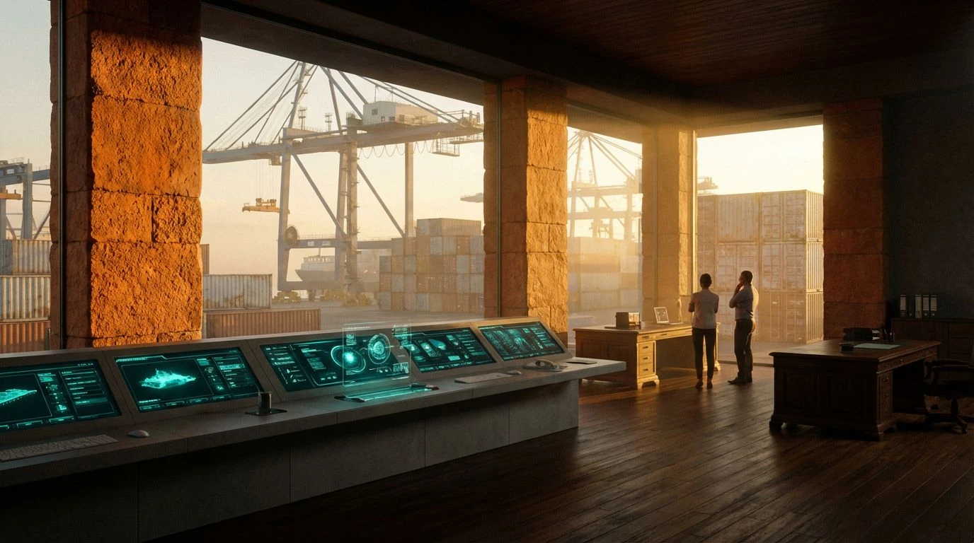
· 5 min readIndustrial interfaces often treat geography as an obstacle to overcome, offering uniform dashboards of clinical grays and aggressive warning reds that feel entirely detached from the physical world they govern. Yet anyone who has watched a cargo ship navigate the Konkan coast understands that moving goods is a deeply physical, weather-beaten business. Translating this organic adventure into logistics infrastructure software requires a departure from Silicon Valley sterility entirely. Borrowing the salt-crusted teals of the Arabian Sea and the baked clay oranges of Maharashtra port towns roots digital platforms in the actual gravity of trade. It turns an abstract supply chain into something tangible, where screens feel as dependable and worldly as a rusted iron bollard or a well-used nautical map.
Mangrove Dispatch 🌿
A digital dashboard tasked with complex routing needs a visual anchor, and Mangrove Dispatch provides precisely that weight entirely through color. We start with the stark reliability of Sun-Bleached Tarpaulin, providing a wide-open backdrop where data points can breathe comfortably. Contrast enters through Prawn Shell Pink and Estuary Mud, bringing a rugged, organic warmth that mimics the sun-drenched docks of Karwar or Ratnagiri. When you direct a user eye to a critical update, the vivid jump of Monsoon Leaf alongside Seafoam Tarmac signals action with natural urgency, far removed from the panic-inducing neon greens of typical software. Deep Water Anchorage anchors the lower registers, giving sidebars and navigation menus a substantial, ocean-deep grounding. The result is an interface that feels built for long hauls and unpredictable weather, allowing logistics managers to track shipping containers with a sense of calm authority.
Laterite Route 🚢
Designing software for heavy industry usually implies adopting a brutally spartan aesthetic, but Laterite Route proves that efficiency can handle heavy dirt and vibrant heat. You immediately sense the physical toll of regional freight through Goan Clay and Rusted Hull, signaling alerts or urgent cargo notices with the baked-earth reality of a crumbling coastal fort. High Noon Mustard flashes in to guide the cursor across dense spreadsheets, cutting through the visual noise without screaming. The interface finds its resting state in the muted, industrial quiet of Weathered Bollard, Algae Bloom, and Scrub Forest, creating neutral zones for complex routing tables. When serious lifting is required, the layout sinks into the immense weight of Arabian Sea Trench and Pitch Dark Cargo for headers and heavy data blocks. This is a color scheme that knows what it takes to muscle goods across borders, giving procurement software the battered confidence of a seasoned port foreman.
Port Authority ⚓
The daily grind of moving tonnage requires immediate clarity, a demand answered rather sharply by the Port Authority color scheme. Rather than drowning operators in senseless data streams, this collection channels the precise moments of a ship making land. Text and borders built from Clove Bark provide an unshakeable typographical foundation, ensuring legibility even under terrible warehouse lighting. Sundried Laterite sits perfectly alongside Concrete Pier to establish secondary modules, separating regional transit schedules with dusty, practical borders. The eye is naturally drawn toward actionable items by the sharp oceanic slice of Konkan Current and Bright Horizon, directing fleet managers to active tracking lines with coastal sharpness. Against the expansive, dull silver of Aluminum Container, these vibrant tracking details pop vividly, turning an ordinarily monotonous supply chain monitoring tool into a scene of organized graphical adventure.
Maritime Tides 🌊
Keeping track of international freight traffic on a flat screen can easily feel like a video game minus the fun entirely. Maritime Tides strips away the artificiality, replacing the usual tech-bro aesthetics with the raw temperature of a working shipyard. The deep rust of Cashew Nut and the flashing urgency of Turmeric Warning Lamp offer distinct navigational cues, meant for identifying bottlenecks or delayed shipments with zero ambiguity. The transition through Monsoon Overcast and Galvanized Steel creates vast, legible backgrounds for inventory lists, looking like the side of an aging bulk carrier. Shallows, Deep Channel, and Freighter Hull stack effortlessly to structure primary and secondary navigation panels, organizing coastal routes with marine discipline. Finally, Midnight Watch drops into the absolute blackness of night shifts on the water. It gives logistics applications a serious, weather-ready attitude that respects the difficult reality of sea freight rather than smoothing it over.
Coastal Ledger 🌴
A truly effective control panel should not look like it was designed in a sterile vacuum, which is exactly why Coastal Ledger matters for infrastructural toolkits. There is an unmistakable scent of brine here. Beginning with Damp Teak and Terracotta Roof, you get rich, sun-faded framing devices that ground the user in physical materials, not just pixels. Oil Spill provides an unexpectedly dense, near-black tone for ultra-crisp typography against the blinding expanse of Salt Crust. The oceanic trio of Faded Nets, Pale High Tide, and Weathered Paint creates a superb hierarchy for data visualization, allowing interactive maps to chart vessels with a worn, analog beauty. Perhaps the sharpest trick is the inclusion of Sunset Bougainvillea, a burst of tropical pink that serves as an unpredictable interaction state, a hover effect that momentarily thrills. It proves that tracking shipping logistics does not require sacrificing visual joy or geographical personality at the altar of corporate efficiency.
Ditching the conventional palettes of Silicon Valley enterprise software for the sun-baked reality of the Konkan coast completely transforms how operators interact with logistics platforms. These colors communicate the grit, heat, and oceanic vastness of actual physical labor, grounding the abstraction of cloud-based tracking in the tangible world of rusted hulls and salt-sprayed docks. By designing interfaces that acknowledge the ruggedness of coastal transit, developers create tools that feel less like a clinical surveillance system and more like a dependable nautical compass, ready for the unpredictability of global trade.