'%3e%3cpath%20fill-rule='evenodd'%20clip-rule='evenodd'%20d='M51.1303%2019.2492C50.7278%2019.913%2050.1346%2020.4426%2049.3508%2020.838C48.5669%2021.2335%2047.6172%2021.4312%2046.5014%2021.4312C44.8208%2021.4312%2043.4367%2021.0216%2042.3492%2020.2025C41.2617%2019.3833%2040.6686%2018.2394%2040.5697%2016.7706H44.4253C44.4818%2017.3355%2044.6831%2017.7804%2045.0291%2018.1052C45.3751%2018.43%2045.8164%2018.5924%2046.3531%2018.5924C46.8192%2018.5924%2047.1864%2018.4653%2047.4547%2018.2111C47.7231%2017.9569%2047.8572%2017.618%2047.8572%2017.1943C47.8572%2016.8129%2047.7337%2016.4952%2047.4865%2016.241C47.2393%2015.9867%2046.9322%2015.7784%2046.565%2015.616C46.1978%2015.4536%2045.6893%2015.2594%2045.0397%2015.0334C44.0934%2014.7086%2043.3202%2014.3944%2042.72%2014.0907C42.1197%2013.7871%2041.6042%2013.3351%2041.1735%2012.7349C40.7427%2012.1347%2040.5273%2011.3544%2040.5273%2010.394C40.5273%209.50418%2040.7533%208.73448%2041.2053%208.08481C41.6572%207.43515%2042.2821%206.93731%2043.0801%206.5913C43.8781%206.24528%2044.7925%206.07227%2045.8235%206.07227C47.49%206.07227%2048.8141%206.46771%2049.7956%207.25861C50.7772%208.04951%2051.3315%209.13698%2051.4586%2010.5211H47.5395C47.4689%2010.0268%2047.2888%209.63483%2046.9993%209.3453C46.7097%209.05578%2046.3178%208.91102%2045.8235%208.91102C45.3998%208.91102%2045.0573%209.024%2044.7961%209.24997C44.5348%209.47594%2044.4041%209.80783%2044.4041%2010.2457C44.4041%2010.5988%2044.5207%2010.8989%2044.7537%2011.146C44.9867%2011.3932%2045.2798%2011.5944%2045.6328%2011.7498C45.9859%2011.9052%2046.4944%2012.1029%2047.1581%2012.343C48.1185%2012.6678%2048.9023%2012.9891%2049.5096%2013.3069C50.1169%2013.6246%2050.6395%2014.0872%2051.0773%2014.6945C51.5151%2015.3018%2051.734%2016.0927%2051.734%2017.0672C51.734%2017.8581%2051.5328%2018.5854%2051.1303%2019.2492ZM59.0242%206.3053V21.2829H55.4016V6.3053H59.0242ZM73.9409%206.3053V9.18642H69.8734V21.2829H66.2296V9.18642H62.2046V6.3053H73.9409ZM80.7438%209.18642V12.3218H85.8069V15.0546H80.7438V18.3806H86.4425V21.2829H77.1212V6.3053H86.4425V9.18642H80.7438ZM99.667%2016.0291V21.2829H96.0444V6.3053H101.913C103.692%206.3053%20105.048%206.74665%20105.98%207.62934C106.912%208.51204%20107.378%209.7019%20107.378%2011.199C107.378%2012.1311%20107.17%2012.9609%20106.753%2013.6882C106.337%2014.4155%20105.719%2014.9875%20104.9%2015.4042C104.08%2015.8208%20103.085%2016.0291%20101.913%2016.0291H99.667ZM103.692%2011.199C103.692%209.8855%20102.965%209.22879%20101.51%209.22879H99.667V13.1268H101.51C102.965%2013.1268%20103.692%2012.4842%20103.692%2011.199ZM120.092%2018.5501H114.478L113.546%2021.2829H109.732L115.219%206.41123H119.393L124.879%2021.2829H121.024L120.092%2018.5501ZM119.16%2015.7961L117.295%2010.2881L115.41%2015.7961H119.16ZM131.555%2018.5077H136.385V21.2829H127.933V6.3053H131.555V18.5077ZM143.337%209.18642V12.3218H148.4V15.0546H143.337V18.3806H149.035V21.2829H139.714V6.3053H149.035V9.18642H143.337ZM163.507%206.3053V9.18642H159.44V21.2829H155.796V9.18642H151.771V6.3053H163.507ZM177.449%206.3053V9.18642H173.382V21.2829H169.738V9.18642H165.713V6.3053H177.449ZM184.252%209.18642V12.3218H189.315V15.0546H184.252V18.3806H189.951V21.2829H180.629V6.3053H189.951V9.18642H184.252Z'%20fill='%23EEF0ED'/%3e%3cmask%20id='mask0_3101_7327'%20style='mask-type:alpha'%20maskUnits='userSpaceOnUse'%20x='0'%20y='0'%20width='27'%20height='28'%3e%3cpath%20d='M23.8328%200.759766H2.64808C1.18559%200.759766%200%201.94535%200%203.40785V24.5925C0%2026.055%201.18559%2027.2406%202.64808%2027.2406H23.8328C25.2952%2027.2406%2026.4808%2026.055%2026.4808%2024.5925V3.40785C26.4808%201.94535%2025.2952%200.759766%2023.8328%200.759766Z'%20fill='white'/%3e%3c/mask%3e%3cg%20mask='url(%23mask0_3101_7327)'%3e%3cpath%20d='M23.8328%200.759766H2.64808C1.18559%200.759766%200%201.94535%200%203.40785V24.5925C0%2026.055%201.18559%2027.2406%202.64808%2027.2406H23.8328C25.2952%2027.2406%2026.4808%2026.055%2026.4808%2024.5925V3.40785C26.4808%201.94535%2025.2952%200.759766%2023.8328%200.759766Z'%20fill='%23D8D8D8'/%3e%3cpath%20d='M13.2404%200.759766H0V14.0001H13.2404V0.759766Z'%20fill='%238C61FF'/%3e%3cpath%20d='M13.2404%2014H0V27.2404H13.2404V14Z'%20fill='%2336C3FE'/%3e%3cpath%20d='M26.4806%2014H13.2402V27.2404H26.4806V14Z'%20fill='%236592FE'/%3e%3cpath%20d='M26.4806%200.759766H13.2402V14.0002H26.4806V0.759766Z'%20fill='%236059F7'/%3e%3c/g%3e%3c/g%3e%3cdefs%3e%3cclipPath%20id='clip0_3101_7327'%3e%3crect%20width='190'%20height='28'%20fill='white'/%3e%3c/clipPath%3e%3c/defs%3e%3c/svg%3e)
'%3e%3cpath%20d='M23.8328%200.759521H2.64808C1.18559%200.759521%200%201.94511%200%203.40761V24.5923C0%2026.0548%201.18559%2027.2404%202.64808%2027.2404H23.8328C25.2952%2027.2404%2026.4808%2026.0548%2026.4808%2024.5923V3.40761C26.4808%201.94511%2025.2952%200.759521%2023.8328%200.759521Z'%20fill='%23D8D8D8'/%3e%3cpath%20d='M13.2404%200.759521H0V13.9999H13.2404V0.759521Z'%20fill='%238C61FF'/%3e%3cpath%20d='M13.2404%2013.9998H0V27.2402H13.2404V13.9998Z'%20fill='%2336C3FE'/%3e%3cpath%20d='M26.4809%2013.9998H13.2405V27.2402H26.4809V13.9998Z'%20fill='%236592FE'/%3e%3cpath%20d='M26.4809%200.759277H13.2405V13.9997H26.4809V0.759277Z'%20fill='%236059F7'/%3e%3c/g%3e%3c/svg%3e)
Arctic Color Palettes for Modern Social Interface Design
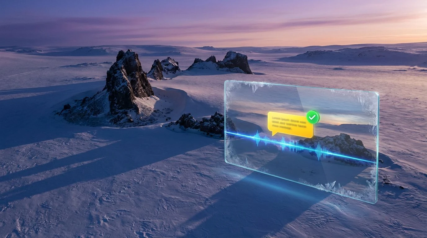
· 5 min readUser interfaces are notoriously loud, fighting for attention in crowded digital arenas. Yet the future of digital communication demands room to breathe. Visual thinkers are turning far north, borrowing from the vast, uninterrupted stretches of the arctic tundra to shape the next wave of social platforms. This environment provides a stark visual language constructed from endless glacial tones, optic whites, and sudden flashes of stubborn flora. Bringing these extreme landscapes into interactive spaces yields layouts that feel clinical and crisp but incredibly alive. The visual silence mimics a clear sky, turning the screen into a wide open plain where texts, voice notes, and images sit perfectly balanced against negative space. Stripping back the interface to this frostbitten spectrum delivers ultimate mental clarity alongside radical bursts of pigment that direct the eye.
Lichen & Ice 🧊
Bringing the sharp contrast of a frozen coastline into a graphical user interface creates an immediate sense of hierarchy. The deep tones of Basalt Rock establish a grounding background, offering a softer alternative to stark black for dark mode designs. Against this muted base, Acid Moss and Pale Lichen act as high-visibility notification alerts, cutting through the screen exactly how neon foliage survives on freezing stone. Glacial Crevasse and Frosted Glass map perfectly onto message bubbles and chat overlays, keeping the daily conversation flow light and decipherable. Moving deeper into the interface, Deep Fjord provides necessary weight for navigational tabs or primary action buttons. The interplay between the electric greens and clinical blues constructs an atmosphere of hyper-modern communication, feeling somewhat scientific but highly engaging for quick, text-heavy interactions.
Midnight Sun ☀️
Trading out sterile minimalism for an earthy approach to extreme climates shows exactly how natural tones ground a hyper-connected social app. Permafrost Earth and Pine Shadow offer rich, unexpected grounding shades that challenge the standard grays of modern tech platforms. When paired with Solar Flare, these organic darks suddenly read as young and energetic, perfect for an app focused on quick photo sharing or intimate group chats. Signal Green steps in as the ultimate online status indicator, bright enough to command immediate attention without overwhelming the grid. For the primary reading areas, Atmospheric Ice and Polar Sky carry the weight of text and media, ensuring the eye never tires during long scrolling sessions. The colder Brine Blue acts as the anchor, giving structural elements a professional polish. The overall effect is incredibly wide and expansive, turning a dense digital feed into an easy, breathable layout.
Borealis Ground 🌲
Applying the rugged textures of a forest edge against a freezing ocean translates brilliantly into wayfinding systems for complex digital communities. Obsidian Night sets an uncompromising stage, allowing the layout to feel vast and endless. Against this deep void, Shattered Ice provides the essential cold logic needed for readable typography and floating dialog containers. Ocean Trench anchors the bottom navigation bars, keeping the experience steady. The organic warmth of Boreal Bark and Rusty Thicket introduce tactile, human touchpoints within the icy framework, ideal for user avatars or customizable profile sections. The stark, acidic pop of Electric Spore acts as a brilliant micro-interaction trigger, guiding thumbs to direct messages or new posts. This approach proves that social tools do not need to look entirely artificial to feel cutting-edge; they can pull from raw, untamed terrain to create highly sophisticated utility.
Alpine Tech 🏔️
Pushing social platform design toward the visual language of high-altitude expedition gear creates an atmosphere of serious speed and reliability. Absolute Void strips away all distraction, presenting a completely flat black canvas that is easy on the eyes during late-night screen time. On top of this, Hyper Blue operates as the primary communication thread, carrying an undeniable tech-forward confidence that reads as secure and wildly fast. Summit Yellow and Pale Sun deliver high-visibility accents, mimicking the neon safety tethers used by mountaineers, perfectly suited for primary calls to action or unread message badges. Oxygen Green handles success states and positive feedback loops with a synthetic, gaming-adjacent energy. Winter Dusk softens the edges of secondary menus or inactive icons. Bringing these extreme, high-visibility contrast ratios into a messaging context makes the entire user journey feel precise, deliberate, and undeniably cool.
Glacial Pop ❄️
Introducing an almost architectural minimalism to screen-based interactions requires a very specific control of light and dark. Carbon Plunge and Granite Ridge construct a severe, monochromatic scaffolding for the app layout, organizing complex threads and media galleries without needing visible dividing lines. Blinding Snow takes over the central reading plains, offering maximum legibility for dense typographical layouts. Against this highly controlled, brutalist background, Warning Yellow and Meltwater Cyan burst off the screen. These extreme neons function as perfect digital markers, highlighting trending topics or live video broadcasts with raw urgency. Arctic Coral adds a surprising flash of warmth, catching the eye for direct mentions or favorite features. The entire system works like a highly functioning weather station, combining clinical observation with flashes of extreme, life-saving color. It feels impossibly modern and perfectly suited for the rapid pace of contemporary internet culture.
Designing a communication tool that stands out requires a complete rethinking of digital environments. Drawing from the coldest corners of the globe introduces an incredibly effective method for managing data overload. By trusting the power of expansive whites, deep shadows, and electric accents, interface creators can build platforms that feel as refreshing as breathing sub-zero air. The resulting layouts prioritize extreme legibility and fast decision-making, providing an aesthetic that acts as a deliberate escape from the relentless noise of current internet avenues. These frosty, high-contrast systems push the boundaries of what a screen can convey, proving that a severe, untamed color approach produces some of the most inviting user experiences.