'%3e%3cpath%20fill-rule='evenodd'%20clip-rule='evenodd'%20d='M51.1303%2019.2492C50.7278%2019.913%2050.1346%2020.4426%2049.3508%2020.838C48.5669%2021.2335%2047.6172%2021.4312%2046.5014%2021.4312C44.8208%2021.4312%2043.4367%2021.0216%2042.3492%2020.2025C41.2617%2019.3833%2040.6686%2018.2394%2040.5697%2016.7706H44.4253C44.4818%2017.3355%2044.6831%2017.7804%2045.0291%2018.1052C45.3751%2018.43%2045.8164%2018.5924%2046.3531%2018.5924C46.8192%2018.5924%2047.1864%2018.4653%2047.4547%2018.2111C47.7231%2017.9569%2047.8572%2017.618%2047.8572%2017.1943C47.8572%2016.8129%2047.7337%2016.4952%2047.4865%2016.241C47.2393%2015.9867%2046.9322%2015.7784%2046.565%2015.616C46.1978%2015.4536%2045.6893%2015.2594%2045.0397%2015.0334C44.0934%2014.7086%2043.3202%2014.3944%2042.72%2014.0907C42.1197%2013.7871%2041.6042%2013.3351%2041.1735%2012.7349C40.7427%2012.1347%2040.5273%2011.3544%2040.5273%2010.394C40.5273%209.50418%2040.7533%208.73448%2041.2053%208.08481C41.6572%207.43515%2042.2821%206.93731%2043.0801%206.5913C43.8781%206.24528%2044.7925%206.07227%2045.8235%206.07227C47.49%206.07227%2048.8141%206.46771%2049.7956%207.25861C50.7772%208.04951%2051.3315%209.13698%2051.4586%2010.5211H47.5395C47.4689%2010.0268%2047.2888%209.63483%2046.9993%209.3453C46.7097%209.05578%2046.3178%208.91102%2045.8235%208.91102C45.3998%208.91102%2045.0573%209.024%2044.7961%209.24997C44.5348%209.47594%2044.4041%209.80783%2044.4041%2010.2457C44.4041%2010.5988%2044.5207%2010.8989%2044.7537%2011.146C44.9867%2011.3932%2045.2798%2011.5944%2045.6328%2011.7498C45.9859%2011.9052%2046.4944%2012.1029%2047.1581%2012.343C48.1185%2012.6678%2048.9023%2012.9891%2049.5096%2013.3069C50.1169%2013.6246%2050.6395%2014.0872%2051.0773%2014.6945C51.5151%2015.3018%2051.734%2016.0927%2051.734%2017.0672C51.734%2017.8581%2051.5328%2018.5854%2051.1303%2019.2492ZM59.0242%206.3053V21.2829H55.4016V6.3053H59.0242ZM73.9409%206.3053V9.18642H69.8734V21.2829H66.2296V9.18642H62.2046V6.3053H73.9409ZM80.7438%209.18642V12.3218H85.8069V15.0546H80.7438V18.3806H86.4425V21.2829H77.1212V6.3053H86.4425V9.18642H80.7438ZM99.667%2016.0291V21.2829H96.0444V6.3053H101.913C103.692%206.3053%20105.048%206.74665%20105.98%207.62934C106.912%208.51204%20107.378%209.7019%20107.378%2011.199C107.378%2012.1311%20107.17%2012.9609%20106.753%2013.6882C106.337%2014.4155%20105.719%2014.9875%20104.9%2015.4042C104.08%2015.8208%20103.085%2016.0291%20101.913%2016.0291H99.667ZM103.692%2011.199C103.692%209.8855%20102.965%209.22879%20101.51%209.22879H99.667V13.1268H101.51C102.965%2013.1268%20103.692%2012.4842%20103.692%2011.199ZM120.092%2018.5501H114.478L113.546%2021.2829H109.732L115.219%206.41123H119.393L124.879%2021.2829H121.024L120.092%2018.5501ZM119.16%2015.7961L117.295%2010.2881L115.41%2015.7961H119.16ZM131.555%2018.5077H136.385V21.2829H127.933V6.3053H131.555V18.5077ZM143.337%209.18642V12.3218H148.4V15.0546H143.337V18.3806H149.035V21.2829H139.714V6.3053H149.035V9.18642H143.337ZM163.507%206.3053V9.18642H159.44V21.2829H155.796V9.18642H151.771V6.3053H163.507ZM177.449%206.3053V9.18642H173.382V21.2829H169.738V9.18642H165.713V6.3053H177.449ZM184.252%209.18642V12.3218H189.315V15.0546H184.252V18.3806H189.951V21.2829H180.629V6.3053H189.951V9.18642H184.252Z'%20fill='%23EEF0ED'/%3e%3cmask%20id='mask0_3101_7327'%20style='mask-type:alpha'%20maskUnits='userSpaceOnUse'%20x='0'%20y='0'%20width='27'%20height='28'%3e%3cpath%20d='M23.8328%200.759766H2.64808C1.18559%200.759766%200%201.94535%200%203.40785V24.5925C0%2026.055%201.18559%2027.2406%202.64808%2027.2406H23.8328C25.2952%2027.2406%2026.4808%2026.055%2026.4808%2024.5925V3.40785C26.4808%201.94535%2025.2952%200.759766%2023.8328%200.759766Z'%20fill='white'/%3e%3c/mask%3e%3cg%20mask='url(%23mask0_3101_7327)'%3e%3cpath%20d='M23.8328%200.759766H2.64808C1.18559%200.759766%200%201.94535%200%203.40785V24.5925C0%2026.055%201.18559%2027.2406%202.64808%2027.2406H23.8328C25.2952%2027.2406%2026.4808%2026.055%2026.4808%2024.5925V3.40785C26.4808%201.94535%2025.2952%200.759766%2023.8328%200.759766Z'%20fill='%23D8D8D8'/%3e%3cpath%20d='M13.2404%200.759766H0V14.0001H13.2404V0.759766Z'%20fill='%238C61FF'/%3e%3cpath%20d='M13.2404%2014H0V27.2404H13.2404V14Z'%20fill='%2336C3FE'/%3e%3cpath%20d='M26.4806%2014H13.2402V27.2404H26.4806V14Z'%20fill='%236592FE'/%3e%3cpath%20d='M26.4806%200.759766H13.2402V14.0002H26.4806V0.759766Z'%20fill='%236059F7'/%3e%3c/g%3e%3c/g%3e%3cdefs%3e%3cclipPath%20id='clip0_3101_7327'%3e%3crect%20width='190'%20height='28'%20fill='white'/%3e%3c/clipPath%3e%3c/defs%3e%3c/svg%3e)
'%3e%3cpath%20d='M23.8328%200.759521H2.64808C1.18559%200.759521%200%201.94511%200%203.40761V24.5923C0%2026.0548%201.18559%2027.2404%202.64808%2027.2404H23.8328C25.2952%2027.2404%2026.4808%2026.0548%2026.4808%2024.5923V3.40761C26.4808%201.94511%2025.2952%200.759521%2023.8328%200.759521Z'%20fill='%23D8D8D8'/%3e%3cpath%20d='M13.2404%200.759521H0V13.9999H13.2404V0.759521Z'%20fill='%238C61FF'/%3e%3cpath%20d='M13.2404%2013.9998H0V27.2402H13.2404V13.9998Z'%20fill='%2336C3FE'/%3e%3cpath%20d='M26.4809%2013.9998H13.2405V27.2402H26.4809V13.9998Z'%20fill='%236592FE'/%3e%3cpath%20d='M26.4809%200.759277H13.2405V13.9997H26.4809V0.759277Z'%20fill='%236059F7'/%3e%3c/g%3e%3c/svg%3e)
Royal Blue Color Palettes Disrupting Scandi Nursery Design
· 5 min readHuman visual perception prioritizes contrast. For years, the aesthetic governing children's environments has been dominated by low-contrast, desaturated earth tones engineered to minimize sensory overload. Yet, from a developmental standpoint, the growing brain seeks distinct visual anchors to process spatial relationships and object boundaries. The sudden, striking reintroduction of heavy, short-wavelength blues into minimalist spaces represents a recalibration of how we approach optical weight in early childhood. Royal blue occupies a unique position in our perceptual system. Its dense saturation provides stark contrast against neutral white and beige backgrounds without the alarming physiological response often triggered by heavy reds or neon yellows. By anchoring pale, minimalist settings with dense primary tones, designers are engineering environments that stimulate cognitive curiosity while maintaining the ordered visual tranquility signature to Nordic design conventions.
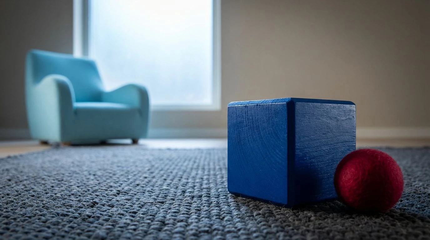
Cognitive Contrast 🧩
The Cognitive Contrast palette demonstrates how visual weight operates in complex spatial systems. Here, True Royal Blue acts as a high-frequency anchor against the softer, low-reflectance spread of Pale Slate and Reflective Peach. In early childhood environments, the human eye naturally tracks toward the points of highest contrast. Placing a pure, short-wavelength blue within a localized field of Goldenrod and Deep Maroon builds an environment of academic precision. The desaturated neutral tones absorb light, preventing sensory exhaustion, while the sudden strike of heavy blue commands attention and physical engagement. This optical hierarchy encourages spatial awareness, guiding a young gaze toward specific interactive objects rather than allowing vision to drift aimlessly across an undifferentiated field.
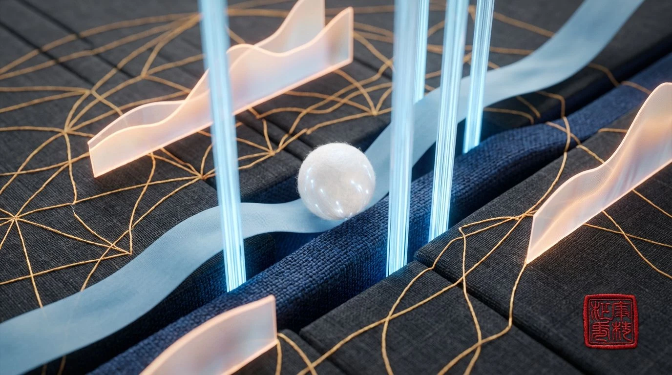
Optic Velocity ⚡
Optic Velocity strips the visual field down to its most stimulating components, heavily relying on the stark contrast between Pure Royal and Frosted Glacier. When high-chroma short-wavelength colors are placed alongside a sudden burst of Primary Crimson, the resulting optical tension is palpable. This specific color relationship mimics the high-visibility markers found in scientific instruments and early educational learning tools. Against the subdued Slate Shadow, these brilliant primary tones appear exceptionally crisp, cutting through the visual fog typical of muted rooms. The sharp boundaries between the heavy blue and the stark whites provide immediate physical cues for developing visual-motor coordination, creating a space engineered for both rigorous physical play and deliberate observation.
Organic Geometry 📐
The interplay of light and optical gravity dictates the Organic Geometry arrangement. By weighting the high-reflectance Pale Sand and the mid-frequency Chlorophyll Green with the dense absorption of Deep Cerulean, this grouping provides a highly legible visual landscape. The brown and beige tones offer a grounding, low-stimulation background that prevents the optical fatigue often caused by entirely white rooms. When Deep Cerulean is introduced into this muted, naturalistic setting, it operates as a distinct visual target. The resulting environment merges the biological comfort of earth-toned spaces with the sharp, calculated precision of primary geometry. Children interacting in this optical setting experience a clear distinction between the passive, resting areas and the active zones defined by the heavy blue.
Chromatic Theorem 🔭
Chromatic Theorem illustrates how adjacent spectral frequencies interact to create depth and focus. Academic Royal serves as the central visual weight, standing in strict contrast to the gentle, desaturated qualities of Subdued Periwinkle and Clay Rose. The human eye processes these contrasting saturation levels sequentially, first reading the dense blue before exploring the softer surrounding tones. This controlled distribution of color intensity proves highly effective in educational spaces where sustained attention is required. The introduction of Oxidized Ochre and Verdigris Teal prevents the setting from feeling sterile, offering mid-wavelength variations that keep the visual cortex engaged over time. The overall effect is one of calculated curiosity, where every shade serves a specific perceptual purpose.
Prismatic Construct 🏗️
While pushing the boundaries of typical minimalist design, the Prismatic Construct selection relies on Alabaster Parchment to provide a necessary visual void between highly active blocks of color. The light-absorbing qualities of Carbon Matte and Iron Oxide create profound depth, while Deep Cyan provides a cool recess against the outward projecting warmth of Cadmium Red and Spectral Yellow. In application, this creates a room that functions much like a three-dimensional puzzle. Processing the visual field requires the eye to judge distance and proximity based on how these colors advance or recede against the clean background. By relying on exact, bold placements of Deep Cyan alongside high-energy reds, the design challenges the static monotony of traditional beige and forces active cognitive processing.
The strategic reintroduction of heavy, short-wavelength blues into minimalist children's spaces marks a crucial shift in our understanding of environmental design. Rather than viewing color purely as an aesthetic afterthought, this approach answers the biological demand for visual stimulation and high-contrast boundaries. By anchoring expansive, low-reflectance neutrals with dense, academic colors, environments are calibrated to support both neurological calm and intense, focused play. The resulting spaces prove that minimalism need not be devoid of perceptual energy; precision in color application can construct rooms that actively guide attention, shape spatial cognition, and bring a calculated vitality to early developmental settings.