'%3e%3cpath%20fill-rule='evenodd'%20clip-rule='evenodd'%20d='M51.1303%2019.2492C50.7278%2019.913%2050.1346%2020.4426%2049.3508%2020.838C48.5669%2021.2335%2047.6172%2021.4312%2046.5014%2021.4312C44.8208%2021.4312%2043.4367%2021.0216%2042.3492%2020.2025C41.2617%2019.3833%2040.6686%2018.2394%2040.5697%2016.7706H44.4253C44.4818%2017.3355%2044.6831%2017.7804%2045.0291%2018.1052C45.3751%2018.43%2045.8164%2018.5924%2046.3531%2018.5924C46.8192%2018.5924%2047.1864%2018.4653%2047.4547%2018.2111C47.7231%2017.9569%2047.8572%2017.618%2047.8572%2017.1943C47.8572%2016.8129%2047.7337%2016.4952%2047.4865%2016.241C47.2393%2015.9867%2046.9322%2015.7784%2046.565%2015.616C46.1978%2015.4536%2045.6893%2015.2594%2045.0397%2015.0334C44.0934%2014.7086%2043.3202%2014.3944%2042.72%2014.0907C42.1197%2013.7871%2041.6042%2013.3351%2041.1735%2012.7349C40.7427%2012.1347%2040.5273%2011.3544%2040.5273%2010.394C40.5273%209.50418%2040.7533%208.73448%2041.2053%208.08481C41.6572%207.43515%2042.2821%206.93731%2043.0801%206.5913C43.8781%206.24528%2044.7925%206.07227%2045.8235%206.07227C47.49%206.07227%2048.8141%206.46771%2049.7956%207.25861C50.7772%208.04951%2051.3315%209.13698%2051.4586%2010.5211H47.5395C47.4689%2010.0268%2047.2888%209.63483%2046.9993%209.3453C46.7097%209.05578%2046.3178%208.91102%2045.8235%208.91102C45.3998%208.91102%2045.0573%209.024%2044.7961%209.24997C44.5348%209.47594%2044.4041%209.80783%2044.4041%2010.2457C44.4041%2010.5988%2044.5207%2010.8989%2044.7537%2011.146C44.9867%2011.3932%2045.2798%2011.5944%2045.6328%2011.7498C45.9859%2011.9052%2046.4944%2012.1029%2047.1581%2012.343C48.1185%2012.6678%2048.9023%2012.9891%2049.5096%2013.3069C50.1169%2013.6246%2050.6395%2014.0872%2051.0773%2014.6945C51.5151%2015.3018%2051.734%2016.0927%2051.734%2017.0672C51.734%2017.8581%2051.5328%2018.5854%2051.1303%2019.2492ZM59.0242%206.3053V21.2829H55.4016V6.3053H59.0242ZM73.9409%206.3053V9.18642H69.8734V21.2829H66.2296V9.18642H62.2046V6.3053H73.9409ZM80.7438%209.18642V12.3218H85.8069V15.0546H80.7438V18.3806H86.4425V21.2829H77.1212V6.3053H86.4425V9.18642H80.7438ZM99.667%2016.0291V21.2829H96.0444V6.3053H101.913C103.692%206.3053%20105.048%206.74665%20105.98%207.62934C106.912%208.51204%20107.378%209.7019%20107.378%2011.199C107.378%2012.1311%20107.17%2012.9609%20106.753%2013.6882C106.337%2014.4155%20105.719%2014.9875%20104.9%2015.4042C104.08%2015.8208%20103.085%2016.0291%20101.913%2016.0291H99.667ZM103.692%2011.199C103.692%209.8855%20102.965%209.22879%20101.51%209.22879H99.667V13.1268H101.51C102.965%2013.1268%20103.692%2012.4842%20103.692%2011.199ZM120.092%2018.5501H114.478L113.546%2021.2829H109.732L115.219%206.41123H119.393L124.879%2021.2829H121.024L120.092%2018.5501ZM119.16%2015.7961L117.295%2010.2881L115.41%2015.7961H119.16ZM131.555%2018.5077H136.385V21.2829H127.933V6.3053H131.555V18.5077ZM143.337%209.18642V12.3218H148.4V15.0546H143.337V18.3806H149.035V21.2829H139.714V6.3053H149.035V9.18642H143.337ZM163.507%206.3053V9.18642H159.44V21.2829H155.796V9.18642H151.771V6.3053H163.507ZM177.449%206.3053V9.18642H173.382V21.2829H169.738V9.18642H165.713V6.3053H177.449ZM184.252%209.18642V12.3218H189.315V15.0546H184.252V18.3806H189.951V21.2829H180.629V6.3053H189.951V9.18642H184.252Z'%20fill='%23EEF0ED'/%3e%3cmask%20id='mask0_3101_7327'%20style='mask-type:alpha'%20maskUnits='userSpaceOnUse'%20x='0'%20y='0'%20width='27'%20height='28'%3e%3cpath%20d='M23.8328%200.759766H2.64808C1.18559%200.759766%200%201.94535%200%203.40785V24.5925C0%2026.055%201.18559%2027.2406%202.64808%2027.2406H23.8328C25.2952%2027.2406%2026.4808%2026.055%2026.4808%2024.5925V3.40785C26.4808%201.94535%2025.2952%200.759766%2023.8328%200.759766Z'%20fill='white'/%3e%3c/mask%3e%3cg%20mask='url(%23mask0_3101_7327)'%3e%3cpath%20d='M23.8328%200.759766H2.64808C1.18559%200.759766%200%201.94535%200%203.40785V24.5925C0%2026.055%201.18559%2027.2406%202.64808%2027.2406H23.8328C25.2952%2027.2406%2026.4808%2026.055%2026.4808%2024.5925V3.40785C26.4808%201.94535%2025.2952%200.759766%2023.8328%200.759766Z'%20fill='%23D8D8D8'/%3e%3cpath%20d='M13.2404%200.759766H0V14.0001H13.2404V0.759766Z'%20fill='%238C61FF'/%3e%3cpath%20d='M13.2404%2014H0V27.2404H13.2404V14Z'%20fill='%2336C3FE'/%3e%3cpath%20d='M26.4806%2014H13.2402V27.2404H26.4806V14Z'%20fill='%236592FE'/%3e%3cpath%20d='M26.4806%200.759766H13.2402V14.0002H26.4806V0.759766Z'%20fill='%236059F7'/%3e%3c/g%3e%3c/g%3e%3cdefs%3e%3cclipPath%20id='clip0_3101_7327'%3e%3crect%20width='190'%20height='28'%20fill='white'/%3e%3c/clipPath%3e%3c/defs%3e%3c/svg%3e)
'%3e%3cpath%20d='M23.8328%200.759521H2.64808C1.18559%200.759521%200%201.94511%200%203.40761V24.5923C0%2026.0548%201.18559%2027.2404%202.64808%2027.2404H23.8328C25.2952%2027.2404%2026.4808%2026.0548%2026.4808%2024.5923V3.40761C26.4808%201.94511%2025.2952%200.759521%2023.8328%200.759521Z'%20fill='%23D8D8D8'/%3e%3cpath%20d='M13.2404%200.759521H0V13.9999H13.2404V0.759521Z'%20fill='%238C61FF'/%3e%3cpath%20d='M13.2404%2013.9998H0V27.2402H13.2404V13.9998Z'%20fill='%2336C3FE'/%3e%3cpath%20d='M26.4809%2013.9998H13.2405V27.2402H26.4809V13.9998Z'%20fill='%236592FE'/%3e%3cpath%20d='M26.4809%200.759277H13.2405V13.9997H26.4809V0.759277Z'%20fill='%236059F7'/%3e%3c/g%3e%3c/svg%3e)
Phonk Music Color Palettes: Bold Design for Healthcare
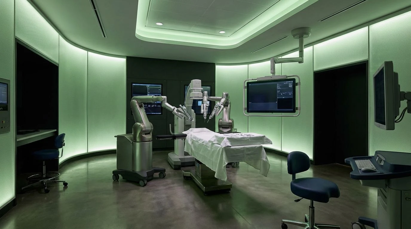
· 6 min readWe have sanitized the act of healing until it resembles a void. Modern clinics and wellness applications drape themselves in ghost-white and anemic beige, whispering promises of recovery in a visual language so hushed it borders on lifeless. Yet, the human body does not heal in whispers. Recovery is a violent, triumphant biological war, a rhythm of blood rushing and cells multiplying with a desperate urgency. What if the aesthetic of medicine stopped apologizing for this raw pulse? Enter the subterranean frequencies of underground hip-hop and phonk, where distorted bass and neon-drenched shadows mirror the true velocity of survival. By abandoning the pastel safety nets of conventional design, we invite a frantic, unapologetic vitality back into the room. A medical interface painted in the bruised purples and toxic greens of a late-night street race does not ask you to simply rest. It demands that you live, electrifying the weary eye with the raw shock of a defibrillator.
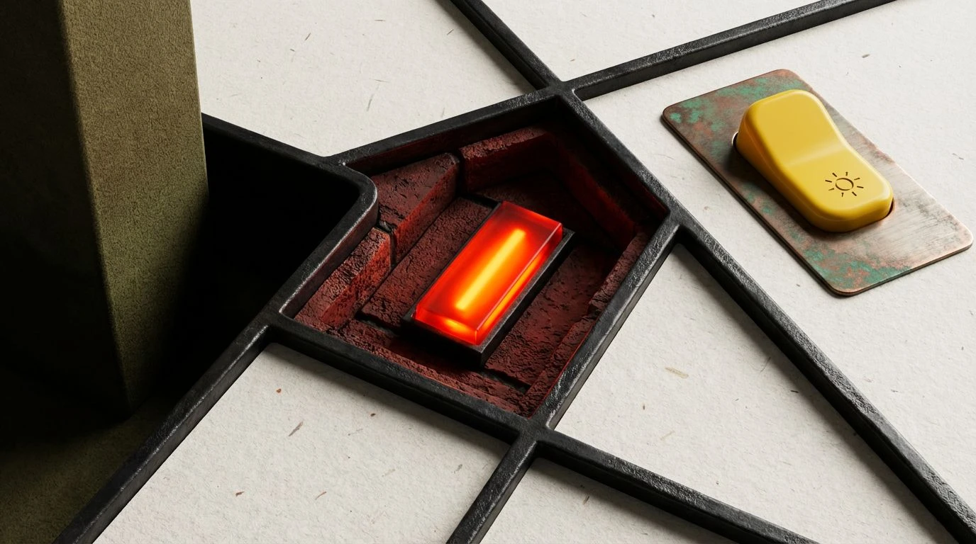
Midnight Defibrillator 🫀
The Midnight Defibrillator palette drags the clinical experience out of a sterile hallway and into the heavy, thumping dark of an underground parking garage. Here, the grounding weight of Subwoofer Wood meets the absolute void of Abyssal Black, creating a negative space so vast you can almost hear the low-frequency rumble echoing through it. Suddenly, the eye is struck by Hazard Yellow and Defibrillator Green, a pairing that jolts the nervous system awake like a sudden spike on a heart monitor. These are not colors meant to coddle the patient; they are loud, synthetic demands for survival. Static Cyan sweeps through the shadows like the erratic glow of a rigged street lamp, while Bass Drop Purple hums with a bruised, nocturnal energy. Applied to a wellness screen or a recovery tracking app, this combination strips away the apologetic tone of modern medicine. It replaces polite recovery with a gritty, high-speed chase toward health, using the visual language of phonk music to remind the body that it is still a powerful, mechanical engine capable of aggressive repair.
Adrenaline Overdrive 🏎️
Healing is rarely a passive state, and the Adrenaline Overdrive palette captures the frenetic, forward momentum required to climb out of illness. It begins with the urban realism of Concrete Dust and Chainlink Grey, grounding the visual field in the rough textures of the street. Against this muted industrial backdrop, Asphalt Shadow stretches out deeply, preparing the stage for an explosive intervention. When Strobe Yellow and Adrenaline Green finally pierce the gloom, they do so with the erratic, blinding tempo of a phonk track reaching its crescendo. This is the visual equivalent of a sudden, deep breath after nearly drowning. Siren Blue adds a wailing, authoritative urgency, cutting through the noise like an ambulance speeding down an empty boulevard, while the brittle chill of Menthol Ice acts as a sudden, sharp shock to the senses. For a healthcare brand brave enough to embrace this aesthetic, these colors reject the notion of fragile patients. Instead, they transform the healing journey into an electric sprint, urging the user forward with the relentless, head-nodding rhythm of a heavy bassline.
Neon Triage 💊
Within the Neon Triage palette, the biological reality of the human body collides violently with the artificial glow of the night city. Arterial Spray leads the charge, an unapologetic splash of survival that refuses to be ignored or watered down by polite aesthetics. It is grounded by the gritty, oxidized warmth of Dried Rust and the brief, frantic flare of Sparks, reminding us that recovery burns energy. Bone Ash provides the faintest whisper of traditional healthcare, a pale canvas quickly overtaken by the murky depths of Deep Venous and the muted calm of Surgical Sage. Yet, what truly transforms this collection into a medical rebellion is the sudden, jarring invasion of Neon Scalpel and Synthetic Euphoria. These hyper-saturated, chemical hues mimic the dizzying high of painkillers and the sensory overload of a subterranean rave. By splashing these electric night-tones across a health interface, designers create a space where trauma meets unapologetic vitality. It is a visual rhythm that acknowledges the pain of the wound while forcefully injecting the frantic, synthetic energy required to dance through the recovery.
Radioactive Recovery 🧬
There is a strange, intoxicating beauty in a fever breaking, a sudden shift from sickness to survival that the Radioactive Recovery palette captures with toxic precision. The oppressive, heavy silence of Midnight Alley swallows the lower registers of the screen like the heavy bass of a chopped-and-screwed mixtape. From this obscurity crawls Toxic Moss and Scrub Green, biological and raw, hinting at a grim but necessary struggle. Then, the tempo wildly accelerates. Acid Spit and Radioactive Isotope burst through the dark like shattered neon signs in a rain-slicked alleyway. These are unsafe colors, radiating a synthetic, chemical glow that mimics the aggressive punch of experimental medicine sinking into the bloodstream. Fever Sweat flickers unsteadily at the edges, bright and delirious, before the cooling, chemical relief of Powder Pill washes over the scene. This palette turns a medical application into a survival race that you are guaranteed to win. It challenges the patient to embrace the strange, mutant energy of their own immune system, proving that true healing is a bright, roaring fire rather than a quiet night of sleep.
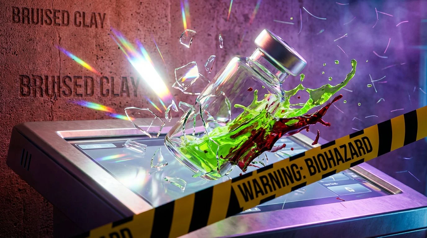
Tactical Paramedic 🚑
The Tactical Paramedic palette refuses to wait for the ambulance to arrive; it is the ambulance rushing toward you at breakneck speed. It opens with Clinical Glare and Gauze, deceptive markers of a traditional medical environment, completely unaware of the sonic boom about to shatter their quiet. Bruised Clay adds a grounding, sweaty humanity to the mix, an organic heaviness that feels like calloused hands working to save a life. Then the beat drops, and the visual field is seized by the blaring urgency of Siren Red and Warning Tape. These colors scream for immediate action, stripping away any pretense of gentle care. They are matched blow for blow by Venom Green and Overclocked Vitality, hues so aggressively bright they seem to vibrate on the screen like an overdriven synthesizer. To build a healthcare interface with this palette is to treat the user not as a victim, but as a fighter stepping into the ring. It is an aesthetic of combat and triumph, utilizing the unapologetic, high-contrast aggression of hip-hop culture to kickstart the heart and aggressively shock the spirit back into a state of absolute motion.
To abandon the pale ghostliness of modern medical design is to recognize that surviving is a loud endeavor. These hyper-saturated, bass-heavy color spaces drag the healing process out of polite society and plunge it into the electric underground. By borrowing the relentless tempo and bruised neon of phonk music, we do not merely decorate a screen; we construct a visual defibrillator. The aggressive reds, venomous greens, and deep, abyssal shadows remind the exhausted patient that their physical form is still a magnificent, roaring engine. When healthcare speaks in the visual language of a subterranean rave, it stops whispering apologies for illness and starts screaming a defiant, joyous demand for life. The sterile clinic is gone, replaced entirely by a rhythmic, relentless beat that drives the blood permanently forward.