'%3e%3cpath%20fill-rule='evenodd'%20clip-rule='evenodd'%20d='M51.1303%2019.2492C50.7278%2019.913%2050.1346%2020.4426%2049.3508%2020.838C48.5669%2021.2335%2047.6172%2021.4312%2046.5014%2021.4312C44.8208%2021.4312%2043.4367%2021.0216%2042.3492%2020.2025C41.2617%2019.3833%2040.6686%2018.2394%2040.5697%2016.7706H44.4253C44.4818%2017.3355%2044.6831%2017.7804%2045.0291%2018.1052C45.3751%2018.43%2045.8164%2018.5924%2046.3531%2018.5924C46.8192%2018.5924%2047.1864%2018.4653%2047.4547%2018.2111C47.7231%2017.9569%2047.8572%2017.618%2047.8572%2017.1943C47.8572%2016.8129%2047.7337%2016.4952%2047.4865%2016.241C47.2393%2015.9867%2046.9322%2015.7784%2046.565%2015.616C46.1978%2015.4536%2045.6893%2015.2594%2045.0397%2015.0334C44.0934%2014.7086%2043.3202%2014.3944%2042.72%2014.0907C42.1197%2013.7871%2041.6042%2013.3351%2041.1735%2012.7349C40.7427%2012.1347%2040.5273%2011.3544%2040.5273%2010.394C40.5273%209.50418%2040.7533%208.73448%2041.2053%208.08481C41.6572%207.43515%2042.2821%206.93731%2043.0801%206.5913C43.8781%206.24528%2044.7925%206.07227%2045.8235%206.07227C47.49%206.07227%2048.8141%206.46771%2049.7956%207.25861C50.7772%208.04951%2051.3315%209.13698%2051.4586%2010.5211H47.5395C47.4689%2010.0268%2047.2888%209.63483%2046.9993%209.3453C46.7097%209.05578%2046.3178%208.91102%2045.8235%208.91102C45.3998%208.91102%2045.0573%209.024%2044.7961%209.24997C44.5348%209.47594%2044.4041%209.80783%2044.4041%2010.2457C44.4041%2010.5988%2044.5207%2010.8989%2044.7537%2011.146C44.9867%2011.3932%2045.2798%2011.5944%2045.6328%2011.7498C45.9859%2011.9052%2046.4944%2012.1029%2047.1581%2012.343C48.1185%2012.6678%2048.9023%2012.9891%2049.5096%2013.3069C50.1169%2013.6246%2050.6395%2014.0872%2051.0773%2014.6945C51.5151%2015.3018%2051.734%2016.0927%2051.734%2017.0672C51.734%2017.8581%2051.5328%2018.5854%2051.1303%2019.2492ZM59.0242%206.3053V21.2829H55.4016V6.3053H59.0242ZM73.9409%206.3053V9.18642H69.8734V21.2829H66.2296V9.18642H62.2046V6.3053H73.9409ZM80.7438%209.18642V12.3218H85.8069V15.0546H80.7438V18.3806H86.4425V21.2829H77.1212V6.3053H86.4425V9.18642H80.7438ZM99.667%2016.0291V21.2829H96.0444V6.3053H101.913C103.692%206.3053%20105.048%206.74665%20105.98%207.62934C106.912%208.51204%20107.378%209.7019%20107.378%2011.199C107.378%2012.1311%20107.17%2012.9609%20106.753%2013.6882C106.337%2014.4155%20105.719%2014.9875%20104.9%2015.4042C104.08%2015.8208%20103.085%2016.0291%20101.913%2016.0291H99.667ZM103.692%2011.199C103.692%209.8855%20102.965%209.22879%20101.51%209.22879H99.667V13.1268H101.51C102.965%2013.1268%20103.692%2012.4842%20103.692%2011.199ZM120.092%2018.5501H114.478L113.546%2021.2829H109.732L115.219%206.41123H119.393L124.879%2021.2829H121.024L120.092%2018.5501ZM119.16%2015.7961L117.295%2010.2881L115.41%2015.7961H119.16ZM131.555%2018.5077H136.385V21.2829H127.933V6.3053H131.555V18.5077ZM143.337%209.18642V12.3218H148.4V15.0546H143.337V18.3806H149.035V21.2829H139.714V6.3053H149.035V9.18642H143.337ZM163.507%206.3053V9.18642H159.44V21.2829H155.796V9.18642H151.771V6.3053H163.507ZM177.449%206.3053V9.18642H173.382V21.2829H169.738V9.18642H165.713V6.3053H177.449ZM184.252%209.18642V12.3218H189.315V15.0546H184.252V18.3806H189.951V21.2829H180.629V6.3053H189.951V9.18642H184.252Z'%20fill='%23EEF0ED'/%3e%3cmask%20id='mask0_3101_7327'%20style='mask-type:alpha'%20maskUnits='userSpaceOnUse'%20x='0'%20y='0'%20width='27'%20height='28'%3e%3cpath%20d='M23.8328%200.759766H2.64808C1.18559%200.759766%200%201.94535%200%203.40785V24.5925C0%2026.055%201.18559%2027.2406%202.64808%2027.2406H23.8328C25.2952%2027.2406%2026.4808%2026.055%2026.4808%2024.5925V3.40785C26.4808%201.94535%2025.2952%200.759766%2023.8328%200.759766Z'%20fill='white'/%3e%3c/mask%3e%3cg%20mask='url(%23mask0_3101_7327)'%3e%3cpath%20d='M23.8328%200.759766H2.64808C1.18559%200.759766%200%201.94535%200%203.40785V24.5925C0%2026.055%201.18559%2027.2406%202.64808%2027.2406H23.8328C25.2952%2027.2406%2026.4808%2026.055%2026.4808%2024.5925V3.40785C26.4808%201.94535%2025.2952%200.759766%2023.8328%200.759766Z'%20fill='%23D8D8D8'/%3e%3cpath%20d='M13.2404%200.759766H0V14.0001H13.2404V0.759766Z'%20fill='%238C61FF'/%3e%3cpath%20d='M13.2404%2014H0V27.2404H13.2404V14Z'%20fill='%2336C3FE'/%3e%3cpath%20d='M26.4806%2014H13.2402V27.2404H26.4806V14Z'%20fill='%236592FE'/%3e%3cpath%20d='M26.4806%200.759766H13.2402V14.0002H26.4806V0.759766Z'%20fill='%236059F7'/%3e%3c/g%3e%3c/g%3e%3cdefs%3e%3cclipPath%20id='clip0_3101_7327'%3e%3crect%20width='190'%20height='28'%20fill='white'/%3e%3c/clipPath%3e%3c/defs%3e%3c/svg%3e)
'%3e%3cpath%20d='M23.8328%200.759521H2.64808C1.18559%200.759521%200%201.94511%200%203.40761V24.5923C0%2026.0548%201.18559%2027.2404%202.64808%2027.2404H23.8328C25.2952%2027.2404%2026.4808%2026.0548%2026.4808%2024.5923V3.40761C26.4808%201.94511%2025.2952%200.759521%2023.8328%200.759521Z'%20fill='%23D8D8D8'/%3e%3cpath%20d='M13.2404%200.759521H0V13.9999H13.2404V0.759521Z'%20fill='%238C61FF'/%3e%3cpath%20d='M13.2404%2013.9998H0V27.2402H13.2404V13.9998Z'%20fill='%2336C3FE'/%3e%3cpath%20d='M26.4809%2013.9998H13.2405V27.2402H26.4809V13.9998Z'%20fill='%236592FE'/%3e%3cpath%20d='M26.4809%200.759277H13.2405V13.9997H26.4809V0.759277Z'%20fill='%236059F7'/%3e%3c/g%3e%3c/svg%3e)
Use De Stijl Color Palettes for High-Urgency UI Design
· 5 min readWhen your messaging platform demands attention, it usually resorts to visual shouting. A glaring crimson banner slapping across your screen is the digital equivalent of someone banging pots and pans together. But looking back at the early twentieth century, the De Stijl movement possessed a much smarter approach to commanding focus. By treating space and pigment with mathematical exactness, figures like Mondrian and Van Doesburg proved that rigorous geometry could arrest the eye without causing retinal distress. Applying this philosophy to software alters how we experience critical notifications. Transitioning away from aggressive reds toward a calculated arrangement of teal and burnt orange offers a radical shift. It delivers the immediate necessity of an alert while simultaneously suggesting financial or operational wellbeing. The result is a notification that arrives not as a panic attack, but as an authoritative, impeccably styled telegram.
Gridlocked Urgency 🚨
The Gridlocked Urgency collection borrows directly from the foundational principles of early abstract art, translating gallery aesthetics into everyday software notifications. Instead of relying on predictable and grating warning tones, Terracotta Alarm delivers a punch of burnt orange that commands immediate attention while remaining surprisingly civilized against the stark backdrop of Archival Ink. When paired side by side with the vivid burst of Electric Cyan, the visual friction creates an unmistakable sense of importance. This is an environment built for clarity, where users facing a barrage of daily data can instantly recognize priorities. The softer transition into Glacial Interface ensures that once the initial alert state registers in the mind, the lingering visual impression is calm and structurally sound, proving that user interfaces can be demanding without feeling chaotic.
Bureaucratic Spring 📟
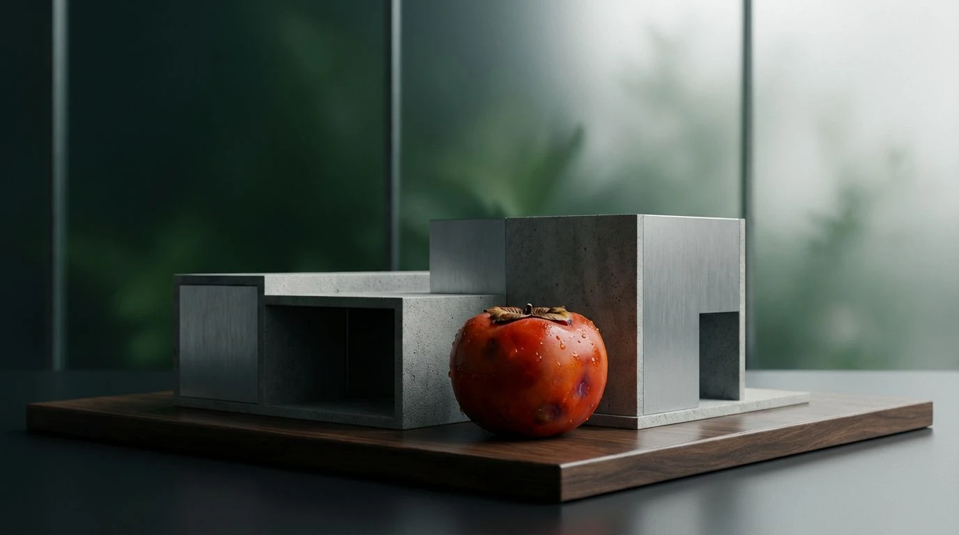
There is a distinct irony in making a system notification look both wealthy and alarming, yet Bureaucratic Spring manages exactly that trick. The grounding presence of Alpine Teal establishes a deeply professional environment, recalling mid-century bank vaults and serious administrative spaces. Against this sober foundation, the sheer audacity of Radioactive Success leaps off the screen. It is an unapologetic, almost startling alert hue that acts exactly like a sharp whistle in a quiet library. Yet, rather than feeling aggressive, it is tempered by the muted sophistication of Brass Penny and Vellum Invoice. This combination serves platforms that handle high-stakes transactions where success and failure need immediate differentiation. The user is guided by the precision of color blocking rather than anxious, flashing graphics, ensuring the overall experience feels prosperous, structured, and firmly under control.
Calculated Prosperity 📈
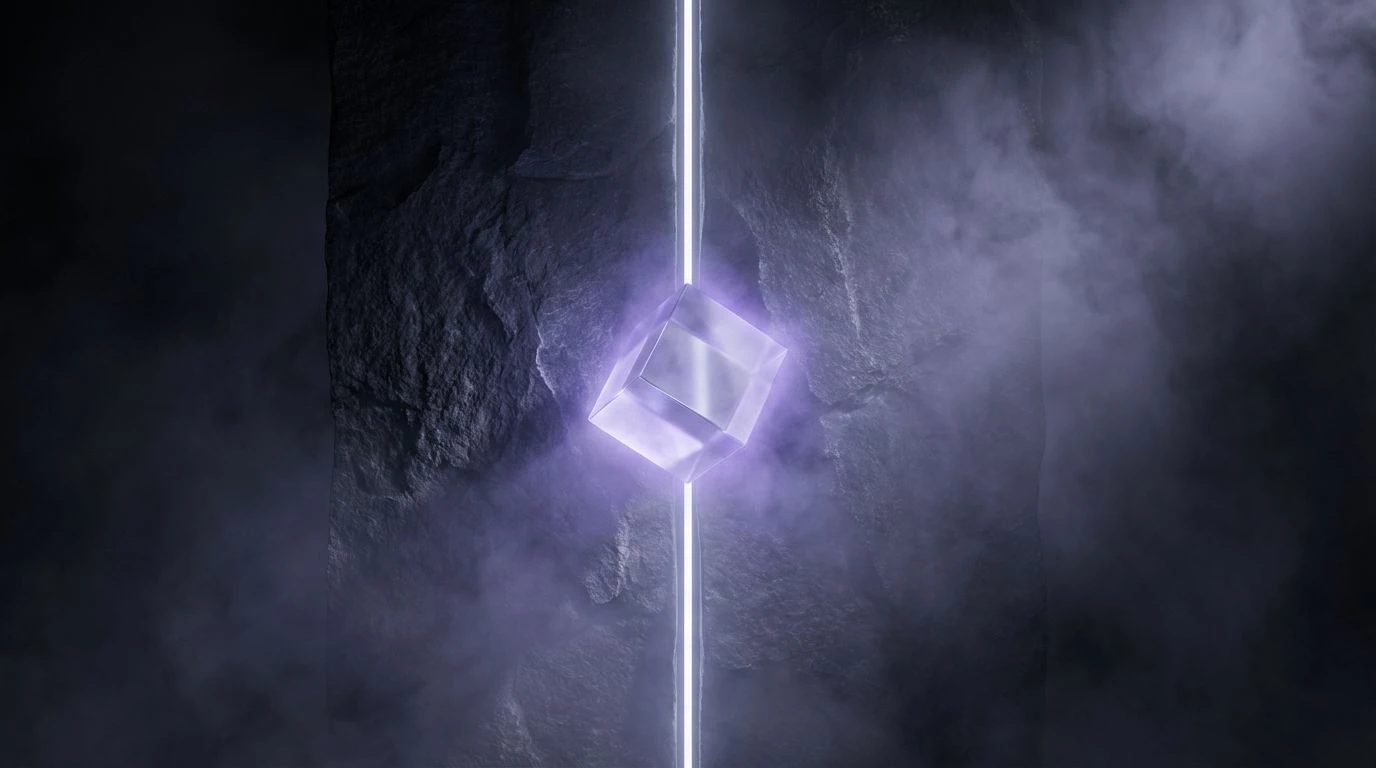
Calculated Prosperity leans into the cool, detached logic of architectural drafting to structure its messages. Using Midnight Terminal as a deep, abyssal backdrop allows smaller geometric flashes of urgency to operate with surgical precision. The introduction of Prosperous Mint acts as a refreshing counter-signal to traditional warning signs, implying that an action is required but the system remains secure and profitable. This creates a remarkably sophisticated psychological space for the user. When an alert arrives bathed in Blueprint Sky or grounded by Tarnished Gold, it feels less like an error message and much more like wealth management advice. It proves that borrowing strict, uncompromising boundaries from historical art movements gives modern software a sense of unshakeable authority. Navigating a workspace painted in these tones feels like stepping into a highly functional, entirely predictable machine where every notification has exactly one correct place.
Strict Communication 📩
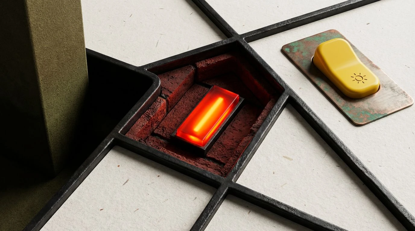
Few visual arrangements command respect quite like Strict Communication. This selection takes the austere rulebook of De Stijl and turns the contrast dial to maximum, constructing an environment where ambiguity simply ceases to exist. Deep Petrol anchors the design, serving as a vast reservoir of calm confidence, while Warning Flare behaves as the sharp, uncompromising messenger piercing through the quiet. What is particularly clever here is how the interplay between Ultramarine Logic and the severe off-black of Obsidian Grid mimics the structural beams of a modernist building. If a notification drops down into this space, there is zero confusion about its priority level. The severe boundary lines created here prevent visual fatigue, allowing the user to process pressing updates about server outages or shifting market margins with total composure. The platform therefore transitions from a mere tool into a highly curated command center.
Critical Architecture 🏛️
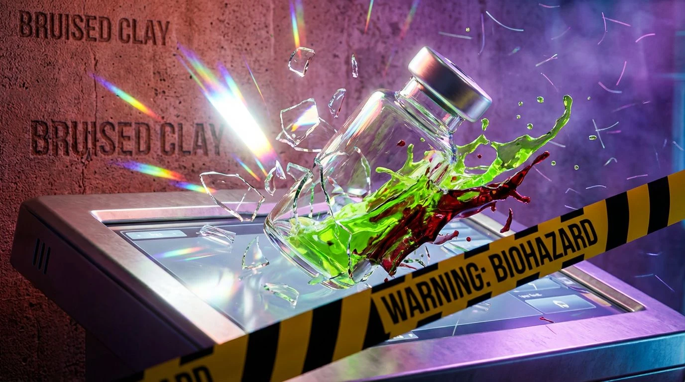
Critical Architecture applies the rigorous exactitude of modernist grids to an undeniably tactile, almost industrial visual space. The stark contrast introduced by Emergency Blaze over Velvet Shadow immediately reads as an urgent directive, mimicking the visual language of safety signs, yet it remains intensely stylish. Softening this severe interaction is the cool, mathematical presence of Oxidized Copper, dropping the temperature just enough to stop the user from reaching for the panic button. Using Fired Brick and Olive Drab as supporting players adds a grounded, worldly weight that many flat software interfaces sorely lack. When an alert flashes in these exacting shades, it communicates robust reliability. The user interacts with the system not as a series of abstract digital boxes, but as a well-oiled mechanical instrument where every color block is deliberate, every boundary line is sharp, and every delivered message carries the total weight of institutional certainty.
Breaking free from the conventional, panic-inducing language of standard system alerts opens up entirely new psychological spaces for users to inhabit. By borrowing the strict, mathematical geometry of early modernists and pairing it with a deeply deliberate application of teal and burnt orange, software designers can achieve something remarkably rare. We stop reacting to our screens with anxiety and instead begin to process information with cool, collected rationality. These visual formulas transform everyday digital platforms into environments of quiet luxury and absolute control, where an emergency reads merely as a new, clearly defined task to complete.