'%3e%3cpath%20fill-rule='evenodd'%20clip-rule='evenodd'%20d='M51.1303%2019.2492C50.7278%2019.913%2050.1346%2020.4426%2049.3508%2020.838C48.5669%2021.2335%2047.6172%2021.4312%2046.5014%2021.4312C44.8208%2021.4312%2043.4367%2021.0216%2042.3492%2020.2025C41.2617%2019.3833%2040.6686%2018.2394%2040.5697%2016.7706H44.4253C44.4818%2017.3355%2044.6831%2017.7804%2045.0291%2018.1052C45.3751%2018.43%2045.8164%2018.5924%2046.3531%2018.5924C46.8192%2018.5924%2047.1864%2018.4653%2047.4547%2018.2111C47.7231%2017.9569%2047.8572%2017.618%2047.8572%2017.1943C47.8572%2016.8129%2047.7337%2016.4952%2047.4865%2016.241C47.2393%2015.9867%2046.9322%2015.7784%2046.565%2015.616C46.1978%2015.4536%2045.6893%2015.2594%2045.0397%2015.0334C44.0934%2014.7086%2043.3202%2014.3944%2042.72%2014.0907C42.1197%2013.7871%2041.6042%2013.3351%2041.1735%2012.7349C40.7427%2012.1347%2040.5273%2011.3544%2040.5273%2010.394C40.5273%209.50418%2040.7533%208.73448%2041.2053%208.08481C41.6572%207.43515%2042.2821%206.93731%2043.0801%206.5913C43.8781%206.24528%2044.7925%206.07227%2045.8235%206.07227C47.49%206.07227%2048.8141%206.46771%2049.7956%207.25861C50.7772%208.04951%2051.3315%209.13698%2051.4586%2010.5211H47.5395C47.4689%2010.0268%2047.2888%209.63483%2046.9993%209.3453C46.7097%209.05578%2046.3178%208.91102%2045.8235%208.91102C45.3998%208.91102%2045.0573%209.024%2044.7961%209.24997C44.5348%209.47594%2044.4041%209.80783%2044.4041%2010.2457C44.4041%2010.5988%2044.5207%2010.8989%2044.7537%2011.146C44.9867%2011.3932%2045.2798%2011.5944%2045.6328%2011.7498C45.9859%2011.9052%2046.4944%2012.1029%2047.1581%2012.343C48.1185%2012.6678%2048.9023%2012.9891%2049.5096%2013.3069C50.1169%2013.6246%2050.6395%2014.0872%2051.0773%2014.6945C51.5151%2015.3018%2051.734%2016.0927%2051.734%2017.0672C51.734%2017.8581%2051.5328%2018.5854%2051.1303%2019.2492ZM59.0242%206.3053V21.2829H55.4016V6.3053H59.0242ZM73.9409%206.3053V9.18642H69.8734V21.2829H66.2296V9.18642H62.2046V6.3053H73.9409ZM80.7438%209.18642V12.3218H85.8069V15.0546H80.7438V18.3806H86.4425V21.2829H77.1212V6.3053H86.4425V9.18642H80.7438ZM99.667%2016.0291V21.2829H96.0444V6.3053H101.913C103.692%206.3053%20105.048%206.74665%20105.98%207.62934C106.912%208.51204%20107.378%209.7019%20107.378%2011.199C107.378%2012.1311%20107.17%2012.9609%20106.753%2013.6882C106.337%2014.4155%20105.719%2014.9875%20104.9%2015.4042C104.08%2015.8208%20103.085%2016.0291%20101.913%2016.0291H99.667ZM103.692%2011.199C103.692%209.8855%20102.965%209.22879%20101.51%209.22879H99.667V13.1268H101.51C102.965%2013.1268%20103.692%2012.4842%20103.692%2011.199ZM120.092%2018.5501H114.478L113.546%2021.2829H109.732L115.219%206.41123H119.393L124.879%2021.2829H121.024L120.092%2018.5501ZM119.16%2015.7961L117.295%2010.2881L115.41%2015.7961H119.16ZM131.555%2018.5077H136.385V21.2829H127.933V6.3053H131.555V18.5077ZM143.337%209.18642V12.3218H148.4V15.0546H143.337V18.3806H149.035V21.2829H139.714V6.3053H149.035V9.18642H143.337ZM163.507%206.3053V9.18642H159.44V21.2829H155.796V9.18642H151.771V6.3053H163.507ZM177.449%206.3053V9.18642H173.382V21.2829H169.738V9.18642H165.713V6.3053H177.449ZM184.252%209.18642V12.3218H189.315V15.0546H184.252V18.3806H189.951V21.2829H180.629V6.3053H189.951V9.18642H184.252Z'%20fill='%23EEF0ED'/%3e%3cmask%20id='mask0_3101_7327'%20style='mask-type:alpha'%20maskUnits='userSpaceOnUse'%20x='0'%20y='0'%20width='27'%20height='28'%3e%3cpath%20d='M23.8328%200.759766H2.64808C1.18559%200.759766%200%201.94535%200%203.40785V24.5925C0%2026.055%201.18559%2027.2406%202.64808%2027.2406H23.8328C25.2952%2027.2406%2026.4808%2026.055%2026.4808%2024.5925V3.40785C26.4808%201.94535%2025.2952%200.759766%2023.8328%200.759766Z'%20fill='white'/%3e%3c/mask%3e%3cg%20mask='url(%23mask0_3101_7327)'%3e%3cpath%20d='M23.8328%200.759766H2.64808C1.18559%200.759766%200%201.94535%200%203.40785V24.5925C0%2026.055%201.18559%2027.2406%202.64808%2027.2406H23.8328C25.2952%2027.2406%2026.4808%2026.055%2026.4808%2024.5925V3.40785C26.4808%201.94535%2025.2952%200.759766%2023.8328%200.759766Z'%20fill='%23D8D8D8'/%3e%3cpath%20d='M13.2404%200.759766H0V14.0001H13.2404V0.759766Z'%20fill='%238C61FF'/%3e%3cpath%20d='M13.2404%2014H0V27.2404H13.2404V14Z'%20fill='%2336C3FE'/%3e%3cpath%20d='M26.4806%2014H13.2402V27.2404H26.4806V14Z'%20fill='%236592FE'/%3e%3cpath%20d='M26.4806%200.759766H13.2402V14.0002H26.4806V0.759766Z'%20fill='%236059F7'/%3e%3c/g%3e%3c/g%3e%3cdefs%3e%3cclipPath%20id='clip0_3101_7327'%3e%3crect%20width='190'%20height='28'%20fill='white'/%3e%3c/clipPath%3e%3c/defs%3e%3c/svg%3e)
'%3e%3cpath%20d='M23.8328%200.759521H2.64808C1.18559%200.759521%200%201.94511%200%203.40761V24.5923C0%2026.0548%201.18559%2027.2404%202.64808%2027.2404H23.8328C25.2952%2027.2404%2026.4808%2026.0548%2026.4808%2024.5923V3.40761C26.4808%201.94511%2025.2952%200.759521%2023.8328%200.759521Z'%20fill='%23D8D8D8'/%3e%3cpath%20d='M13.2404%200.759521H0V13.9999H13.2404V0.759521Z'%20fill='%238C61FF'/%3e%3cpath%20d='M13.2404%2013.9998H0V27.2402H13.2404V13.9998Z'%20fill='%2336C3FE'/%3e%3cpath%20d='M26.4809%2013.9998H13.2405V27.2402H26.4809V13.9998Z'%20fill='%236592FE'/%3e%3cpath%20d='M26.4809%200.759277H13.2405V13.9997H26.4809V0.759277Z'%20fill='%236059F7'/%3e%3c/g%3e%3c/svg%3e)
Nordic Ice Breaker Color Palettes for Creative Leadership
· 4 min readThe contemporary approach to professional branding leans heavily into a predictable sort of approachability. Creative leaders are frequently instructed to appear endlessly warm, agreeable, and cloaked in soft, sandy neutrals that suggest unlimited patience. This is fundamentally tedious. If the alternative requires looking to the frigid, uncompromising architecture of Scandinavian maritime engineering, then perhaps it is time to don a high-visibility jacket and smash straight through the corporate pack ice. Adopting the psychological architecture of a Nordic icebreaker trades polite consensus for calculated aggression. It relies on deep oceanic navies, metallic silvers forged for basic survival, and the shocking intrusion of neon safety gear. This strategy establishes an authority that feels entirely unbothered by extreme conditions. It frames creative output not as a collaborative group therapy session, but as a heavy-duty mechanical process designed to fracture obstacles and navigate freezing waters with terrifying, industrial calm.
Svalbard Expedition 🚢
A maritime emergency translated into absolute minimalism. The deep, heavy red and stark white play aggressively against unconcerned industrial grey. In a leadership context, this is about drawing a severe line in the snow and daring anyone to cross it. It signals absolute authority without raising its voice. A combination that operates exactly like a heavy steel prow cutting through solid sea ice, offering an aesthetic that is unfussy, unapologetically direct, and perhaps just a fraction dangerous. The subtle inclusion of pale peach and muted orange stops the whole affair from freezing over completely, reminding observers that a human hand is still operating the heavy machinery. It speaks to a professional style that prefers decisive, heavy impact over endless debate.
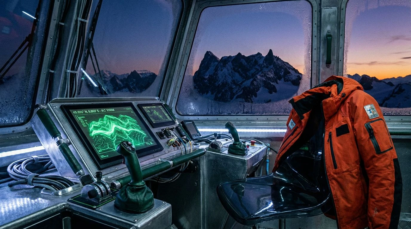
Midnight Sun Navigation 🧭
The freezing blue of sub-zero waters sits alongside unfeeling, neutral grey. Abyssal Trench acts as the heavy anchor of professional authority, whilst the shocking Bright Blue slices through corporate fog exactly like an electrical navigation light piercing a blizzard. Modern creative leadership usually tries to soften its edges and smile through the pain. This particular arrangement demands attention through pure, cold precision rather than charm. It is the visual equivalent of a prolonged stare across a brutally long boardroom table, suggesting you know exactly what is happening in the depths while everyone else is merely treading water on the surface.
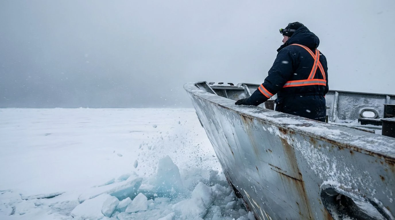
Baffin Bay Warning ⚠️
Industrial safety gear thrust into freezing oceanic depths produces an extraordinary visual shock. The extreme contrast between the darkest navy and the blaring caution tones of yellow and green creates a deliberate confrontation. By adopting this stance, you project an aggressively competent persona. You are not arriving at the office to make friends or organize off-site trust falls; you are arriving to clear a navigable channel through intractable pack ice. The muted red adds an oddly human touch, perhaps the only genuine warmth left on a frozen deck. It proves that even a ruthlessly efficient, ice-breaking approach to leadership retains a vital pulse beneath the heavy layers of waterproof armor.
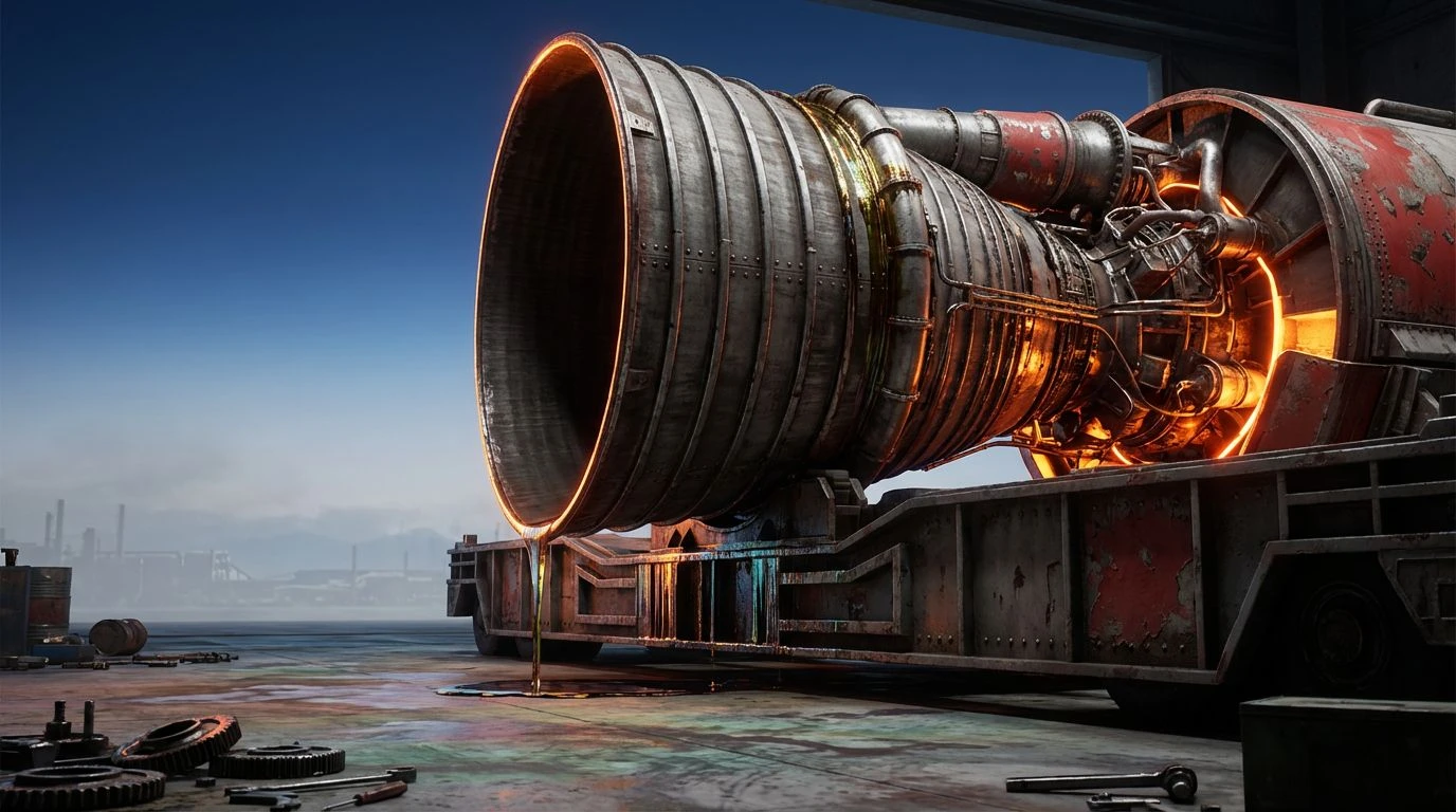
Icebreaker Engine Room ⚙️
Unapologetically loud and aggressively functional by design. The toxic brilliance of high-visibility yellows clashing with freezing silver and absolute black is the standard uniform of extreme, hostile environments. It tells clients and hesitant colleagues that your creative vision cuts straight through the background noise with sheer industrial force. Ice Blue acts as a stark, chilling reminder of the frozen geography waiting outside the ship. This dictates a professional philosophy operating entirely on the premise that genuine power does not bother whispering. Instead, it wears fluorescent tactical gear, carries incredibly heavy machinery, and clears a path through sheer mechanical will.
Arctic Command ⚓
A fully stocked emergency survival kit dumped unceremoniously onto a polished glass drafting table. Bright orange, deep red, and sharp yellow provide vital navigational markers against an unforgiving, bleak background of true black, heavy grey, and stark white. The deep marine blues act as the binding agent for the nautical theme. Fashioning a professional identity around these severe tones replaces the predictably soft-focus empathy of most creative directors with the unyielding presence of a sea captain staring down a storm. It establishes an aesthetic of zero compromises, specifically designed to survive gale-force winds, brutal corporate deadlines, and freezing temperatures without ever flinching or asking for permission.
Rethinking how we present authority through the lens of heavy-duty maritime transport abruptly challenges the polite, beige conventions of modern aesthetics. These vivid, high-contrast combinations reject the tired notion that professional leadership must always feel comforting, therapeutic, or universally agreeable. Instead, they offer a harsh visual language built specifically on survival, precision, and unapologetic visibility. Wearing the aesthetic signals of distress flares, storm clouds, and unyielding steel communicates an attitude of supreme, mechanical competence in highly hostile environments. It signals to every observer that the person standing at the helm remains entirely unshakeable, aggressively intentional, and fully prepared to smash straight through whatever obstacles happen to float into their designated path.