'%3e%3cpath%20fill-rule='evenodd'%20clip-rule='evenodd'%20d='M51.1303%2019.2492C50.7278%2019.913%2050.1346%2020.4426%2049.3508%2020.838C48.5669%2021.2335%2047.6172%2021.4312%2046.5014%2021.4312C44.8208%2021.4312%2043.4367%2021.0216%2042.3492%2020.2025C41.2617%2019.3833%2040.6686%2018.2394%2040.5697%2016.7706H44.4253C44.4818%2017.3355%2044.6831%2017.7804%2045.0291%2018.1052C45.3751%2018.43%2045.8164%2018.5924%2046.3531%2018.5924C46.8192%2018.5924%2047.1864%2018.4653%2047.4547%2018.2111C47.7231%2017.9569%2047.8572%2017.618%2047.8572%2017.1943C47.8572%2016.8129%2047.7337%2016.4952%2047.4865%2016.241C47.2393%2015.9867%2046.9322%2015.7784%2046.565%2015.616C46.1978%2015.4536%2045.6893%2015.2594%2045.0397%2015.0334C44.0934%2014.7086%2043.3202%2014.3944%2042.72%2014.0907C42.1197%2013.7871%2041.6042%2013.3351%2041.1735%2012.7349C40.7427%2012.1347%2040.5273%2011.3544%2040.5273%2010.394C40.5273%209.50418%2040.7533%208.73448%2041.2053%208.08481C41.6572%207.43515%2042.2821%206.93731%2043.0801%206.5913C43.8781%206.24528%2044.7925%206.07227%2045.8235%206.07227C47.49%206.07227%2048.8141%206.46771%2049.7956%207.25861C50.7772%208.04951%2051.3315%209.13698%2051.4586%2010.5211H47.5395C47.4689%2010.0268%2047.2888%209.63483%2046.9993%209.3453C46.7097%209.05578%2046.3178%208.91102%2045.8235%208.91102C45.3998%208.91102%2045.0573%209.024%2044.7961%209.24997C44.5348%209.47594%2044.4041%209.80783%2044.4041%2010.2457C44.4041%2010.5988%2044.5207%2010.8989%2044.7537%2011.146C44.9867%2011.3932%2045.2798%2011.5944%2045.6328%2011.7498C45.9859%2011.9052%2046.4944%2012.1029%2047.1581%2012.343C48.1185%2012.6678%2048.9023%2012.9891%2049.5096%2013.3069C50.1169%2013.6246%2050.6395%2014.0872%2051.0773%2014.6945C51.5151%2015.3018%2051.734%2016.0927%2051.734%2017.0672C51.734%2017.8581%2051.5328%2018.5854%2051.1303%2019.2492ZM59.0242%206.3053V21.2829H55.4016V6.3053H59.0242ZM73.9409%206.3053V9.18642H69.8734V21.2829H66.2296V9.18642H62.2046V6.3053H73.9409ZM80.7438%209.18642V12.3218H85.8069V15.0546H80.7438V18.3806H86.4425V21.2829H77.1212V6.3053H86.4425V9.18642H80.7438ZM99.667%2016.0291V21.2829H96.0444V6.3053H101.913C103.692%206.3053%20105.048%206.74665%20105.98%207.62934C106.912%208.51204%20107.378%209.7019%20107.378%2011.199C107.378%2012.1311%20107.17%2012.9609%20106.753%2013.6882C106.337%2014.4155%20105.719%2014.9875%20104.9%2015.4042C104.08%2015.8208%20103.085%2016.0291%20101.913%2016.0291H99.667ZM103.692%2011.199C103.692%209.8855%20102.965%209.22879%20101.51%209.22879H99.667V13.1268H101.51C102.965%2013.1268%20103.692%2012.4842%20103.692%2011.199ZM120.092%2018.5501H114.478L113.546%2021.2829H109.732L115.219%206.41123H119.393L124.879%2021.2829H121.024L120.092%2018.5501ZM119.16%2015.7961L117.295%2010.2881L115.41%2015.7961H119.16ZM131.555%2018.5077H136.385V21.2829H127.933V6.3053H131.555V18.5077ZM143.337%209.18642V12.3218H148.4V15.0546H143.337V18.3806H149.035V21.2829H139.714V6.3053H149.035V9.18642H143.337ZM163.507%206.3053V9.18642H159.44V21.2829H155.796V9.18642H151.771V6.3053H163.507ZM177.449%206.3053V9.18642H173.382V21.2829H169.738V9.18642H165.713V6.3053H177.449ZM184.252%209.18642V12.3218H189.315V15.0546H184.252V18.3806H189.951V21.2829H180.629V6.3053H189.951V9.18642H184.252Z'%20fill='%23EEF0ED'/%3e%3cmask%20id='mask0_3101_7327'%20style='mask-type:alpha'%20maskUnits='userSpaceOnUse'%20x='0'%20y='0'%20width='27'%20height='28'%3e%3cpath%20d='M23.8328%200.759766H2.64808C1.18559%200.759766%200%201.94535%200%203.40785V24.5925C0%2026.055%201.18559%2027.2406%202.64808%2027.2406H23.8328C25.2952%2027.2406%2026.4808%2026.055%2026.4808%2024.5925V3.40785C26.4808%201.94535%2025.2952%200.759766%2023.8328%200.759766Z'%20fill='white'/%3e%3c/mask%3e%3cg%20mask='url(%23mask0_3101_7327)'%3e%3cpath%20d='M23.8328%200.759766H2.64808C1.18559%200.759766%200%201.94535%200%203.40785V24.5925C0%2026.055%201.18559%2027.2406%202.64808%2027.2406H23.8328C25.2952%2027.2406%2026.4808%2026.055%2026.4808%2024.5925V3.40785C26.4808%201.94535%2025.2952%200.759766%2023.8328%200.759766Z'%20fill='%23D8D8D8'/%3e%3cpath%20d='M13.2404%200.759766H0V14.0001H13.2404V0.759766Z'%20fill='%238C61FF'/%3e%3cpath%20d='M13.2404%2014H0V27.2404H13.2404V14Z'%20fill='%2336C3FE'/%3e%3cpath%20d='M26.4806%2014H13.2402V27.2404H26.4806V14Z'%20fill='%236592FE'/%3e%3cpath%20d='M26.4806%200.759766H13.2402V14.0002H26.4806V0.759766Z'%20fill='%236059F7'/%3e%3c/g%3e%3c/g%3e%3cdefs%3e%3cclipPath%20id='clip0_3101_7327'%3e%3crect%20width='190'%20height='28'%20fill='white'/%3e%3c/clipPath%3e%3c/defs%3e%3c/svg%3e)
'%3e%3cpath%20d='M23.8328%200.759521H2.64808C1.18559%200.759521%200%201.94511%200%203.40761V24.5923C0%2026.0548%201.18559%2027.2404%202.64808%2027.2404H23.8328C25.2952%2027.2404%2026.4808%2026.0548%2026.4808%2024.5923V3.40761C26.4808%201.94511%2025.2952%200.759521%2023.8328%200.759521Z'%20fill='%23D8D8D8'/%3e%3cpath%20d='M13.2404%200.759521H0V13.9999H13.2404V0.759521Z'%20fill='%238C61FF'/%3e%3cpath%20d='M13.2404%2013.9998H0V27.2402H13.2404V13.9998Z'%20fill='%2336C3FE'/%3e%3cpath%20d='M26.4809%2013.9998H13.2405V27.2402H26.4809V13.9998Z'%20fill='%236592FE'/%3e%3cpath%20d='M26.4809%200.759277H13.2405V13.9997H26.4809V0.759277Z'%20fill='%236059F7'/%3e%3c/g%3e%3c/svg%3e)
Biotech Color Palettes: Beyond Sterile White Design
· 5 min readFor decades, the visual language of biotechnology has been trapped in a clinical loop. Companies striving to cure diseases or engineer new proteins lean entirely on stark white spaces and icy blues, projecting an image that feels surgical rather than living. This sanitized aesthetic ignores what biology actually looks like in practice. It is time for branding directors to look downward at the forest floor. The damp woodland understory offers a far more accurate visual representation of life sciences. It is wet, vivid, and pulsating with raw vitality. By adopting bright, acidic greens cutting through dark, earthy grays, brands can communicate a grounded compassion alongside explosive organic growth, shifting the visual narrative from artificial intervention to natural, thriving acceleration.
Mycelial Network 🍄
This collection directly confronts the clinical aesthetic by introducing aggressive life against a stark backdrop. Fungal White provides a familiar starting point for cautious brands, but it is immediately brought to earth by the heavy weight of Basalt Gray and Fog Bark. These deep neutrals establish a sensation of rooting in fertile soil rather than floating in a vacuum. Against this moody base, Chlorophyll Bright slices through with undeniable energy, mimicking the fresh shoots breaking through a gloomy woodland floor. Meanwhile, a pop of Cordyceps Orange signals an alarming yet productive vitality, acting as a striking accent color for key data points or digital calls to action. It creates a user experience that feels completely rigorous but deeply connected to organic processes.
Bioluminescent Damp 🐌
Moving further into the untamed woods, this scheme captures the strange quality of micro-ecosystems thriving in total natural shade. Deep Peat and Wet Boulder create an intensely rich background that mimics the cool moisture of a shadowed ravine. Instead of standard corporate blues, Bacterial Cyan and Algae Dark offer an aquatic trustworthiness that feels drawn straight from a Petri dish rather than a hospital corridor. The unexpected flashes of Slime Mold Pink and Nightshade act as brilliant disruptors, perfect for breaking up dense scientific typography or rendering complex genomic visualizations on screen. Fern Frond anchors the entire grouping, reassuring the viewer that this wild, overgrown aesthetic remains tied to professional biological advancement and patient care.
Photosynthetic Canopy 🌿
Capturing the constant cycle of decay and renewal, this selection balances heavy earthen tones with striking digital vibrancy inside user interfaces. Decomposition and Rotting Log provide a radically different foundation for life science platforms, moving away from weightless layouts toward layouts that feel physically present and dense. Out of this dark material comes Biolab Green, an electric shade that reads as accelerated cellular division or synthetic biology in action. The atmospheric additions of Deep Puddle and Dew Drop cool the visual temperature down, adding a layer of clinical precision without sacrificing the wet, living quality of the brand identity. Against these darker shapes, Canopy Sunlight acts as a sudden burst of clarity, ideal for highlighting medical breakthrough metrics.
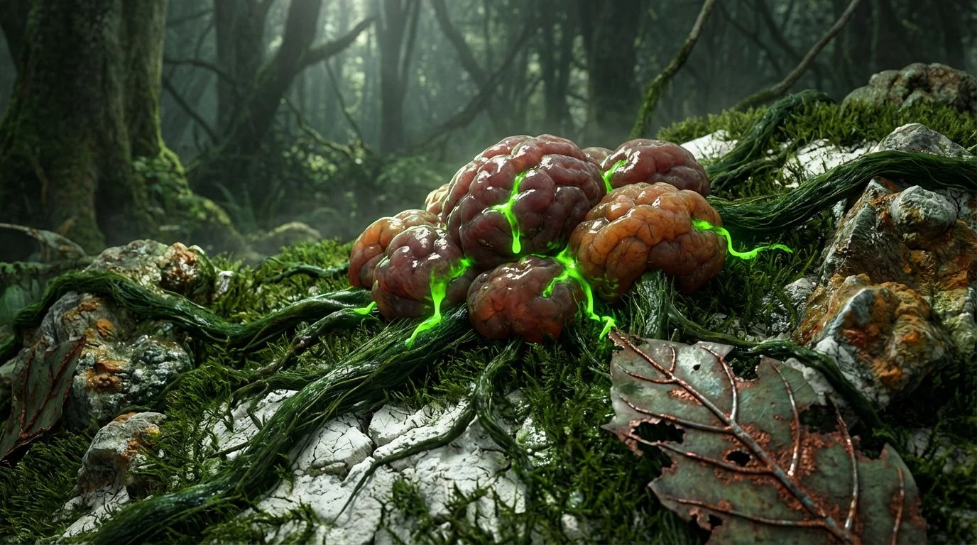
Verdant Toxicity 🦠
This particular set walks a careful line between the natural world and engineered manipulation, making it ideal for pioneering agricultural tech companies or aggressive startup laboratories. Abyss Soil sets a nearly pitch-black stage, simulating the lightless zones where the most interesting microbial actions take place. Layered onto this, Acidic Fern and Toxic Spore present a saturated, almost radioactive tone, suggesting biology that has been optimized and supercharged by human hands. Earthy Wood softens this intense contrast, ensuring the corporate identity remains approachable and rooted in compassionate outcomes rather than pure science fiction. The introduction of Cyanobacteria acts as a bridging tone, linking the aggressive neon shades with the calm neutrality of Lab Coat White.
Organic Matter 🐛
Emphasizing the tactile, physical reality of scientific research, this restrained group relies on murky depths and sudden, sharp UI highlights. Deep Canopy and Dark Algae replace standard black or navy with a vegetal heaviness that grounds the eye completely. Neon Sap provides the crucial contrast required for modern web accessibility, standing out clearly against the darker tones while maintaining an undeniably botanical feel. What sets this grouping apart is the inclusion of Fleshy Fungus, a biological neutral that mimics skin, yeast, or cultured proteins, introducing a deeply physical, somatic element to the visual system. Combined with Chalk Soil and Oxidized Leaf, an interface built on these tones feels incredibly sophisticated, treating biological data almost like high-end architecture.
Transitioning away from visual tropes of emptiness is not just a stylistic exercise for the life sciences sector; it is a vital shift in communication design. By looking downward into the mud, moss, and shadows, companies can present a far more honest picture of their work to the world. These saturated greens, acidic yellows, and deep basalt grays speak the actual language of cells, soil, and living systems. They replace artificial detachment with raw, moving energy. Embracing these visceral colors allows a brand to express absolute scientific rigor while still feeling alive, proving that advanced medical and biological research can be both highly precise and profoundly human at the exact same moment.