'%3e%3cpath%20fill-rule='evenodd'%20clip-rule='evenodd'%20d='M51.1303%2019.2492C50.7278%2019.913%2050.1346%2020.4426%2049.3508%2020.838C48.5669%2021.2335%2047.6172%2021.4312%2046.5014%2021.4312C44.8208%2021.4312%2043.4367%2021.0216%2042.3492%2020.2025C41.2617%2019.3833%2040.6686%2018.2394%2040.5697%2016.7706H44.4253C44.4818%2017.3355%2044.6831%2017.7804%2045.0291%2018.1052C45.3751%2018.43%2045.8164%2018.5924%2046.3531%2018.5924C46.8192%2018.5924%2047.1864%2018.4653%2047.4547%2018.2111C47.7231%2017.9569%2047.8572%2017.618%2047.8572%2017.1943C47.8572%2016.8129%2047.7337%2016.4952%2047.4865%2016.241C47.2393%2015.9867%2046.9322%2015.7784%2046.565%2015.616C46.1978%2015.4536%2045.6893%2015.2594%2045.0397%2015.0334C44.0934%2014.7086%2043.3202%2014.3944%2042.72%2014.0907C42.1197%2013.7871%2041.6042%2013.3351%2041.1735%2012.7349C40.7427%2012.1347%2040.5273%2011.3544%2040.5273%2010.394C40.5273%209.50418%2040.7533%208.73448%2041.2053%208.08481C41.6572%207.43515%2042.2821%206.93731%2043.0801%206.5913C43.8781%206.24528%2044.7925%206.07227%2045.8235%206.07227C47.49%206.07227%2048.8141%206.46771%2049.7956%207.25861C50.7772%208.04951%2051.3315%209.13698%2051.4586%2010.5211H47.5395C47.4689%2010.0268%2047.2888%209.63483%2046.9993%209.3453C46.7097%209.05578%2046.3178%208.91102%2045.8235%208.91102C45.3998%208.91102%2045.0573%209.024%2044.7961%209.24997C44.5348%209.47594%2044.4041%209.80783%2044.4041%2010.2457C44.4041%2010.5988%2044.5207%2010.8989%2044.7537%2011.146C44.9867%2011.3932%2045.2798%2011.5944%2045.6328%2011.7498C45.9859%2011.9052%2046.4944%2012.1029%2047.1581%2012.343C48.1185%2012.6678%2048.9023%2012.9891%2049.5096%2013.3069C50.1169%2013.6246%2050.6395%2014.0872%2051.0773%2014.6945C51.5151%2015.3018%2051.734%2016.0927%2051.734%2017.0672C51.734%2017.8581%2051.5328%2018.5854%2051.1303%2019.2492ZM59.0242%206.3053V21.2829H55.4016V6.3053H59.0242ZM73.9409%206.3053V9.18642H69.8734V21.2829H66.2296V9.18642H62.2046V6.3053H73.9409ZM80.7438%209.18642V12.3218H85.8069V15.0546H80.7438V18.3806H86.4425V21.2829H77.1212V6.3053H86.4425V9.18642H80.7438ZM99.667%2016.0291V21.2829H96.0444V6.3053H101.913C103.692%206.3053%20105.048%206.74665%20105.98%207.62934C106.912%208.51204%20107.378%209.7019%20107.378%2011.199C107.378%2012.1311%20107.17%2012.9609%20106.753%2013.6882C106.337%2014.4155%20105.719%2014.9875%20104.9%2015.4042C104.08%2015.8208%20103.085%2016.0291%20101.913%2016.0291H99.667ZM103.692%2011.199C103.692%209.8855%20102.965%209.22879%20101.51%209.22879H99.667V13.1268H101.51C102.965%2013.1268%20103.692%2012.4842%20103.692%2011.199ZM120.092%2018.5501H114.478L113.546%2021.2829H109.732L115.219%206.41123H119.393L124.879%2021.2829H121.024L120.092%2018.5501ZM119.16%2015.7961L117.295%2010.2881L115.41%2015.7961H119.16ZM131.555%2018.5077H136.385V21.2829H127.933V6.3053H131.555V18.5077ZM143.337%209.18642V12.3218H148.4V15.0546H143.337V18.3806H149.035V21.2829H139.714V6.3053H149.035V9.18642H143.337ZM163.507%206.3053V9.18642H159.44V21.2829H155.796V9.18642H151.771V6.3053H163.507ZM177.449%206.3053V9.18642H173.382V21.2829H169.738V9.18642H165.713V6.3053H177.449ZM184.252%209.18642V12.3218H189.315V15.0546H184.252V18.3806H189.951V21.2829H180.629V6.3053H189.951V9.18642H184.252Z'%20fill='%23EEF0ED'/%3e%3cmask%20id='mask0_3101_7327'%20style='mask-type:alpha'%20maskUnits='userSpaceOnUse'%20x='0'%20y='0'%20width='27'%20height='28'%3e%3cpath%20d='M23.8328%200.759766H2.64808C1.18559%200.759766%200%201.94535%200%203.40785V24.5925C0%2026.055%201.18559%2027.2406%202.64808%2027.2406H23.8328C25.2952%2027.2406%2026.4808%2026.055%2026.4808%2024.5925V3.40785C26.4808%201.94535%2025.2952%200.759766%2023.8328%200.759766Z'%20fill='white'/%3e%3c/mask%3e%3cg%20mask='url(%23mask0_3101_7327)'%3e%3cpath%20d='M23.8328%200.759766H2.64808C1.18559%200.759766%200%201.94535%200%203.40785V24.5925C0%2026.055%201.18559%2027.2406%202.64808%2027.2406H23.8328C25.2952%2027.2406%2026.4808%2026.055%2026.4808%2024.5925V3.40785C26.4808%201.94535%2025.2952%200.759766%2023.8328%200.759766Z'%20fill='%23D8D8D8'/%3e%3cpath%20d='M13.2404%200.759766H0V14.0001H13.2404V0.759766Z'%20fill='%238C61FF'/%3e%3cpath%20d='M13.2404%2014H0V27.2404H13.2404V14Z'%20fill='%2336C3FE'/%3e%3cpath%20d='M26.4806%2014H13.2402V27.2404H26.4806V14Z'%20fill='%236592FE'/%3e%3cpath%20d='M26.4806%200.759766H13.2402V14.0002H26.4806V0.759766Z'%20fill='%236059F7'/%3e%3c/g%3e%3c/g%3e%3cdefs%3e%3cclipPath%20id='clip0_3101_7327'%3e%3crect%20width='190'%20height='28'%20fill='white'/%3e%3c/clipPath%3e%3c/defs%3e%3c/svg%3e)
'%3e%3cpath%20d='M23.8328%200.759521H2.64808C1.18559%200.759521%200%201.94511%200%203.40761V24.5923C0%2026.0548%201.18559%2027.2404%202.64808%2027.2404H23.8328C25.2952%2027.2404%2026.4808%2026.0548%2026.4808%2024.5923V3.40761C26.4808%201.94511%2025.2952%200.759521%2023.8328%200.759521Z'%20fill='%23D8D8D8'/%3e%3cpath%20d='M13.2404%200.759521H0V13.9999H13.2404V0.759521Z'%20fill='%238C61FF'/%3e%3cpath%20d='M13.2404%2013.9998H0V27.2402H13.2404V13.9998Z'%20fill='%2336C3FE'/%3e%3cpath%20d='M26.4809%2013.9998H13.2405V27.2402H26.4809V13.9998Z'%20fill='%236592FE'/%3e%3cpath%20d='M26.4809%200.759277H13.2405V13.9997H26.4809V0.759277Z'%20fill='%236059F7'/%3e%3c/g%3e%3c/svg%3e)
Industrial Color Palettes for Toddler Game Design Trends
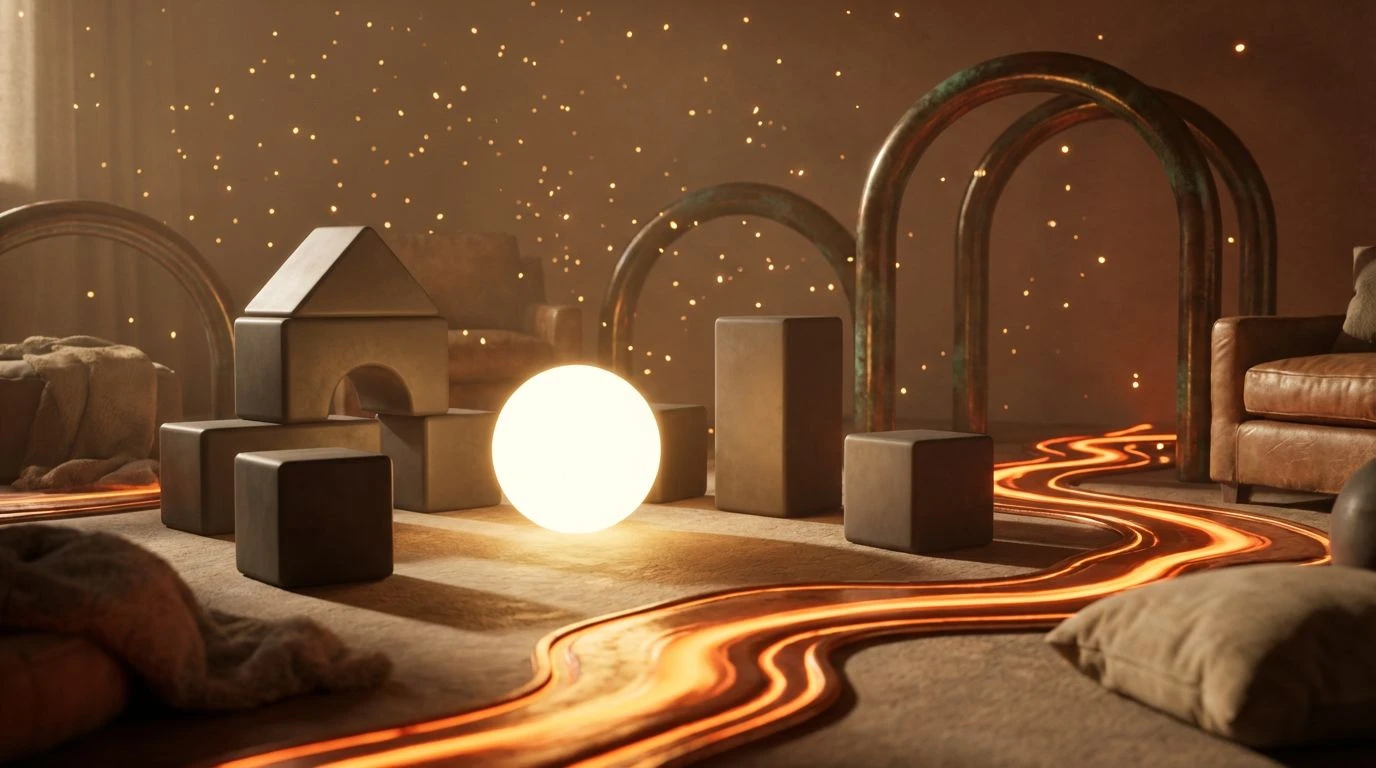
· 5 min readThere is an unexpected poetry in the intense, glowing heat of a smelting plant. The fierce amber glare of liquid metal and the dense, earthy darkness of an industrial forge might seem wholly removed from the bright, pastel-drenched environments traditionally designed for early childhood development. Yet, a shift is occurring in the visual vocabulary of toddler educational games. Game designers are abandoning the expected primary colors in favor of a palette drawn directly from the foundry. By embracing the warmth of deep ochre, raw iron, and radiant orange, developers are crafting virtual spaces that command a child’s attention without causing sensory fatigue. This approach borrows the ambient glow of industrial heat to foster quiet focus, replacing frenetic visual noise with a grounded, energetic optimism rooted in the earth itself.
Radiant Forge 🏭
This sequence captures the sudden flash of light striking cold metal, opening with the stark clarity of Crucible White before plunging into the fierce warmth of Molten Tangerine. For developers building interactive puzzles or early reading applications, this arrangement offers a distinct visual hierarchy. The inclusion of Weathered Bronze and Charcoal Silt provides a heavy, stabilizing foundation that anchors the screen, preventing the brighter tones from overwhelming a young user. Brass Spark introduces a flash of playful energy, guiding the eye toward interactive elements or rewarding accomplishments. The resulting environment feels alive with heat, yet carefully contained, offering an atmosphere where toddlers can concentrate on complex tasks. The contrast between the darker industrial browns and the radiant orange creates a sense of spatial depth, transforming a flat screen into a glowing, contained hearth that commands sustained curiosity.
Alchemist's Workshop 🧪
Expanding the industrial register to include reactive chemical hues, this collection balances the aggressive heat of Bellows Orange with the cooling influence of Oxidized Mint. The heavy presence of Midnight Soot and Forged Steel establishes an environment reminiscent of a busy, shadowed workshop, treating the interface as a literal workspace for a child's developing mind. Golden Ochre warms the mid-tones, serving as a transitional shade that comforts the eye as it scans across digital interactive tools. The unexpected appearances of Sulphur Yellow and Industrial Pine introduce an almost magical chemistry to the visual language, proving that industrial aesthetics need not be devoid of whimsy. When applied to math and spatial reasoning games, these stark contrasts signal interactive states vividly. The chilled mint grounds the heated orange, offering a visual resting place that maintains engagement without exhausting the viewer, resulting in a perfectly calibrated digital forge.
Iron Furnace 🔥
The raw power of a working blast furnace defines this exceptionally focused progression. Magma Red and Casting Gold stand as the commanding visual anchors, bringing a sense of urgency and vigorous joy to a digital playground. To ensure this intensity remains suitable for early learners, the accompanying shades of Iron Slag and Plume Ash cool the overall temperature, applying the muted, powdery finish of a factory floor. Cinder Black provides strict visual boundaries, defining shapes and interactive buttons with absolute clarity. In an educational context, this stark differentiation is invaluable for toddlers learning to distinguish objects and navigate interfaces independently. The hot, metallic yellows and reds act as beacons, clearly indicating pathways or correct answers, while the slate grays recede into a quiet, undisruptive background. It is an exercise in visual discipline, proving that loud, heated colors can be managed meticulously to foster a focused, steady journey through complex digital tasks.
Glowing Ember 🌟
Straying from the heavier carbon tones, this lighter, more luminous sequence mimics the soft ambient glow of cooling metal. Tempered Clay and Soft Copper establish a gentle, welcoming background that feels remarkably organic, lacking the harsh sterility often found in modern children's software. From this warm baseline, Kiln Fire and Radiant Zinc emerge as cheerful, energetic highlights that celebrate small victories within a game. The surprise addition of Fluorescent Slag acts as a sudden burst of contemporary energy, a neon spark jumping from a lathe. This specific combination excels in creative applications, such as digital painting or musical instruments, where toddlers need a bright, optimistic open space to experiment. The absence of true black or heavy gray allows the virtual room to feel expansive and airy, despite being bathed in the colors of extreme thermal energy. It channels the playful side of the industrial process, focusing entirely on light, warmth, and discovery.
Molten Machinery ⚙️
This expansive array captures the full lifecycle of metallurgical work, from the darkest shadows of the factory to the blinding peak of the forge. Void Black and Porcelain Glaze set a dramatic, high-contrast stage, ensuring that the interface is instantly readable for very young eyes still developing tracking skills. Against this stark canvas, Rusty Iron and Blazing Amber deliver the necessary dose of energetic optimism, painting the interactive elements with an inviting, tactile warmth. Heated Sand serves as the perfect moderating tone, a soft middle ground that brings approachability and calmness to reading or counting exercises. The bright shock of White Hot Spark and Patina Green can be reserved for moments of peak reward, celebrating a solved puzzle or a completed sentence. By mapping the intense thermal transitions of a smelter onto the user interface, developers provide toddlers with a visual space that feels simultaneously serious, structured, and thrillingly alive.
The reimagining of industrial heat as a tool for early childhood education marks a mature departure from predictable design conventions. By drawing upon the amber warmth and grounded earth tones of a working forge, designers have discovered an unexpected wellspring of playful yet structured energy. These color strategies prioritize sustained attention and visual comfort over immediate, shallow stimulation. They transform digital spaces into glowing, supportive arenas where a developing mind can explore complex problems without distraction. Ultimately, looking to the intense, constructive atmosphere of a smelting plant has yielded an aesthetic that respects a child's capacity for concentration, proving that quiet authority and vibrant optimism can coexist beautifully inside a virtual classroom.