'%3e%3cpath%20fill-rule='evenodd'%20clip-rule='evenodd'%20d='M51.1303%2019.2492C50.7278%2019.913%2050.1346%2020.4426%2049.3508%2020.838C48.5669%2021.2335%2047.6172%2021.4312%2046.5014%2021.4312C44.8208%2021.4312%2043.4367%2021.0216%2042.3492%2020.2025C41.2617%2019.3833%2040.6686%2018.2394%2040.5697%2016.7706H44.4253C44.4818%2017.3355%2044.6831%2017.7804%2045.0291%2018.1052C45.3751%2018.43%2045.8164%2018.5924%2046.3531%2018.5924C46.8192%2018.5924%2047.1864%2018.4653%2047.4547%2018.2111C47.7231%2017.9569%2047.8572%2017.618%2047.8572%2017.1943C47.8572%2016.8129%2047.7337%2016.4952%2047.4865%2016.241C47.2393%2015.9867%2046.9322%2015.7784%2046.565%2015.616C46.1978%2015.4536%2045.6893%2015.2594%2045.0397%2015.0334C44.0934%2014.7086%2043.3202%2014.3944%2042.72%2014.0907C42.1197%2013.7871%2041.6042%2013.3351%2041.1735%2012.7349C40.7427%2012.1347%2040.5273%2011.3544%2040.5273%2010.394C40.5273%209.50418%2040.7533%208.73448%2041.2053%208.08481C41.6572%207.43515%2042.2821%206.93731%2043.0801%206.5913C43.8781%206.24528%2044.7925%206.07227%2045.8235%206.07227C47.49%206.07227%2048.8141%206.46771%2049.7956%207.25861C50.7772%208.04951%2051.3315%209.13698%2051.4586%2010.5211H47.5395C47.4689%2010.0268%2047.2888%209.63483%2046.9993%209.3453C46.7097%209.05578%2046.3178%208.91102%2045.8235%208.91102C45.3998%208.91102%2045.0573%209.024%2044.7961%209.24997C44.5348%209.47594%2044.4041%209.80783%2044.4041%2010.2457C44.4041%2010.5988%2044.5207%2010.8989%2044.7537%2011.146C44.9867%2011.3932%2045.2798%2011.5944%2045.6328%2011.7498C45.9859%2011.9052%2046.4944%2012.1029%2047.1581%2012.343C48.1185%2012.6678%2048.9023%2012.9891%2049.5096%2013.3069C50.1169%2013.6246%2050.6395%2014.0872%2051.0773%2014.6945C51.5151%2015.3018%2051.734%2016.0927%2051.734%2017.0672C51.734%2017.8581%2051.5328%2018.5854%2051.1303%2019.2492ZM59.0242%206.3053V21.2829H55.4016V6.3053H59.0242ZM73.9409%206.3053V9.18642H69.8734V21.2829H66.2296V9.18642H62.2046V6.3053H73.9409ZM80.7438%209.18642V12.3218H85.8069V15.0546H80.7438V18.3806H86.4425V21.2829H77.1212V6.3053H86.4425V9.18642H80.7438ZM99.667%2016.0291V21.2829H96.0444V6.3053H101.913C103.692%206.3053%20105.048%206.74665%20105.98%207.62934C106.912%208.51204%20107.378%209.7019%20107.378%2011.199C107.378%2012.1311%20107.17%2012.9609%20106.753%2013.6882C106.337%2014.4155%20105.719%2014.9875%20104.9%2015.4042C104.08%2015.8208%20103.085%2016.0291%20101.913%2016.0291H99.667ZM103.692%2011.199C103.692%209.8855%20102.965%209.22879%20101.51%209.22879H99.667V13.1268H101.51C102.965%2013.1268%20103.692%2012.4842%20103.692%2011.199ZM120.092%2018.5501H114.478L113.546%2021.2829H109.732L115.219%206.41123H119.393L124.879%2021.2829H121.024L120.092%2018.5501ZM119.16%2015.7961L117.295%2010.2881L115.41%2015.7961H119.16ZM131.555%2018.5077H136.385V21.2829H127.933V6.3053H131.555V18.5077ZM143.337%209.18642V12.3218H148.4V15.0546H143.337V18.3806H149.035V21.2829H139.714V6.3053H149.035V9.18642H143.337ZM163.507%206.3053V9.18642H159.44V21.2829H155.796V9.18642H151.771V6.3053H163.507ZM177.449%206.3053V9.18642H173.382V21.2829H169.738V9.18642H165.713V6.3053H177.449ZM184.252%209.18642V12.3218H189.315V15.0546H184.252V18.3806H189.951V21.2829H180.629V6.3053H189.951V9.18642H184.252Z'%20fill='%23EEF0ED'/%3e%3cmask%20id='mask0_3101_7327'%20style='mask-type:alpha'%20maskUnits='userSpaceOnUse'%20x='0'%20y='0'%20width='27'%20height='28'%3e%3cpath%20d='M23.8328%200.759766H2.64808C1.18559%200.759766%200%201.94535%200%203.40785V24.5925C0%2026.055%201.18559%2027.2406%202.64808%2027.2406H23.8328C25.2952%2027.2406%2026.4808%2026.055%2026.4808%2024.5925V3.40785C26.4808%201.94535%2025.2952%200.759766%2023.8328%200.759766Z'%20fill='white'/%3e%3c/mask%3e%3cg%20mask='url(%23mask0_3101_7327)'%3e%3cpath%20d='M23.8328%200.759766H2.64808C1.18559%200.759766%200%201.94535%200%203.40785V24.5925C0%2026.055%201.18559%2027.2406%202.64808%2027.2406H23.8328C25.2952%2027.2406%2026.4808%2026.055%2026.4808%2024.5925V3.40785C26.4808%201.94535%2025.2952%200.759766%2023.8328%200.759766Z'%20fill='%23D8D8D8'/%3e%3cpath%20d='M13.2404%200.759766H0V14.0001H13.2404V0.759766Z'%20fill='%238C61FF'/%3e%3cpath%20d='M13.2404%2014H0V27.2404H13.2404V14Z'%20fill='%2336C3FE'/%3e%3cpath%20d='M26.4806%2014H13.2402V27.2404H26.4806V14Z'%20fill='%236592FE'/%3e%3cpath%20d='M26.4806%200.759766H13.2402V14.0002H26.4806V0.759766Z'%20fill='%236059F7'/%3e%3c/g%3e%3c/g%3e%3cdefs%3e%3cclipPath%20id='clip0_3101_7327'%3e%3crect%20width='190'%20height='28'%20fill='white'/%3e%3c/clipPath%3e%3c/defs%3e%3c/svg%3e)
'%3e%3cpath%20d='M23.8328%200.759521H2.64808C1.18559%200.759521%200%201.94511%200%203.40761V24.5923C0%2026.0548%201.18559%2027.2404%202.64808%2027.2404H23.8328C25.2952%2027.2404%2026.4808%2026.0548%2026.4808%2024.5923V3.40761C26.4808%201.94511%2025.2952%200.759521%2023.8328%200.759521Z'%20fill='%23D8D8D8'/%3e%3cpath%20d='M13.2404%200.759521H0V13.9999H13.2404V0.759521Z'%20fill='%238C61FF'/%3e%3cpath%20d='M13.2404%2013.9998H0V27.2402H13.2404V13.9998Z'%20fill='%2336C3FE'/%3e%3cpath%20d='M26.4809%2013.9998H13.2405V27.2402H26.4809V13.9998Z'%20fill='%236592FE'/%3e%3cpath%20d='M26.4809%200.759277H13.2405V13.9997H26.4809V0.759277Z'%20fill='%236059F7'/%3e%3c/g%3e%3c/svg%3e)
Logistics Color Palettes: Outlaw Red vs Corporate Blue
· 6 min readTo speak of logistics is, traditionally, to speak in an endless, uninspired wash of corporate sapphire. It is a visual sleepwalk through oceans of predictable navy, whispering safety while whispering nothing of speed, stakes, or the raw pulse of global movement. It is time to abandon that tired wash of forgettable hues. Imagine, instead, the electric thrill of an engine running hot in the dead of night, the flash of a taillight bleeding into rain-slicked asphalt. This is the visual domain of the outlaw, a space carved out by heavy iron, sharp edges, and the unrelenting precision of blood red cutting through heavy shadows. Moving massive weight across continents is not a gentle act yielding to pastel comforts, but a commanding display of industrial force. By wrapping fleets and shipments in unapologetic crimsons and bruising charcoals, a brand stops asking for permission. It claims the road. It demands absolute attention, replacing a timid handshake with an undeniable declaration of arrival.
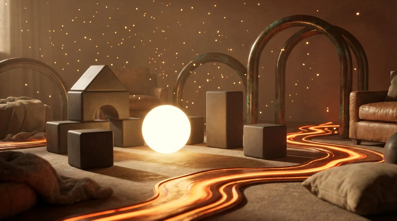
Asphalt Fever 🏍️
In the visual theatre of Asphalt Fever, the eye is immediately dragged toward the heat. This is not the sterile climate-controlled environment of a boardroom, but the searing exhaust of a heavy-haul convoy tearing down a midnight highway. The pale flush of Faded Rust bleeds seamlessly into the startling, high-octane flare of Accelerant Orange, capturing the precise moment a spark catches fuel. Beneath these heated tones, Coagulated Crimson anchors the arrangement in something heavy and undeniable, grounding the flighty warmth in absolute, unyielding authority. As the gaze wanders, the dull metallic gleam of Burnished Brass hints at heavy chains and heavy machinery, a textured contrast to the matte, shadow-drenched gravitas of Oil Slick and the cooler, atmospheric haze of Fogged Chrome. Wrapping a shipping container or an eighteen-wheeler in these shades transforms a mere transport vessel into an animal of the road. It tells a story of speed running hot, of schedules conquered not through polite request, but through pure, untamed mechanical willpower.
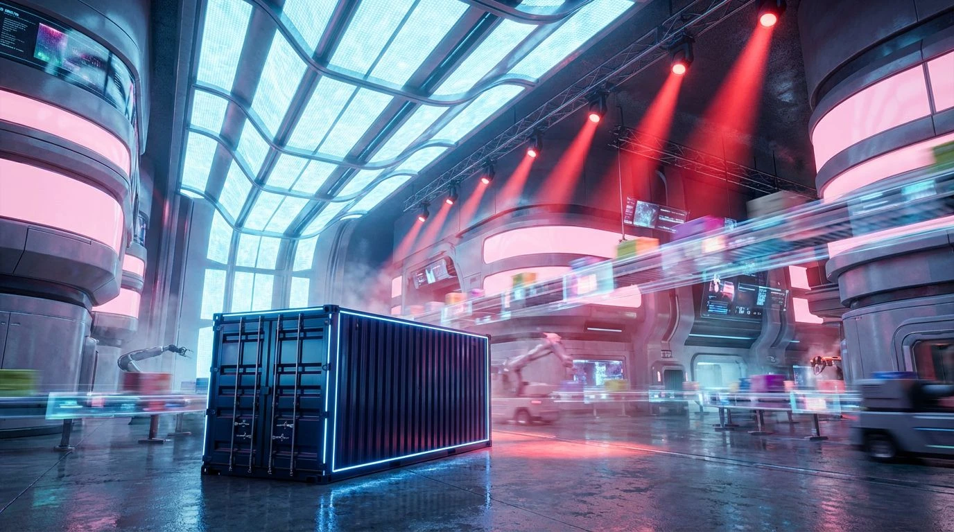
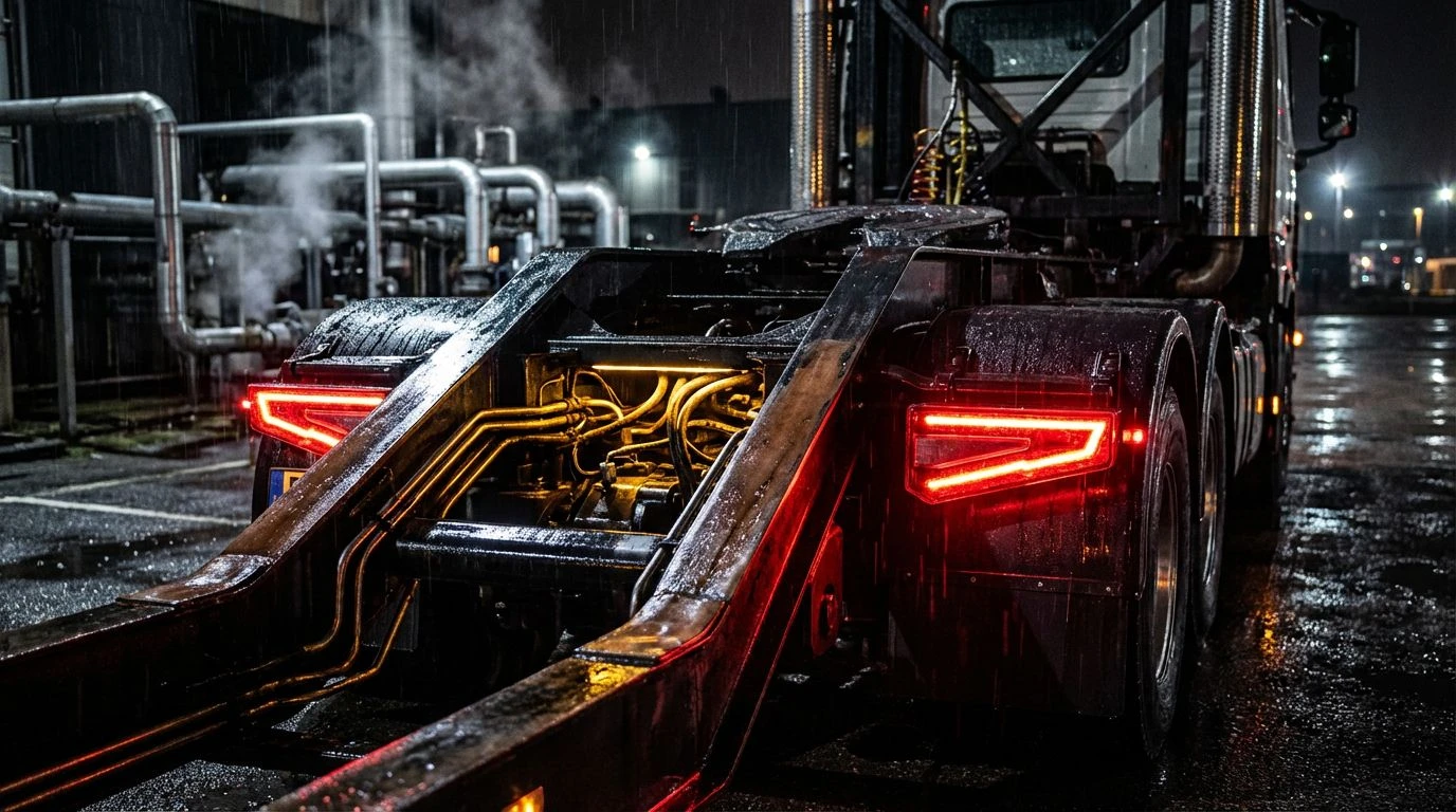
Neon Smokescreen 🌃
Step into the atmospheric tension of Neon Smokescreen, where the sprawling expanse of nocturnal transit comes alive under city streetlights. The foundation here is vast and uncompromising, dominated by the endless, swallowing dark of Vantablack Night. Against this heavy curtain, Frosted Steel and Concrete Ash rise like the skeletal frameworks of towering warehouses, their cool, detached stoicism standing like sentinels in the dark. Yet, the true power of this visual experience lies in the sudden, violent rupture of light. Headlight Flare cuts across the shadows with the golden intensity of sodium streetlamps turning on at dusk, sharply tracing the edge of a moving trailer. Alongside it, Siren Rouge bursts upon the scene with the alarming, undeniable urgency of a hazard light in motion. Applying this unapologetic contrast to supply chain fleets casts them as nocturnal predators navigating urban mazes. It is a cinematic styling that sheds the expected corporate gentleness, proposing instead a thrilling, high-stakes sprint through a sleeping city where every delivery is an urgent mission.
Rust and Rebellion ⛽
Rust and Rebellion drops us instantly into an industrial wasteland reclaimed by sheer, motorized velocity. This is an environment stripped of pretense, built upon the gritty, textured foundation of Scorched Earth and the slick, rain-washed sheen of Wet Tarmac. It smells of ozone and burning rubber. The transition from the deep, oxidized warmth of Dried Blood into the screaming, inescapable presence of Warning Sign Orange is sharp enough to cause a physical reaction. It is a visual blast of heat, commanding focus and respect from anyone sharing the lane. Providing a momentary visual breath, Scuffed Aluminum offers the battered, functional beauty of heavy cargo doors. But precisely when the eye settles, the startling jolt of Toxic Acid flashes like a chemical spill or a neon hazard sticker. Using these tones completely rewrites the script of logistics branding from safe transit to dangerous capability. It speaks to an audience that craves the adrenaline of the unexpected, framing global shipping not as a predictable routine, but as a fearless conquest of difficult terrain and impossible timelines.
Terminal Velocity 🛑
There is a surgical, almost brutal precision at play within Terminal Velocity. It begins with the absolute extremes of Stark Glare and Midnight Void, offering no middle ground, only the harsh, unforgiving contrast of bright headlights violently piercing a moonless night. The mid-tones of Pounded Iron and Dull Blade wrap the scene in the cold, unfeeling armor of large-scale infrastructure, reminiscent of suspension bridges and shipyard cranes. Then comes the unapologetic strike of Severed Artery, a crimson so raw and vibrant it demands immediate obedience. This is the color of emergency stops and high-priority cargo, flanked by the urban grit of Cabs Yellow and the murky, commanding depth of Motor Pool Green. Together, they create a visual language of strict authority and rapid execution. When a brand paints its logistics network in these colors, it strips away the polite smiles of customer service and presents raw, mechanical capability. It turns every moving box into a high-security dispatch, every warehouse into a command center, and every route into a celebrated act of defiance against the mundane.
Heavy Metal Syndicate ⛓️
In the unapologetic grip of Heavy Metal Syndicate, we find a luxurious, tactile rawness that redefines how industrial power is worn. The eye is first met by the cool, indifferent expanse of Galvanized Pipe, settling effortlessly against the crushing, limitless weight of Abyss Black. This dark, heavy backdrop acts as the perfect canvas for the sheer, aggressive thrill of Killswitch Red. It is not a friendly color; it is a warning label, an alarm bell, a streak of taillight caught in a long-exposure photograph. Warming the chilled steel and blinding red, the worn, familiar texture of Oiled Leather adds a measure of rugged consequence, hinting at heavy boots on the gas pedal and callused hands on a steering wheel. Finally, a sudden flare of Molten Gold catches the light, elevating the raw industrial machinery to something strangely premium and highly sought after. Shifting a supply chain identity away from safe blues and into this striking composition signals a refusal to be ignored. It wraps the act of delivery in an aura of untouchable prestige and rebellious flair, moving cargo with the swagger of a modern-day raiding party.
Trading the uninspired, predictable safety of corporate blue for the aggressive, high-stakes theater of crimsons, burnt oranges, and heavy charcoals completely rewrites the visual rulebook of global transport. These are not colors that ask for clearance; they are colors that dictate the rhythm of the highway. By allowing the raw, unfiltered energy of the outlaw to command the visual space, the brand transforms an everyday transaction into a cinematic event. Ships, trucks, and cargo boxes cease to be mere couriers. They become commanding figures cutting through the noise of a saturated market, driven by the sheer, undeniable force of high-speed rebellion. The result is an unforgettable aesthetic signature that leaves the timid competition stranded in the rearview mirror.