'%3e%3cpath%20fill-rule='evenodd'%20clip-rule='evenodd'%20d='M51.1303%2019.2492C50.7278%2019.913%2050.1346%2020.4426%2049.3508%2020.838C48.5669%2021.2335%2047.6172%2021.4312%2046.5014%2021.4312C44.8208%2021.4312%2043.4367%2021.0216%2042.3492%2020.2025C41.2617%2019.3833%2040.6686%2018.2394%2040.5697%2016.7706H44.4253C44.4818%2017.3355%2044.6831%2017.7804%2045.0291%2018.1052C45.3751%2018.43%2045.8164%2018.5924%2046.3531%2018.5924C46.8192%2018.5924%2047.1864%2018.4653%2047.4547%2018.2111C47.7231%2017.9569%2047.8572%2017.618%2047.8572%2017.1943C47.8572%2016.8129%2047.7337%2016.4952%2047.4865%2016.241C47.2393%2015.9867%2046.9322%2015.7784%2046.565%2015.616C46.1978%2015.4536%2045.6893%2015.2594%2045.0397%2015.0334C44.0934%2014.7086%2043.3202%2014.3944%2042.72%2014.0907C42.1197%2013.7871%2041.6042%2013.3351%2041.1735%2012.7349C40.7427%2012.1347%2040.5273%2011.3544%2040.5273%2010.394C40.5273%209.50418%2040.7533%208.73448%2041.2053%208.08481C41.6572%207.43515%2042.2821%206.93731%2043.0801%206.5913C43.8781%206.24528%2044.7925%206.07227%2045.8235%206.07227C47.49%206.07227%2048.8141%206.46771%2049.7956%207.25861C50.7772%208.04951%2051.3315%209.13698%2051.4586%2010.5211H47.5395C47.4689%2010.0268%2047.2888%209.63483%2046.9993%209.3453C46.7097%209.05578%2046.3178%208.91102%2045.8235%208.91102C45.3998%208.91102%2045.0573%209.024%2044.7961%209.24997C44.5348%209.47594%2044.4041%209.80783%2044.4041%2010.2457C44.4041%2010.5988%2044.5207%2010.8989%2044.7537%2011.146C44.9867%2011.3932%2045.2798%2011.5944%2045.6328%2011.7498C45.9859%2011.9052%2046.4944%2012.1029%2047.1581%2012.343C48.1185%2012.6678%2048.9023%2012.9891%2049.5096%2013.3069C50.1169%2013.6246%2050.6395%2014.0872%2051.0773%2014.6945C51.5151%2015.3018%2051.734%2016.0927%2051.734%2017.0672C51.734%2017.8581%2051.5328%2018.5854%2051.1303%2019.2492ZM59.0242%206.3053V21.2829H55.4016V6.3053H59.0242ZM73.9409%206.3053V9.18642H69.8734V21.2829H66.2296V9.18642H62.2046V6.3053H73.9409ZM80.7438%209.18642V12.3218H85.8069V15.0546H80.7438V18.3806H86.4425V21.2829H77.1212V6.3053H86.4425V9.18642H80.7438ZM99.667%2016.0291V21.2829H96.0444V6.3053H101.913C103.692%206.3053%20105.048%206.74665%20105.98%207.62934C106.912%208.51204%20107.378%209.7019%20107.378%2011.199C107.378%2012.1311%20107.17%2012.9609%20106.753%2013.6882C106.337%2014.4155%20105.719%2014.9875%20104.9%2015.4042C104.08%2015.8208%20103.085%2016.0291%20101.913%2016.0291H99.667ZM103.692%2011.199C103.692%209.8855%20102.965%209.22879%20101.51%209.22879H99.667V13.1268H101.51C102.965%2013.1268%20103.692%2012.4842%20103.692%2011.199ZM120.092%2018.5501H114.478L113.546%2021.2829H109.732L115.219%206.41123H119.393L124.879%2021.2829H121.024L120.092%2018.5501ZM119.16%2015.7961L117.295%2010.2881L115.41%2015.7961H119.16ZM131.555%2018.5077H136.385V21.2829H127.933V6.3053H131.555V18.5077ZM143.337%209.18642V12.3218H148.4V15.0546H143.337V18.3806H149.035V21.2829H139.714V6.3053H149.035V9.18642H143.337ZM163.507%206.3053V9.18642H159.44V21.2829H155.796V9.18642H151.771V6.3053H163.507ZM177.449%206.3053V9.18642H173.382V21.2829H169.738V9.18642H165.713V6.3053H177.449ZM184.252%209.18642V12.3218H189.315V15.0546H184.252V18.3806H189.951V21.2829H180.629V6.3053H189.951V9.18642H184.252Z'%20fill='%23EEF0ED'/%3e%3cmask%20id='mask0_3101_7327'%20style='mask-type:alpha'%20maskUnits='userSpaceOnUse'%20x='0'%20y='0'%20width='27'%20height='28'%3e%3cpath%20d='M23.8328%200.759766H2.64808C1.18559%200.759766%200%201.94535%200%203.40785V24.5925C0%2026.055%201.18559%2027.2406%202.64808%2027.2406H23.8328C25.2952%2027.2406%2026.4808%2026.055%2026.4808%2024.5925V3.40785C26.4808%201.94535%2025.2952%200.759766%2023.8328%200.759766Z'%20fill='white'/%3e%3c/mask%3e%3cg%20mask='url(%23mask0_3101_7327)'%3e%3cpath%20d='M23.8328%200.759766H2.64808C1.18559%200.759766%200%201.94535%200%203.40785V24.5925C0%2026.055%201.18559%2027.2406%202.64808%2027.2406H23.8328C25.2952%2027.2406%2026.4808%2026.055%2026.4808%2024.5925V3.40785C26.4808%201.94535%2025.2952%200.759766%2023.8328%200.759766Z'%20fill='%23D8D8D8'/%3e%3cpath%20d='M13.2404%200.759766H0V14.0001H13.2404V0.759766Z'%20fill='%238C61FF'/%3e%3cpath%20d='M13.2404%2014H0V27.2404H13.2404V14Z'%20fill='%2336C3FE'/%3e%3cpath%20d='M26.4806%2014H13.2402V27.2404H26.4806V14Z'%20fill='%236592FE'/%3e%3cpath%20d='M26.4806%200.759766H13.2402V14.0002H26.4806V0.759766Z'%20fill='%236059F7'/%3e%3c/g%3e%3c/g%3e%3cdefs%3e%3cclipPath%20id='clip0_3101_7327'%3e%3crect%20width='190'%20height='28'%20fill='white'/%3e%3c/clipPath%3e%3c/defs%3e%3c/svg%3e)
'%3e%3cpath%20d='M23.8328%200.759521H2.64808C1.18559%200.759521%200%201.94511%200%203.40761V24.5923C0%2026.0548%201.18559%2027.2404%202.64808%2027.2404H23.8328C25.2952%2027.2404%2026.4808%2026.0548%2026.4808%2024.5923V3.40761C26.4808%201.94511%2025.2952%200.759521%2023.8328%200.759521Z'%20fill='%23D8D8D8'/%3e%3cpath%20d='M13.2404%200.759521H0V13.9999H13.2404V0.759521Z'%20fill='%238C61FF'/%3e%3cpath%20d='M13.2404%2013.9998H0V27.2402H13.2404V13.9998Z'%20fill='%2336C3FE'/%3e%3cpath%20d='M26.4809%2013.9998H13.2405V27.2402H26.4809V13.9998Z'%20fill='%236592FE'/%3e%3cpath%20d='M26.4809%200.759277H13.2405V13.9997H26.4809V0.759277Z'%20fill='%236059F7'/%3e%3c/g%3e%3c/svg%3e)
Industrial Color Palettes for Modern Dashboard Design
· 6 min readThere is a distinct sort of relief in watching the modern user interface abandon the blinding glare of cheerful minimalism for something a bit more severe. We are currently witnessing a fascinating resurrection in digital design, where the austere, institutional palette of a mid-century chemistry laboratory has suddenly become the most intelligent way to organize complex information. Think of the heavy, enameled equipment of post-war academia, where muted olive drab metal housings met the sudden, urgent warning of a faded orange indicator lamp. It is an aesthetic born out of pure function, an uncompromising visual language built for serious people doing serious things in rooms smelling faintly of ozone and floor wax. By adopting these moody, moderately low-lit tones, contemporary dashboards finally offer a quiet retreat from the relentless optimism of modern tech, allowing us to stare at our metrics and analytics through the calming, authoritative lens of an analog past.
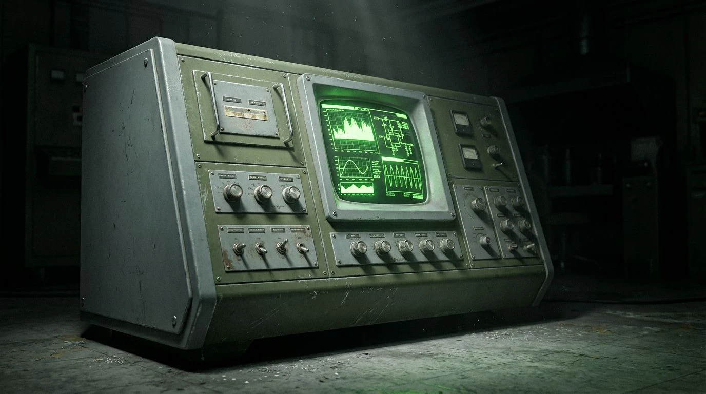
Cathode Ray Tube 🧫
When operating within an interface designed with Cathode Ray Tube, one cannot help but feel as though they are calibrating instruments for a covert meteorological survey rather than just checking quarterly user engagement metrics. The arrangement relies heavily on the industrial severity of Oxidized Aluminum and Lead Apron, providing an entirely emotionless backing for serious mental labor. Then comes the grounding weight of Military Surplus, an olive drab so uncompromising it practically demands a fresh lab coat before you log in. Vent Hood Black swallows any remaining light, creating a moderately low-lit space where the eye is artificially drawn toward the shocking, radioactive punctuation of Toxic Isotope. This sudden slash of neon green reads less like a friendly notification and more like an emergency pressure valve firing off in a basement laboratory. It is a wildly effective combination for technical dashboards that require total, unbroken concentration, turning mundane management into an exercise of mid-century scientific rigor.
Reactive Reagents 🧪
The sheer visual confidence of Reactive Reagents lies in its refusal to comfort the user, opting instead for a striking, high-contrast utility that feels simultaneously vintage and entirely forward-facing. Bakelite Black builds out the heavy, impenetrable foundation of the screen, creating a vast darkroom effect that makes staring at analytics for eight hours a surprisingly tolerable endeavor. Against this darkness, Chalk Dust and Steel Cabinet serve as the structural framework, mapping out grids and sidebars with the quiet authority of an old filing system. What elevates this collection from a simple dark theme is the aggressive, chemical bite of Bromine Gas, a faded orange that feels ripped straight from a hazard warning label, softened only momentarily by the gentler Litmus Peach. When applied to graphs and critical alerts, these orange tones command attention without resorting to the desperate screaming of modern primary colors. The result is a highly readable, highly serious workspace that treats the operator like a trained technician rather than a distracted consumer.
Archival Botany 🌿
Not all laboratories are built for volatile reactions, and Archival Botany proves that technical spaces can possess a sort of quiet, dusty elegance without losing their analytical edge. This particular arrangement entirely ditches the harshness of pitch-black screens, wrapping the interface in Bleached Parchment, a tone that feels like turning the pages of an old, extensively annotated field journal. Data visualization here becomes an act of gentle preservation, anchored by the incredibly dense, shadowy depths of Deep Linoleum. It is an olive hue so heavy it feels almost historically significant, beautifully complementing the mid-range utility of Tarnished Brass. When you map user pathways or system architecture in Faded Sage against these dense greens, the information feels organic, grown rather than engineered. Operating within this scheme lowers the heart rate, providing a restorative environment that proves data management does not require the visual aggression of a spaceship control panel. It is intellectual, quiet, and profoundly civilized.
Spectrometer Reading 📊
Navigating an interface draped in Spectrometer Reading feels decidedly like peering through a highly calibrated optical instrument, where flashes of startling data disrupt a beautifully monotonous environment. The background architecture is frankly unapologetic in its starkness, utilizing Sterile Swab and Brushed Zinc to build a clinical, unfeeling cage for the numbers to live inside. Graphite Rod and Carbon Deposit handle the heavy lifting of typography and deep shadow spaces, keeping the overall glow low enough to prevent eye fatigue during marathon coding sessions. Yet, the real magic happens when the data itself appears, rendered in the brilliant, contradictory tones of Rusting Filament, Ozone Blue, and Cobalt Tint. These colors hit the optic nerve precisely like a chemical flash in a dark room. The burnt, faded orange serves as the perfect foil to the icy, detached blues, allowing a user to instantly spot anomalies or shifting trends without hunting through menus. It is a masterclass in using loud interruptions against a quiet, academic backdrop.
Synthetic Isotope 🧬
Synthetic Isotope presents a wildly peculiar challenge to the standard tracking tool, looking less like a predictable corporate application and more like an accidental chemical spill over a very expensive piece of mid-century hardware. The entire theater of operations is grounded by Deep Vacuum, an incredibly dark tone that pushes all the other colors forward with dramatic intensity. Asbestos Tile provides a necessary, dulling middle ground, stopping the brighter shades from overwhelming the retinas. What makes this arrangement so uniquely fascinating is the tension between Iodine Spill and Heavy Copper, an earthy, analog pairing that feels rugged and slightly dangerous, offset by the entirely artificial glow of Copper Sulfate and Potassium Violet. Applying this to a technical workspace transforms the act of monitoring servers or financial algorithms into something nearing science fiction. The faded oranges and weird, chalky purples give the distinct impression that whatever systems you are overseeing are highly complex, slightly unstable, and entirely under your expert control.
Abandoning the predictable safety of stark white and flat blue in favor of these historical, institutional shades is perhaps the most sophisticated decision a modern interface designer can make. By borrowing the quiet severity of the mid-century laboratory, these carefully tuned arrangements treat information with the gravity it actually deserves. The interplay between murky, authoritative greens and the sharp, urgent bite of aged orange turns an ordinary screen into a piece of precision instrumentation. It changes the posture of the person sitting in front of the machine, demanding a slower, more deliberate interaction with the information at hand. Ultimately, looking backward at analog science spaces provides an incredibly effective map for moving forward, proving that the most intelligent way to display our modern digital complexities is through the aesthetic ghosts of the past.