'%3e%3cpath%20fill-rule='evenodd'%20clip-rule='evenodd'%20d='M51.1303%2019.2492C50.7278%2019.913%2050.1346%2020.4426%2049.3508%2020.838C48.5669%2021.2335%2047.6172%2021.4312%2046.5014%2021.4312C44.8208%2021.4312%2043.4367%2021.0216%2042.3492%2020.2025C41.2617%2019.3833%2040.6686%2018.2394%2040.5697%2016.7706H44.4253C44.4818%2017.3355%2044.6831%2017.7804%2045.0291%2018.1052C45.3751%2018.43%2045.8164%2018.5924%2046.3531%2018.5924C46.8192%2018.5924%2047.1864%2018.4653%2047.4547%2018.2111C47.7231%2017.9569%2047.8572%2017.618%2047.8572%2017.1943C47.8572%2016.8129%2047.7337%2016.4952%2047.4865%2016.241C47.2393%2015.9867%2046.9322%2015.7784%2046.565%2015.616C46.1978%2015.4536%2045.6893%2015.2594%2045.0397%2015.0334C44.0934%2014.7086%2043.3202%2014.3944%2042.72%2014.0907C42.1197%2013.7871%2041.6042%2013.3351%2041.1735%2012.7349C40.7427%2012.1347%2040.5273%2011.3544%2040.5273%2010.394C40.5273%209.50418%2040.7533%208.73448%2041.2053%208.08481C41.6572%207.43515%2042.2821%206.93731%2043.0801%206.5913C43.8781%206.24528%2044.7925%206.07227%2045.8235%206.07227C47.49%206.07227%2048.8141%206.46771%2049.7956%207.25861C50.7772%208.04951%2051.3315%209.13698%2051.4586%2010.5211H47.5395C47.4689%2010.0268%2047.2888%209.63483%2046.9993%209.3453C46.7097%209.05578%2046.3178%208.91102%2045.8235%208.91102C45.3998%208.91102%2045.0573%209.024%2044.7961%209.24997C44.5348%209.47594%2044.4041%209.80783%2044.4041%2010.2457C44.4041%2010.5988%2044.5207%2010.8989%2044.7537%2011.146C44.9867%2011.3932%2045.2798%2011.5944%2045.6328%2011.7498C45.9859%2011.9052%2046.4944%2012.1029%2047.1581%2012.343C48.1185%2012.6678%2048.9023%2012.9891%2049.5096%2013.3069C50.1169%2013.6246%2050.6395%2014.0872%2051.0773%2014.6945C51.5151%2015.3018%2051.734%2016.0927%2051.734%2017.0672C51.734%2017.8581%2051.5328%2018.5854%2051.1303%2019.2492ZM59.0242%206.3053V21.2829H55.4016V6.3053H59.0242ZM73.9409%206.3053V9.18642H69.8734V21.2829H66.2296V9.18642H62.2046V6.3053H73.9409ZM80.7438%209.18642V12.3218H85.8069V15.0546H80.7438V18.3806H86.4425V21.2829H77.1212V6.3053H86.4425V9.18642H80.7438ZM99.667%2016.0291V21.2829H96.0444V6.3053H101.913C103.692%206.3053%20105.048%206.74665%20105.98%207.62934C106.912%208.51204%20107.378%209.7019%20107.378%2011.199C107.378%2012.1311%20107.17%2012.9609%20106.753%2013.6882C106.337%2014.4155%20105.719%2014.9875%20104.9%2015.4042C104.08%2015.8208%20103.085%2016.0291%20101.913%2016.0291H99.667ZM103.692%2011.199C103.692%209.8855%20102.965%209.22879%20101.51%209.22879H99.667V13.1268H101.51C102.965%2013.1268%20103.692%2012.4842%20103.692%2011.199ZM120.092%2018.5501H114.478L113.546%2021.2829H109.732L115.219%206.41123H119.393L124.879%2021.2829H121.024L120.092%2018.5501ZM119.16%2015.7961L117.295%2010.2881L115.41%2015.7961H119.16ZM131.555%2018.5077H136.385V21.2829H127.933V6.3053H131.555V18.5077ZM143.337%209.18642V12.3218H148.4V15.0546H143.337V18.3806H149.035V21.2829H139.714V6.3053H149.035V9.18642H143.337ZM163.507%206.3053V9.18642H159.44V21.2829H155.796V9.18642H151.771V6.3053H163.507ZM177.449%206.3053V9.18642H173.382V21.2829H169.738V9.18642H165.713V6.3053H177.449ZM184.252%209.18642V12.3218H189.315V15.0546H184.252V18.3806H189.951V21.2829H180.629V6.3053H189.951V9.18642H184.252Z'%20fill='%23EEF0ED'/%3e%3cmask%20id='mask0_3101_7327'%20style='mask-type:alpha'%20maskUnits='userSpaceOnUse'%20x='0'%20y='0'%20width='27'%20height='28'%3e%3cpath%20d='M23.8328%200.759766H2.64808C1.18559%200.759766%200%201.94535%200%203.40785V24.5925C0%2026.055%201.18559%2027.2406%202.64808%2027.2406H23.8328C25.2952%2027.2406%2026.4808%2026.055%2026.4808%2024.5925V3.40785C26.4808%201.94535%2025.2952%200.759766%2023.8328%200.759766Z'%20fill='white'/%3e%3c/mask%3e%3cg%20mask='url(%23mask0_3101_7327)'%3e%3cpath%20d='M23.8328%200.759766H2.64808C1.18559%200.759766%200%201.94535%200%203.40785V24.5925C0%2026.055%201.18559%2027.2406%202.64808%2027.2406H23.8328C25.2952%2027.2406%2026.4808%2026.055%2026.4808%2024.5925V3.40785C26.4808%201.94535%2025.2952%200.759766%2023.8328%200.759766Z'%20fill='%23D8D8D8'/%3e%3cpath%20d='M13.2404%200.759766H0V14.0001H13.2404V0.759766Z'%20fill='%238C61FF'/%3e%3cpath%20d='M13.2404%2014H0V27.2404H13.2404V14Z'%20fill='%2336C3FE'/%3e%3cpath%20d='M26.4806%2014H13.2402V27.2404H26.4806V14Z'%20fill='%236592FE'/%3e%3cpath%20d='M26.4806%200.759766H13.2402V14.0002H26.4806V0.759766Z'%20fill='%236059F7'/%3e%3c/g%3e%3c/g%3e%3cdefs%3e%3cclipPath%20id='clip0_3101_7327'%3e%3crect%20width='190'%20height='28'%20fill='white'/%3e%3c/clipPath%3e%3c/defs%3e%3c/svg%3e)
'%3e%3cpath%20d='M23.8328%200.759521H2.64808C1.18559%200.759521%200%201.94511%200%203.40761V24.5923C0%2026.0548%201.18559%2027.2404%202.64808%2027.2404H23.8328C25.2952%2027.2404%2026.4808%2026.0548%2026.4808%2024.5923V3.40761C26.4808%201.94511%2025.2952%200.759521%2023.8328%200.759521Z'%20fill='%23D8D8D8'/%3e%3cpath%20d='M13.2404%200.759521H0V13.9999H13.2404V0.759521Z'%20fill='%238C61FF'/%3e%3cpath%20d='M13.2404%2013.9998H0V27.2402H13.2404V13.9998Z'%20fill='%2336C3FE'/%3e%3cpath%20d='M26.4809%2013.9998H13.2405V27.2402H26.4809V13.9998Z'%20fill='%236592FE'/%3e%3cpath%20d='M26.4809%200.759277H13.2405V13.9997H26.4809V0.759277Z'%20fill='%236059F7'/%3e%3c/g%3e%3c/svg%3e)

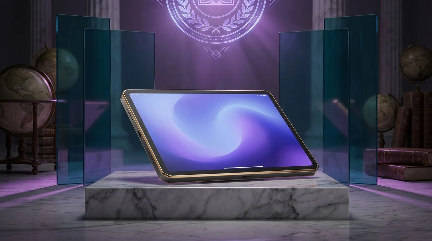
History-Inspired Color Palettes for Educational Design
· 5 min readWhen we examine a seventeenth-century maritime map, our eyes take in more than precise coastlines and navigational boundaries. The visual experience is anchored by a specific spectrum of deeply saturated blues and warm, metallic yellows resting against the soft, highly reflective surface of ancient paper. Human perception responds to these specific wavelengths with a demonstrable shift in cognitive processing. Deep navy acts as a visual anchor, acting as a low-arousal color that lowers heart rates and promotes sustained concentration. Golden ochre, by contrast, draws entirely upon our neurological sensitivity to sunlight and fire, pulling our attention with quiet authority rather than the alarming shrillness of primary reds or greens. Together, this optical pairing constructs an atmosphere of intellectual reliability and historical weight. Translating these spectral relationships into modern educational and research environments allows designers to tap into deeply ingrained psychological responses, creating spaces that foster rigorous study and quiet, confident discovery.
Cartographer's Current 🧭
The human eye immediately registers the contrast between the oxidized copper tones in this group and the sweeping aquatic depths present in the darker shades. In early cartography, these tones mapped both known continents and uncharted waters. For an academic environment, this spectrum creates a sense of intellectual expansion. The eye travels from the familiar warmth of Gilded Brass down into the profound cognitive depths of Marianas Indigo and Midnight Trench. This particular progression triggers a psychological response linked to discovery and sustained focus. Slate Astrolabe and Fogged Silver provide a neutral resting area for the visual cortex, preventing optical fatigue, while Trade Wind Blue and Seafoam Verdigris act as perceptive markers, drawing attention to vital information like landmarks on an early navigational chart. This specific combination builds trust through a grounded, scholarly presence while maintaining an active, exploratory energy.
Scholar's Sextant 🔭
Human psychology often associates high-contrast warm yellows and deep blackish-blues with clarity and orientation, similar to the phenomenon of observing stars against a night sky. In this selection, the piercing intensity of Solar Flare Gold stands against the absolute depths of Observatory Void, recreating the physical experience of studying a celestial map in dim light. The inclusion of Tarnished Sovereign and Mahogany Desk adds a tactile, historical grounding, simulating the organic material finishes of antique navigational tools and old timber. From a perceptive standpoint, these heavy, grounding colors establish immense reliability and structure. Lead Type and Iron Plating serve as structural anchors in the visual field, allowing the intense golden tones to direct attention without overwhelming the viewer. The arrangement creates an atmosphere of serious, focused study where reliable, ancient methods inform modern academic discovery.
Meridian Wax 📜
Perception of this grouping actively shifts the viewer between intense energetic focus and deep cognitive calm. Red and orange wavelengths, seen here in Sealing Wax Crimson and Alidade Orange, typically stimulate autonomic arousal and draw the eye immediately, much like the prominent rhumb lines or administrative wax seals on historical parchment. This high-energy upper register is meticulously balanced by the expanding depths of Equator Cerulean, Benthic Blue, and Midnight Ink. These cool, recessive blues lower visual tension, promoting sustained concentration and the absorption of complex information. Sundial Yellow provides an orienting point of light, while Overcast Iron offers a space of neutral visual rest. Applied to digital education, this visual organization allows the eye to quickly identify critical interactive elements before settling back into the quiet, trusting expanse of deep maritime tones.
Antiquarian Archive ⚓
This restrained minimal arrangement relies on the psychological phenomenon of visual comfort born from high legibility and natural contrast. Vellum Surface mimics the exact optical reflectance of ancient paper, resting softly on the eye to reduce the physiological strain typically caused by harsh backlit screens. Overlaid on this soft background, Golden Ochre and Captain's Navy establish a predictable hierarchy of information. The blue provides a severe, trustworthy base for reading and absorption, mimicking the steady reliability of age-old gallnut ink, while the ochre directs attention with the quiet authority of aged gold leaf. Tarnished Silver bridges the extremes, acting as an intermediate step that softens the transition from light background to dark text. In educational platforms, this exact color relationship promotes prolonged reading and deep cognitive processing, turning the interface into a serene, scholarly environment.
Astrolabe Standard 📏
The human visual system processes achromatic greys as entirely neutral, which allows any color paired with them to step forward with striking clarity. Polished Pewter and Oxidized Steel dominate the background of this group, providing a strictly utilitarian framing mechanism that removes visual distraction and focuses the mind entirely on the task at hand. Against this quiet stage, Brass Caliper acts as a precise optical target, signaling areas of importance, interaction, or academic achievement with its warm, metallic sheen. Navigational Blue and Deep Trench establish the structural grounding, using the naturally recessive qualities of dark blue to construct borders, text, and organizational dividing lines. This particular visual strategy minimizes cognitive load, making it highly effective for complex research databases where the user must navigate dense, complicated information with the same precision required of a seventeenth-century sailor.
The physiological and psychological responses to these historical maritime palettes demonstrate that visual design for education relies heavily on cognitive biology. The interaction between quiet, recessive blues and commanding, warm yellows constructs a visual field that expertly commands attention without inducing retinal fatigue. Observers naturally assign a sense of historical authority and structural reliability to these specific wavelength combinations, largely due to centuries of cultural conditioning and the physical properties of light reflection. Applying these precise color relationships transforms digital research environments from sterile databases into spaces of serious scholarly pursuit, encouraging users to engage with complex material with the quiet confidence of an early cartographer mapping the unknown.