'%3e%3cpath%20fill-rule='evenodd'%20clip-rule='evenodd'%20d='M51.1303%2019.2492C50.7278%2019.913%2050.1346%2020.4426%2049.3508%2020.838C48.5669%2021.2335%2047.6172%2021.4312%2046.5014%2021.4312C44.8208%2021.4312%2043.4367%2021.0216%2042.3492%2020.2025C41.2617%2019.3833%2040.6686%2018.2394%2040.5697%2016.7706H44.4253C44.4818%2017.3355%2044.6831%2017.7804%2045.0291%2018.1052C45.3751%2018.43%2045.8164%2018.5924%2046.3531%2018.5924C46.8192%2018.5924%2047.1864%2018.4653%2047.4547%2018.2111C47.7231%2017.9569%2047.8572%2017.618%2047.8572%2017.1943C47.8572%2016.8129%2047.7337%2016.4952%2047.4865%2016.241C47.2393%2015.9867%2046.9322%2015.7784%2046.565%2015.616C46.1978%2015.4536%2045.6893%2015.2594%2045.0397%2015.0334C44.0934%2014.7086%2043.3202%2014.3944%2042.72%2014.0907C42.1197%2013.7871%2041.6042%2013.3351%2041.1735%2012.7349C40.7427%2012.1347%2040.5273%2011.3544%2040.5273%2010.394C40.5273%209.50418%2040.7533%208.73448%2041.2053%208.08481C41.6572%207.43515%2042.2821%206.93731%2043.0801%206.5913C43.8781%206.24528%2044.7925%206.07227%2045.8235%206.07227C47.49%206.07227%2048.8141%206.46771%2049.7956%207.25861C50.7772%208.04951%2051.3315%209.13698%2051.4586%2010.5211H47.5395C47.4689%2010.0268%2047.2888%209.63483%2046.9993%209.3453C46.7097%209.05578%2046.3178%208.91102%2045.8235%208.91102C45.3998%208.91102%2045.0573%209.024%2044.7961%209.24997C44.5348%209.47594%2044.4041%209.80783%2044.4041%2010.2457C44.4041%2010.5988%2044.5207%2010.8989%2044.7537%2011.146C44.9867%2011.3932%2045.2798%2011.5944%2045.6328%2011.7498C45.9859%2011.9052%2046.4944%2012.1029%2047.1581%2012.343C48.1185%2012.6678%2048.9023%2012.9891%2049.5096%2013.3069C50.1169%2013.6246%2050.6395%2014.0872%2051.0773%2014.6945C51.5151%2015.3018%2051.734%2016.0927%2051.734%2017.0672C51.734%2017.8581%2051.5328%2018.5854%2051.1303%2019.2492ZM59.0242%206.3053V21.2829H55.4016V6.3053H59.0242ZM73.9409%206.3053V9.18642H69.8734V21.2829H66.2296V9.18642H62.2046V6.3053H73.9409ZM80.7438%209.18642V12.3218H85.8069V15.0546H80.7438V18.3806H86.4425V21.2829H77.1212V6.3053H86.4425V9.18642H80.7438ZM99.667%2016.0291V21.2829H96.0444V6.3053H101.913C103.692%206.3053%20105.048%206.74665%20105.98%207.62934C106.912%208.51204%20107.378%209.7019%20107.378%2011.199C107.378%2012.1311%20107.17%2012.9609%20106.753%2013.6882C106.337%2014.4155%20105.719%2014.9875%20104.9%2015.4042C104.08%2015.8208%20103.085%2016.0291%20101.913%2016.0291H99.667ZM103.692%2011.199C103.692%209.8855%20102.965%209.22879%20101.51%209.22879H99.667V13.1268H101.51C102.965%2013.1268%20103.692%2012.4842%20103.692%2011.199ZM120.092%2018.5501H114.478L113.546%2021.2829H109.732L115.219%206.41123H119.393L124.879%2021.2829H121.024L120.092%2018.5501ZM119.16%2015.7961L117.295%2010.2881L115.41%2015.7961H119.16ZM131.555%2018.5077H136.385V21.2829H127.933V6.3053H131.555V18.5077ZM143.337%209.18642V12.3218H148.4V15.0546H143.337V18.3806H149.035V21.2829H139.714V6.3053H149.035V9.18642H143.337ZM163.507%206.3053V9.18642H159.44V21.2829H155.796V9.18642H151.771V6.3053H163.507ZM177.449%206.3053V9.18642H173.382V21.2829H169.738V9.18642H165.713V6.3053H177.449ZM184.252%209.18642V12.3218H189.315V15.0546H184.252V18.3806H189.951V21.2829H180.629V6.3053H189.951V9.18642H184.252Z'%20fill='%23EEF0ED'/%3e%3cmask%20id='mask0_3101_7327'%20style='mask-type:alpha'%20maskUnits='userSpaceOnUse'%20x='0'%20y='0'%20width='27'%20height='28'%3e%3cpath%20d='M23.8328%200.759766H2.64808C1.18559%200.759766%200%201.94535%200%203.40785V24.5925C0%2026.055%201.18559%2027.2406%202.64808%2027.2406H23.8328C25.2952%2027.2406%2026.4808%2026.055%2026.4808%2024.5925V3.40785C26.4808%201.94535%2025.2952%200.759766%2023.8328%200.759766Z'%20fill='white'/%3e%3c/mask%3e%3cg%20mask='url(%23mask0_3101_7327)'%3e%3cpath%20d='M23.8328%200.759766H2.64808C1.18559%200.759766%200%201.94535%200%203.40785V24.5925C0%2026.055%201.18559%2027.2406%202.64808%2027.2406H23.8328C25.2952%2027.2406%2026.4808%2026.055%2026.4808%2024.5925V3.40785C26.4808%201.94535%2025.2952%200.759766%2023.8328%200.759766Z'%20fill='%23D8D8D8'/%3e%3cpath%20d='M13.2404%200.759766H0V14.0001H13.2404V0.759766Z'%20fill='%238C61FF'/%3e%3cpath%20d='M13.2404%2014H0V27.2404H13.2404V14Z'%20fill='%2336C3FE'/%3e%3cpath%20d='M26.4806%2014H13.2402V27.2404H26.4806V14Z'%20fill='%236592FE'/%3e%3cpath%20d='M26.4806%200.759766H13.2402V14.0002H26.4806V0.759766Z'%20fill='%236059F7'/%3e%3c/g%3e%3c/g%3e%3cdefs%3e%3cclipPath%20id='clip0_3101_7327'%3e%3crect%20width='190'%20height='28'%20fill='white'/%3e%3c/clipPath%3e%3c/defs%3e%3c/svg%3e)
'%3e%3cpath%20d='M23.8328%200.759521H2.64808C1.18559%200.759521%200%201.94511%200%203.40761V24.5923C0%2026.0548%201.18559%2027.2404%202.64808%2027.2404H23.8328C25.2952%2027.2404%2026.4808%2026.0548%2026.4808%2024.5923V3.40761C26.4808%201.94511%2025.2952%200.759521%2023.8328%200.759521Z'%20fill='%23D8D8D8'/%3e%3cpath%20d='M13.2404%200.759521H0V13.9999H13.2404V0.759521Z'%20fill='%238C61FF'/%3e%3cpath%20d='M13.2404%2013.9998H0V27.2402H13.2404V13.9998Z'%20fill='%2336C3FE'/%3e%3cpath%20d='M26.4809%2013.9998H13.2405V27.2402H26.4809V13.9998Z'%20fill='%236592FE'/%3e%3cpath%20d='M26.4809%200.759277H13.2405V13.9997H26.4809V0.759277Z'%20fill='%236059F7'/%3e%3c/g%3e%3c/svg%3e)
High-Contrast Color Palettes for Cybersecurity Design
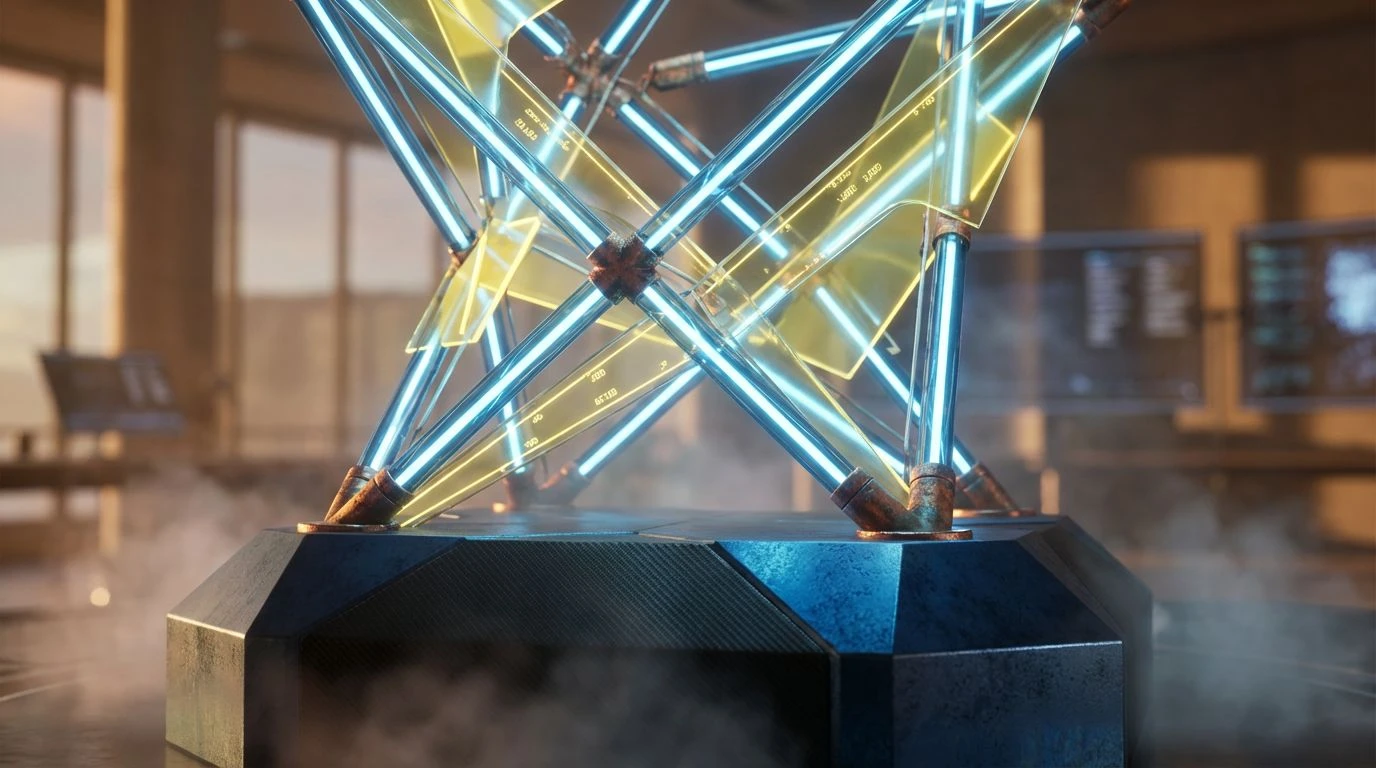
· 6 min readThe human visual cortex is distinctively wired to detect anomalies within predictable environments. For decades, the standard interface for security and development has relied on low-contrast greys, a choice originally intended to reduce eye strain and present a neutral, unobtrusive canvas. However, in the context of high-stakes monitoring and cybersecurity, neutrality can be a fatal flaw. When every data point is rendered in a wash of indistinguishable slate, the brain filters out urgent signals, treating them as background noise. To combat this cognitive drift, we must look toward the shorter, higher-energy wavelengths of the visible spectrum. By introducing sharp, radioactive indigos and piercing blues against deep, photon-absorbing voids, we engage the viewer’s attention systems directly. This approach turns a dashboard from a passive spreadsheet into an active command center, where color serves not as decoration but as a critical layer of information architecture, signaling authority, depth, and immediate situational awareness.
Syntax Sentinel 🛡️
In the realm of visual perception, the contrast between Biohazard Green and Ultraviolet Indigo creates a phenomenon known as simultaneous contrast, where each color intensifies the apparent saturation of the other. This palette utilizes Obsidian Slate not merely as a background, but as a negative space that simulates the absence of light, allowing the active colors to glow with the intensity of instrument LEDs in a darkened cockpit. The inclusion of Cerenkov Blue introduces a spectral peak that the human eye associates with high-energy emissions or electrical arcs. When applied to a dashboard, this triad of green, indigo, and blue separates data streams into distinct logical layers. The Ultraviolet Indigo suggests deep, encrypted structures, while the green indicates active, authorized processes. By anchoring these against the neutral stability of Tungsten Shield, the interface conveys a sense of impenetrability, suggesting a system that is fully operational and aggressively monitored.
Phosphor Trace 📠
This arrangement mimics the specific luminescence of early cathode-ray tube displays, yet refines the spectrum for modern high-definition screens. The dominance of Abyssal Void creates a total blackout effect, minimizing photon bleed and maximizing the signal-to-noise ratio for the foreground elements. Against this deep darkness, Filament Glow and Quantum Lavender operate as distinct spectral opposites. The pale yellow stimulates the retina's luminance channel, making it ideal for reading critical text or logs, while the lavender activates the S-cones (blue-sensitive cones), often perceived as receding or distant. This push-and-pull effect allows for the creation of perceived depth within a 2D plane. Submarine Teal acts as a stabilizing mid-tone, bridging the gap between high alertness and background monitoring. The result is an interface that feels archival yet futuristic, prioritizing long-term readability and minimizing the blue-light fatigue often associated with harsher, pure white text.
Critical Mass ☢️
By severely restricting the chromatic range, Critical Mass relies on the psychological impact of isolation. The vast majority of this scheme is composed of Event Horizon and Iron Bar Structure, creating a monotone industrial environment that feels rigid and unyielding. This desaturated foundation serves a specific biological purpose: it prevents the visual cortex from being overstimulated by irrelevant color data. Into this grey uniformity, Reactor Core Orange is introduced as a singular, inescapable variable. Evolution has trained the primate eye to detect fruit and fire against dull backgrounds; here, that instinct is repurposed for error detection and security alerts. The contrast ratio between the orange and the dark background is calibrated to trigger an immediate orienting response. This is not a palette for exploration; it is a palette for exception management, where the absence of color implies safety, and the presence of orange dictates immediate, decisive action.
Binary Fortress 🏰
This collection appeals to the classic schema of control systems, balancing the coolness of logic against the heat of critical failure. Shadow Protocol provides a dense, heavy footing, grounding the interface in a serious, utilitarian tone. The interplay between Electric Sky and Logic Blue creates a gradient of functionality; the lighter blue suggests active, flowing data or connectivity, while the darker blue implies stored, static information. This distinction helps the user mentally catalogue different types of stable operations. However, the introduction of System Error Red disrupts this cool equilibrium. Red remains the wavelength with the longest reach in the visible spectrum and the highest associations with physiological arousal. By placing this piercing red against the cool, analytical blues and neutral Silicon Wafer greys, the palette establishes a clear hierarchy of command. It communicates that the system is running coolly and efficiently, until the precise moment a threat requires the operator to break their flow.
Orbital Command 🛰️
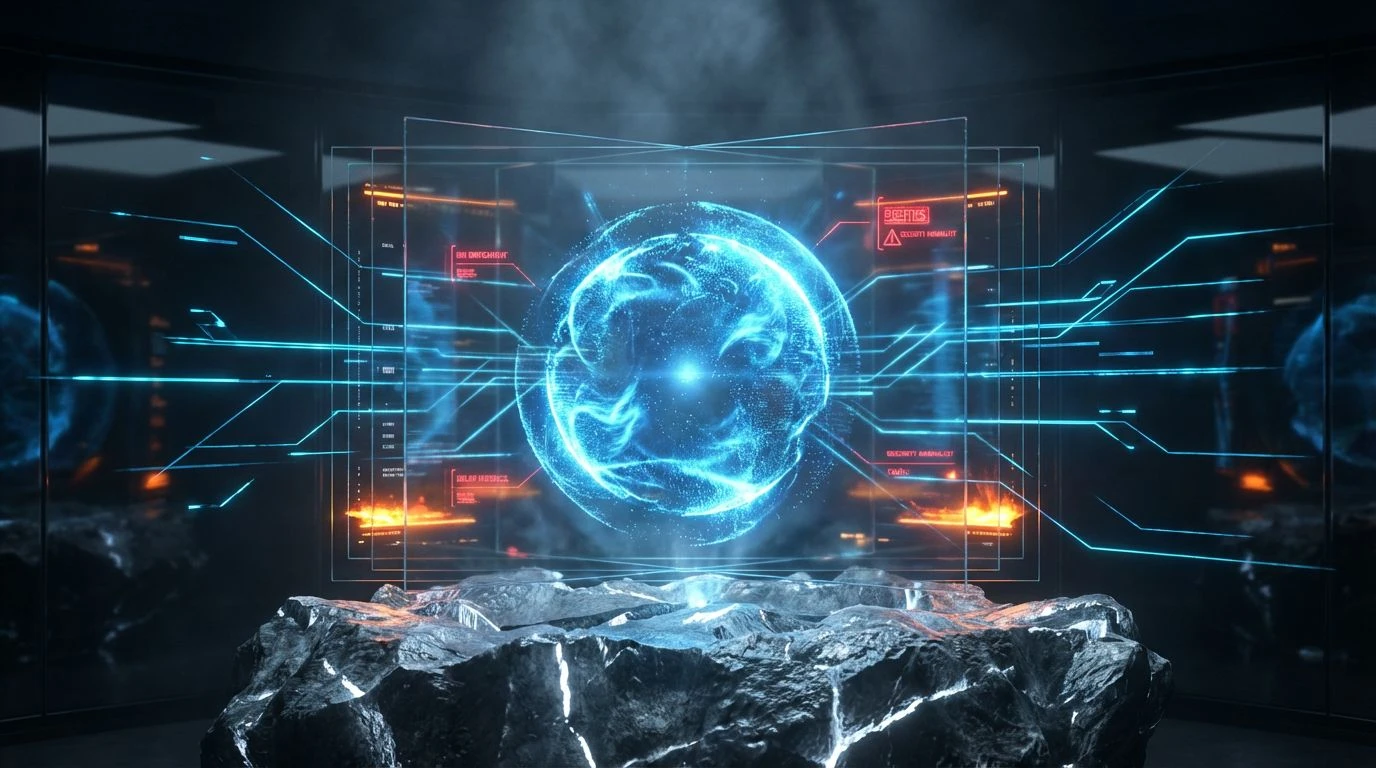
Visualizing vast datasets requires a color scheme that can represent both distance and density. Orbital Command achieves this by pairing the retreating, atmospheric qualities of Ion Drive Blue and Galactic Azure with the advancing aggression of Solar Flare orange. Blue wavelengths scatter easily, often creating a perception of haziness or depth—the 'aerial perspective' effect. This makes the blue tones excellent for visualizing background processes, network topologies, or map data that needs to sit visually behind the primary metrics. Conversely, the orange—sitting opposite blue on the color wheel—vibrates visually when placed against it. This complementary contrast maximizes legibility without requiring stark white brightness. The heavy anchor of Deep Space Grey prevents the vibrant hues from becoming gaudy, maintaining a serious, militaristic discipline. It suggests a heads-up display where situational awareness is paramount, and where data streams are as deep and infinite as the environments they monitor.
Transitioning from safe, neutral monochromatic schemes to high-stakes, high-contrast chromatic arrays fundamentally alters the user's relationship with the interface. We move beyond simple aesthetics and enter the realm of cognitive ergonomics, where the wavelength and intensity of a hue dictate the urgency of the data it represents. The shift toward radioactive indigos and piercing cyans creates a visual language of authority and precision, mimicking the biological markers of bioluminescence and warning coloration found in nature. These palettes do not merely display information; they prioritize it, guiding the foveal focus to critical variances while relegating stable metrics to the periphery. By understanding the psychological weight of these heavy spectral anchors, developers can construct environments that maintain heightened alertness without inducing fatigue, proving that in the domain of digital security, the most effective defense is often a striking, undeniable visibility.