'%3e%3cpath%20fill-rule='evenodd'%20clip-rule='evenodd'%20d='M51.1303%2019.2492C50.7278%2019.913%2050.1346%2020.4426%2049.3508%2020.838C48.5669%2021.2335%2047.6172%2021.4312%2046.5014%2021.4312C44.8208%2021.4312%2043.4367%2021.0216%2042.3492%2020.2025C41.2617%2019.3833%2040.6686%2018.2394%2040.5697%2016.7706H44.4253C44.4818%2017.3355%2044.6831%2017.7804%2045.0291%2018.1052C45.3751%2018.43%2045.8164%2018.5924%2046.3531%2018.5924C46.8192%2018.5924%2047.1864%2018.4653%2047.4547%2018.2111C47.7231%2017.9569%2047.8572%2017.618%2047.8572%2017.1943C47.8572%2016.8129%2047.7337%2016.4952%2047.4865%2016.241C47.2393%2015.9867%2046.9322%2015.7784%2046.565%2015.616C46.1978%2015.4536%2045.6893%2015.2594%2045.0397%2015.0334C44.0934%2014.7086%2043.3202%2014.3944%2042.72%2014.0907C42.1197%2013.7871%2041.6042%2013.3351%2041.1735%2012.7349C40.7427%2012.1347%2040.5273%2011.3544%2040.5273%2010.394C40.5273%209.50418%2040.7533%208.73448%2041.2053%208.08481C41.6572%207.43515%2042.2821%206.93731%2043.0801%206.5913C43.8781%206.24528%2044.7925%206.07227%2045.8235%206.07227C47.49%206.07227%2048.8141%206.46771%2049.7956%207.25861C50.7772%208.04951%2051.3315%209.13698%2051.4586%2010.5211H47.5395C47.4689%2010.0268%2047.2888%209.63483%2046.9993%209.3453C46.7097%209.05578%2046.3178%208.91102%2045.8235%208.91102C45.3998%208.91102%2045.0573%209.024%2044.7961%209.24997C44.5348%209.47594%2044.4041%209.80783%2044.4041%2010.2457C44.4041%2010.5988%2044.5207%2010.8989%2044.7537%2011.146C44.9867%2011.3932%2045.2798%2011.5944%2045.6328%2011.7498C45.9859%2011.9052%2046.4944%2012.1029%2047.1581%2012.343C48.1185%2012.6678%2048.9023%2012.9891%2049.5096%2013.3069C50.1169%2013.6246%2050.6395%2014.0872%2051.0773%2014.6945C51.5151%2015.3018%2051.734%2016.0927%2051.734%2017.0672C51.734%2017.8581%2051.5328%2018.5854%2051.1303%2019.2492ZM59.0242%206.3053V21.2829H55.4016V6.3053H59.0242ZM73.9409%206.3053V9.18642H69.8734V21.2829H66.2296V9.18642H62.2046V6.3053H73.9409ZM80.7438%209.18642V12.3218H85.8069V15.0546H80.7438V18.3806H86.4425V21.2829H77.1212V6.3053H86.4425V9.18642H80.7438ZM99.667%2016.0291V21.2829H96.0444V6.3053H101.913C103.692%206.3053%20105.048%206.74665%20105.98%207.62934C106.912%208.51204%20107.378%209.7019%20107.378%2011.199C107.378%2012.1311%20107.17%2012.9609%20106.753%2013.6882C106.337%2014.4155%20105.719%2014.9875%20104.9%2015.4042C104.08%2015.8208%20103.085%2016.0291%20101.913%2016.0291H99.667ZM103.692%2011.199C103.692%209.8855%20102.965%209.22879%20101.51%209.22879H99.667V13.1268H101.51C102.965%2013.1268%20103.692%2012.4842%20103.692%2011.199ZM120.092%2018.5501H114.478L113.546%2021.2829H109.732L115.219%206.41123H119.393L124.879%2021.2829H121.024L120.092%2018.5501ZM119.16%2015.7961L117.295%2010.2881L115.41%2015.7961H119.16ZM131.555%2018.5077H136.385V21.2829H127.933V6.3053H131.555V18.5077ZM143.337%209.18642V12.3218H148.4V15.0546H143.337V18.3806H149.035V21.2829H139.714V6.3053H149.035V9.18642H143.337ZM163.507%206.3053V9.18642H159.44V21.2829H155.796V9.18642H151.771V6.3053H163.507ZM177.449%206.3053V9.18642H173.382V21.2829H169.738V9.18642H165.713V6.3053H177.449ZM184.252%209.18642V12.3218H189.315V15.0546H184.252V18.3806H189.951V21.2829H180.629V6.3053H189.951V9.18642H184.252Z'%20fill='%23EEF0ED'/%3e%3cmask%20id='mask0_3101_7327'%20style='mask-type:alpha'%20maskUnits='userSpaceOnUse'%20x='0'%20y='0'%20width='27'%20height='28'%3e%3cpath%20d='M23.8328%200.759766H2.64808C1.18559%200.759766%200%201.94535%200%203.40785V24.5925C0%2026.055%201.18559%2027.2406%202.64808%2027.2406H23.8328C25.2952%2027.2406%2026.4808%2026.055%2026.4808%2024.5925V3.40785C26.4808%201.94535%2025.2952%200.759766%2023.8328%200.759766Z'%20fill='white'/%3e%3c/mask%3e%3cg%20mask='url(%23mask0_3101_7327)'%3e%3cpath%20d='M23.8328%200.759766H2.64808C1.18559%200.759766%200%201.94535%200%203.40785V24.5925C0%2026.055%201.18559%2027.2406%202.64808%2027.2406H23.8328C25.2952%2027.2406%2026.4808%2026.055%2026.4808%2024.5925V3.40785C26.4808%201.94535%2025.2952%200.759766%2023.8328%200.759766Z'%20fill='%23D8D8D8'/%3e%3cpath%20d='M13.2404%200.759766H0V14.0001H13.2404V0.759766Z'%20fill='%238C61FF'/%3e%3cpath%20d='M13.2404%2014H0V27.2404H13.2404V14Z'%20fill='%2336C3FE'/%3e%3cpath%20d='M26.4806%2014H13.2402V27.2404H26.4806V14Z'%20fill='%236592FE'/%3e%3cpath%20d='M26.4806%200.759766H13.2402V14.0002H26.4806V0.759766Z'%20fill='%236059F7'/%3e%3c/g%3e%3c/g%3e%3cdefs%3e%3cclipPath%20id='clip0_3101_7327'%3e%3crect%20width='190'%20height='28'%20fill='white'/%3e%3c/clipPath%3e%3c/defs%3e%3c/svg%3e)
'%3e%3cpath%20d='M23.8328%200.759521H2.64808C1.18559%200.759521%200%201.94511%200%203.40761V24.5923C0%2026.0548%201.18559%2027.2404%202.64808%2027.2404H23.8328C25.2952%2027.2404%2026.4808%2026.0548%2026.4808%2024.5923V3.40761C26.4808%201.94511%2025.2952%200.759521%2023.8328%200.759521Z'%20fill='%23D8D8D8'/%3e%3cpath%20d='M13.2404%200.759521H0V13.9999H13.2404V0.759521Z'%20fill='%238C61FF'/%3e%3cpath%20d='M13.2404%2013.9998H0V27.2402H13.2404V13.9998Z'%20fill='%2336C3FE'/%3e%3cpath%20d='M26.4809%2013.9998H13.2405V27.2402H26.4809V13.9998Z'%20fill='%236592FE'/%3e%3cpath%20d='M26.4809%200.759277H13.2405V13.9997H26.4809V0.759277Z'%20fill='%236059F7'/%3e%3c/g%3e%3c/svg%3e)
Institutional Trust via Olive Green Color Palettes
· 5 min readThere is a distinct, tangible quietude found within the halls of historic governance—a scent of polished wood, the cool touch of a brass railing, the visual rhythm of green blotting paper on a mahogany desk. Translating this atmospheric weight into the digital sphere requires a departure from the sterile blues and whites of standard corporate design. We turn instead to the sober authority of olive and the lustrous history of brass. This approach is not merely about decoration; it is about translating the sensation of permanence and reliability onto a screen. By adopting these grounded, earthy, and metallic hues, a web portal ceases to be a fleeting grouping of pixels and transforms into a digital edifice, standing with the same dignity as a stone pillar. It commands respect through restraint, offering a visual silence that allows trust to flourish naturally.
The Modernist Bureau 🏛️
There is a rebellious energy hidden within this arrangement, where the traditional weight of Antique Gold and Midnight Ink finds itself interrupted by the shocking modernity of Electric Cyan and Bubblegum Glitch. This is the visual equivalent of a contemporary art installation housed within a neoclassical rotunda. The presence of Crushed Raspberry and Deep Teal provides a sophisticated backdrop, allowing the brighter hues to act as wayfinding beacons for the user. It suggests an institution that respects its history but refuses to be trapped by it. The Slate Shadow and Dusty Heather keep the expansive negative spaces grounded, preventing the vibrancy from becoming chaotic. This selection is ideal for a forward-thinking initiative or a cultural department that needs to signal innovation while maintaining its statutory backbone.
Municipal Ledger 📓
Clean lines and functional clarity define this assortment, recalling the tactile pleasure of a well-organized filing cabinet or a fresh architectural blueprint. Moss Velvet provides the essential organic foundation—a nod to the landscape and the public ground—while Charcoal Suit anchors the text with absolute legibility and seriousness. The surprise element, Citron Highlighter, acts exactly as its namesake implies: guiding the eye instantly to critical alerts or action buttons without disrupting the overall calm. Concrete Slab and Federal Blue offer a cool, neutral middle ground, creating a breathable interface that feels efficient and unburdened. It mirrors the experience of a perfectly run administrative office where every form is filed correctly, and transparency is the only currency.
Regency Seal 📜
A sense of pageantry and procedure flows through these tones, mimicking the ribbon-wrapped scrolls and wax stamps of a bygone era. Gilded Seal and Royal Ink establish a hierarchy of supreme importance, creating headers and focal points that demand attention without shouting. The gradation of greens, from the deep Evergreen to the lighter Spring Ticket, allows for a nuanced layering of information, much like the structured tiers of government itself. Diplomatic Blue creates a bridge between the regal purple and the earthy olives, offering a cooling counterpoint that keeps the screen from feeling too warm or stifling. This grouping is perfectly suited for archival access or high-level certification portals, where the user needs to feel they are interacting with the definitive source of truth.
The Executive Chamber 💼
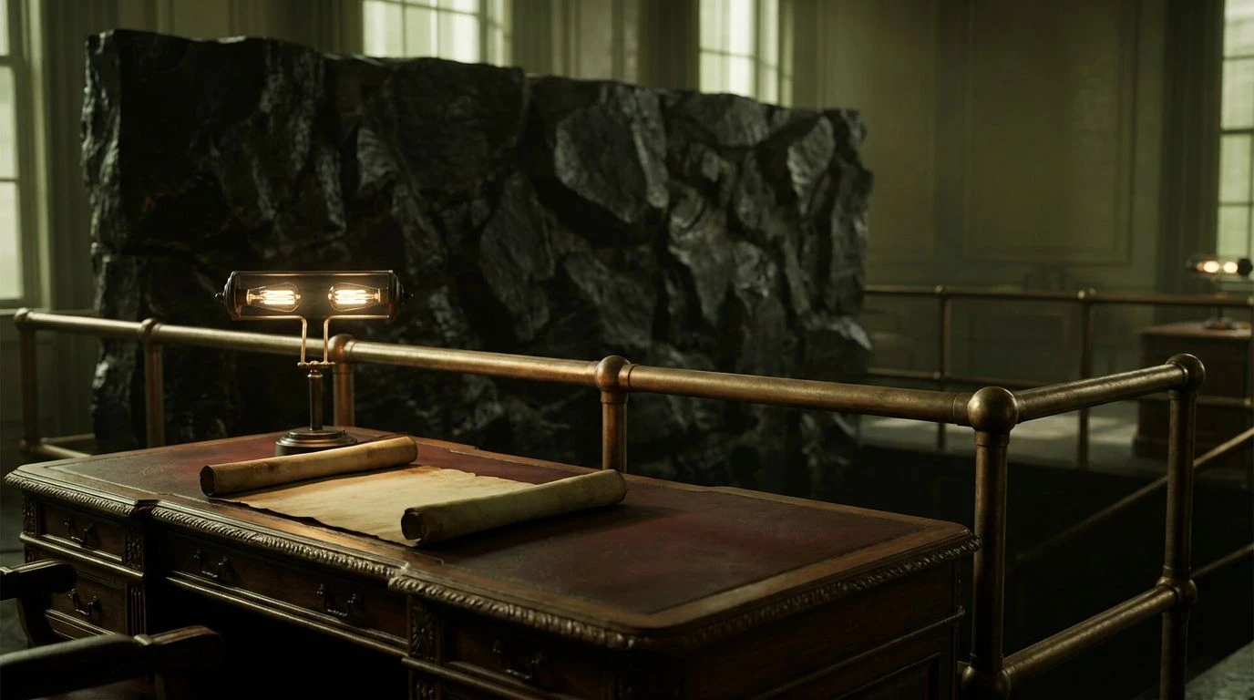
Here lies the heavy silence of distinct power. This palette eschews the frivolous for the substantial, drawing inspiration from dimly lighted libraries and the hushed tones of private council rooms. Obsidian and Steel Filament provide a high-contrast, dark mode aesthetic that feels incredibly premium, distinctly separated from the stark blacks of consumer apps. The warmth comes from Aged Bronze and Oxblood Leather, colors that simulate the patina of time and the durability of high-quality materials. Parchment acts as the illuminator, a soft light source amidst the shadows. Using this scheme for a dashboard suggests serious, uncompromising data management; it is a visual promise that the information contained within is secure, permanent, and treated with gravity.
Civic Park Blueprint 🌐
Light, air, and public infrastructure come to mind with this crisp selection. It balances the utilitarian nature of Deep Navy and Army Green with the breezy openness of Frost and Aluminum. The Acid Olive provides a verdant spark, a sign of life that cuts through the bureaucratic greys, making the navigation feel responsive and alive. Faded Rose offers a rare, soft touch—a humanizing element that softens the hard edges of the darker navy tones. This array speaks to the day-to-day utility of city services, evoking the feeling of a clean, well-maintained public park or a transit map. It is approachable and democratic, stripping away intimidation while retaining a structure that feels engineered and reliable.
The journey through these curated selections suggests that the face of institutional authority need not be rigid or predictable to command respect. From the deep, leather-bound seriousness of mahogany tones to the unexpected jolts of electric contrasts, we see that the visual language of the state can assert its presence through weight and material simulation rather than simple color coding. These schemes offer a way to anchor the user in a space that feels curated, intentional, and historically rooted, even when displayed on a glowing glass rectangle. Grounding the digital experience in the colors of the physical world—moss, gold, stone, and ink—reminds the citizen that the institution serves a tangible reality. It is a design philosophy that honors the past while building a functional, trustworthy interface for the present moment.