'%3e%3cpath%20fill-rule='evenodd'%20clip-rule='evenodd'%20d='M51.1303%2019.2492C50.7278%2019.913%2050.1346%2020.4426%2049.3508%2020.838C48.5669%2021.2335%2047.6172%2021.4312%2046.5014%2021.4312C44.8208%2021.4312%2043.4367%2021.0216%2042.3492%2020.2025C41.2617%2019.3833%2040.6686%2018.2394%2040.5697%2016.7706H44.4253C44.4818%2017.3355%2044.6831%2017.7804%2045.0291%2018.1052C45.3751%2018.43%2045.8164%2018.5924%2046.3531%2018.5924C46.8192%2018.5924%2047.1864%2018.4653%2047.4547%2018.2111C47.7231%2017.9569%2047.8572%2017.618%2047.8572%2017.1943C47.8572%2016.8129%2047.7337%2016.4952%2047.4865%2016.241C47.2393%2015.9867%2046.9322%2015.7784%2046.565%2015.616C46.1978%2015.4536%2045.6893%2015.2594%2045.0397%2015.0334C44.0934%2014.7086%2043.3202%2014.3944%2042.72%2014.0907C42.1197%2013.7871%2041.6042%2013.3351%2041.1735%2012.7349C40.7427%2012.1347%2040.5273%2011.3544%2040.5273%2010.394C40.5273%209.50418%2040.7533%208.73448%2041.2053%208.08481C41.6572%207.43515%2042.2821%206.93731%2043.0801%206.5913C43.8781%206.24528%2044.7925%206.07227%2045.8235%206.07227C47.49%206.07227%2048.8141%206.46771%2049.7956%207.25861C50.7772%208.04951%2051.3315%209.13698%2051.4586%2010.5211H47.5395C47.4689%2010.0268%2047.2888%209.63483%2046.9993%209.3453C46.7097%209.05578%2046.3178%208.91102%2045.8235%208.91102C45.3998%208.91102%2045.0573%209.024%2044.7961%209.24997C44.5348%209.47594%2044.4041%209.80783%2044.4041%2010.2457C44.4041%2010.5988%2044.5207%2010.8989%2044.7537%2011.146C44.9867%2011.3932%2045.2798%2011.5944%2045.6328%2011.7498C45.9859%2011.9052%2046.4944%2012.1029%2047.1581%2012.343C48.1185%2012.6678%2048.9023%2012.9891%2049.5096%2013.3069C50.1169%2013.6246%2050.6395%2014.0872%2051.0773%2014.6945C51.5151%2015.3018%2051.734%2016.0927%2051.734%2017.0672C51.734%2017.8581%2051.5328%2018.5854%2051.1303%2019.2492ZM59.0242%206.3053V21.2829H55.4016V6.3053H59.0242ZM73.9409%206.3053V9.18642H69.8734V21.2829H66.2296V9.18642H62.2046V6.3053H73.9409ZM80.7438%209.18642V12.3218H85.8069V15.0546H80.7438V18.3806H86.4425V21.2829H77.1212V6.3053H86.4425V9.18642H80.7438ZM99.667%2016.0291V21.2829H96.0444V6.3053H101.913C103.692%206.3053%20105.048%206.74665%20105.98%207.62934C106.912%208.51204%20107.378%209.7019%20107.378%2011.199C107.378%2012.1311%20107.17%2012.9609%20106.753%2013.6882C106.337%2014.4155%20105.719%2014.9875%20104.9%2015.4042C104.08%2015.8208%20103.085%2016.0291%20101.913%2016.0291H99.667ZM103.692%2011.199C103.692%209.8855%20102.965%209.22879%20101.51%209.22879H99.667V13.1268H101.51C102.965%2013.1268%20103.692%2012.4842%20103.692%2011.199ZM120.092%2018.5501H114.478L113.546%2021.2829H109.732L115.219%206.41123H119.393L124.879%2021.2829H121.024L120.092%2018.5501ZM119.16%2015.7961L117.295%2010.2881L115.41%2015.7961H119.16ZM131.555%2018.5077H136.385V21.2829H127.933V6.3053H131.555V18.5077ZM143.337%209.18642V12.3218H148.4V15.0546H143.337V18.3806H149.035V21.2829H139.714V6.3053H149.035V9.18642H143.337ZM163.507%206.3053V9.18642H159.44V21.2829H155.796V9.18642H151.771V6.3053H163.507ZM177.449%206.3053V9.18642H173.382V21.2829H169.738V9.18642H165.713V6.3053H177.449ZM184.252%209.18642V12.3218H189.315V15.0546H184.252V18.3806H189.951V21.2829H180.629V6.3053H189.951V9.18642H184.252Z'%20fill='%23EEF0ED'/%3e%3cmask%20id='mask0_3101_7327'%20style='mask-type:alpha'%20maskUnits='userSpaceOnUse'%20x='0'%20y='0'%20width='27'%20height='28'%3e%3cpath%20d='M23.8328%200.759766H2.64808C1.18559%200.759766%200%201.94535%200%203.40785V24.5925C0%2026.055%201.18559%2027.2406%202.64808%2027.2406H23.8328C25.2952%2027.2406%2026.4808%2026.055%2026.4808%2024.5925V3.40785C26.4808%201.94535%2025.2952%200.759766%2023.8328%200.759766Z'%20fill='white'/%3e%3c/mask%3e%3cg%20mask='url(%23mask0_3101_7327)'%3e%3cpath%20d='M23.8328%200.759766H2.64808C1.18559%200.759766%200%201.94535%200%203.40785V24.5925C0%2026.055%201.18559%2027.2406%202.64808%2027.2406H23.8328C25.2952%2027.2406%2026.4808%2026.055%2026.4808%2024.5925V3.40785C26.4808%201.94535%2025.2952%200.759766%2023.8328%200.759766Z'%20fill='%23D8D8D8'/%3e%3cpath%20d='M13.2404%200.759766H0V14.0001H13.2404V0.759766Z'%20fill='%238C61FF'/%3e%3cpath%20d='M13.2404%2014H0V27.2404H13.2404V14Z'%20fill='%2336C3FE'/%3e%3cpath%20d='M26.4806%2014H13.2402V27.2404H26.4806V14Z'%20fill='%236592FE'/%3e%3cpath%20d='M26.4806%200.759766H13.2402V14.0002H26.4806V0.759766Z'%20fill='%236059F7'/%3e%3c/g%3e%3c/g%3e%3cdefs%3e%3cclipPath%20id='clip0_3101_7327'%3e%3crect%20width='190'%20height='28'%20fill='white'/%3e%3c/clipPath%3e%3c/defs%3e%3c/svg%3e)
'%3e%3cpath%20d='M23.8328%200.759521H2.64808C1.18559%200.759521%200%201.94511%200%203.40761V24.5923C0%2026.0548%201.18559%2027.2404%202.64808%2027.2404H23.8328C25.2952%2027.2404%2026.4808%2026.0548%2026.4808%2024.5923V3.40761C26.4808%201.94511%2025.2952%200.759521%2023.8328%200.759521Z'%20fill='%23D8D8D8'/%3e%3cpath%20d='M13.2404%200.759521H0V13.9999H13.2404V0.759521Z'%20fill='%238C61FF'/%3e%3cpath%20d='M13.2404%2013.9998H0V27.2402H13.2404V13.9998Z'%20fill='%2336C3FE'/%3e%3cpath%20d='M26.4809%2013.9998H13.2405V27.2402H26.4809V13.9998Z'%20fill='%236592FE'/%3e%3cpath%20d='M26.4809%200.759277H13.2405V13.9997H26.4809V0.759277Z'%20fill='%236059F7'/%3e%3c/g%3e%3c/svg%3e)
From Pale Yellow to Vivid Orange: A Brightness Shift in Marketing Palettes
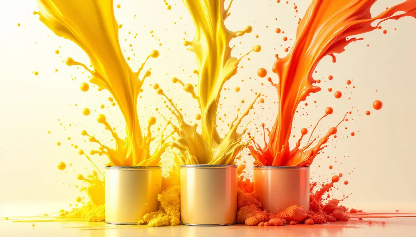
Marketing palettes are shifting! From pale yellows to vivid oranges, discover how color choices reflect cultural trends and influence brand perception.
· 3 min readInterior Design's Emerging Triads: Minimalist Edition
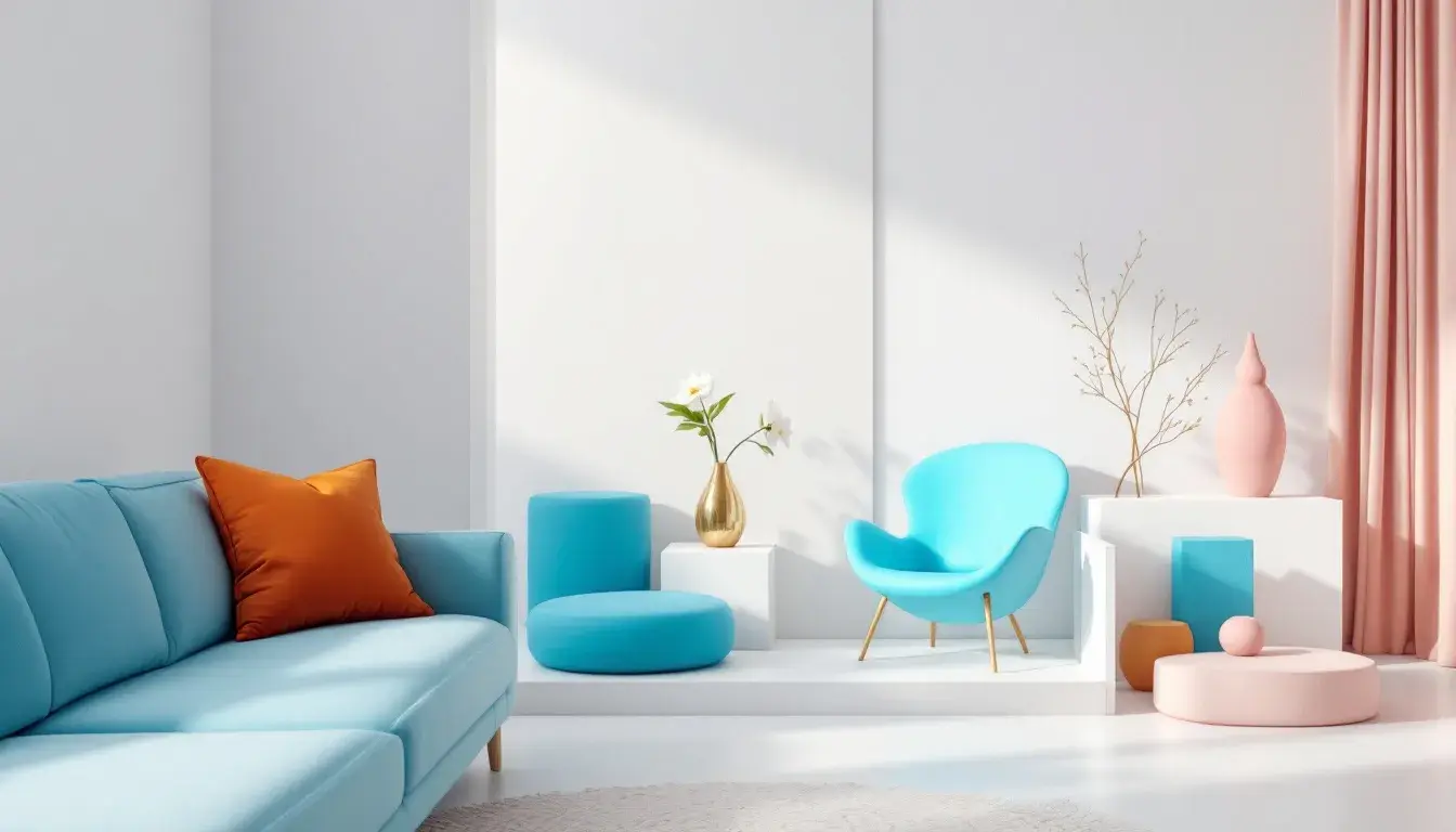
Unlock serene minimalist interiors! Explore emerging color triads & palettes for calm, elegant home design. Find your perfect tranquil space.
· 3 min readProjected Palette Lifespan: Which Occasion Colors Dominate Design Projects?
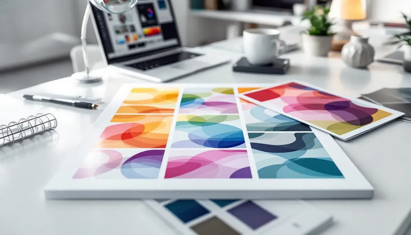
Projecting color palette longevity in home decor. Explore enduring design choices! Brand impact, user engagement, and lasting aesthetic appeal.
· 5 min readThe 'Analogous' Advantage: Cool Color Scheme Dominance in September

Find September home decor inspiration. Discover cool color schemes like Analogous, Star Citizen, Modern Mix, Earthy Blue and more!
· 3 min readThe Bright & The Bold: A Look into High-Contrast Industries

Uncover high-contrast color palettes for confident home decor & branding. Explore modern designs for finance, tech, & creative industries.
· 3 min readThe Tech Color Wheel: Electric Blue's Journey

Explore captivating color palettes inspired by Electric Blue driving innovation. Envision future tech through 'Cosmic Dawn,' 'Space Hub' & more!
· 3 min readTravel Industry Color Preferences: A Seasonal Breakdown
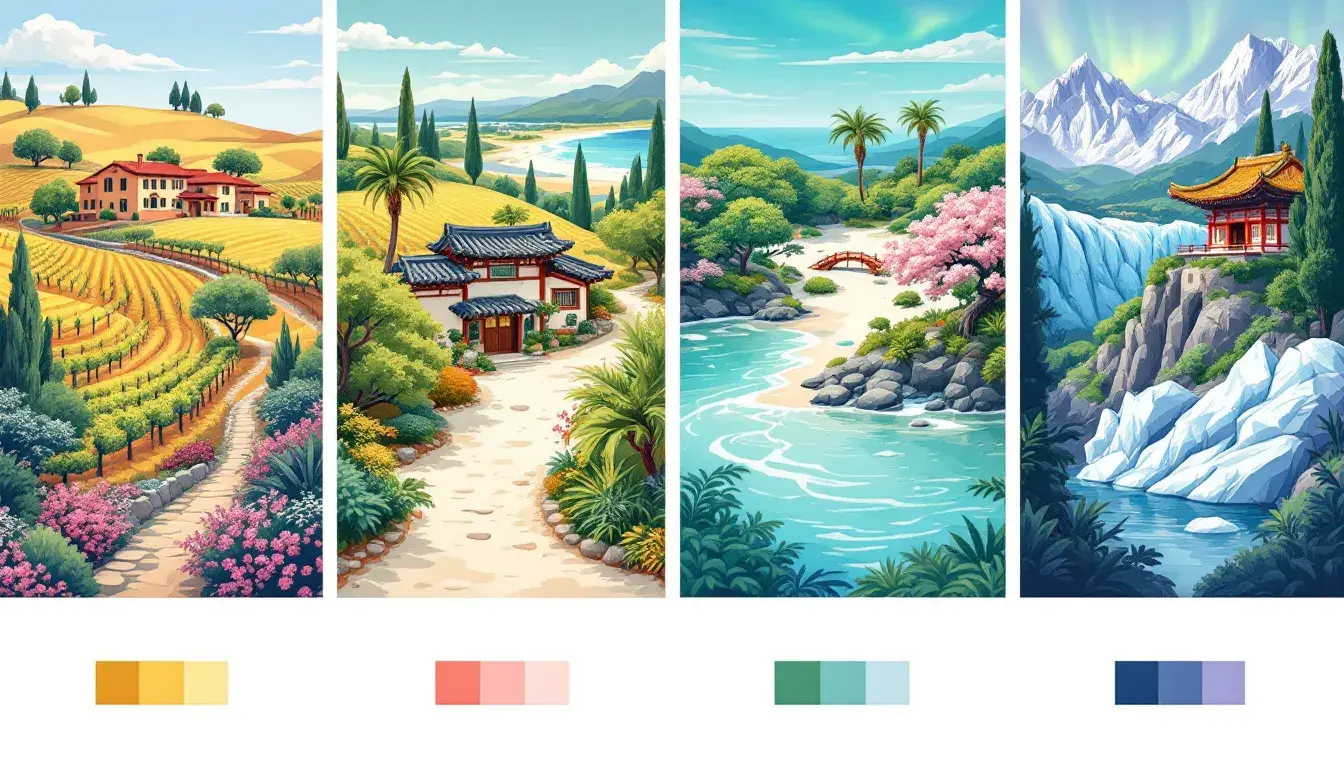
Evoke wanderlust! Explore travel color palettes—Elegant, Coastal, Korea & Anchorage. Inspire adventure through strategic color design.
· 3 min readAutumn Trends: Earthy Color vs Tech Contrast Styles

Explore autumn home decor trends: earthy palettes & tech contrasts. Discover warm, innovative color schemes for a balanced, stylish space.
· 5 min readBeyond Red and Blue: Exploring Dominant Color Combinations in 'Technology' Palettes

Uncommon tech-inspired color palettes for home decor. Move past predictable blues & reds; discover vibrant, elegant design choices.
· 3 min readCoastal Harmony
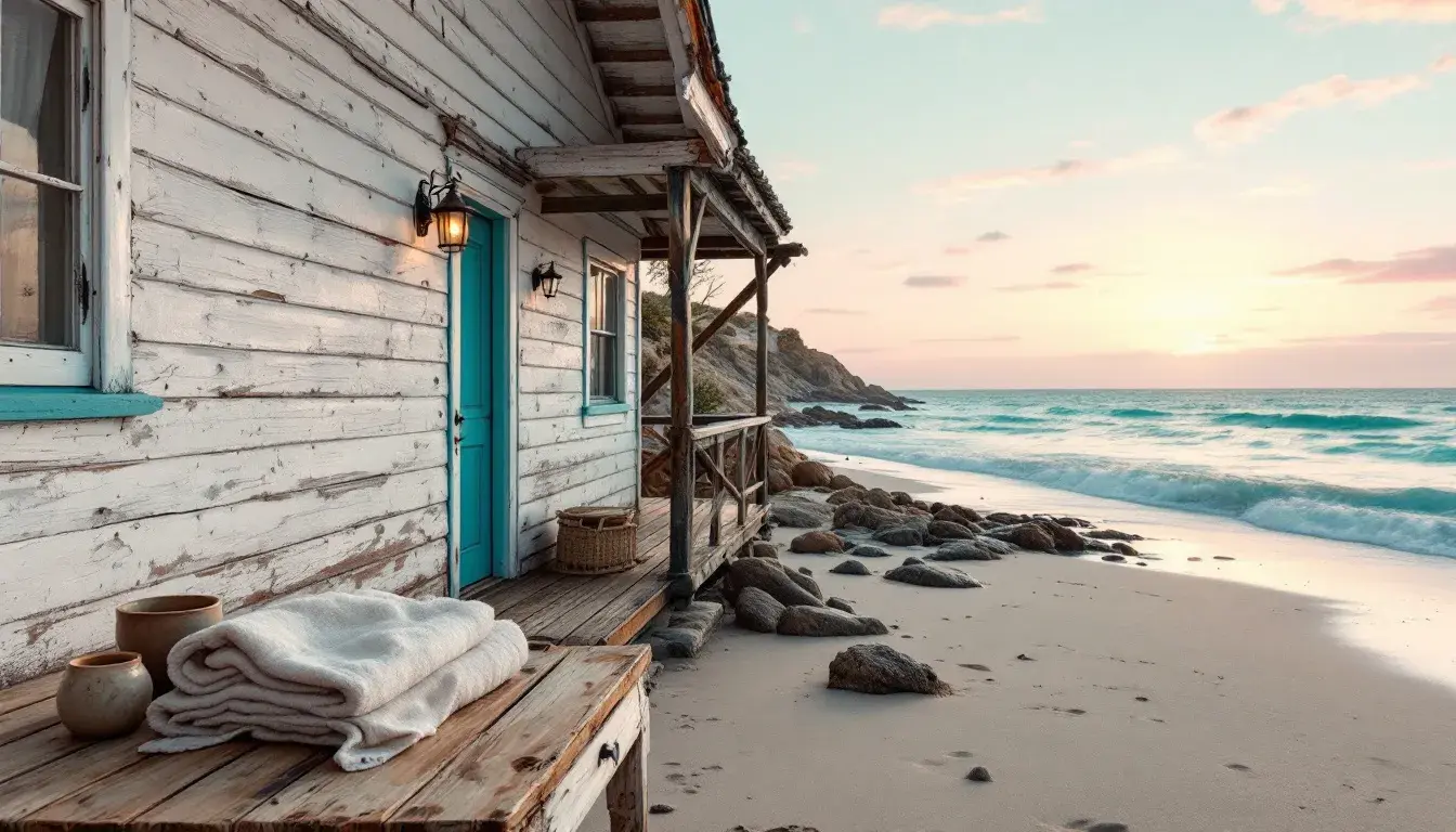
Transform your home with coastal color palettes. Discover how to evoke the ocean's calm with expert color stories and create your personal sanctuary.
· 3 min readDominant Industry Colors of September 2025

Predicting industry colors for Sept 2025. Explore dominant palettes in tech, finance, & marketing, revealing the mood & innovation they signal.
· 3 min readFashion Forward? Analyzing Color Trends Accross Celebrations Events

Unpack color trends in event fashion! See how palettes express joy, values, and cultural shifts. Find your perfect sartorial celebration statement.
· 3 min readSeasonal Color Shifts: From Cheerful Spring to Cozy Autumn

Invigorate your home! Explore spring's vibrant color shifts & design ideas for renewal. Find your ideal palette for fresh starts & cheerful spaces.
· 2 min readThe Coolest Summer Palettes: Ranking Trends by 'Coolness'

Elevate your summer home with cool color palettes! Discover the top trends for a refreshing, stylish, and relaxing space this season.
· 2 min readThe Psychology of Green: Palettes Designed for Relaxation

Unwind with green-inspired home decor! Explore palettes designed to foster relaxation and enhance well-being. Create a serene sanctuary today.
· 3 min readBeyond the Rainbow: Decoding the Most Coveted Color Scheme

Uncover interior design's best color schemes. Craft emotional spaces with expert-curated palettes for serene, harmonious and balanced homes.
· 5 min readBeyond Wellness: The Untapped Potential of Olive Green Palettes in Tech

Uncover the revitalizing potential of olive green in tech design! Explore palettes that boost focus, spark innovation, & foster digital well-being.
· 3 min readCharcoal Chic: The Dominance of #121212 in Modern Branding
Learn why deep charcoal (#121212) reigns in modern branding. Explore versatile palettes and discover its enduring sophistication and elegance.
· 3 min readFrom January to August: Tracking Color Palette Evolution Through the Year

Explore seasonal color trends in design! Learn how palettes evolve from winter's chill to August's warmth, influencing home decor choices.
· 2 min readInnovative Industries: Which Color Schemes are Most Prominent in Finance and Technology?

Explore how color schemes shape perception in finance and tech! From trust-building blues to innovative contrasts, see aesthetics in action.
· 5 min read