Nautical Color Palettes for Modern Web Design and Coding
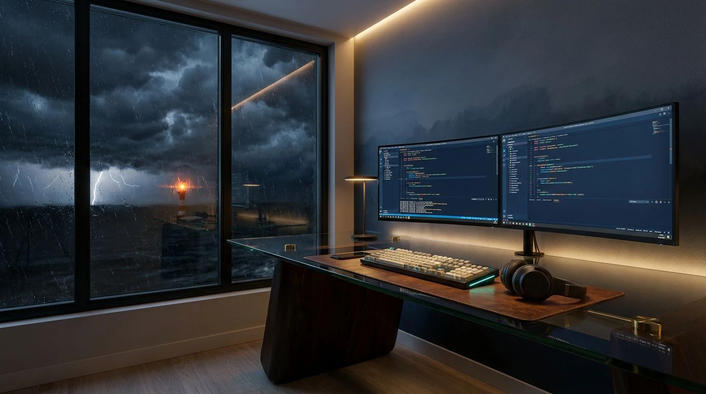
· 6 min readThere is a particular kind of fatigue that comes from staring at the abstract void of a modern text editor. The infinite scroll of neon syntax suspended in a pitch-black abyss feels entirely detached from the physical world. It makes sense, then, to seek out something more grounded. Imagine swapping the sterile glow of standard dark mode for the sturdy, weathered desk of an old sea captain. By bringing rugged, nautical tones into the coding environment, the act of writing software transforms into something akin to navigating turbulent waters. Deep navy blues and rich earthy browns offer a visual anchor, providing a sense of quiet authority and trust. When the screen stops looking like a sci-fi interface and starts feeling like well-worn canvas and polished brass, the abstract logic of web development suddenly feels a bit more human.
Charted Waters 🧭
Charted Waters takes the visual chaos of an active codebase and anchors it in the familiarity of an old maritime map. The transition from the deep, authoritative Midnight Trench to the bright, almost warning-like flash of Navigational Beacon provides the perfect contrast for syntax highlighting. Variables and functions stand out not as random neon distractions, but as vital coordinates against the muted, steadfast background of Overcast Horizon and Worn Parchment. The richer earthy tones, like Mahogany Hull and Weathered Leather, serve to warm up the interface, perhaps framing the sidebars or terminal windows, giving the impression of a wooden ship holding strong against the ocean. It is a palette for the developer who sees their work as a craft requiring patience and an eye on the shifting tides of user behavior, offering visual stability when debugging feels like steering through a storm.
Port Authority ⚓
There is a distinctly industrial romance to Port Authority. It rejects the overly sanitized aesthetic of contemporary Silicon Valley in favor of something that feels like it has actually seen a day of hard labor. The oppressive weight of Pitch Tar forms a formidable backdrop for the text editor, allowing the crisp, reliable Admiral Navy to structure the workspace with quiet confidence. Crucially, the inclusion of Distress Flare adds a necessary punch of urgency, ideal for flagging syntax errors or critical terminal warnings without relying on the typical, garish error-reds of modern compilers. Polished Brass steps in to handle strings or key values, catching the eye just as a well-kept instrument catches the sun. This color scheme turns the act of writing code into an exercise in rugged discipline, grounding the often abstract frustration of software architecture in the tactile, dependable reality of a busy shipyard.
Celestial Navigation 🔭
Celestial Navigation looks upwards, trading the heavy woods of the ship for the sharp, calculating instruments used to map the stars. The foundational Abyssal Depth provides a near-black canvas, vast and unyielding, demanding a level of focus that lighter themes simply cannot command. Against this endless dark, Meridian Blue and True North trace the lines of logic in the code, acting as the mathematical constants that guide a vessel through open water. The unexpected appearance of Sargasso Green serves beautifully for comments and annotations, a reminder of organic life amid the strict geometry of the application logic. Meanwhile, Sea Salt acts as the primary text color, crisp and legible, cutting through the visual noise like wind over the bow. It is an environment built for the pragmatic programmer, someone who values precision and relies on trusted, historical methods to navigate the modern complexities of their server infrastructure.
Mariner's Logbook 📖
A good logbook is a record of survival, a daily accounting of triumphs and minor disasters, which is exactly what a commit history happens to be. Mariner's Logbook captures this documentary spirit. The background, bathed in the impenetrable Squid Ink, feels permanent and archival. Code components are brought to life through Phosphorescent Wake and Royal Ensign, striking against the dark like bioluminescence disturbed by a passing hull. The softer, more muted tones of Storm Front and Squall Gray are perfectly suited for the peripheral elements of the screen, keeping the file tree and status bars present but out of the immediate line of sight. When an error or deprecated function needs attention, Sunbaked Brick provides a weary but firm warning. Working within this palette feels less like typing commands into a machine and more like recording hard-won wisdom, turning the daily grind of web development into a satisfying, enduring narrative.
The Captain's Quarters 🕯️
Stepping away from the stark contrasts of the open deck, The Captain's Quarters offers a surprisingly warm, introspective space for writing software. The deep, brooding Murky Fathom sets a quiet, contemplative stage, far removed from the hyperactive glare of most modern interfaces. It is a space designed for deep architectural thought, where the rich, historical warmth of Varnished Oak and Sunken Driftwood frames the workspace with a sense of quiet authority. This is not an environment for frantic hotfixing, but rather for careful, deliberate planning. The gentle relief of Ocean Swell and Morning Watch guides the eye through complex logical structures without causing fatigue. The sudden, soft warmth of Faded Coral serves as an elegant highlight for keywords or variables, akin to the last light of sunset catching the edge of a map. It creates an atmosphere of intellectual safety, where the developer is firmly in command, armed with experience and a well-considered strategy.
The visual space we inhabit while building digital tools quietly shapes the way we think about the work itself. By trading the synthetic, weightless aesthetics of typical software environments for the grounded, historical grit of a maritime journey, developers can find a surprising amount of focus. Deep ocean blues and weathered wood tones offer more than just a stylistic preference, they provide a psychological anchor in an otherwise abstract profession. These color arrangements remind us that while the medium is made of pixels and syntax, the act of building requires the same patience, discipline, and rugged resolve as steering a ship across open water. The result is a workspace that feels less like a fleeting digital trend and much more like a trusted, enduring tool.