Calming Office Color Palettes: The Power of Muted Green
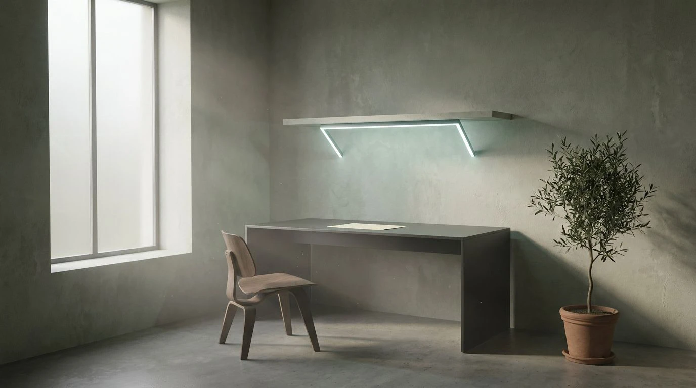
· 5 min readWe spend a vast majority of our waking hours racing against artificial deadlines, fueled by the harsh, anxiety-inducing lighting of modern office spaces. But then I painted my workspace a very specific shade of cool-toned grey-green, a color so muted and removed from the relentless demand for productivity that it felt like an act of quiet rebellion. It turns out that a simple shift in environment can completely rewrite your relationship with time. Staring at this pale, ghostly wash on the walls, my desperate need to reply to emails within three minutes simply vanished. The room took on an ethereal melancholy, feeling less like a place to conquer the inbox and more like a waiting room for a gentle, cinematic purgatory. Color operates on us in ways we rarely acknowledge, stripping away our manufactured urgency and replacing it with a profound, unapologetic stillness.
The Commuter's Pause 🏢
Staring at this collection of cool, industrial tones is akin to looking out of a train window on a damp Tuesday morning. The relationship between Deep Slate Water and Rain-Washed Concrete brings an immediate, physical sensation of stepping away from the chaotic noise of city life. This is the visual equivalent of noise-canceling headphones. If you place Faded Brick against Overcast Stone, you create a space that actively discourages panic, substituting the adrenaline rush of approaching deadlines with a quiet, almost romantic detachment. The addition of Frost and Midnight Asphalt frames the room, giving it a structured yet remarkably indifferent atmosphere. It feels like stepping into a brutalist library where whispering is not just requested but naturally compelled by the building itself, asking you to slow down and accept the passing of the hours without fighting them.
Morning Fog and Filter Coffee ☕
There is a peculiar comfort found in things that are proudly unexciting, and this palette champions the mundane with a quiet confidence. Winter Fjord serves as the visual weight here, sharing a close kinship with our beloved ghostly grey-green, pulling the temperature of the room down to a gentle chill. Paired with Damp Wool and Bleached Paper, it creates an environment that feels perpetually suspended in the early hours of dawn, long before the phone starts ringing. The heavier additions of Spilled Espresso and Cast Iron provide just enough gravity to keep the space from floating away completely. When applied to a workspace, these tones actively dismantle the modern compulsion for constant action. You look at these colors and realize that whatever minor crisis is happening on your monitor can probably wait until tomorrow. It is a masterclass in lowering expectations and finding peace in the resulting void.
The Fluorescent Disconnect 🚆
At first glance, the sharp intrusion of Warning Sign Orange and Screen Glow might seem completely at odds with the concept of slowing down. Yet, when placed against the vast emptiness of Halogen Glare and Scuffed Steel, these bright interruptions mimic the fleeting distractions of a busy life viewed through a thick pane of glass. The space becomes a diorama of a stressful world that you are no longer obligated to participate in. Shadowed Concrete and Ink Void stretch out like an endless, quiet evening, swallowing the louder colors whole. This palette captures the exact feeling of sitting alone in a sterile, brightly lit corporate lobby after everyone else has gone home. The sudden lack of human chatter turns the harsh environment into something strangely poetic and deeply isolating. The urgency does not disappear entirely; it just belongs to someone else, somewhere far away, leaving you perfectly undisturbed in the quiet.
A Measured Withdrawal 🌫️
To truly abandon the frantic pace of modern work, sometimes you must strip away all visual noise until almost nothing remains. This arrangement does exactly that, offering a brutally minimal landscape that refuses to entertain you. Aged Plaster and Cold Ash form a pale, indifferent backdrop that feels entirely removed from the concept of time. There is no joy here, but there is no stress either, just a flat, unapologetic neutrality. Introducing Blank Canvas and Graphite Dust to the equation turns the room into a sensory deprivation tank. It is an aesthetic that actively punishes frantic energy, rewarding only slow, deliberate movements. When your surroundings stubbornly refuse to stimulate your senses, your brain eventually gives up the charade of being busy. You find yourself staring at the wall, realizing that the most productive thing you can do is absolutely nothing at all, wrapped up in the safety of complete dullness.
The Archive Room 🪑
Moving away from stark concrete, this selection leans into the heavy, slow-moving atmosphere of an abandoned records department. Oxidized Copper carries the same cool, dusty melancholy as our original grey-green muse, while Yellowed Page and Faint Sunlight introduce a sickly, fading warmth that suggests years of neglect. This is not the bright, optimistic yellow of a startup office; it is the color of a memo from a decade ago, forgotten in a drawer. Old Mahogany and Dried Rose add a touch of faded grandeur, forcing the occupant to recognize that all immediate concerns will eventually become history. Sitting in a room wrapped in these tones makes the idea of rushing feel entirely foolish. The arrangement works like a heavy blanket, weighing down your impulses and slowing your heartbeat to match the sluggish, geological pace of an institution that has long since forgotten why it was built in the first place.
Replacing the aggressive primary colors of contemporary ambition with these muted, indifferent tones is a strangely effective form of self-preservation. It is remarkable how quickly the terrifying illusion of constant emergency collapses when your physical surroundings simply refuse to participate in the panic. Whether through the cold detachment of industrial greys or the dusty decay of forgotten archival shades, stepping into these spaces allows us to reclaim our time. The world outside the window might still be moving at a breakneck pace, but within these carefully painted walls, the clock has comfortably stopped. We are left with a quiet, necessary emptiness, proving that the best defense against a demanding world is sometimes just turning down the visual volume.