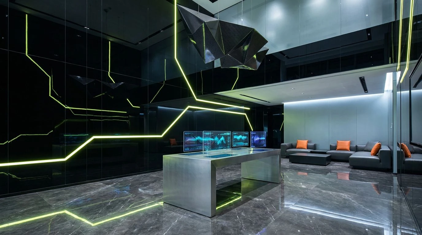
Electric Lime Color Palettes for Luxury Finance Design
· 7 min readFor decades, the visual language of high-net-worth management has been a study in defensive boredom. Walk into any legacy wealth consultancy and you are immediately accosted by navy blues so deep they mimic sleep, punctuated only by the occasional sad mahogany accent. The message was always clear: your money is safe because we are far too unimaginative to lose it. Yet a sudden aesthetic rebellion is rewriting the rules of luxury finance. A new guard is discarding the dusty gentleman's club palette, opting instead for stark, precision-cut greys sharply interrupted by the violent, unavoidable shock of electric lime. Accompanied by flashes of unapologetic turquoise, this visual vocabulary strips away the pretense of quiet wealth. It replaces the old guard's snoozy discretion with a high-wire act of algorithmic speed and energetic playfulness. After all, if the modern fortune is built on disruptive technology and split-second crypto trades, why should the interface looking after it pretend we are still trading bonds over claret?
Yield & Volt ⚡
The old aesthetic regime of private banking relied on muted tones to whisper rather than shout, but Yield & Volt entirely dispenses with indoor voices. Here, the foundational stability of Graphite Slate and Boardroom Ash creates a cold, calculating stage. It is an environment built for pure mathematical precision, stripped of emotional excess. Then, Electric Lime cuts through the gloom like a laser in a server room. It is a wildly jarring addition that demands immediate attention, dragging the eye directly to the bottom line with unapologetic urgency. Accompanied by the frosty, hyperactive rush of Glacial Teal, the visual experience shifts from conservative wealth hoarding to aggressive, forward-looking accumulation. This is not the colour scheme of a quiet trust fund slowly earning two percent a year. It is the visual equivalent of a high-frequency trading algorithm executing a thousand transactions a second. The juxtaposition of dour greys and blistering neons perfectly captures the modern tension between cold financial calculation and the sheer, intoxicating adrenaline of sudden profit.
Algorithmic Chill 🧊
To understand Algorithmic Chill is to accept that the romance has finally been drained from the stock market, replaced by something much faster and entirely machine-driven. Concrete Ledger and Steel Audit set a brutally minimalist tone, forming an architectural base that feels as sterile and unforgiving as a data centre at midnight. There is zero warmth here, and that is precisely the point. The absence of traditional comfort makes the sudden injection of Neobank Cyan feel all the more striking. This energetic, playful splash of colour acts as a visual caffeine hit, dragging the austere greys into the twenty-first century. It suggests a financial interface where moving millions requires nothing more than a casual swipe on a touchscreen. The deep punch of Ultraviolet Dividends adds a final layer of eccentric luxury, proving that institutional wealth management does not have to dress in a three-piece suit to command respect. It is a ruthlessly modern aesthetic, trading the illusion of heritage for the undeniable reality of speed, where your portfolio is managed by code rather than a man named Charles.
Rogue Trader Neon 📉
Traditional finance dictates that serious money should never look like it is having fun. Rogue Trader Neon shatters that stuffy convention with gleeful vandalism. We begin with a thoroughly sensible bedrock of Vault Grey and Nickel, a nod to the serious, uncompromising world of international capital. Yet, this sensible foundation is instantly crashed by a party of hyperactive accents that belong more in a Tokyo arcade than a Swiss bank. Liquid Turquoise brings that signature shot of energetic playfulness, turning risk assessment into a wildly colourful game. It is joined by Violet Futures and a thoroughly irresponsible Bubblegum Deficit, colours that thumb their noses at old-world austerity. The resulting atmosphere is delightfully unhinged yet totally calculated. It speaks to a new generation of wealth creators who made their fortunes in tech startups or decentralised finance and refuse to park their millions in an institution that looks like a funeral parlour. This visual approach takes the severe, mathematical precision of modern economics and dresses it in fluorescent streetwear, proving that financial dominance and a sense of humour are not mutually exclusive.
Fiat Flash 💸
There is an aggressive confidence baked into Fiat Flash that makes standard corporate branding look entirely spineless by comparison. The heavy lifting is done by Carbon Portfolio and Obsidian Reserve, establishing an atmosphere of weighty, undeniable authority. It feels expensive, heavy, and deliberately intimidating. But rather than relying on gold or brass to signal its luxury, this collection opts for a brilliant, synthetic shock to the system. Flash Crash Cyan arrives with the buzzing, erratic energy of a live ticker tape, bringing a frantic, playful edge to the otherwise sombre environment. Tangerine Asset acts as a secondary alarm bell, completely disregarding the unwritten rule that banking interfaces should soothe the client. Instead, these colours agitate and excite. They frame wealth management not as a passive, sleepy activity, but as a thrilling, high-stakes sport. The interplay between the dark, crushing greys and the neon highlights creates a narrative of extreme risk and extreme reward. It tells the viewer that while the institution handling their money is grounded in serious mathematics, they are not afraid to push the throttle wide open.
High Net Worth Hysteria 🚀
High Net Worth Hysteria operates on a frequency that is simultaneously familiar and deeply unsettling. We are initially greeted by Old Money Brass, a muddy, jaundiced nod to the gilded history of private banking. It is the colour of tarnished plaques and old coins. But that historical comfort is violently hijacked by Acidic Return, a radioactive lime that sears the retinas and demands absolute focus. This is where the energetic playfulness turns slightly manic, transforming a standard financial dashboard into a neon-drenched command centre. Hyperlink Blue acts as the technological anchor, a sharp, saturated primary that reminds us this entire operation is running on cloud servers and fibre-optic cables. Grounded barely by Charcoal Veto, the visual volume remains cranked to the absolute maximum. It is a wildly disjointed collection of tones that perfectly captures the absurdity of modern wealth, where digital fortunes are minted overnight and traditional financial models are routinely flipped upside down. The stark contrast between the swampy gold and the blistering lime is a middle finger to quiet luxury, declaring that the new money has arrived and it refuses to turn the brightness down.
The visual overhaul of high-tier wealth management is long overdue. By abandoning the tired, muted tones of historical privilege, these hyper-modern combinations prove that financial authority does not require visual sedation. The stark, uncompromising greys offer all the mathematical seriousness an investor could ever want, laying a foundation of absolute precision. Yet it is the unapologetic intrusion of radioactive limes and erratic turquoises that truly defines this new era. These violently cheerful accents refuse to let the eye rest, injecting a much-needed shot of adrenaline and energetic playfulness into the dry world of asset management. They reframe the act of growing a fortune not as a tedious chore, but as a thrilling, fast-paced game of digital strategy. Ultimately, this aesthetic rebellion reminds us that modern wealth is built on disruption, speed, and bold moves. If the financial strategies of tomorrow are daring and unconventional, the interfaces we use to track them should be nothing less than electrifying.