Optimizing Workspaces with High-Contrast Color Palettes
· 5 min readHuman vision evolved to detect sharp boundaries to navigate complex environments rapidly. When we apply stark, high-contrast anchors like black, white, and neutral grey to a workspace, we optimize cognitive processing and reduce visual fatigue. But starkness alone can feel sterile to the mammalian brain. By introducing the warming wavelengths of harvested gold and the sharp distinctiveness of primary colors, we trigger a psychological shift toward optimism and sustained energy. This visual strategy maps the precise logic of a chessboard onto the human need for biological warmth, turning a home office into an engine of focused, cheerful productivity based on the predictable physics of light and perception.
Strategic Hearth ♟️
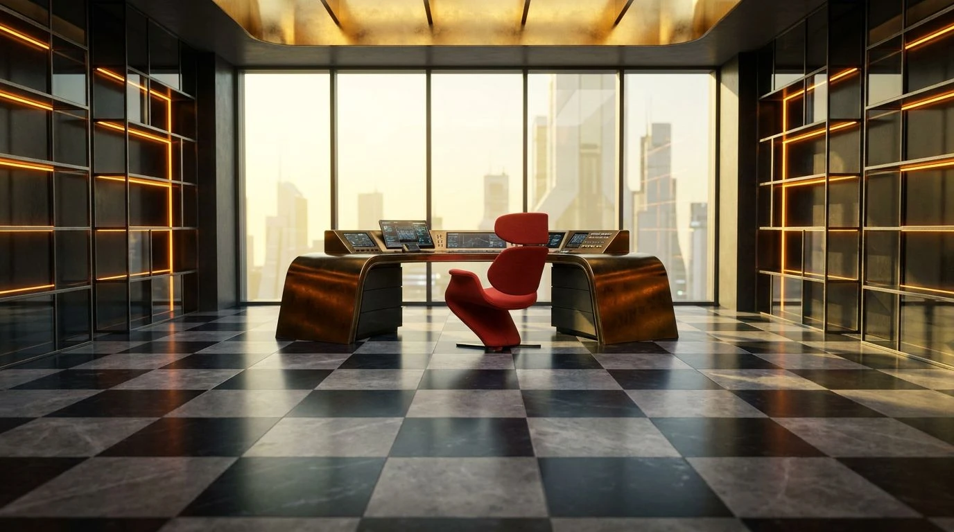
To understand the perceptual weight of this selection, we must look at how the eye processes stark divides. The sharp boundaries created by Obsidian and Glacier White provide absolute visual clarity, mimicking the strict geometry of a structured game board. This reduces the cognitive load required to parse a room. Against this highly ordered background, Oxidized Crimson acts as a primary stimulant, drawing the eye precisely where attention is required without overwhelming the visual field. Lichen and Graphite operate as intermediate wavelengths, softening the transition between absolute light and shadow. In a home office, this specific distribution of light and pigment anchors the mind, promoting intense concentration while the red element supplies a necessary pulse of energetic warmth, translating raw contrast into a highly functional atmosphere.
Equinox Gambit 🌾
This spectrum demonstrates how varied wavelengths can modify our perception of an enclosed space. Charcoal serves as the necessary dark anchor, providing depth and spatial orientation, while Solar Flare mimics the intense radiation of midday light on agricultural fields. This gold tone triggers biological cues associated with daylight and wakefulness, making it highly effective for an energetic workspace. The inclusion of primary and secondary anchors like Cerulean, Oceanic Trench, and Amethyst introduces short-wavelength colors that stimulate mental acuity and alertness. When placed adjacent to the warmth of Loam and Sprouted Wheat, the cooler colors appear to recede, creating an optical illusion of expansive space. This sophisticated arrangement allows a home office to feel simultaneously grounded and limitlessly open, keeping the occupant continuously engaged.
Agrarian Logic 🌻
Human psychology responds profoundly to the colors of a thriving ecosystem paired with predictable patterns. Carbon and Cirrus Grey establish the structured, binary foundation reminiscent of a strategic grid, providing a resting place for the optic nerve. Superimposed on this neutral foundation are three distinct physiological triggers: Ripe Grain, Chlorophyll, and Atmospheric Blue. Ripe Grain reflects light in the yellow-orange spectrum, historically signaling harvest and abundance, which lowers stress hormones and encourages optimism. Chlorophyll provides a central, mid-spectrum green that requires almost no effort for the human eye to focus on, effectively reducing screen fatigue. Atmospheric Blue expands the perceived boundaries of the room. Together, these primary tones transform a rigid workspace into a biologically supportive environment that sustains long-term motivation.
Luminous Grid 🍯
The interplay of light and dark in this sequence relies on high-albedo surfaces colliding with total light absorption. Snowfield and Vantablack establish the maximum possible contrast ratio, sharpening edges and directing visual flow just as lines define a schematic diagram. Within this high-contrast framework, Honeycomb acts as the dominant warming agent. Yellow and gold wavelengths scatter easily, filling a room with a soft, ambient glow that the brain interprets as sunlight, instantly lifting the mood of the observer. Sunbaked Clay and Iron bridge the gap between the extremes, offering mid-tone resting areas for the retina. The sudden introduction of Cyanotype and Maritime injects high-frequency visual data that prevents the gold from becoming overly soporific. For a home office, this precise calibration of sunlight-mimicking yellows and sharp blues maximizes both emotional cheer and intellectual vigor.
Photon Harvest ☀️
Visual perception is deeply influenced by the temperature of the light that hits our retinas. This arrangement leans heavily into the long-wavelength spectrum, utilizing Pure Saffron, Pale Pollen, and Tarnished Brass to simulate the physical sensation of radiant heat. These golden hues stimulate the release of serotonin, chemically fostering an environment of active optimism. To prevent visual exhaustion from this intense warmth, Basalt and Stratus are deployed as achromatic shields. These greys absorb excess light and provide structural boundaries, acting like the dark squares on a chessboard to organize the visual field. Cinnabar adds a localized point of high physiological arousal, accelerating heart rate marginally to keep energy levels elevated. The resulting space feels less like a traditional room and more like a carefully engineered light box designed to sustain strategic thinking.
The application of color in our immediate surroundings acts as a biological interface between our environment and our nervous system. By utilizing the strict mechanics of black, white, and grey, we give our visual processing centers the clarity required to operate without fatigue. When we overlay this logical framework with the warm, serotonin-boosting wavelengths of harvested gold and the sharp stimulation of primary colors, we engineer a space that actively works to sustain human attention and elevate daily mood. This calculated approach transforms a standard home office into a highly calibrated instrument for productivity, demonstrating that our physiological well-being is intimately tied to the specific frequencies of light we choose to inhabit.