Muted Orange and Brown Color Palettes in Modern Branding
· 5 min readFor years, brands leaning into the magician archetype relied heavily on high-contrast neon grids, glitch aesthetics, and stark monochrome to signal transformation and technological magic. But visual culture is tiring of the hyper-digital. The next era of transformative branding pulls back from artificiality, grounding its visionary edge in earthy, tangible materials. Muted oranges, baked clays, and rich browns are replacing sterile blues and blinding whites. This new direction signals an updated kind of alchemy, one that treats innovation not as a disruption of nature, but as an extension of it. By pairing these grounding tones with unexpected flashes of vivid color, design studios are crafting identities that feel simultaneously ancient and incredibly forward-thinking. It is a visual language for companies promising real-world change, rooting abstract technological leaps in something deeply human and materially rich.
Earthen Alchemy 🏺
Earthen Alchemy captures this transition perfectly by anchoring aggressive technological promises in familiar, tactile tones. The foundational weight of Burnt Clay and Raw Umber acts as a stabilizing force, suggesting reliability and deep-rooted knowledge. Against this soil-like base, unexpected flashes of Neon Magenta and Sulfur Yellow read as sudden sparks of invention rather than constant digital noise. This approach mirrors the updated magician archetype, where transformation feels earned and material. In branding a biotech startup or a radical sustainability initiative, applying Fogged Silver and Botanical Glass alongside these earthy tones frames innovation as an organic process. The dark depth of Obsidian Blue provides a backdrop that feels infinite yet approachable, proving that visionary brands no longer need to rely on sterile, screen-lit palettes to signal their boundary-pushing ideas.
Mystical Grounding 🔮
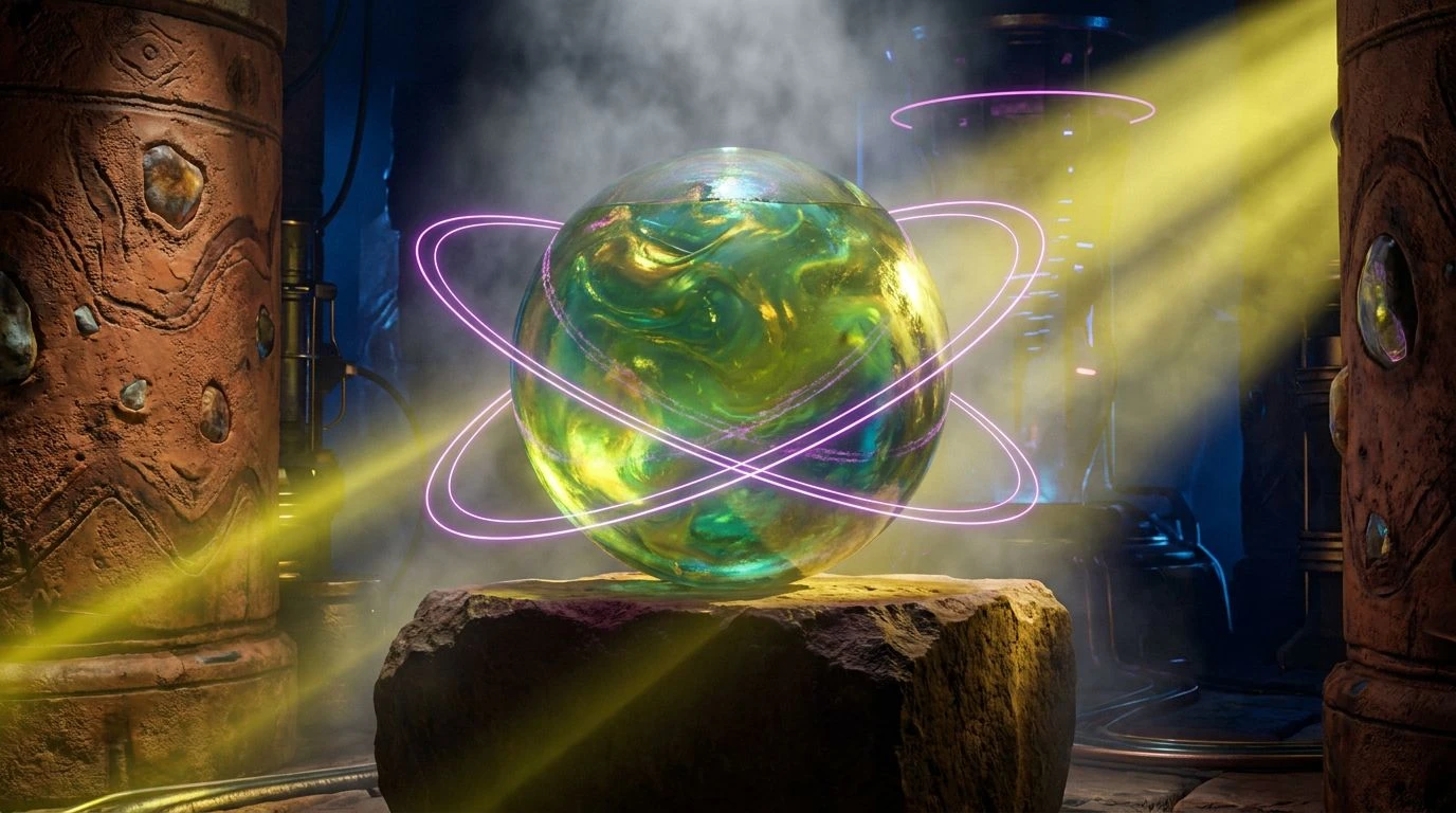
Moving away from the typical startup visual language, Mystical Grounding leans heavily into an esoteric, deeply tactile atmosphere. The anchoring shades of Espresso Soil and Ash Stone create a textured, almost historical foundation, setting up a striking contrast with the hyper-modern jolt of Acid Moss and Violet Ray. This juxtaposition is exactly how modern magician brands are redefining themselves, moving past clinical minimalism into something more storied and mysterious. Tarnished Brass adds a layer of crafted luxury, suggesting artifacts and tools of transformation, while Midnight Amethyst and Electric Lavender inject a distinctly spiritual frequency. When applied to physical packaging or spatial design, Alabaster Dust provides necessary breathing room, allowing the heavier browns and electric greens to interact without overwhelming the eye. It is an aesthetic perfectly suited for wellness tech or alternative energy brands wanting to look both rooted and radically advanced.
Terracotta Future 🏜️
Terracotta Future completely discards the icy tech-bro aesthetic for a warm, climate-aware approach to visionary design. The reliance on Deep Rust, Sunbaked Ochre, and Persimmon Flare sets the visual identity in arid, sun-baked landscapes, tying technological magic back to the physical earth. Patina Sage and Liquid Cyan offer a refreshing, oxidized contrast, recalling ancient copper tools and age-old scientific discovery. The surprising additions of Cyber Fuchsia and Velvet Crimson push the collection out of historical pastiche and directly into the contemporary design sphere. This combination serves brands that create miraculous solutions in physical spaces, such as architectural material labs or agricultural tech. The deep shadow provided by Iron Ore keeps the bright tones in check, creating a balanced, highly photographic identity system that feels both tactile and thrillingly new.
Solar Sorcery 🌞
Warmth and clarity drive the visual narrative of Solar Sorcery, a palette that strips away unnecessary noise to focus on glowing, optimistic transformation. Desert Sand and Pale Sol provide a soft, sweeping backdrop, allowing the intense heat of Molten Amber and Saffron Spun to take the spotlight. This specific balance speaks to a highly polished, intellectual magic, perfect for fintech disruptors or educational platforms acting as agents of change. The inclusion of Muted Slate and Clouded Chrome cools down the aggressive yellows and oranges, providing a sophisticated, industrial edge that prevents the collection from feeling overly nostalgic. Void Black adds necessary typographical weight, ensuring legibility and sharp contrast against the gentle Porcelain canvas. This collection demonstrates how modern magicians can communicate their visionary status through warmth and approachability rather than cold, imposing futurism.
Ancient Innovation 🕰️
The tension between history and future progress is masterfully handled within Ancient Innovation. Iron Oxide and Aged Gold provide a rich, heavy base that feels almost archaeological, suggesting profound secrets unearthed for modern use. This historical weight is violently and beautifully interrupted by Cinnabar Spark and Cobalt Current, colors that feel electrically charged and impossible to ignore. This exact friction is what makes the updated magician archetype so compelling, proving that true invention builds upon the past rather than erasing it. Deep Sea Teal and Basalt Grey act as neutralizing agents, offering calm, sophisticated midtones that bridge the gap between the blazing reds and stark Chalk White. Applied to digital interfaces or editorial layouts, this collection allows brands to appear as modern-day alchemists, turning raw, earthly elements into highly sophisticated, world-altering products.
The departure from icy, glitch-heavy aesthetics marks a significant maturation in how transformative companies present themselves to the world. By adopting earthy browns, baked clays, and muted oranges, these visionary identities tether their high-concept ideas to tangible, physical reality. The addition of sudden, electric colors against these historical, organic backdrops creates a visual friction that feels entirely fresh. This approach moves beyond the tired tropes of the tech sector, offering a visual language that is both culturally rich and fearlessly forward-thinking. Brands that adopt this grounded, tactile magic will find themselves connecting with audiences on a much more human, trustworthy level, proving that true invention feels less like a disruption and more like a natural progression of the physical world.