Navy and Gray Color Palettes for Strong Interior Design
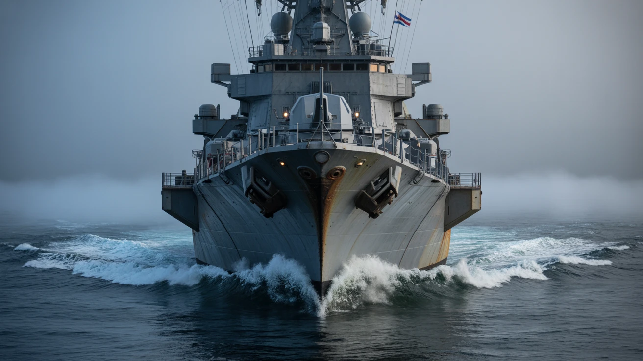
· 5 min readDecember descends with an undeniable physical presence, settling heavily over coastal waters and transforming the horizon into a thick wall of slate and shadow. The air turns biting and opaque, wrapping massive steel vessels in a quiet, imposing stillness. This environment is defined by its sheer visual weight, a space where light struggles to pierce through dense atmospheric layers. Charcoal and deep navy tones dominate the scene, offering a profound sense of security and formidable strength while maintaining an air of the unknown. Designing for this mood requires channeling that raw atmospheric tension into a visual language that feels grounded, impenetrable, and deeply reassuring. The resulting aesthetic relies on stark contrasts and muted temperatures, reflecting a season where the sea and sky blur into one continuous, impenetrable mass.
Overcast Anchorage ⚓
The Overcast Anchorage palette captures the exact moment a coastal squall flattens the contrast of a naval dockyard. Moving from the stark grounding of Obsidian Hull and Battleship Gray into the stark, piercing clarity of Sea Foam Frost, this selection mimics the visual experience of looking out into an approaching storm. Signal Flag Blue acts as the solitary marker of navigation against the sprawling expanse of Winter Overcast, guiding the eye through an otherwise desaturated environment. Designers can apply these tones to create spaces or interfaces that command authority and quiet confidence. The heavy, industrial feel of the grays paired with a sharp, disciplined blue establishes a mood of absolute reliability. It is an aesthetic perfectly suited for structural brand identities or architectural materials that need to project permanence and unwavering stability against shifting elements.
Nautical Twilight 🧭
As daylight retreats, the Nautical Twilight palette paints the heavy atmosphere of a fleet transitioning into night operations. Mariana Trench provides an expansive, bottomless foundation, absorbing light rather than reflecting it, while Rusted Anchor introduces a textural, weathered warmth reminiscent of aging industrial materials. These dark, anchoring elements are suddenly pierced by Bioluminescent Wake and Open Ocean, delivering sharp, electrical bursts of color that mimic navigational instruments glowing through thick condensation. Fog Bank and Cold Iron bridge these extremes, settling into the mid-tones with mechanical precision. This color relationship builds an atmosphere of high stakes and absolute precision. It translates seamlessly into digital interfaces requiring severe legibility under challenging conditions, or spatial environments that want to wrap visitors in a sense of protective isolation and calculated intent.
Admiralty Signals 🚢
Admiralty Signals introduces a rigid, highly functional color system inspired by maritime warning protocols and the severe geometry of naval architecture. The foundational depths of Abyss and Deep Water Draft establish an impenetrable backdrop, mimicking the freezing waters of the North Atlantic. Against this void, Portside Warning and Starboard Moss serve as strict directional markers, creating a visual tension that demands immediate attention. Tarnished Brass adds an element of historical weight and weathering, grounding the technical sharpness of Bridge Display Blue and Gunmetal Glint. Pier Shadow acts as a transitional anchor between the vivid signals and the oceanic void. This specific grouping translates into design languages that prioritize strict wayfinding and operational clarity. The stark contrast between the heavy nautical blues and the alarming red and green offers a compelling route for branding systems that want to project both rich heritage and acute technical capability.
Radar Silence 📡
Radar Silence captures the claustrophobic yet strangely comforting atmosphere of a vessel running quiet beneath a frozen sea. The progression from Submarine Hull and Pitch Depth into Midnight Swell creates an almost suffocating sense of weight, a visual pressure that feels intensely private and secure. Submerged Blue offers just enough saturation to hint at liquid surroundings, preventing the dark tones from reading as flat blackness. As the eye moves upward toward Armor Plate and Heavy Mist, the tension releases slightly, ending finally on the brittle chill of Frost Line. This specific gradient of shadowy blues and grays works exceptionally well for luxury packaging or editorial layouts that require an atmosphere of exclusivity and quiet power. By denying the viewer any high-key warmth, the visual language remains intensely focused, wrapping the audience in an environment of total secrecy and unbreakable trust.
Sonar Echoes 🌊
Sonar Echoes disrupts the expected maritime palette by injecting synthetic, high-visibility colors against a backdrop of chilling nautical tones. Trench Pressure and Squall Cloud establish the dense, foggy atmosphere expected of a winter morning at sea, providing a solemn, quiet baseline. However, the sudden intrusion of Radar Sweep and Algae Clad shifts the mood entirely, mimicking the glowing, artificial scan lines of tactical equipment tracking movement beneath the waves. Ice Breaker offers a harsh, freezing contrast that separates these acidic greens from the heavy oceanic blues. Finally, Flare Smoke and Distress Red introduce a critical sense of urgency, signaling immediate action within the sprawling mist. This combination is highly effective for technical outerwear or specialized equipment design, where utilitarian grays must intersect with life-saving visibility. It creates a space that feels active, alert, and deeply connected to survival in hostile, unpredictable environments.
The visual weight of a winter maritime environment provides a rich framework for exploring themes of security, isolation, and calculated precision. By anchoring these color strategies in dense charcoal grays and impenetrable navy blues, designers can construct spaces and interfaces that feel instantly reliable and deeply protective. The selective addition of synthetic brights, weathered metallics, or stark warning colors allows these heavy atmospheric palettes to remain functional rather than becoming overwhelmingly dark. Ultimately, adopting this aesthetic language means prioritizing a sense of physical weight and absolute authority, offering audiences a profound feeling of safety within an otherwise harsh and unpredictable landscape.