Warm Color Palette Trends for Modern EV Brand Design
· 5 min readElectric vehicle branding has long been trapped in a specific visual language. We all know the look: icy blues, sterile silvers, glowing neon accents communicating speed and zero emissions. But what happens when an automotive brand steps away from the cold laboratory aesthetic and embraces the quiet intensity of a dusty coral sunset? Swapping clinical precision for emotional warmth fundamentally changes how we perceive velocity. A muted palette featuring soft terracotta, royal blue, and burnt orange suggests a different kind of performance, one that feels human, grounded, and connected to the landscape it travels through. It is a bold departure from the established visual codes of the mobility sector, challenging the assumption that future-facing technology must look entirely devoid of human touch. Looking at how these specific shades interact gives us a glimpse into a much more sophisticated era of transport design.
Velocity Mirage 🏜️
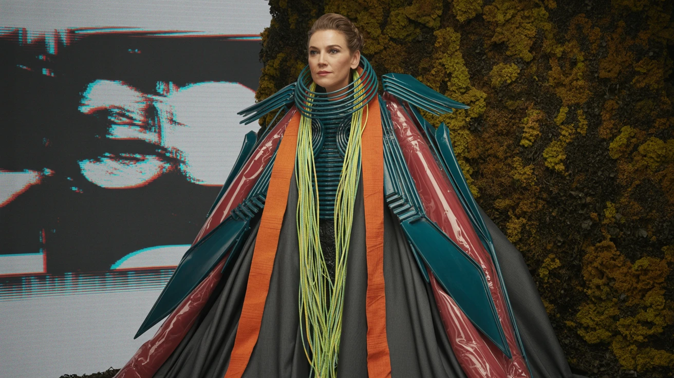
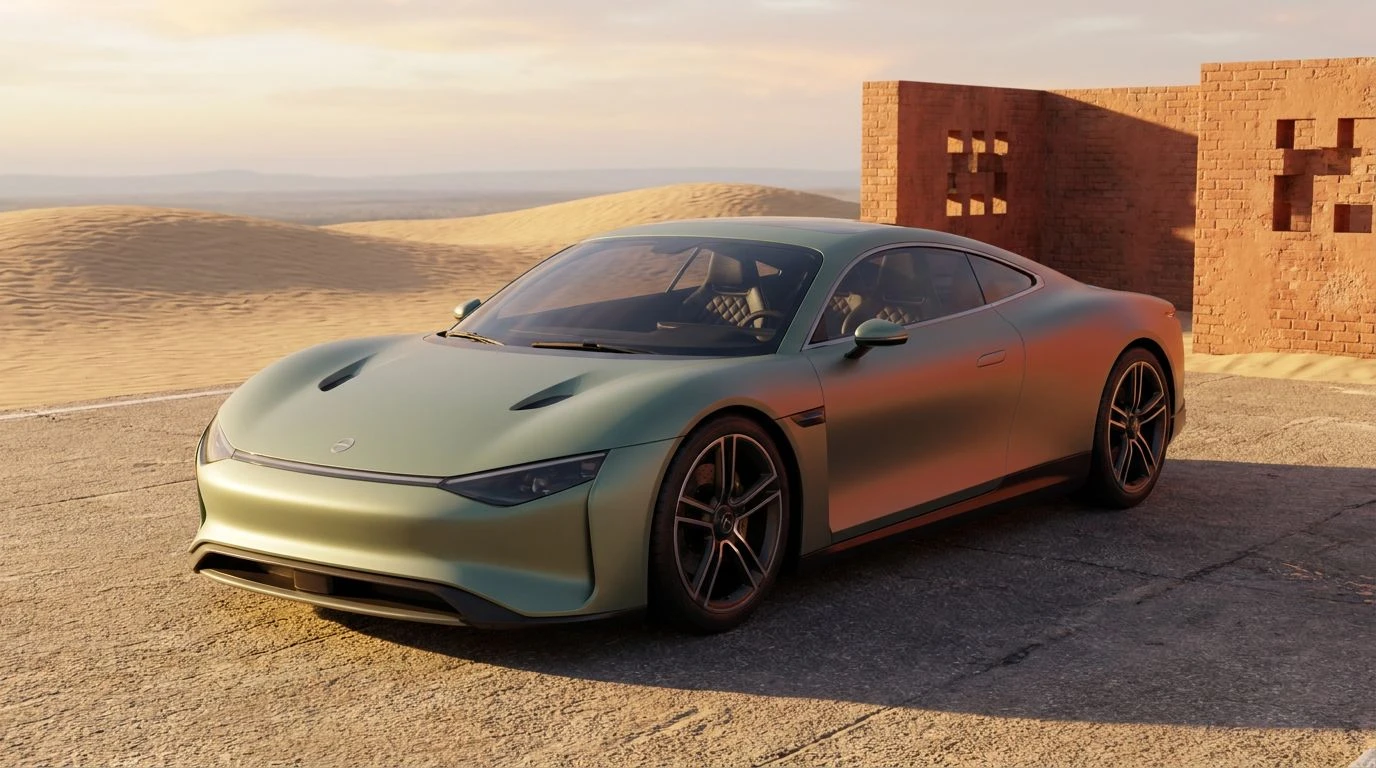
Velocity Mirage pushes the boundaries of standard automotive design by mixing aggressive organic tones with hyper-synthetic brights. The stark contrast between the grounding weight of Oxidized Rust and the synthetic jolt of Circuit Green creates a visual tension perfect for high-speed aerodynamics. Solar Flare Coral acts as the primary heat source against the cooling properties of Electric Cyan and Abyssal Teal. This color relationship completely bypasses the traditional clinical look of modern transport. Imagine these tones wrapped around the sleek, matte curves of an electric hypercar, where Carbon Black splitters and Optic White badges ground the aggressive flashes of color. It communicates a raw, unfiltered kind of speed, positioning the brand not as a sterile tech company, but as a living, breathing machine tearing through an arid desert landscape. The visual impact is immediate and unforgettable, proving that a dusty coral sunset can indeed support a high-performance narrative.
Desert Asphalt 🌇
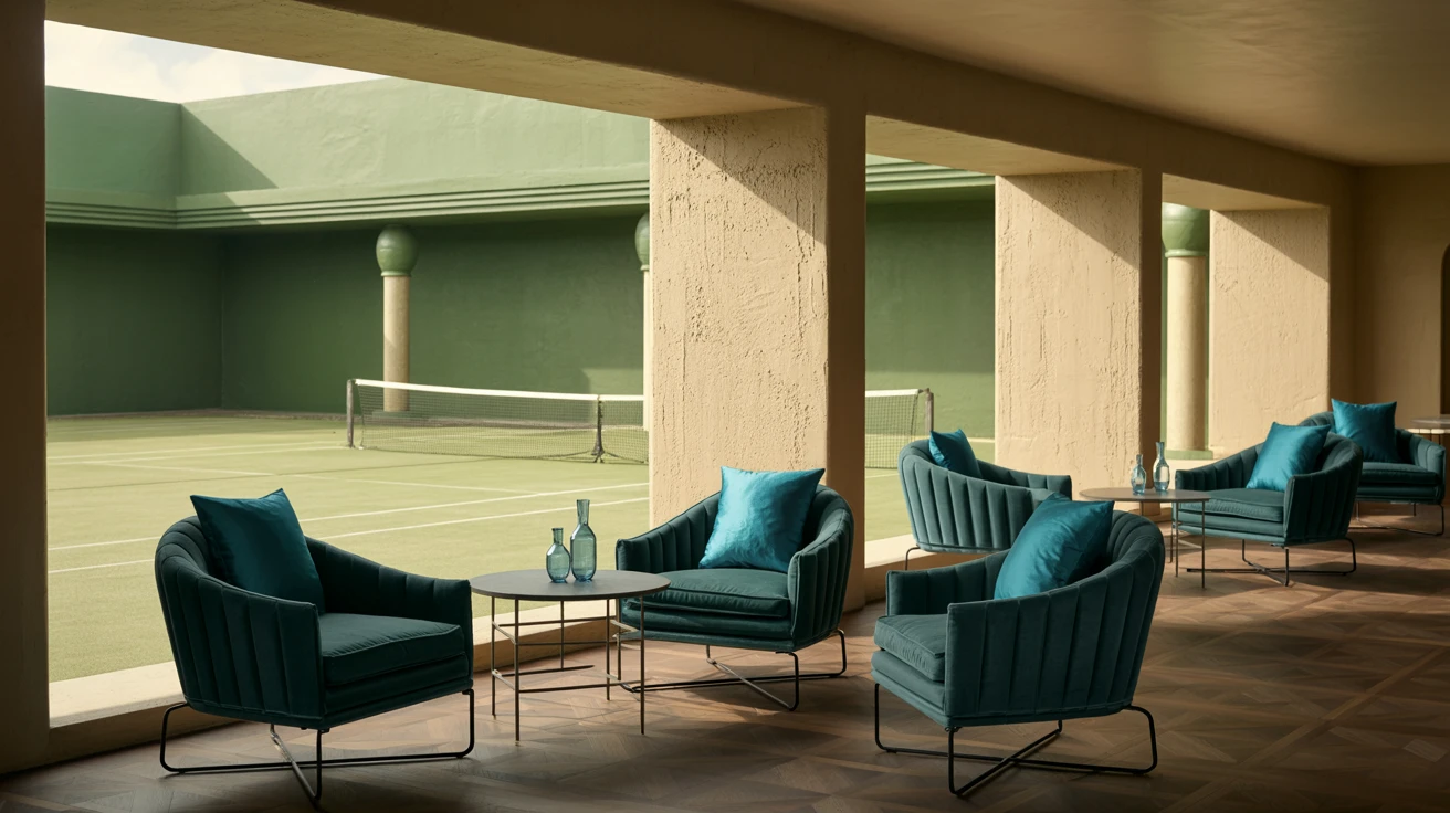
Taking a decidedly softer approach to the concept of movement, Desert Asphalt proves that performance vehicles do not need to shout. This selection relies on the quiet confidence of Faded Agave and Dusty Coral, framing them against the utilitarian neutrality of Dune Sand and Bleached Tarmac. The inclusion of Baked Brick brings an earthy richness, recalling the sun-baked clay of remote testing tracks. It presents a sophisticated alternative to neon racing stripes, aimed at a demographic that values refined aesthetics over aggressive posturing. Applied to a minimalist vehicle interior, Obsidian Leather provides deep, luxurious contrast against the muted exterior finishes. The overall effect is incredibly cinematic, turning a simple drive into an atmospheric journey. It redefines automotive luxury by prioritizing warmth, texture, and a grounded connection to the natural world over cold, hard technological dominance.
Mojave Overdrive 🛞
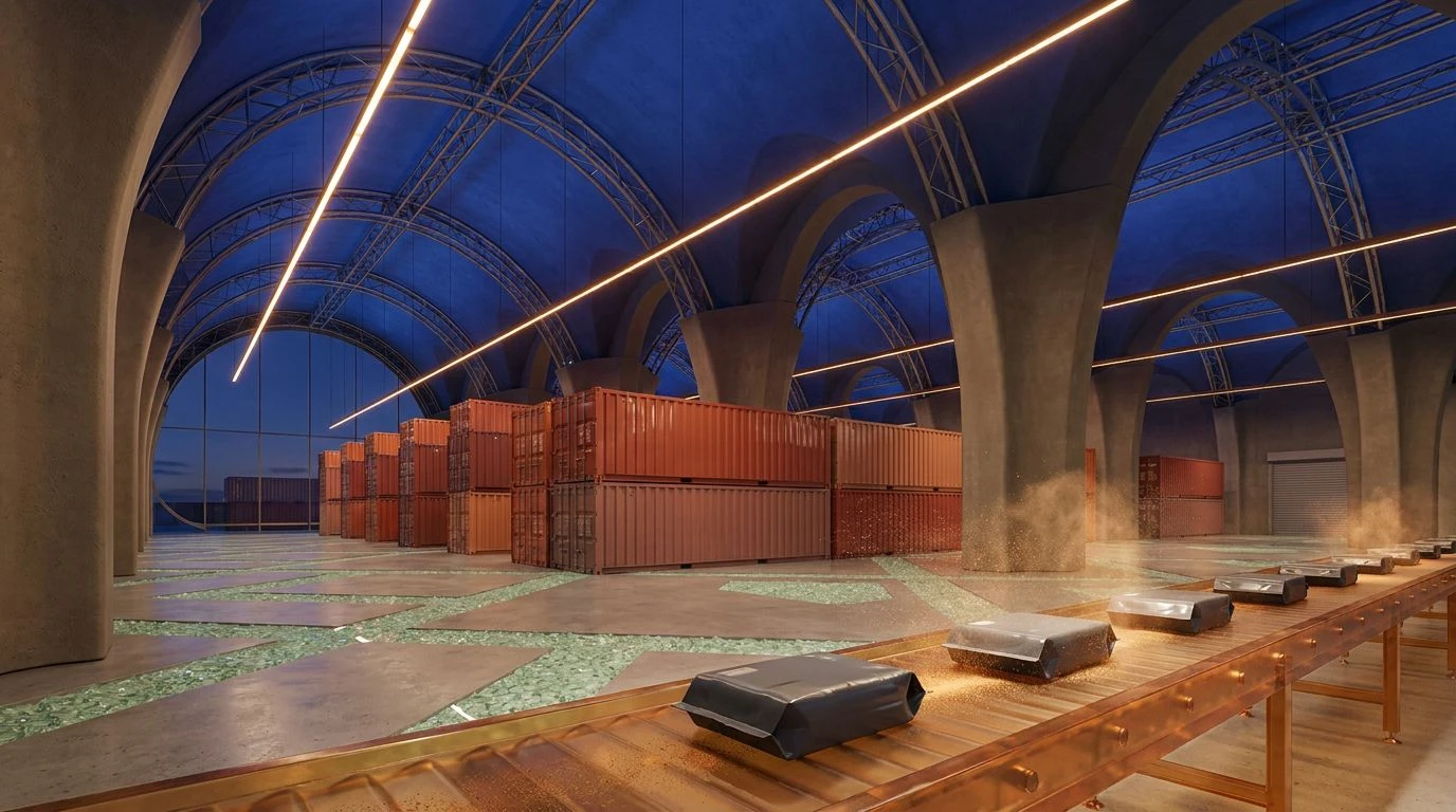
Mojave Overdrive captures the transition from day to night on the open road. The sharp sting of Amber Turn Signal cuts right through the dense, heavy presence of Rich Soil and Vantablack. This creates a specific kind of visual rhythm that feels tailor-made for motion graphics and digital dashboard interfaces. The softer, more atmospheric tones like Frosted Eucalyptus and Morning Mist provide the necessary breathing room, keeping the overall look from feeling too heavy or oppressive. When applied to the physical form of an automobile, Deep Pine and Pale Sun offer an unexpected yet highly sophisticated two-tone application. The pairing feels both historic and entirely new, hinting at classic seventies racing liveries while remaining firmly rooted in modern material science. It tells a story of endurance and capability without ever resorting to the exhausted tropes of futuristic cyber-design.
Stratosphere Drift 🏎️
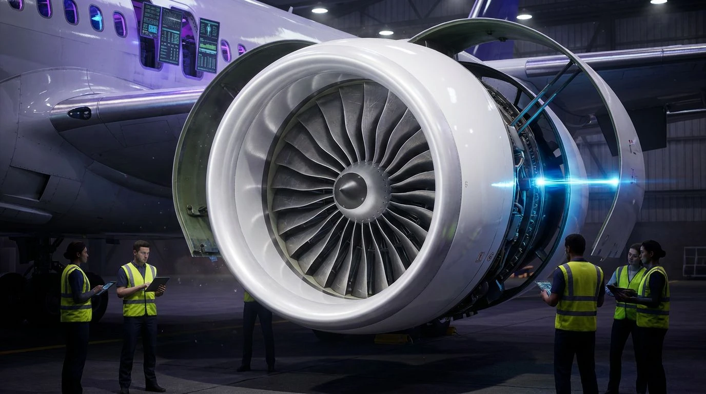
By reducing the visual noise down to just five distinct tones, Stratosphere Drift makes a powerful statement about focused engineering. Royal Cobalt acts as the structural foundation here, offering a familiar nod to traditional motor sports, but the sudden introduction of Powder Coral entirely changes the conversation. This unexpected pairing creates a vibrant, electric energy that feels fast even when standing still. Anodized Aluminum and Cloud White serve as industrial framing devices, allowing the coral and blue to push and pull against each other with maximum visual intensity. Anchoring it all is Matte Graphite, providing the necessary contrast for the brighter tones to truly pop. This arrangement works brilliantly across high-end promotional campaigns and vehicle body wraps alike, proving that a softer, warmer hue can absolutely hold its own in a high-octane environment when balanced with the right industrial counterweights.
Horizon Line ⚡
Horizon Line explores the territory where natural landscapes collide with precision machinery. Oceanic Teal and Midnight Juniper establish a dark, sophisticated backdrop that feels deeply tied to the natural world. Against this moody foundation, Burnt Ochre and Golden Hour arrive like a sudden burst of acceleration. The addition of Polished Bronze bridges the gap between the organic elements and the industrial reality of a motor vehicle. Salt Flat White and Pumice Stone provide a clean, technical finish that keeps the warmer tones from feeling overly nostalgic or vintage. It is a selection that speaks to grand touring and long-distance travel, offering a visual identity that feels mature, capable, and highly composed. This direction allows a modern manufacturer to project power and range without relying on aggressive, angular graphics or the predictable neon accents of the current market.
Stepping away from the predictable blues and silvers of the current transportation market opens up entirely new ways to communicate speed and innovation. A dusty coral and teal palette proves that performance branding does not have to be cold to be taken seriously. By leaning into unexpected warmth and grounded, earth-inspired tones, designers can create visual identities that feel remarkably human and refreshingly distinct. The aesthetic of velocity is shifting, moving past the rigid constraints of a laboratory setting and out into the vast, sun-drenched landscapes where these machines actually belong. It is a sophisticated pivot that ultimately rewards brands willing to challenge the expected look of tomorrow.