1970s Italian Cinema Color Palettes: Dark Navy & Sepia
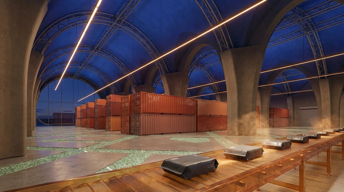
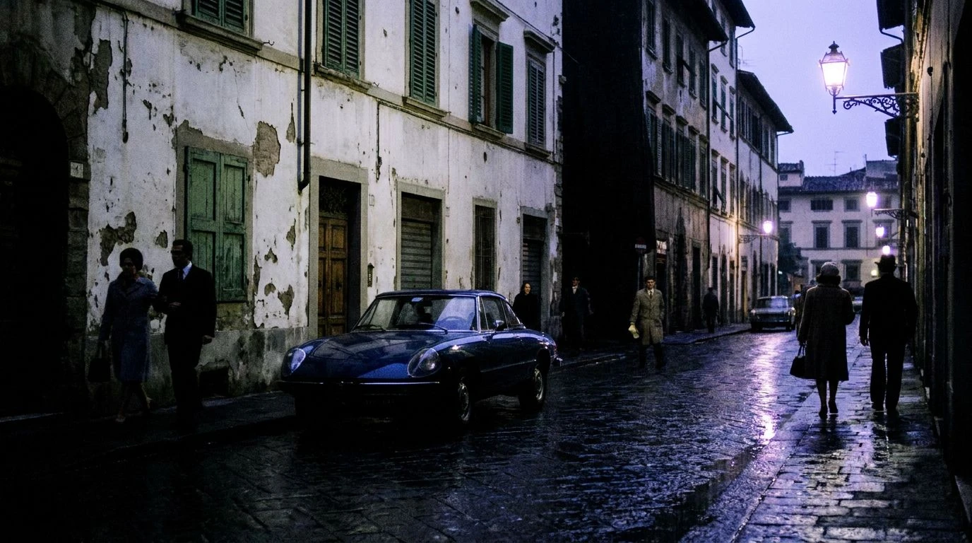
· 6 min readThe visual vocabulary of 1970s Italian cinema is often misremembered as a continuous parade of sun-drenched coastal towns and bright Mediterranean yellows. In reality, the era was defined by a profound melancholy, expressed through shadows cast against deep water and aging concrete. Directors working during the Years of Lead turned their lenses away from postcard vistas and toward an atmosphere dripping with industrial weariness. The prevailing chromatic signature was an assertive, moody dark blue, contrasted sharply against the aging sepia tones of old world interiors. This specific juxtaposition captured a nation caught between post-war economic miracles and modern decay, presenting a sophisticated visual language that remains striking today. By examining the precise shades of oceanic blues and weathered browns used on celluloid, one can read a silent narrative of political unrest, urban alienation, and undeniable cinematic elegance.
Visconti's Vista 🎞️
The palette known as Visconti's Vista captures the tension between aristocratic decay and the stark realities of the modern world. Opening with the warmth of Roasted Chestnut and Faded Parchment, the sequence immediately suggests the interiors of a fading Roman palazzo, dust motes drifting across heavy velvet drapes. The addition of Roman Terracotta grounds the sequence in a distinctly Mediterranean earthiness before shifting abruptly into cooler, more distant tones. The introduction of Tyrrhenian Sky offers a brief moment of coastal reprieve, only to be overwhelmed by the commanding presence of Deep Cobalt and Industrial Slate. This progression from warm nostalgia to cold modernity mirrors the thematic preoccupations of the era's filmmakers. The blues do not represent an inviting sea, but rather an encroaching chill of industrialization. Such a color narrative transforms a simple scene of characters staring out a window into a profound commentary on changing times.
Cinecittà Shadows 🎥
When observing the severe angles of modernist architecture in vintage political thrillers, the tonal range of Cinecittà Shadows frequently dominates the screen. The combination begins with Sunbaked Olive and Plaster White, recalling the suffocating heat of a midday piazza devoid of pedestrians. This stark, bleached environment is swiftly overtaken by the oppressive weight of Midnight Adriatic, a color that functions as the emotional anchor for the period. It is a blue so dark it borders on the abyss, suggesting secrets kept behind closed doors and the silent operations of power. Accented by Soft Periwinkle, which adds a fleeting, almost fragile memory of clearer days, the arrangement concludes with the definitive finality of Celluloid Black. Through these specific shades, the viewer is transported into a world of paranoia and sophistication. The visual storytelling relies on this abrupt contrast between blinding, arid sunlight and the terrifying, elegant darkness that follows the setting sun.
Antonioni's Fog 🌫️
The feeling of profound alienation in a rapidly expanding metropolis requires a specific visual vocabulary, one perfectly captured by Antonioni's Fog. A harsh, uncompromising wash of Blinding Sun strips the environment of comfort, exposing every crack in the brutalist concrete structures. Moving into Aged Sepia, the sequence introduces a historical anchor, a reminder of the agrarian past that the modern city has paved over. However, it is the transition into Fogged Silver and Cool Slate that truly defines the emotional atmosphere of the films from this decade. These colors create a visual barrier, a smog-filled skyline that separates the characters from their own desires. Anchoring this cold expanse is Deep Ink, a shade that mimics the polluted waterways surrounding industrial ports. The resulting aesthetic is strikingly sophisticated, utilizing an absence of warmth to speak volumes about human isolation. This calculated lack of color transforms the ordinary act of existing in a modern city into a visually arresting tragedy.
Roman Neo-Realism 🎬
Grounding the cinematic experience in the grit of everyday struggle, Roman Neo-Realism relies on heavily shadowed, earthen tones that refuse to romanticize their subjects. The sequence opens with Worn Leather and Dark Espresso, colors pulled directly from the dimly lit interiors of working-class cafes and the scuffed boots of exhausted laborers. These are shades of endurance and survival, entirely devoid of glamour. The introduction of Urban Concrete shifts the mood toward the architectural reality of the 1970s, where historical monuments were increasingly surrounded by utilitarian sprawl. Plunging into Pitch Black, the darkness becomes total, an oppressive force that obscures the edges of the frame. Finally, Tyrrhenian Navy emerges, a severe, formal shade that communicates institutional authority and the distant, unapproachable sea. Together, these selections build an environment where survival requires constant vigilance, wrapping the viewer in an atmosphere that is as culturally demanding as it is visually spectacular.
Fellini's Twilight 🌅
A strange and melancholy beauty characterizes the transitional moments between day and night in Mediterranean filmmaking, a mood preserved within Fellini's Twilight. The absolute darkness of Noir frames the composition, acting as a velvet curtain against which softer memories can play out. Touches of Faded Coral and Muted Rose introduce an unexpected tenderness, mimicking the last moments of sunlight reflecting off fading stucco facades before evening takes hold. These gentle tones clash against the harsher reality of Rust, a color signaling decay and the slow corrosion of old machinery abandoned in seaside towns. The crispness of Alabaster provides a momentary flash of clarity amidst the encroaching shadows. Dominating the final act are Dusky Navy and Steel Grey, shades that wash over the environment like a cold tide, replacing the brief romance of dusk with the stark, industrial reality of the night. This sophisticated arrangement perfectly articulates the sorrowful nostalgia of an era looking back at its own lost innocence.
The cinematic language of the 1970s Mediterranean relied on color to articulate a complex cultural condition, utilizing severe blues and deteriorating browns to frame a society in transition. These palettes demonstrate how visual choices carry the weight of history, transforming ordinary landscapes into profound statements on urban alienation and historical decay. Through the deliberate application of shadow and severe chromatic restraint, filmmakers established a legacy of sophistication that continues to influence contemporary aesthetics. Recognizing the deliberate artistry behind these moody ocean shades and muted architectural tones allows one to appreciate the enduring power of this specific era in film. The visual strategies developed during this period remain a testament to the capacity of color to communicate unspoken anxieties and undeniable elegance.