Warm Neutral Color Palettes Inspired by Library Sunlight
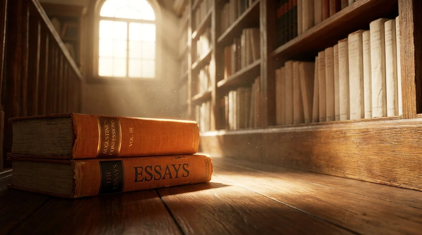
· 5 min readThere is a highly specific atmosphere that takes over institutional spaces during late summer afternoons, defined heavily by light and materiality. As the day pushes toward four o'clock, the harsh glare of midday softens into a heavy, directional glow. When this light strikes the quiet aisles of an aging library, it transforms utilitarian oak shelves and scattered dust particles into a highly atmospheric spatial experience. Capturing this moment relies on a strict material language of warm neutrals, aged paper tones, and highly concentrated flashes of yellow. This aesthetic moves away from sterile modernism, leaning toward a sense of analog productivity. Designers are looking at this specific late-summer quality to create interiors and visual identities that feel grounded and historically anchored, prioritizing tactility over pure minimalism. The resulting color groupings suggest a slow, deliberate approach to work, deeply rooted in the physical weight of books and timber architecture.
Archival Afternoon 🕰️
Applying Archival Afternoon within an interior space immediately recalls the feeling of pulling an old volume from a shadowed corner. Crisp Page acts as the necessary spatial void, allowing the eye to rest against the heavier historical tones. The architectural weight relies on the pairing of Faded Morocco and Leather Spine, which suggest well-worn bindings and aged upholstery found in historic reading rooms. Cutting through this heavy historical atmosphere, Slanting Ray provides a sharp, highly directional strike of warmth, mimicking exactly how late day sunlight creates sharp geometric shapes across reading tables. Finally, Green Desk Lamp grounds the entire arrangement with a hit of institutional tradition, nodding to the classic banker lamps that populate scholarly institutions. This combination works exceptionally well for branding boutique bookstores or styling residential studies where a mood of focused, quiet research is the primary goal.
Periodicals Room 🗞️
The material language of Periodicals Room reads like an architectural cross-section of a municipal library built a century ago. Oak Panel establishes the solid, heavy foundation of custom millwork, while Cast Iron Shelving and Printer's Ink offer the structural contrast needed to define space. Against these industrial anchors, Aged Vellum and Newspaper Margin provide broad surfaces of warm, tactile relief, softening the harder edges of the design. The magic happens when Four O'Clock Glint enters the equation, acting as that singular streak of aggressive late summer sunlight hitting a reading desk. Dust Mote and Faded Blueprint add soft mid-tone layers, suggesting the quiet, airborne particles and archived maps stashed away in flat files. Designing with this collection is highly effective for hospitality environments or quiet co-working spaces that aim to project permanence and intellectual rigor.
Late Summer Study 🪟
A highly restrained approach to scholarly aesthetics, Late Summer Study strips the library environment down to its most basic material interactions. Blank Notepad offers a clean architectural canvas, allowing the heavier, richer tones to command attention. Mahogany Bookstand and Waxed Card Catalog deliver a serious, timber-focused foundation that grounds the eye, suggesting decades of floor wax and polished handrails. Breaking up these heavy woods is Late August Gold, a concentrated flash of heavy warmth that behaves exactly like a direct beam of afternoon sun heating up a wooden tabletop. Pencil Smudge acts as the perfect transitional tone, a soft industrial grey that prevents the warmer colors from feeling overly nostalgic or saccharine. This specific arrangement serves brilliantly in editorial design or minimalist library renovations where the goal is to maintain a feeling of historic warmth without relying on cluttered styling or heavy ornamentation.
Rare Books Section 📙
Rare Books Section approaches the scholarly theme with a surprisingly graphic, high-contrast attitude. Rather than relying entirely on soft, faded memories, this palette uses Typeset Black and Cotton Paper to create a stark, modernist structural grid. Within this rigid framework, Orange Cloth Cover bursts forward with unexpected intensity, recalling the vivid buckram bindings of mid-century hardcovers. Foxed Edges adds a layer of stained, oxidized history to the mix, preventing the brighter tones from feeling too new or plastic. Gilded Lettering injects a concentrated dose of golden warmth, a direct nod to the tooling on leather spines catching the slanted afternoon light. Mezzanine Floor ties the entire arrangement together with a structural, concrete-like finish. This sharply defined set of colors is incredibly useful for modern branding projects or exhibition graphics that want to reference historical academia while maintaining a sharp, contemporary edge.
Cartographer's Desk 🗺️
Moving away from heavy timber, Cartographer's Desk focuses on the precise, delicate tools of geography and technical drawing. Afternoon Sunbeam washes the entire space in a soft, golden glow, setting the late August timeframe with absolute precision. Against this warm wash, Oxidized Brass introduces a slightly green, metallic weight, reminiscent of old compasses and brass-cornered rulers resting on drafting tables. The presence of Faded Cyanotype and Prussian Blue Ink introduces an academic coolness, shifting the mood toward blueprints and archival cartography. Charcoal Sketch completes the collection by offering deep, graphic contrast that anchors the lighter, more airy tones. The entire profile reads as intellectual and highly specialized, making it a spectacular choice for stationary design, museum wayfinding systems, or boutique hotel lobbies that aim to cultivate an atmosphere of worldly exploration and quiet study.
Designing around the specific quality of late afternoon sunlight inside an archival space requires a careful handling of temperature and material references. The warm yellows and golden ochres perform best when allowed to act as directional lighting, cutting through heavy timber tones and crisp paper whites. These collections demonstrate how shifting the weight from deep leathers to industrial blues or stark typography can completely alter the resulting spatial mood. Ultimately, referencing this nostalgic, scholarly atmosphere is less about literal replication and more about capturing the quiet, analog productivity that these environments encourage. This careful application of light and shadow provides a highly effective toolkit for creating spaces and visuals that feel both intellectually grounded and comfortably warm.