Grayscale Color Palettes in Post-Modern Interior Design
· 5 min readThe nineteen eighties are often remembered as a chaotic collision of neon and excess, a visual loud-hailer that defined the post-modern aesthetic. Yet beneath the clashing patterns and asymmetrical geometry, a much stricter design vocabulary was quietly calling the shots. Grayscale precision acted as the architectural anchor of the decade. By stripping away the visual noise, designers found a commanding language in pure black, stark white, and the clinical gradients of gray between them. This rigid grayscale foundation provided the necessary authority to hold the era's more rebellious color choices together. It is a lesson in control and restraint, showing how a monochromatic baseline transforms scattered ideas into striking, deliberate statements.
Executive Memphis 📐
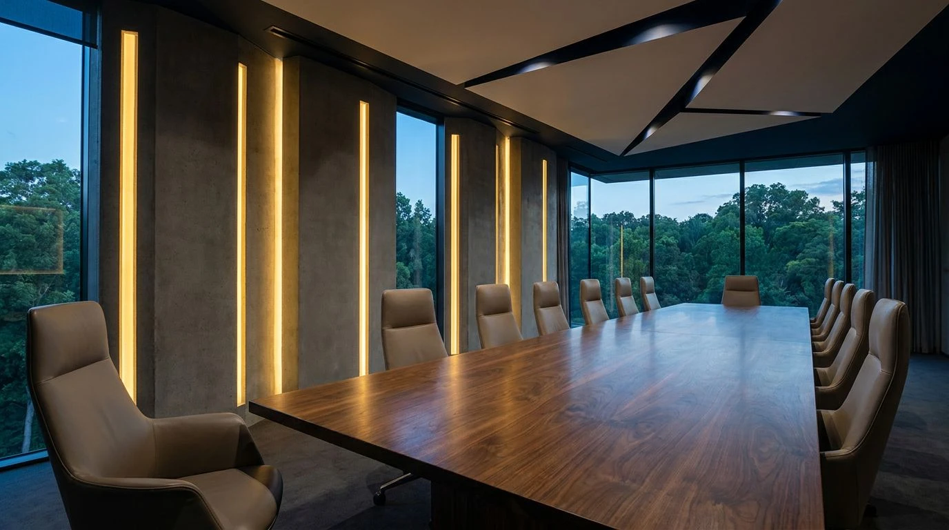
When strict boardroom geometry collides with the playful rebellion of the late twentieth century, you get a visual language that refuses to be ignored. Executive Memphis pairs the absolute finality of Pitch and Gallery White with unexpected interjections of Plastic Pink and Structural Red. The resulting mood is strictly professional but undeniably cynical. It recalls the heavy, architectural furniture pieces of the era, where stark laminates met glossy lacquer. The inclusion of Pine Forest grounds the more theatrical tones, creating an environment that feels both calculated and expressive. This approach works remarkably well in modern commercial spaces seeking a sense of strict authority without sacrificing personality. The dark, commanding contrast demands attention, while the colorful interruptions act as deliberate acts of design defiance.
Grid System 🔲
There is a distinct rhythm to Grid System, born from the strict typographical layouts of eighty-era graphic design. Paper and Carbon establish a harsh, unyielding baseline, mapping out a space that feels deeply analytical. Mid-tones like Concrete and Steel soften the severe contrast just enough to let the aggressively bright accents stand out. Cyanotype and Ultraviolet cut through the grayscale like neon tubes in a brutalist nightclub, demanding immediate focus. This arrangement dictates how the eye moves across a room or a page, using brights as punctuation marks within a strict monochromatic manuscript. It channels a specific type of cold, calculated energy that feels incredibly relevant today. Spaces drawing on this look immediately project competence and strict order, using the sudden shocks of Coral and blue to keep the viewer completely alert.
Primary Structure 🏗️
Borrowing heavily from industrial signage and architectural wayfinding, Primary Structure relies on the sheer impact of primary colors set against a severe grayscale void. Optic White and Vantablack form a brutal container. Inside this strict perimeter, Signal Red and Safety Yellow operate like warning labels on heavy machinery. The mood is utilitarian, recalling high-tech architecture like the Pompidou Centre where function becomes a highly stylized visual performance. By anchoring these bright, almost aggressive tones with Ash and Graphite, the design completely avoids feeling chaotic. Instead, it becomes a masterclass in visual hierarchy and spatial dominance. It feels engineered rather than painted, suited for environments that want to direct traffic, command respect, and project absolute confidence in every single line.
Blueprint Authority 📏
Blueprint Authority strips away almost all distractions, leaving only the barest necessities of form and function. Drafting Paper and Ink provide maximum contrast, a pure binary that leaves no room for hesitation or doubt. The transition tones of Plaster and Cement give the arrangement volume and depth, preventing the space from feeling completely flat or sterile. Then comes the solitary strike of Blueprint Blue, a piercing, singular interruption that changes the entire context of the grayscale. This precise application of a solitary bright tone acts like a signature on a technical drawing, asserting authorship and control over the space. It creates an atmosphere of deep concentration and serious intent, ideal for environments dedicated to intense focus. The effect is strikingly minimal but carries immense visual weight.
Brutalist Acid 🔋
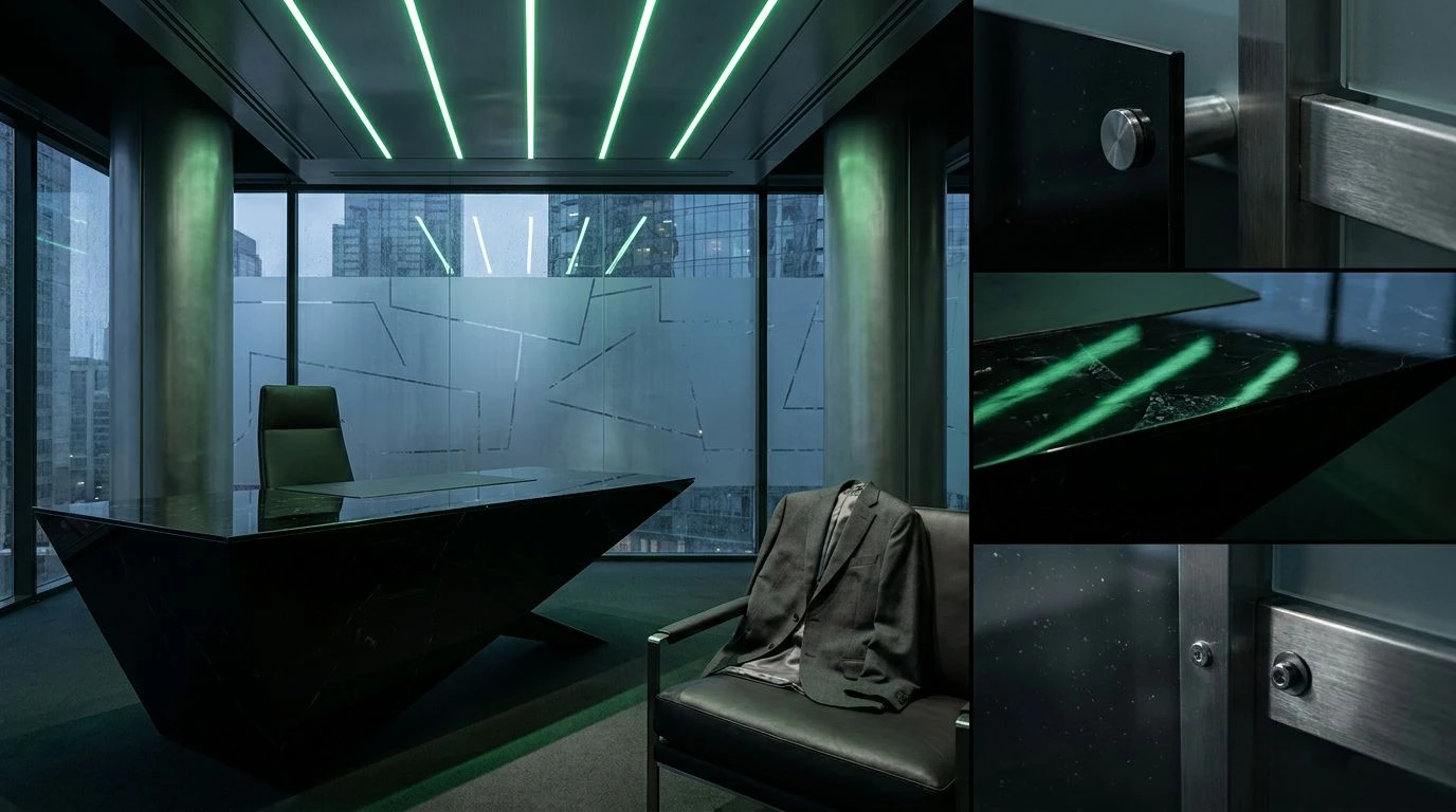
A sharp departure from the friendly, approachable aesthetics of modern consumer products, Brutalist Acid leans into something much more confrontational and raw. The grayscale base of Titanium White, Anodized Aluminum, and Gunmetal reads like cold hardware, unpolished and uncompromising. When Acid Yellow is dropped into this austere environment, the reaction is instantaneous and electric. The toxic, synthetic nature of the yellow completely transforms the muted background, turning passive materials into active, almost dangerous elements. Olive Drab anchors the aggressive yellow just enough to keep it from washing out the eye. This combination feels ripped directly from a post-modern sci-fi film set, offering a gritty, uncompromising mood. It builds a space that feels radically functional, rejecting comfort in favor of pure, striking impact.
Revisiting the severe, grayscale-dominated side of nineteen eighties design offers a powerful lesson in visual restraint. When black, white, and gray are treated as structural materials rather than mere backgrounds, they create spaces of immense power and clarity. The sudden shocks of neon, primary hues, or acid tones become deliberate, calculated moves rather than decorative accidents. This method of anchoring wild, experimental ideas within a rigid monochromatic framework remains incredibly effective for modern spaces and objects. It allows designers to act boldly, knowing the strict parameters of their chosen palette will keep everything grounded, intentional, and strictly focused on the final objective.