Retro Color Palette Ideas: Reimagining the Lunar Landing
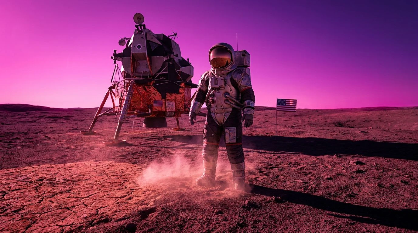
· 6 min readWhen we picture the historical documentation of the Apollo missions, the visual memory is dominated by a stark, high-contrast spectrum. We imagine the blinding albedo of the lunar surface against the infinite black of space, interrupted only by the metallic sheen of the lander and the pristine white suits of the astronauts. This visual vocabulary implies a sterile, strictly mathematical triumph. But if we shift the optical filters to embrace the playful, optimistic chromatic trends of the 1960s, a completely different psychological landscape emerges. By replacing the clinical grays and stark whites with the earthy warmth of terracotta and the high-energy wavelengths of magenta, the narrative of human spaceflight transforms. The visual record becomes less about the cold mechanics of surviving a vacuum and more about the vibrant human ingenuity that made the journey possible. This reimagined documentation changes our perceptual relationship with the event, transforming a distant scientific milestone into a deeply human, culturally vivid memory.
Apollo Warmth 🚀
The Apollo Warmth color arrangement introduces an unexpected thermal quality to an environment traditionally defined by extreme cold. By anchoring the visual field with Vacuum Black and Albedo White, the transition into the dusty, mid-tone grays of Basalt Dust and Crater Ash feels familiar to our understanding of lunar geology. However, the unexpected introduction of Regolith Clay and Sunlit Peach entirely reconfigures the perceptual temperature of the scene. In human vision, red and orange wavelengths advance toward the viewer, creating a sense of proximity and comfort. Applying these earthy, fired-clay tones to the lunar soil or the metallic struts of the lander creates a striking visual contrast. Instead of a hostile, alien wasteland, the lunar surface reads as an extension of an earthly desert. The psychological distance between the viewer and the astronaut collapses, presenting the moon walk not as an isolated scientific experiment, but as a bold, playful expedition bathed in the optimistic light of an eternal, warming sun.
Lunar Mod 👩🚀
By pushing the boundaries of the visible spectrum, the Lunar Mod collection explores the interplay between earthly geology and synthetic innovation. The earthy foundation provided by Oxidized Terracotta, Lunar Pumice, and Shadowed Mare grounds the viewer in a tactile, recognizable reality, reminiscent of southwestern landscapes or mid-century ceramic design. This organic base is sharply interrupted by the artificial, high-frequency energy of Neon Fluorite and Ultraviolet Thruster. In the context of visual psychology, magenta does not exist as a single wavelength of light; it is a perceptual construct created by the brain when eyes detect both red and blue light simultaneously. Placing these vibrant, fabricated purples against the muted lunar soil creates a perceptual shock, highlighting the artificial nature of human technology in a primordial environment. Spacesuit White and Deep Space Charcoal serve as neutral boundaries, allowing the intense contrast between the baked clay tones and the electric magenta to dominate the visual field. This creates a deeply playful, pop-art interpretation of space exploration that celebrates the bold aesthetics of the era.
Ultraviolet Regolith 🪐
The Ultraviolet Regolith combination approaches the lunar documentation by reimagining the interaction between solar radiation and the barren surface. Here, the traditional silver tones are replaced by Titanium Hull, serving as a cool, reflective baseline. The dramatic shift occurs with the pairing of Rusted Iron Oxide and Ionized Violet. Human color perception relies on opposing channels, and the contrast between the warm, grounded reds and the high-energy, cooling purples creates a visual tension that captures the imagination. The inclusion of Solar Flare Peach softens this transition, offering a bright, fleshy tone that contrasts sharply with the ethereal coolness of Cosmic Lavender. If the lunar landing photography utilized these specific wavelengths, the resulting images would suggest a world bathed in invisible forces, where cosmic rays and magnetic fields become visually tangible. The psychological effect is one of wonder and surrealism, turning a methodical feat of engineering into a psychedelic, scientifically curious exploration of light and energy beyond our atmosphere.
Mission Control Clay 📡
Grounding the celestial journey in terrestrial materials, the Mission Control Clay sequence focuses on the human element behind the machinery. The dominant Cinnabar Module and Scorched Earth bring a deep, almost primordial heat to the visual narrative, reminiscent of raw iron and baked mud. These are colors processed by the human brain as heavy, durable, and reliable. Counterbalancing this extreme warmth are the muted, oxidized greens of Sage Oxidizer and Verdigris Panel, paired with the dense darkness of Void Obsidian. Telemetry Parchment provides a soft, non-reflective white that reduces eye strain, mimicking the paper readouts and analog dials of a mid-century command center. This specific arrangement shifts the focus from the vacuum of space to the tactile, analog reality of the engineers and mathematicians who charted the course. By viewing the space race through these earthy, grounded pigments, the narrative highlights human labor, the friction of reentry, and the physical materials that withstood the extreme conditions of atmospheric escape.
Sea of Tranquility Pop 🔭
The Sea of Tranquility Pop array expands the chromatic range to create a highly theatrical, high-contrast vision of extraterrestrial arrival. The pairing of Ceramic Heat Shield and Meteorite Beige establishes a warm, dusty foundation that feels immediately recognizable to mammalian vision, which adapted to detect slight variations in natural earth tones. This naturalistic baseline is violently disrupted by the introduction of Cosmic Fuchsia and Deep Nebula Purple. These intense, saturated magentas stimulate the red and blue photoreceptors simultaneously, creating a sensation of intense, unnatural vibrancy that demands immediate visual attention. Supported by the stark, structural anchors of Carbon Shadow and Optical Titanium, the bright colors seem to vibrate against the dark, empty backgrounds. If the first moonwalk were broadcast through this chromatic lens, it would resemble a vivid graphic novel or an avant-garde film rather than a government document. The visual friction between the ancient, baked earth tones and the futuristic, synthetic magentas perfectly captures the technological optimism and cultural vibrancy of the decade.
Reimagining historical footage through specific wavelengths of light alters our cognitive processing of the event itself. By substituting the stark, metallic reality of the Apollo era with the warm, radiating energy of baked clays and the synthetic shock of vibrant purples, the psychological distance of space travel is drastically shortened. We process these colors not as mathematical absolutes, but as emotional signals of human creativity, optimism, and bold experimentation. This chromatic shift reminds us that the technological leaps of the 1960s were not just cold equations executed in a void, but profoundly human endeavors, driven by a culture that was simultaneously reaching for the stars and reinventing its own visual identity on Earth.