'%3e%3cpath%20fill-rule='evenodd'%20clip-rule='evenodd'%20d='M51.1303%2019.2492C50.7278%2019.913%2050.1346%2020.4426%2049.3508%2020.838C48.5669%2021.2335%2047.6172%2021.4312%2046.5014%2021.4312C44.8208%2021.4312%2043.4367%2021.0216%2042.3492%2020.2025C41.2617%2019.3833%2040.6686%2018.2394%2040.5697%2016.7706H44.4253C44.4818%2017.3355%2044.6831%2017.7804%2045.0291%2018.1052C45.3751%2018.43%2045.8164%2018.5924%2046.3531%2018.5924C46.8192%2018.5924%2047.1864%2018.4653%2047.4547%2018.2111C47.7231%2017.9569%2047.8572%2017.618%2047.8572%2017.1943C47.8572%2016.8129%2047.7337%2016.4952%2047.4865%2016.241C47.2393%2015.9867%2046.9322%2015.7784%2046.565%2015.616C46.1978%2015.4536%2045.6893%2015.2594%2045.0397%2015.0334C44.0934%2014.7086%2043.3202%2014.3944%2042.72%2014.0907C42.1197%2013.7871%2041.6042%2013.3351%2041.1735%2012.7349C40.7427%2012.1347%2040.5273%2011.3544%2040.5273%2010.394C40.5273%209.50418%2040.7533%208.73448%2041.2053%208.08481C41.6572%207.43515%2042.2821%206.93731%2043.0801%206.5913C43.8781%206.24528%2044.7925%206.07227%2045.8235%206.07227C47.49%206.07227%2048.8141%206.46771%2049.7956%207.25861C50.7772%208.04951%2051.3315%209.13698%2051.4586%2010.5211H47.5395C47.4689%2010.0268%2047.2888%209.63483%2046.9993%209.3453C46.7097%209.05578%2046.3178%208.91102%2045.8235%208.91102C45.3998%208.91102%2045.0573%209.024%2044.7961%209.24997C44.5348%209.47594%2044.4041%209.80783%2044.4041%2010.2457C44.4041%2010.5988%2044.5207%2010.8989%2044.7537%2011.146C44.9867%2011.3932%2045.2798%2011.5944%2045.6328%2011.7498C45.9859%2011.9052%2046.4944%2012.1029%2047.1581%2012.343C48.1185%2012.6678%2048.9023%2012.9891%2049.5096%2013.3069C50.1169%2013.6246%2050.6395%2014.0872%2051.0773%2014.6945C51.5151%2015.3018%2051.734%2016.0927%2051.734%2017.0672C51.734%2017.8581%2051.5328%2018.5854%2051.1303%2019.2492ZM59.0242%206.3053V21.2829H55.4016V6.3053H59.0242ZM73.9409%206.3053V9.18642H69.8734V21.2829H66.2296V9.18642H62.2046V6.3053H73.9409ZM80.7438%209.18642V12.3218H85.8069V15.0546H80.7438V18.3806H86.4425V21.2829H77.1212V6.3053H86.4425V9.18642H80.7438ZM99.667%2016.0291V21.2829H96.0444V6.3053H101.913C103.692%206.3053%20105.048%206.74665%20105.98%207.62934C106.912%208.51204%20107.378%209.7019%20107.378%2011.199C107.378%2012.1311%20107.17%2012.9609%20106.753%2013.6882C106.337%2014.4155%20105.719%2014.9875%20104.9%2015.4042C104.08%2015.8208%20103.085%2016.0291%20101.913%2016.0291H99.667ZM103.692%2011.199C103.692%209.8855%20102.965%209.22879%20101.51%209.22879H99.667V13.1268H101.51C102.965%2013.1268%20103.692%2012.4842%20103.692%2011.199ZM120.092%2018.5501H114.478L113.546%2021.2829H109.732L115.219%206.41123H119.393L124.879%2021.2829H121.024L120.092%2018.5501ZM119.16%2015.7961L117.295%2010.2881L115.41%2015.7961H119.16ZM131.555%2018.5077H136.385V21.2829H127.933V6.3053H131.555V18.5077ZM143.337%209.18642V12.3218H148.4V15.0546H143.337V18.3806H149.035V21.2829H139.714V6.3053H149.035V9.18642H143.337ZM163.507%206.3053V9.18642H159.44V21.2829H155.796V9.18642H151.771V6.3053H163.507ZM177.449%206.3053V9.18642H173.382V21.2829H169.738V9.18642H165.713V6.3053H177.449ZM184.252%209.18642V12.3218H189.315V15.0546H184.252V18.3806H189.951V21.2829H180.629V6.3053H189.951V9.18642H184.252Z'%20fill='%23EEF0ED'/%3e%3cmask%20id='mask0_3101_7327'%20style='mask-type:alpha'%20maskUnits='userSpaceOnUse'%20x='0'%20y='0'%20width='27'%20height='28'%3e%3cpath%20d='M23.8328%200.759766H2.64808C1.18559%200.759766%200%201.94535%200%203.40785V24.5925C0%2026.055%201.18559%2027.2406%202.64808%2027.2406H23.8328C25.2952%2027.2406%2026.4808%2026.055%2026.4808%2024.5925V3.40785C26.4808%201.94535%2025.2952%200.759766%2023.8328%200.759766Z'%20fill='white'/%3e%3c/mask%3e%3cg%20mask='url(%23mask0_3101_7327)'%3e%3cpath%20d='M23.8328%200.759766H2.64808C1.18559%200.759766%200%201.94535%200%203.40785V24.5925C0%2026.055%201.18559%2027.2406%202.64808%2027.2406H23.8328C25.2952%2027.2406%2026.4808%2026.055%2026.4808%2024.5925V3.40785C26.4808%201.94535%2025.2952%200.759766%2023.8328%200.759766Z'%20fill='%23D8D8D8'/%3e%3cpath%20d='M13.2404%200.759766H0V14.0001H13.2404V0.759766Z'%20fill='%238C61FF'/%3e%3cpath%20d='M13.2404%2014H0V27.2404H13.2404V14Z'%20fill='%2336C3FE'/%3e%3cpath%20d='M26.4806%2014H13.2402V27.2404H26.4806V14Z'%20fill='%236592FE'/%3e%3cpath%20d='M26.4806%200.759766H13.2402V14.0002H26.4806V0.759766Z'%20fill='%236059F7'/%3e%3c/g%3e%3c/g%3e%3cdefs%3e%3cclipPath%20id='clip0_3101_7327'%3e%3crect%20width='190'%20height='28'%20fill='white'/%3e%3c/clipPath%3e%3c/defs%3e%3c/svg%3e)
'%3e%3cpath%20d='M23.8328%200.759521H2.64808C1.18559%200.759521%200%201.94511%200%203.40761V24.5923C0%2026.0548%201.18559%2027.2404%202.64808%2027.2404H23.8328C25.2952%2027.2404%2026.4808%2026.0548%2026.4808%2024.5923V3.40761C26.4808%201.94511%2025.2952%200.759521%2023.8328%200.759521Z'%20fill='%23D8D8D8'/%3e%3cpath%20d='M13.2404%200.759521H0V13.9999H13.2404V0.759521Z'%20fill='%238C61FF'/%3e%3cpath%20d='M13.2404%2013.9998H0V27.2402H13.2404V13.9998Z'%20fill='%2336C3FE'/%3e%3cpath%20d='M26.4809%2013.9998H13.2405V27.2402H26.4809V13.9998Z'%20fill='%236592FE'/%3e%3cpath%20d='M26.4809%200.759277H13.2405V13.9997H26.4809V0.759277Z'%20fill='%236059F7'/%3e%3c/g%3e%3c/svg%3e)
80s Arcade Color Palettes: Nostalgic Neon Design Trends
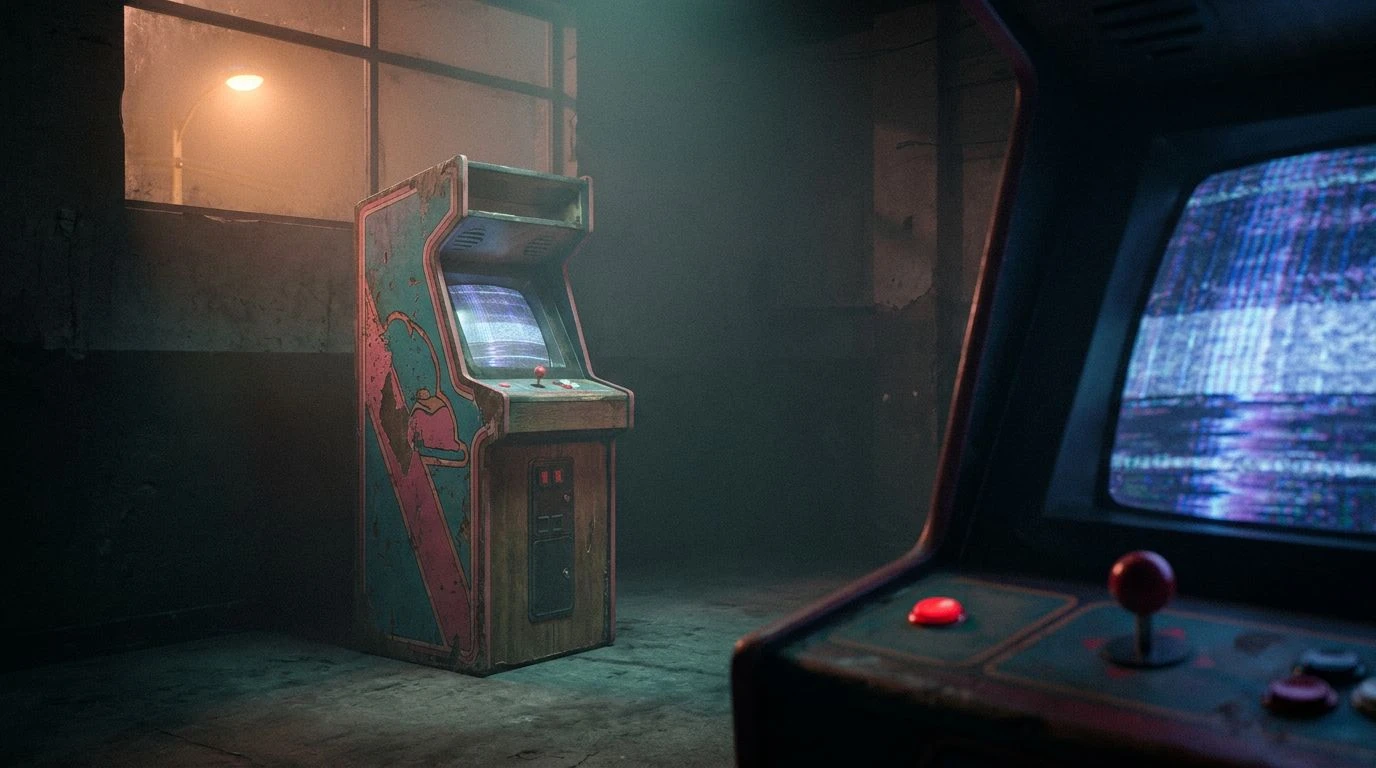
· 6 min readUnder normal daylight conditions, the human visual system processes a staggering array of vibrant stimuli with remarkable efficiency. Yet, drop that same sensory apparatus into a dimly lit room filled with the buzzing cathode ray tubes of a 1980s arcade at two in the morning, and the perceptual experience shifts dramatically. In these late-night urban environments, the optical system battles a phenomenon known as visual fatigue. The aggressively bright primary colors of earlier in the evening soften into diminished wavelengths, visually translating into a muted spectrum that mirrors a creeping psychological distance. We see fading teals, dimming pinks, and shadowed blues replacing sharp contrast. This physical decline in light energy maps remarkably well onto human emotional processing. When the visual cortex stops receiving high-intensity signals from the immediate surroundings, the mind naturally turns inward, prompting a profound sense of isolation despite a physical space packed with towering cabinets and mechanical noise.
CRT Ghosting 🕹️
Within the visual collection of CRT Ghosting, the human eye encounters a fascinating study in wavelength separation and cognitive processing. The sharp chromatic contrast between Marquee Red and Midnight CRT Blue forces the retina to continuously adjust its crystalline lens, mimicking the restless, scanning motion of a crowded room. However, intermediate and desaturated tones like Dusty Coin Matte and Aged Carpet Grey anchor the visual field in physical reality, serving as a dulling agent against the retreating neon. The inclusion of Phosphor Teal offers a specific optical trick, drawing heavily on the rod cells of the eye which become more active in low-light conditions. This biological shift toward scotopic vision makes the teal appear distinct yet strangely distant to the observer. Standing among glowing screens, a person experiences a form of biological detachment as fading warm tones are swallowed by expansive cool shadows, mirroring the sensation of being entirely detached in a space built for communal interaction.
Midnight Token 🪙
The Midnight Token sequence provides a clear look at how the brain interprets constrained lighting scenarios in late-night settings. Tarnished Brass Token and Amber Display land squarely in the middle of the visible spectrum, regions where our cone cells are historically most sensitive, yet their lowered intensity signals to the brain that the primary light source is actively failing. Pushing against these warm metallic signals are the short wavelengths of Pale Mint Phosphor and Faded Cabinet Teal. This specific chromatic opposition creates a tension across the visual field that the human mind often interprets as nostalgia, essentially a perceptual artifact where current sensory input triggers faded memory pathways rather than immediate action. In an aging entertainment center long after midnight, these specific wavelengths trace the physical objects of the room rather than the digital games themselves, effortlessly guiding human attention to the quiet margins of the space where solitude takes precedent over stimulation.
Phosphor Decay 👾
Phosphor Decay explores the phenomenon of visual persistence and afterimages that routinely plague the eyes interacting with late-night screens. When staring at high-intensity localized light sources like a Ruby LED or Arcade Yellow for prolonged periods, the specific photoreceptors in the eye temporarily exhaust themselves. Looking away into a darker room naturally reveals phantom shapes colored in inverted tones, closely resembling Halation Blue or Muted Cyan. Surrounding these ghostly biological impressions are grounded, heavily desaturated pigments like Ash Tray Brown and Stale Smoke Beige, representing the heavy, physical reality of a decaying recreational space. The psychological impact of observing this spectral decay is highly profound, as the brain struggles to reconcile the lingering artificial glow with the surrounding gloom. This creates an isolating perceptual divide for the viewer, trapping them in an optical space somewhere between hyperactive digital environments and the stark, empty architecture that houses them.
Synthwave Solitude 🎧
Moving into the spectrum of Synthwave Solitude, we find a complex biological interaction between short and long wavelengths operating at severely diminished capacities. Colors such as Soft Orange Glow and Cherry Switch Red demand immediate visual attention, historically signaling danger or urgency in our evolutionary past. Yet, when placed beside the retreating, low-energy frequencies of Cobalt Glitch, Lilac Static, and Muted Magenta, their psychological impact is heavily dampened. This exact visual arrangement causes human peripheral vision to blur the edges of the room, reducing the surrounding environment to a generalized wash of quiet chromatic noise. The resulting effect mirrors the psychological state of dissociation. The observer registers the presence of vibrant communal activity on a conscious level but feels entirely disconnected from it biologically, as the surrounding hues lack the necessary luminous energy to bridge the gap between external stimuli and internal processing.
Cathode Ray Blues 📺
The collection characterized as Cathode Ray Blues shifts the physiological response almost entirely toward the parasympathetic nervous system, the bodily network responsible for states of rest and introspection. The dominant wavelengths here, heavily represented by Soft Aqua Glow and Pale Cathode Blue, sit firmly in the cool sector of the spectrum, which requires notably less physical exertion from the ciliary muscles of the eye to maintain steady focus. Paired with Olive Circuit Board and Ticket Paper Off-White, the incoming visual information is remarkably easy for the brain to process, offering a stark biological departure from the sensory assault typically expected in an active gaming venue. This specific chromatic combination systematically reduces neural arousal, guiding the conscious mind into a quiet, almost melancholy operational baseline. It perfectly captures those final moments before the power cuts out completely, where the last remaining glow casts long shadows across the empty carpet.
Examining these specific chromatic arrangements reveals fascinating connections between human perception and the ways our physical surroundings dictate our internal emotional processing. By analyzing the diminished wavelengths typically found in aging recreational spaces at late hours, we uncover a faded spectrum that speaks directly to the bio-mechanics of sensory fatigue. The muted teals, retreating pinks, and shadowed aquatic blues operate as a visual shorthand for psychological distance. As our photoreceptors struggle to interpret these dimming signals in a darkened room, the resulting perceptual gap leaves us isolated in our own minds. This demonstrates precisely how powerful the absence of high-energy light can be in shaping our biological and emotional response to a crowded, noisy environment.