'%3e%3cpath%20fill-rule='evenodd'%20clip-rule='evenodd'%20d='M51.1303%2019.2492C50.7278%2019.913%2050.1346%2020.4426%2049.3508%2020.838C48.5669%2021.2335%2047.6172%2021.4312%2046.5014%2021.4312C44.8208%2021.4312%2043.4367%2021.0216%2042.3492%2020.2025C41.2617%2019.3833%2040.6686%2018.2394%2040.5697%2016.7706H44.4253C44.4818%2017.3355%2044.6831%2017.7804%2045.0291%2018.1052C45.3751%2018.43%2045.8164%2018.5924%2046.3531%2018.5924C46.8192%2018.5924%2047.1864%2018.4653%2047.4547%2018.2111C47.7231%2017.9569%2047.8572%2017.618%2047.8572%2017.1943C47.8572%2016.8129%2047.7337%2016.4952%2047.4865%2016.241C47.2393%2015.9867%2046.9322%2015.7784%2046.565%2015.616C46.1978%2015.4536%2045.6893%2015.2594%2045.0397%2015.0334C44.0934%2014.7086%2043.3202%2014.3944%2042.72%2014.0907C42.1197%2013.7871%2041.6042%2013.3351%2041.1735%2012.7349C40.7427%2012.1347%2040.5273%2011.3544%2040.5273%2010.394C40.5273%209.50418%2040.7533%208.73448%2041.2053%208.08481C41.6572%207.43515%2042.2821%206.93731%2043.0801%206.5913C43.8781%206.24528%2044.7925%206.07227%2045.8235%206.07227C47.49%206.07227%2048.8141%206.46771%2049.7956%207.25861C50.7772%208.04951%2051.3315%209.13698%2051.4586%2010.5211H47.5395C47.4689%2010.0268%2047.2888%209.63483%2046.9993%209.3453C46.7097%209.05578%2046.3178%208.91102%2045.8235%208.91102C45.3998%208.91102%2045.0573%209.024%2044.7961%209.24997C44.5348%209.47594%2044.4041%209.80783%2044.4041%2010.2457C44.4041%2010.5988%2044.5207%2010.8989%2044.7537%2011.146C44.9867%2011.3932%2045.2798%2011.5944%2045.6328%2011.7498C45.9859%2011.9052%2046.4944%2012.1029%2047.1581%2012.343C48.1185%2012.6678%2048.9023%2012.9891%2049.5096%2013.3069C50.1169%2013.6246%2050.6395%2014.0872%2051.0773%2014.6945C51.5151%2015.3018%2051.734%2016.0927%2051.734%2017.0672C51.734%2017.8581%2051.5328%2018.5854%2051.1303%2019.2492ZM59.0242%206.3053V21.2829H55.4016V6.3053H59.0242ZM73.9409%206.3053V9.18642H69.8734V21.2829H66.2296V9.18642H62.2046V6.3053H73.9409ZM80.7438%209.18642V12.3218H85.8069V15.0546H80.7438V18.3806H86.4425V21.2829H77.1212V6.3053H86.4425V9.18642H80.7438ZM99.667%2016.0291V21.2829H96.0444V6.3053H101.913C103.692%206.3053%20105.048%206.74665%20105.98%207.62934C106.912%208.51204%20107.378%209.7019%20107.378%2011.199C107.378%2012.1311%20107.17%2012.9609%20106.753%2013.6882C106.337%2014.4155%20105.719%2014.9875%20104.9%2015.4042C104.08%2015.8208%20103.085%2016.0291%20101.913%2016.0291H99.667ZM103.692%2011.199C103.692%209.8855%20102.965%209.22879%20101.51%209.22879H99.667V13.1268H101.51C102.965%2013.1268%20103.692%2012.4842%20103.692%2011.199ZM120.092%2018.5501H114.478L113.546%2021.2829H109.732L115.219%206.41123H119.393L124.879%2021.2829H121.024L120.092%2018.5501ZM119.16%2015.7961L117.295%2010.2881L115.41%2015.7961H119.16ZM131.555%2018.5077H136.385V21.2829H127.933V6.3053H131.555V18.5077ZM143.337%209.18642V12.3218H148.4V15.0546H143.337V18.3806H149.035V21.2829H139.714V6.3053H149.035V9.18642H143.337ZM163.507%206.3053V9.18642H159.44V21.2829H155.796V9.18642H151.771V6.3053H163.507ZM177.449%206.3053V9.18642H173.382V21.2829H169.738V9.18642H165.713V6.3053H177.449ZM184.252%209.18642V12.3218H189.315V15.0546H184.252V18.3806H189.951V21.2829H180.629V6.3053H189.951V9.18642H184.252Z'%20fill='%23EEF0ED'/%3e%3cmask%20id='mask0_3101_7327'%20style='mask-type:alpha'%20maskUnits='userSpaceOnUse'%20x='0'%20y='0'%20width='27'%20height='28'%3e%3cpath%20d='M23.8328%200.759766H2.64808C1.18559%200.759766%200%201.94535%200%203.40785V24.5925C0%2026.055%201.18559%2027.2406%202.64808%2027.2406H23.8328C25.2952%2027.2406%2026.4808%2026.055%2026.4808%2024.5925V3.40785C26.4808%201.94535%2025.2952%200.759766%2023.8328%200.759766Z'%20fill='white'/%3e%3c/mask%3e%3cg%20mask='url(%23mask0_3101_7327)'%3e%3cpath%20d='M23.8328%200.759766H2.64808C1.18559%200.759766%200%201.94535%200%203.40785V24.5925C0%2026.055%201.18559%2027.2406%202.64808%2027.2406H23.8328C25.2952%2027.2406%2026.4808%2026.055%2026.4808%2024.5925V3.40785C26.4808%201.94535%2025.2952%200.759766%2023.8328%200.759766Z'%20fill='%23D8D8D8'/%3e%3cpath%20d='M13.2404%200.759766H0V14.0001H13.2404V0.759766Z'%20fill='%238C61FF'/%3e%3cpath%20d='M13.2404%2014H0V27.2404H13.2404V14Z'%20fill='%2336C3FE'/%3e%3cpath%20d='M26.4806%2014H13.2402V27.2404H26.4806V14Z'%20fill='%236592FE'/%3e%3cpath%20d='M26.4806%200.759766H13.2402V14.0002H26.4806V0.759766Z'%20fill='%236059F7'/%3e%3c/g%3e%3c/g%3e%3cdefs%3e%3cclipPath%20id='clip0_3101_7327'%3e%3crect%20width='190'%20height='28'%20fill='white'/%3e%3c/clipPath%3e%3c/defs%3e%3c/svg%3e)
'%3e%3cpath%20d='M23.8328%200.759521H2.64808C1.18559%200.759521%200%201.94511%200%203.40761V24.5923C0%2026.0548%201.18559%2027.2404%202.64808%2027.2404H23.8328C25.2952%2027.2404%2026.4808%2026.0548%2026.4808%2024.5923V3.40761C26.4808%201.94511%2025.2952%200.759521%2023.8328%200.759521Z'%20fill='%23D8D8D8'/%3e%3cpath%20d='M13.2404%200.759521H0V13.9999H13.2404V0.759521Z'%20fill='%238C61FF'/%3e%3cpath%20d='M13.2404%2013.9998H0V27.2402H13.2404V13.9998Z'%20fill='%2336C3FE'/%3e%3cpath%20d='M26.4809%2013.9998H13.2405V27.2402H26.4809V13.9998Z'%20fill='%236592FE'/%3e%3cpath%20d='M26.4809%200.759277H13.2405V13.9997H26.4809V0.759277Z'%20fill='%236059F7'/%3e%3c/g%3e%3c/svg%3e)
Earthy Gold Color Palettes: Moving Beyond Neutral Grays
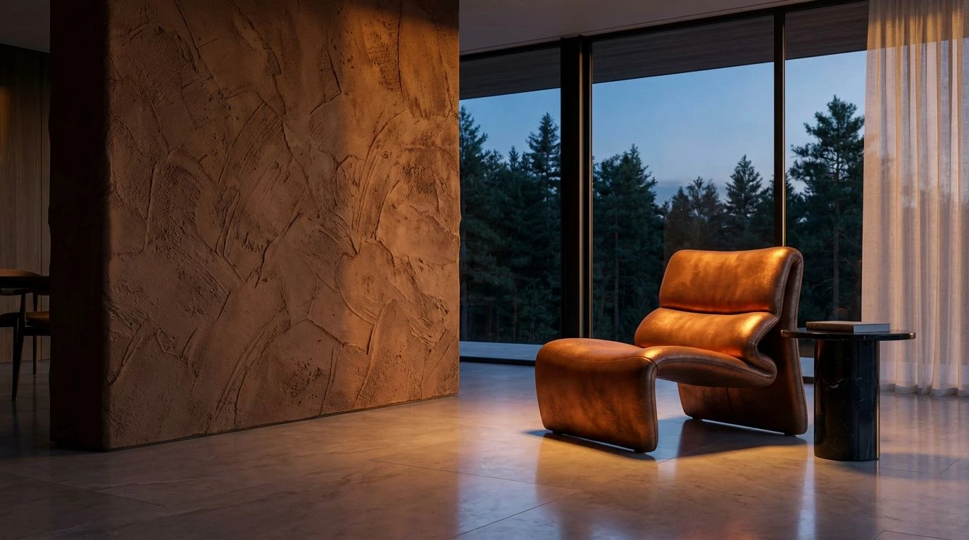
· 5 min readA room washed entirely in gray feels like a waiting area devoid of time. For years, we have hidden behind the safety of these sterile neutrals, constructing spaces that refuse to claim an identity or admit to a history. Yet beneath our feet lies a vast lexicon of soil, clay, and fractured stone, waiting to lend its weight to our visual worlds. It is time to abandon the cautious comfort of pale concrete and ash. True vitality requires a return to colors that remember the heat of the sun and the slow pressure of time. When we invite the grounded breath of earthly gold into our designs, we suddenly replace hesitation with quiet confidence. This is about choosing warmth over indifference, selecting tones that speak of ancient roots rather than empty horizons.
Sunbaked Flint 🏺
Within Sunbaked Flint, the familiar cool wash of Weathered Granite and Winter Sky finds an unexpected breath of life through a seam of Harvest Wheat. This sudden flash of earthy warmth strikes a deliberate contrast against the heavier Shadowed Moss, demanding attention without screaming for it. We are so accustomed to letting River Depth and pale stone dictate a room, hiding behind their predictable silences. But when you anchor these cooler shadows with Fired Clay and golden fields, the entire atmosphere shifts from a sterile gallery into a place inhabited by living breath. The golden tones act like late afternoon light hitting a dormant cliffside, warming the chill of the slate and promising a quiet, enduring rhythm that outlasts any fleeting design trend.
Forest Copper 🌲
Forest Copper illustrates exactly what happens when stark modern parameters meet the vast memory of the forest floor. The sheer drop from Frost to Obsidian and Glacial Stone mimics the cold architecture we have stubbornly clung to for over a decade. Yet, creeping through this rigid framework is the unmistakable pulse of Rich Loam and Burnished Copper, softening the edges of Midnight Ocean. Those copper and soil tones drag the entire visual field downward into something tangible and heavy. It speaks to the feeling of finding ancient metal buried in cool Pine Needle droppings. By substituting passive midtones with these deep, rusted terrestrial colors, a design stretches beyond mere geometry and begins to breathe, reminding the observer of raw, unpolished terrain.
Desert Embers 🏜️
There is no room for timid neutrality in the vast expanses of Desert Embers. Instead of relying on a safe, noncommittal backdrop, this arrangement strips down to the essential, baking heat of the crust. Sunbleached Brick and Desert Saffron replace the conventional middle ground with an unforgiving, yet intensely familiar glow. When Charred Wood and Salt Flat collar these scorching midtones, they frame the warmth, preventing the Roasted Pecan from scattering into chaos. This is what it means to build an environment that remembers the sun. The blazing terrestrial energy entirely banishes the sensation of corporate waiting rooms, flooding the senses with the dry, cracked beauty of a canyon wall at dusk. It proves that groundedness does not require heavy shadows, only colors that know the touch of the earth.
Gilded Moor 🌾
Gilded Moor presents the most direct answer to the ubiquitous use of flat concrete. The chilling presence of Morning Frost and Weathered Slate offers a familiar, fog-like atmosphere, yet they are immediately grounded by the heavy, historical weight of Peat Bog. Emerging from this misty twilight is the soft but undeniable gleam of Tarnished Brass and Spun Bracken. These golden tones do not shine with the gaudy reflection of newly minted coins; rather, they hold the muffled glow of an heirloom passed down through quiet generations. Introducing such deeply rooted metallic and organic shades transforms entirely what might have been a desolate, windswept vista into a hearth. It beckons the weary traveler out of the cold, promising shelter, age, and an unspoken permanence.
Alpine Ochre ⛰️
The striking juxtaposition found in Alpine Ochre tells a story of survival at high altitude, where vibrant life clings to unforgiving stone. Here, the safety of Polished Ash and Basalt Rock is interrupted by a brilliant streak of Wild Mustard. This singular jolt of yellow-earth creates a visual foothold, pulling the eye away from the chill of Snowdrift and Alpine Tarn. Surrounded by the steadying darkness of Iron Ore and the deep, enduring sap of Evergreen Bough, the ochre radiates a fierce, stubborn warmth. Giving up on purely industrial grays means allowing these sudden flashes of terrestrial brilliance to take the lead. The entire visual space transforms from a sterile enclosure into a mountain pass, full of ancient minerals, sharp air, and a rugged, breathing vitality.
We have spent too long decorating our physical and visual spaces as though we are trying to erase the dirt from our shoes. Stripping away the endless sea of noncommittal grays allows a design to reclaim its gravity. When we draw up the deeply buried warmth of clay, rusted iron, and field gold, we invite consequence and memory back into our lives. These terrestrial colors serve as anchors in an increasingly weightless world, tethering our wandering eyes to something ancient and undeniably real. The sheer act of choosing soil over concrete, or tarnish over polish, returns a sense of authentic scale to our surroundings. We begin building monuments to the ground we walk on rather than the sterile skies we have imagined.