'%3e%3cpath%20fill-rule='evenodd'%20clip-rule='evenodd'%20d='M51.1303%2019.2492C50.7278%2019.913%2050.1346%2020.4426%2049.3508%2020.838C48.5669%2021.2335%2047.6172%2021.4312%2046.5014%2021.4312C44.8208%2021.4312%2043.4367%2021.0216%2042.3492%2020.2025C41.2617%2019.3833%2040.6686%2018.2394%2040.5697%2016.7706H44.4253C44.4818%2017.3355%2044.6831%2017.7804%2045.0291%2018.1052C45.3751%2018.43%2045.8164%2018.5924%2046.3531%2018.5924C46.8192%2018.5924%2047.1864%2018.4653%2047.4547%2018.2111C47.7231%2017.9569%2047.8572%2017.618%2047.8572%2017.1943C47.8572%2016.8129%2047.7337%2016.4952%2047.4865%2016.241C47.2393%2015.9867%2046.9322%2015.7784%2046.565%2015.616C46.1978%2015.4536%2045.6893%2015.2594%2045.0397%2015.0334C44.0934%2014.7086%2043.3202%2014.3944%2042.72%2014.0907C42.1197%2013.7871%2041.6042%2013.3351%2041.1735%2012.7349C40.7427%2012.1347%2040.5273%2011.3544%2040.5273%2010.394C40.5273%209.50418%2040.7533%208.73448%2041.2053%208.08481C41.6572%207.43515%2042.2821%206.93731%2043.0801%206.5913C43.8781%206.24528%2044.7925%206.07227%2045.8235%206.07227C47.49%206.07227%2048.8141%206.46771%2049.7956%207.25861C50.7772%208.04951%2051.3315%209.13698%2051.4586%2010.5211H47.5395C47.4689%2010.0268%2047.2888%209.63483%2046.9993%209.3453C46.7097%209.05578%2046.3178%208.91102%2045.8235%208.91102C45.3998%208.91102%2045.0573%209.024%2044.7961%209.24997C44.5348%209.47594%2044.4041%209.80783%2044.4041%2010.2457C44.4041%2010.5988%2044.5207%2010.8989%2044.7537%2011.146C44.9867%2011.3932%2045.2798%2011.5944%2045.6328%2011.7498C45.9859%2011.9052%2046.4944%2012.1029%2047.1581%2012.343C48.1185%2012.6678%2048.9023%2012.9891%2049.5096%2013.3069C50.1169%2013.6246%2050.6395%2014.0872%2051.0773%2014.6945C51.5151%2015.3018%2051.734%2016.0927%2051.734%2017.0672C51.734%2017.8581%2051.5328%2018.5854%2051.1303%2019.2492ZM59.0242%206.3053V21.2829H55.4016V6.3053H59.0242ZM73.9409%206.3053V9.18642H69.8734V21.2829H66.2296V9.18642H62.2046V6.3053H73.9409ZM80.7438%209.18642V12.3218H85.8069V15.0546H80.7438V18.3806H86.4425V21.2829H77.1212V6.3053H86.4425V9.18642H80.7438ZM99.667%2016.0291V21.2829H96.0444V6.3053H101.913C103.692%206.3053%20105.048%206.74665%20105.98%207.62934C106.912%208.51204%20107.378%209.7019%20107.378%2011.199C107.378%2012.1311%20107.17%2012.9609%20106.753%2013.6882C106.337%2014.4155%20105.719%2014.9875%20104.9%2015.4042C104.08%2015.8208%20103.085%2016.0291%20101.913%2016.0291H99.667ZM103.692%2011.199C103.692%209.8855%20102.965%209.22879%20101.51%209.22879H99.667V13.1268H101.51C102.965%2013.1268%20103.692%2012.4842%20103.692%2011.199ZM120.092%2018.5501H114.478L113.546%2021.2829H109.732L115.219%206.41123H119.393L124.879%2021.2829H121.024L120.092%2018.5501ZM119.16%2015.7961L117.295%2010.2881L115.41%2015.7961H119.16ZM131.555%2018.5077H136.385V21.2829H127.933V6.3053H131.555V18.5077ZM143.337%209.18642V12.3218H148.4V15.0546H143.337V18.3806H149.035V21.2829H139.714V6.3053H149.035V9.18642H143.337ZM163.507%206.3053V9.18642H159.44V21.2829H155.796V9.18642H151.771V6.3053H163.507ZM177.449%206.3053V9.18642H173.382V21.2829H169.738V9.18642H165.713V6.3053H177.449ZM184.252%209.18642V12.3218H189.315V15.0546H184.252V18.3806H189.951V21.2829H180.629V6.3053H189.951V9.18642H184.252Z'%20fill='%23EEF0ED'/%3e%3cmask%20id='mask0_3101_7327'%20style='mask-type:alpha'%20maskUnits='userSpaceOnUse'%20x='0'%20y='0'%20width='27'%20height='28'%3e%3cpath%20d='M23.8328%200.759766H2.64808C1.18559%200.759766%200%201.94535%200%203.40785V24.5925C0%2026.055%201.18559%2027.2406%202.64808%2027.2406H23.8328C25.2952%2027.2406%2026.4808%2026.055%2026.4808%2024.5925V3.40785C26.4808%201.94535%2025.2952%200.759766%2023.8328%200.759766Z'%20fill='white'/%3e%3c/mask%3e%3cg%20mask='url(%23mask0_3101_7327)'%3e%3cpath%20d='M23.8328%200.759766H2.64808C1.18559%200.759766%200%201.94535%200%203.40785V24.5925C0%2026.055%201.18559%2027.2406%202.64808%2027.2406H23.8328C25.2952%2027.2406%2026.4808%2026.055%2026.4808%2024.5925V3.40785C26.4808%201.94535%2025.2952%200.759766%2023.8328%200.759766Z'%20fill='%23D8D8D8'/%3e%3cpath%20d='M13.2404%200.759766H0V14.0001H13.2404V0.759766Z'%20fill='%238C61FF'/%3e%3cpath%20d='M13.2404%2014H0V27.2404H13.2404V14Z'%20fill='%2336C3FE'/%3e%3cpath%20d='M26.4806%2014H13.2402V27.2404H26.4806V14Z'%20fill='%236592FE'/%3e%3cpath%20d='M26.4806%200.759766H13.2402V14.0002H26.4806V0.759766Z'%20fill='%236059F7'/%3e%3c/g%3e%3c/g%3e%3cdefs%3e%3cclipPath%20id='clip0_3101_7327'%3e%3crect%20width='190'%20height='28'%20fill='white'/%3e%3c/clipPath%3e%3c/defs%3e%3c/svg%3e)
'%3e%3cpath%20d='M23.8328%200.759521H2.64808C1.18559%200.759521%200%201.94511%200%203.40761V24.5923C0%2026.0548%201.18559%2027.2404%202.64808%2027.2404H23.8328C25.2952%2027.2404%2026.4808%2026.0548%2026.4808%2024.5923V3.40761C26.4808%201.94511%2025.2952%200.759521%2023.8328%200.759521Z'%20fill='%23D8D8D8'/%3e%3cpath%20d='M13.2404%200.759521H0V13.9999H13.2404V0.759521Z'%20fill='%238C61FF'/%3e%3cpath%20d='M13.2404%2013.9998H0V27.2402H13.2404V13.9998Z'%20fill='%2336C3FE'/%3e%3cpath%20d='M26.4809%2013.9998H13.2405V27.2402H26.4809V13.9998Z'%20fill='%236592FE'/%3e%3cpath%20d='M26.4809%200.759277H13.2405V13.9997H26.4809V0.759277Z'%20fill='%236059F7'/%3e%3c/g%3e%3c/svg%3e)
Rusty Red Color Palettes: Designing Digital Bank Luxury
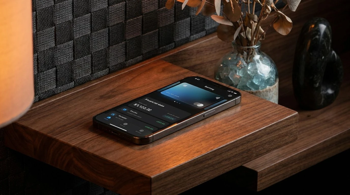
· 5 min readIn human visual perception, specific wavelengths of light trigger immediate psychological associations formed over centuries of cultural conditioning. The transition from physical banking halls with their heavy oak doors and leather-bound ledgers to glowing, untethered screens has created a psychological gap in how we perceive financial security. By observing the visual mechanics of a heritage library, we can engineer digital spaces that signal permanence and authority. The visual pairing of oxidized earth tones and deep carbon blacks taps directly into the brain's recognition of physical weight and natural aging processes. When a digital bank adopts these specific color profiles, it seamlessly shifts the user's perception from a transient online transaction to an experience of inherited wealth and rigorous academic study, altering the emotional geometry of the financial application.
Archive Bindings 📚
A digital interface coded in these specific tones manipulates the user's perception of temporal stability. The eye is first drawn to Crimson Leather, a rich, iron-heavy red that mimics the physical oxidation of antique bookbindings. In cognitive science, humans associate this specific color decay with age, survival, and long-term preservation. When paired with the consuming void of Obsidian Ink, the interface acquires a perceived biological weight, suggesting heavy ledgers resting on solid timber desks. Vellum Dust and Minted Glass act as neutral grounding elements, providing necessary visual resting points for the optic nerve during prolonged screen exposure and minimizing eye strain. Strategically placing Gilded Edge on crucial interaction points like a money transfer button mimics the tactile reward of touching gold leaf on a rare manuscript, transforming a mundane banking task into an act of historic consequence.
Scholastic Ledger 🏛️
When building trust in virtual environments, replicating the visual cues of physical institutions helps bridge the gap between tangible currency and abstract data. The Scholastic Ledger arrangement relies on the sharp visual contrast between Charcoal Spine and Crisp Page to optimize reading geometry while establishing an authoritative academic tone. Oxidized Seal functions as the focal anchor, a deep rusty red that triggers receptors associated with historical wax seals and official documentation, grounding the interface in a sense of verified history. Adding touches of Mahogany Desk and Brass Key introduces the psychological warmth of a headmaster's study, a space historically associated with wisdom and careful stewardship of resources. The subtle inclusion of Aged Felt green and Frosted Window grey introduces an ambient calm, reducing the physiological anxiety often associated with financial monitoring by mimicking the controlled lighting of a rare books archiving room.
Oxford Reading Room 🛋️
Human vision adapted over millennia to recognize the safety of sheltered environments, and the Oxford Reading Room palette triggers these precise biological mechanisms within a digital context. Midnight Carbon provides an infinite, non-reflective background that recedes from the viewer, pushing actionable financial elements forward. Ember Glow stands out as an energetic yet matured rust tone, reminiscent of a dying fire in a private study. This specific wavelength creates a focal intensity for critical alerts without triggering the stress response typically associated with bright emergency reds. The addition of Walnut Shelf offers a sturdy base for data visualization, while the transition through Dried Botanicals into Pale Sky and Inkwell Blue provides a cool, calculated counterbalance. This visual temperature gradient mimics the daylight filtering through tall library windows onto dark wood, naturally guiding the user's eye across complex financial graphs while maintaining an atmosphere of calm, educated authority.
Cartographer's Vault 🗺️
The phenomenon of visual weight dictates that darker, warmer colors appear physically heavier than lighter, cooler ones. The Cartographer's Vault applies this perceptual rule to digital banking by anchoring the application layout in Tar Black and Iron Oxide. These heavy tones suggest literal earth and forged metal, tricking the brain into perceiving a highly stable, immovable interface. Wrought Copper serves as a secondary focal point, simulating the passage of time over raw materials and signaling massive wealth retention. The vast negative space required for numerical financial ledgers is handled by Parchment White, which dramatically reduces the harsh blue-light glare typical of modern displays, replacing it with the soft reflectance of aged mapping paper. Finishing the interface with River Stone and Slate Grey for secondary menus creates a structural framework that feels carved from rock, assuring the user that their assets are housed in an impenetrable, intellectually rigorous vault.
Alchemical Wealth ⚖️
Color acts as a rapid communicator of material properties to the human brain. The Alchemical Wealth selection systematically reconstructs the material properties of a Renaissance scholar's laboratory on a modern screen. Vermilion Wax and Deep Rust replace the traditional, alarmist red of negative bank balances with tones that instead suggest historical preservation and terrestrial permanence. The transition from these rich earthy reds right up to the delicate Rose Quartz creates a continuous gradient of thermal warmth, making the digital platform feel surprisingly inviting and human-centric. Antiqued Gold functions as the mechanism for reward and navigation, drawing the eye precisely to pathways for wealth generation. Surrounding these active elements with Iron Ore and Ash Grey provides a sterile, undistracting workspace that allows the user's visual cortex to focus entirely on numerical data, replicating the silent, concentrated environment of a private archives reading desk.
Examined through the lens of visual perception and digital interface design, we see how profoundly specific wavelengths can alter our psychological response to virtual environments. By substituting the sterile, neon aesthetic of modern technology with the rusty reds and dense charcoals of historical institutions, developers can directly manipulate the perceived emotional weight of a digital banking application. These chromatic choices bypass our conscious awareness, activating deep-seated associations with preservation, academic study, and generational security. Ultimately, this perceptual shift demonstrates that the most advanced digital financial tools can achieve their greatest impact by visually simulating the profound visual gravity of physical history.