'%3e%3cpath%20fill-rule='evenodd'%20clip-rule='evenodd'%20d='M51.1303%2019.2492C50.7278%2019.913%2050.1346%2020.4426%2049.3508%2020.838C48.5669%2021.2335%2047.6172%2021.4312%2046.5014%2021.4312C44.8208%2021.4312%2043.4367%2021.0216%2042.3492%2020.2025C41.2617%2019.3833%2040.6686%2018.2394%2040.5697%2016.7706H44.4253C44.4818%2017.3355%2044.6831%2017.7804%2045.0291%2018.1052C45.3751%2018.43%2045.8164%2018.5924%2046.3531%2018.5924C46.8192%2018.5924%2047.1864%2018.4653%2047.4547%2018.2111C47.7231%2017.9569%2047.8572%2017.618%2047.8572%2017.1943C47.8572%2016.8129%2047.7337%2016.4952%2047.4865%2016.241C47.2393%2015.9867%2046.9322%2015.7784%2046.565%2015.616C46.1978%2015.4536%2045.6893%2015.2594%2045.0397%2015.0334C44.0934%2014.7086%2043.3202%2014.3944%2042.72%2014.0907C42.1197%2013.7871%2041.6042%2013.3351%2041.1735%2012.7349C40.7427%2012.1347%2040.5273%2011.3544%2040.5273%2010.394C40.5273%209.50418%2040.7533%208.73448%2041.2053%208.08481C41.6572%207.43515%2042.2821%206.93731%2043.0801%206.5913C43.8781%206.24528%2044.7925%206.07227%2045.8235%206.07227C47.49%206.07227%2048.8141%206.46771%2049.7956%207.25861C50.7772%208.04951%2051.3315%209.13698%2051.4586%2010.5211H47.5395C47.4689%2010.0268%2047.2888%209.63483%2046.9993%209.3453C46.7097%209.05578%2046.3178%208.91102%2045.8235%208.91102C45.3998%208.91102%2045.0573%209.024%2044.7961%209.24997C44.5348%209.47594%2044.4041%209.80783%2044.4041%2010.2457C44.4041%2010.5988%2044.5207%2010.8989%2044.7537%2011.146C44.9867%2011.3932%2045.2798%2011.5944%2045.6328%2011.7498C45.9859%2011.9052%2046.4944%2012.1029%2047.1581%2012.343C48.1185%2012.6678%2048.9023%2012.9891%2049.5096%2013.3069C50.1169%2013.6246%2050.6395%2014.0872%2051.0773%2014.6945C51.5151%2015.3018%2051.734%2016.0927%2051.734%2017.0672C51.734%2017.8581%2051.5328%2018.5854%2051.1303%2019.2492ZM59.0242%206.3053V21.2829H55.4016V6.3053H59.0242ZM73.9409%206.3053V9.18642H69.8734V21.2829H66.2296V9.18642H62.2046V6.3053H73.9409ZM80.7438%209.18642V12.3218H85.8069V15.0546H80.7438V18.3806H86.4425V21.2829H77.1212V6.3053H86.4425V9.18642H80.7438ZM99.667%2016.0291V21.2829H96.0444V6.3053H101.913C103.692%206.3053%20105.048%206.74665%20105.98%207.62934C106.912%208.51204%20107.378%209.7019%20107.378%2011.199C107.378%2012.1311%20107.17%2012.9609%20106.753%2013.6882C106.337%2014.4155%20105.719%2014.9875%20104.9%2015.4042C104.08%2015.8208%20103.085%2016.0291%20101.913%2016.0291H99.667ZM103.692%2011.199C103.692%209.8855%20102.965%209.22879%20101.51%209.22879H99.667V13.1268H101.51C102.965%2013.1268%20103.692%2012.4842%20103.692%2011.199ZM120.092%2018.5501H114.478L113.546%2021.2829H109.732L115.219%206.41123H119.393L124.879%2021.2829H121.024L120.092%2018.5501ZM119.16%2015.7961L117.295%2010.2881L115.41%2015.7961H119.16ZM131.555%2018.5077H136.385V21.2829H127.933V6.3053H131.555V18.5077ZM143.337%209.18642V12.3218H148.4V15.0546H143.337V18.3806H149.035V21.2829H139.714V6.3053H149.035V9.18642H143.337ZM163.507%206.3053V9.18642H159.44V21.2829H155.796V9.18642H151.771V6.3053H163.507ZM177.449%206.3053V9.18642H173.382V21.2829H169.738V9.18642H165.713V6.3053H177.449ZM184.252%209.18642V12.3218H189.315V15.0546H184.252V18.3806H189.951V21.2829H180.629V6.3053H189.951V9.18642H184.252Z'%20fill='%23EEF0ED'/%3e%3cmask%20id='mask0_3101_7327'%20style='mask-type:alpha'%20maskUnits='userSpaceOnUse'%20x='0'%20y='0'%20width='27'%20height='28'%3e%3cpath%20d='M23.8328%200.759766H2.64808C1.18559%200.759766%200%201.94535%200%203.40785V24.5925C0%2026.055%201.18559%2027.2406%202.64808%2027.2406H23.8328C25.2952%2027.2406%2026.4808%2026.055%2026.4808%2024.5925V3.40785C26.4808%201.94535%2025.2952%200.759766%2023.8328%200.759766Z'%20fill='white'/%3e%3c/mask%3e%3cg%20mask='url(%23mask0_3101_7327)'%3e%3cpath%20d='M23.8328%200.759766H2.64808C1.18559%200.759766%200%201.94535%200%203.40785V24.5925C0%2026.055%201.18559%2027.2406%202.64808%2027.2406H23.8328C25.2952%2027.2406%2026.4808%2026.055%2026.4808%2024.5925V3.40785C26.4808%201.94535%2025.2952%200.759766%2023.8328%200.759766Z'%20fill='%23D8D8D8'/%3e%3cpath%20d='M13.2404%200.759766H0V14.0001H13.2404V0.759766Z'%20fill='%238C61FF'/%3e%3cpath%20d='M13.2404%2014H0V27.2404H13.2404V14Z'%20fill='%2336C3FE'/%3e%3cpath%20d='M26.4806%2014H13.2402V27.2404H26.4806V14Z'%20fill='%236592FE'/%3e%3cpath%20d='M26.4806%200.759766H13.2402V14.0002H26.4806V0.759766Z'%20fill='%236059F7'/%3e%3c/g%3e%3c/g%3e%3cdefs%3e%3cclipPath%20id='clip0_3101_7327'%3e%3crect%20width='190'%20height='28'%20fill='white'/%3e%3c/clipPath%3e%3c/defs%3e%3c/svg%3e)
'%3e%3cpath%20d='M23.8328%200.759521H2.64808C1.18559%200.759521%200%201.94511%200%203.40761V24.5923C0%2026.0548%201.18559%2027.2404%202.64808%2027.2404H23.8328C25.2952%2027.2404%2026.4808%2026.0548%2026.4808%2024.5923V3.40761C26.4808%201.94511%2025.2952%200.759521%2023.8328%200.759521Z'%20fill='%23D8D8D8'/%3e%3cpath%20d='M13.2404%200.759521H0V13.9999H13.2404V0.759521Z'%20fill='%238C61FF'/%3e%3cpath%20d='M13.2404%2013.9998H0V27.2402H13.2404V13.9998Z'%20fill='%2336C3FE'/%3e%3cpath%20d='M26.4809%2013.9998H13.2405V27.2402H26.4809V13.9998Z'%20fill='%236592FE'/%3e%3cpath%20d='M26.4809%200.759277H13.2405V13.9997H26.4809V0.759277Z'%20fill='%236059F7'/%3e%3c/g%3e%3c/svg%3e)
Chic Parisian Color Palettes for Modern Software Design
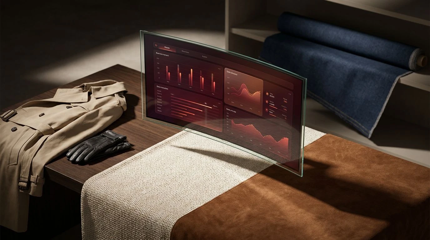
· 6 min readThe architecture of enterprise software historically relies on a visual language of panic and sterile utility. Glaring screens flash with urgent signals, asking for attention through a vocabulary of exhaustion. Yet, wandering through the Marais on a crisp October morning suggests an entirely different possibility for how we interact with space and information. There is an unspoken ruleset in Parisian streetwise dressing where a perfectly draped coat over a muted silhouette commands infinitely more respect than a loud logo. Bringing this philosophy into a pipeline dashboard requires stripping away the noise. When numbers and forecasts rest upon a canvas of understated cream and razor-sharp shadow, data ceases to shout. It begins to converse. The screen transforms into a curated gallery, proving that tracking revenue need not abandon the sensory pleasures of good design.
Marais Midnight 🧥
In the quiet theater of Marais Midnight, the tension between raw utility and refined taste resolves itself effortlessly. Silk Canvas provides an expansive, breathable backdrop, allowing the eye to rest rather than search frantically across the screen. Metrics and client profiles are anchored securely by Obsidian Trench, a shade that defines boundaries with poetic severity. When a crucial metric shifts or a deal closes, a solitary strike of Oxblood Leather draws focus, not as an alarm, but as a deliberate punctuation mark. The transition spaces, softened by Cashmere Dust and Cobblestone Shadow, mimic the textural layering of a well-worn scarf over a tailored collar. Treating a dashboard with this exact palette turns the daily grind of quota tracking into an act of quiet observation. The user feels less like a subordinate inside a machine and more like a gentle observer of a curated gallery, where every figure and chart holds its ground with supreme, unhurried confidence.
Pigalle Neon 🥀
The tension of Pigalle Neon lies in its romantic rebellion. It asks us to look at an interface not as a lifeless spreadsheet but as an evening stroll past a glowing storefront. Onyx Thread and Alabaster Cotton form an uncompromising baseline, stark and deliberate against the soft melancholy of Metro Mist. It is within the shadows of Midnight Damask that the true character of this arrangement emerges, offering a dark, moody vessel for organizing complex numerical narratives. When progress bars fill or targets are surpassed, the sudden bloom of Rosewater Chiffon and Rouge Velvet acts as a burst of floral electricity against a twilight sky. This careful distribution of temperature mimics the flash of a bright silk lining hidden inside a strictly tailored jacket. The sales platform suddenly possesses a pulse, beating with an elegant, almost cinematic rhythm. It creates an environment where tracking performance feels less like a chore and intimately close to reading an impeccably printed fashion editorial.
Seine Fog 🌫️
Stripped of all unnecessary spectacle, Seine Fog champions the profound beauty of absence. By minimizing the spectrum to an ascetic scale of monochrome and muted tones, the interface demands nothing but quiet intellect from its observer. Void Black carves out the fundamental typographic elements, striking forcefully against the crisp expanse of Optic Linen. The softer intermediate zones navigate through Pearl Ash and Storm Wool, providing delicate gradients that suggest depth without declaring it aloud. Twilight Gabardine stands quietly in the background, a moody touch of color that reads almost like a shadow cast by overcast skies. Applying this rigorous discipline to an organizational tool reframes the user's daily rituals entirely. Without the distraction of loud alerts, the mind settles into a state of deep focus and calm deliberation. The platform mirrors the asceticism of avant-garde clothing racks, where the cut and drape of the garments must survive on their own merit, unsupported by flashy patterns or seasonal trends.
Rive Gauche Contrast 🧣
There is a distinct, rhythmic energy alive within Rive Gauche Contrast, a collection of shades that brings unexpected warmth to a traditionally cold digital space. Porcelain Weave and Trench Khaki establish an inviting, tactile foundation, reminiscent of heavy knitted sweaters and classic outerwear waiting by the door. Upon this neutral ground, Chestnut Suede and Noir Leather construct sturdy architectural pillars for menus and navigation. It is the brilliant flash of Pillarbox Crimson and Faded Vermilion that truly sets the temperature, drawing the eye toward critical action items with the same sharp intentionality as a bold red lip or a solitary bright sneaker. Indigo Denim grounds these fiery accents, preventing them from overwhelming the senses and anchoring the layout in timeless confidence. Designing an application with this language turns metric analysis into an intimate, crafted experience. A space that traditionally breeds anxiety becomes a warm, inviting study, holding attention through sheer charm and deliberate layering.
Arrondissement Hype 🛹
Arrondissement Hype disrupts the conventional quietude of continental style through sheer velocity and youthful arrogance. Asphalt Black, Concrete Graphite, and Iron Scaffolding lay down a brutalist pavement, an unyielding matrix built to contain a surge of raw, primary energy. Into this austere framework, a collision of Taxi Yellow and Electric Cobalt creates high-visibility flashes, perfect for highlighting aggressive growth trajectories and breaking news within a fast-paced pipeline. Park Viridian and Mint Glass offer a refreshing detour, a crisp botanical breath cutting through the industrial smog. This collection takes the visual vernacular of premium limited-edition sneakers and applies it directly to productivity tools. The screen transforms into a highly graphic, kinetic field where data visualization mimics the striking typography of oversized billboards plastered along damp city walls. It asks the user to move with speed, decisiveness, and unapologetic swagger, turning every logged entry and finished task into an act of bold, unmistakable motion.
The architecture of our digital tools deeply influences the shape of our thoughts. When a purely functional application borrows the visual patience of a well-dressed pedestrian, the entire psychological weight of the workday shifts. Trading loud, anxious interfaces for considered shades of cream, shadow, and deliberate color teaches us that utility never requires the sacrifice of beauty. We interact with these screens for hours, and they ought to return that gaze with dignity and quiet grace. Transforming a rigid dashboard into an understated sensory pleasure proves that poetry can survive anywhere, even within the strict geometry of commerce and daily numbers.