'%3e%3cpath%20fill-rule='evenodd'%20clip-rule='evenodd'%20d='M51.1303%2019.2492C50.7278%2019.913%2050.1346%2020.4426%2049.3508%2020.838C48.5669%2021.2335%2047.6172%2021.4312%2046.5014%2021.4312C44.8208%2021.4312%2043.4367%2021.0216%2042.3492%2020.2025C41.2617%2019.3833%2040.6686%2018.2394%2040.5697%2016.7706H44.4253C44.4818%2017.3355%2044.6831%2017.7804%2045.0291%2018.1052C45.3751%2018.43%2045.8164%2018.5924%2046.3531%2018.5924C46.8192%2018.5924%2047.1864%2018.4653%2047.4547%2018.2111C47.7231%2017.9569%2047.8572%2017.618%2047.8572%2017.1943C47.8572%2016.8129%2047.7337%2016.4952%2047.4865%2016.241C47.2393%2015.9867%2046.9322%2015.7784%2046.565%2015.616C46.1978%2015.4536%2045.6893%2015.2594%2045.0397%2015.0334C44.0934%2014.7086%2043.3202%2014.3944%2042.72%2014.0907C42.1197%2013.7871%2041.6042%2013.3351%2041.1735%2012.7349C40.7427%2012.1347%2040.5273%2011.3544%2040.5273%2010.394C40.5273%209.50418%2040.7533%208.73448%2041.2053%208.08481C41.6572%207.43515%2042.2821%206.93731%2043.0801%206.5913C43.8781%206.24528%2044.7925%206.07227%2045.8235%206.07227C47.49%206.07227%2048.8141%206.46771%2049.7956%207.25861C50.7772%208.04951%2051.3315%209.13698%2051.4586%2010.5211H47.5395C47.4689%2010.0268%2047.2888%209.63483%2046.9993%209.3453C46.7097%209.05578%2046.3178%208.91102%2045.8235%208.91102C45.3998%208.91102%2045.0573%209.024%2044.7961%209.24997C44.5348%209.47594%2044.4041%209.80783%2044.4041%2010.2457C44.4041%2010.5988%2044.5207%2010.8989%2044.7537%2011.146C44.9867%2011.3932%2045.2798%2011.5944%2045.6328%2011.7498C45.9859%2011.9052%2046.4944%2012.1029%2047.1581%2012.343C48.1185%2012.6678%2048.9023%2012.9891%2049.5096%2013.3069C50.1169%2013.6246%2050.6395%2014.0872%2051.0773%2014.6945C51.5151%2015.3018%2051.734%2016.0927%2051.734%2017.0672C51.734%2017.8581%2051.5328%2018.5854%2051.1303%2019.2492ZM59.0242%206.3053V21.2829H55.4016V6.3053H59.0242ZM73.9409%206.3053V9.18642H69.8734V21.2829H66.2296V9.18642H62.2046V6.3053H73.9409ZM80.7438%209.18642V12.3218H85.8069V15.0546H80.7438V18.3806H86.4425V21.2829H77.1212V6.3053H86.4425V9.18642H80.7438ZM99.667%2016.0291V21.2829H96.0444V6.3053H101.913C103.692%206.3053%20105.048%206.74665%20105.98%207.62934C106.912%208.51204%20107.378%209.7019%20107.378%2011.199C107.378%2012.1311%20107.17%2012.9609%20106.753%2013.6882C106.337%2014.4155%20105.719%2014.9875%20104.9%2015.4042C104.08%2015.8208%20103.085%2016.0291%20101.913%2016.0291H99.667ZM103.692%2011.199C103.692%209.8855%20102.965%209.22879%20101.51%209.22879H99.667V13.1268H101.51C102.965%2013.1268%20103.692%2012.4842%20103.692%2011.199ZM120.092%2018.5501H114.478L113.546%2021.2829H109.732L115.219%206.41123H119.393L124.879%2021.2829H121.024L120.092%2018.5501ZM119.16%2015.7961L117.295%2010.2881L115.41%2015.7961H119.16ZM131.555%2018.5077H136.385V21.2829H127.933V6.3053H131.555V18.5077ZM143.337%209.18642V12.3218H148.4V15.0546H143.337V18.3806H149.035V21.2829H139.714V6.3053H149.035V9.18642H143.337ZM163.507%206.3053V9.18642H159.44V21.2829H155.796V9.18642H151.771V6.3053H163.507ZM177.449%206.3053V9.18642H173.382V21.2829H169.738V9.18642H165.713V6.3053H177.449ZM184.252%209.18642V12.3218H189.315V15.0546H184.252V18.3806H189.951V21.2829H180.629V6.3053H189.951V9.18642H184.252Z'%20fill='%23EEF0ED'/%3e%3cmask%20id='mask0_3101_7327'%20style='mask-type:alpha'%20maskUnits='userSpaceOnUse'%20x='0'%20y='0'%20width='27'%20height='28'%3e%3cpath%20d='M23.8328%200.759766H2.64808C1.18559%200.759766%200%201.94535%200%203.40785V24.5925C0%2026.055%201.18559%2027.2406%202.64808%2027.2406H23.8328C25.2952%2027.2406%2026.4808%2026.055%2026.4808%2024.5925V3.40785C26.4808%201.94535%2025.2952%200.759766%2023.8328%200.759766Z'%20fill='white'/%3e%3c/mask%3e%3cg%20mask='url(%23mask0_3101_7327)'%3e%3cpath%20d='M23.8328%200.759766H2.64808C1.18559%200.759766%200%201.94535%200%203.40785V24.5925C0%2026.055%201.18559%2027.2406%202.64808%2027.2406H23.8328C25.2952%2027.2406%2026.4808%2026.055%2026.4808%2024.5925V3.40785C26.4808%201.94535%2025.2952%200.759766%2023.8328%200.759766Z'%20fill='%23D8D8D8'/%3e%3cpath%20d='M13.2404%200.759766H0V14.0001H13.2404V0.759766Z'%20fill='%238C61FF'/%3e%3cpath%20d='M13.2404%2014H0V27.2404H13.2404V14Z'%20fill='%2336C3FE'/%3e%3cpath%20d='M26.4806%2014H13.2402V27.2404H26.4806V14Z'%20fill='%236592FE'/%3e%3cpath%20d='M26.4806%200.759766H13.2402V14.0002H26.4806V0.759766Z'%20fill='%236059F7'/%3e%3c/g%3e%3c/g%3e%3cdefs%3e%3cclipPath%20id='clip0_3101_7327'%3e%3crect%20width='190'%20height='28'%20fill='white'/%3e%3c/clipPath%3e%3c/defs%3e%3c/svg%3e)
'%3e%3cpath%20d='M23.8328%200.759521H2.64808C1.18559%200.759521%200%201.94511%200%203.40761V24.5923C0%2026.0548%201.18559%2027.2404%202.64808%2027.2404H23.8328C25.2952%2027.2404%2026.4808%2026.0548%2026.4808%2024.5923V3.40761C26.4808%201.94511%2025.2952%200.759521%2023.8328%200.759521Z'%20fill='%23D8D8D8'/%3e%3cpath%20d='M13.2404%200.759521H0V13.9999H13.2404V0.759521Z'%20fill='%238C61FF'/%3e%3cpath%20d='M13.2404%2013.9998H0V27.2402H13.2404V13.9998Z'%20fill='%2336C3FE'/%3e%3cpath%20d='M26.4809%2013.9998H13.2405V27.2402H26.4809V13.9998Z'%20fill='%236592FE'/%3e%3cpath%20d='M26.4809%200.759277H13.2405V13.9997H26.4809V0.759277Z'%20fill='%236059F7'/%3e%3c/g%3e%3c/svg%3e)
Hospital Color Palette Trends: Midnight Crimson & Grey
· 6 min readStep into the modern ward. The air holds a distinctive stillness, a chilling quiet wrapped in walls painted the color of cold rain. We find ourselves in an architectural space where life hangs by the thinnest thread, a theater of absolute necessity. Against an ocean of slate grey, designed to offer sanctuary and cool authority, lies an unexpected jolt to the senses, a sudden streak of midnight crimson. This striking visual antagonism redefines how we experience spaces built for healing. Instead of washing everything in an artificially gentle pastel, a bolder narrative emerges. The raw, beautiful urgency of deep reds crashes against the stoic neutrality of silver and ash, mimicking the physical reality of the human body moving through an impersonal institution. This aesthetic choice speaks volumes, creating environments that do not hide the reality of crisis but stage it with stark, unforgettable elegance. We see a design language that refuses to whisper when it needs to command.
Clinical Awakening 🚑
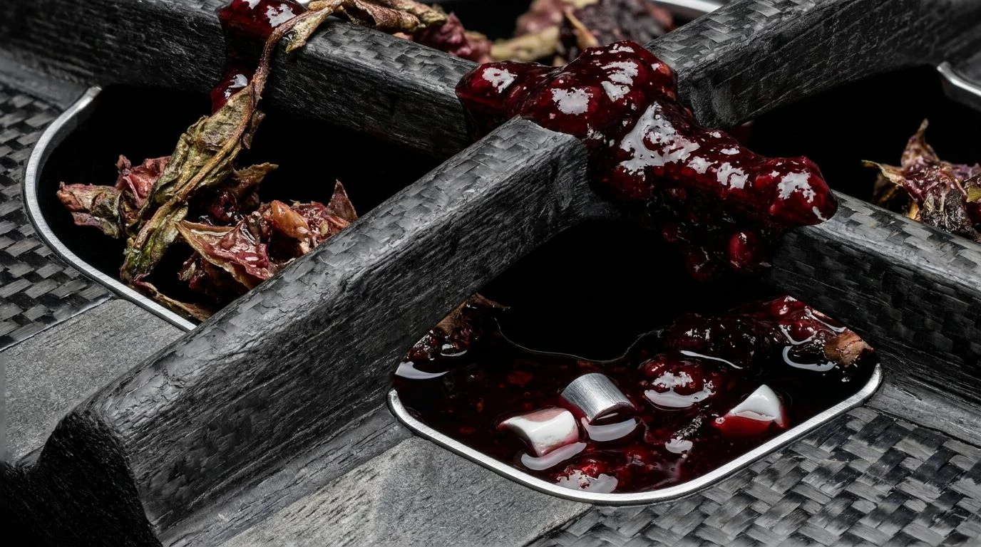
Clinical Awakening offers a scene that pulls the eye directly toward life saving machinery humming in the quiet hours. A wash of Frost Grey and Steel Shadow sets a foundation of absolute calm, reflecting the metallic precision of stainless steel instruments and the unyielding flooring of a trauma bay. Yet, within this quietude, sharp shocks of Alert Orange and Acidic Chartreuse slice through the visual field, demanding immediate attention like a sudden alarm ringing down an empty corridor. A deep undercurrent of Obsidian Void and Midnight Navy grounds the visual experience, adding a layer of grave seriousness to the space. Cobalt Pulse stands as a reassuring beacon against the darker shades, creating a look that is unabashedly functional yet visually mesmerizing. This specific palette breathes life into an otherwise sterile setting, proving that high utility can also possess a striking aesthetic gravity. It transforms a place of anodyne waiting into a gallery of rapid, life altering action.
Surgical Dawn 🩺
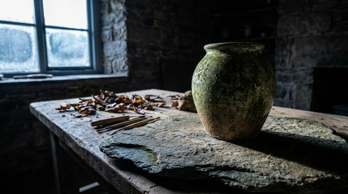
The atmosphere created by Surgical Dawn feels akin to looking out a ward window just as the long night gives way to morning. The pairing of Ink Black and Aluminum Chill crafts a deeply clinical atmosphere, cold to the touch and ruthlessly efficient. Against this metallic stillness, Trauma Orange tears into the gaze, a vivid flash of pure adrenaline that mirrors the split second decisions made upon a surgical table. A softer Apricot Glow acts as a gentle counterbalance, offering a rare moment of warmth akin to the first ray of sun across a linoleum floor. The muted, practical tones of Burnished Umber and Sage Scrub draw heavily from the traditional garments of medical professionals, grounding the high tension of the brighter shades in quiet expertise. Surgical Blue sweeps over the composition like a calming breath, asserting definitive authority. Together, these shades capture the profound emotional swing of a care setting, turning the stark reality of the operating theater into something strangely poetic and visually profound.
Midnight Arterial 🩸
Midnight Arterial serves as the purest expression of the dramatic clash between clinical detachment and the fierce reality of human vitality. Pure Sterile White and Concrete Ghost wrap the viewer in an uncompromising, icy cleanliness, the exact sensation of walking into an intensive care unit where every surface gleams with antiseptic intention. Then comes the shock of Arterial Crimson. This profound, blooming red behaves as a visual heartbeat, loud and undeniable against the Pale Slate surroundings, demanding to be witnessed. An earthy touch of Ochre Bandage brings a slight, bruised reality to the composition, while Charcoal Monitor anchors the scene in the heavy gravity of medical technology keeping watch. The extreme visual distance between the lifeblood red and the unfeeling greys creates a space that feels acutely alive. It speaks to a design philosophy that honors the severity of a medical crisis, framing the absolute fragility of life as a piece of profound, undeniable art.
Fluorescent Pulse 🫀
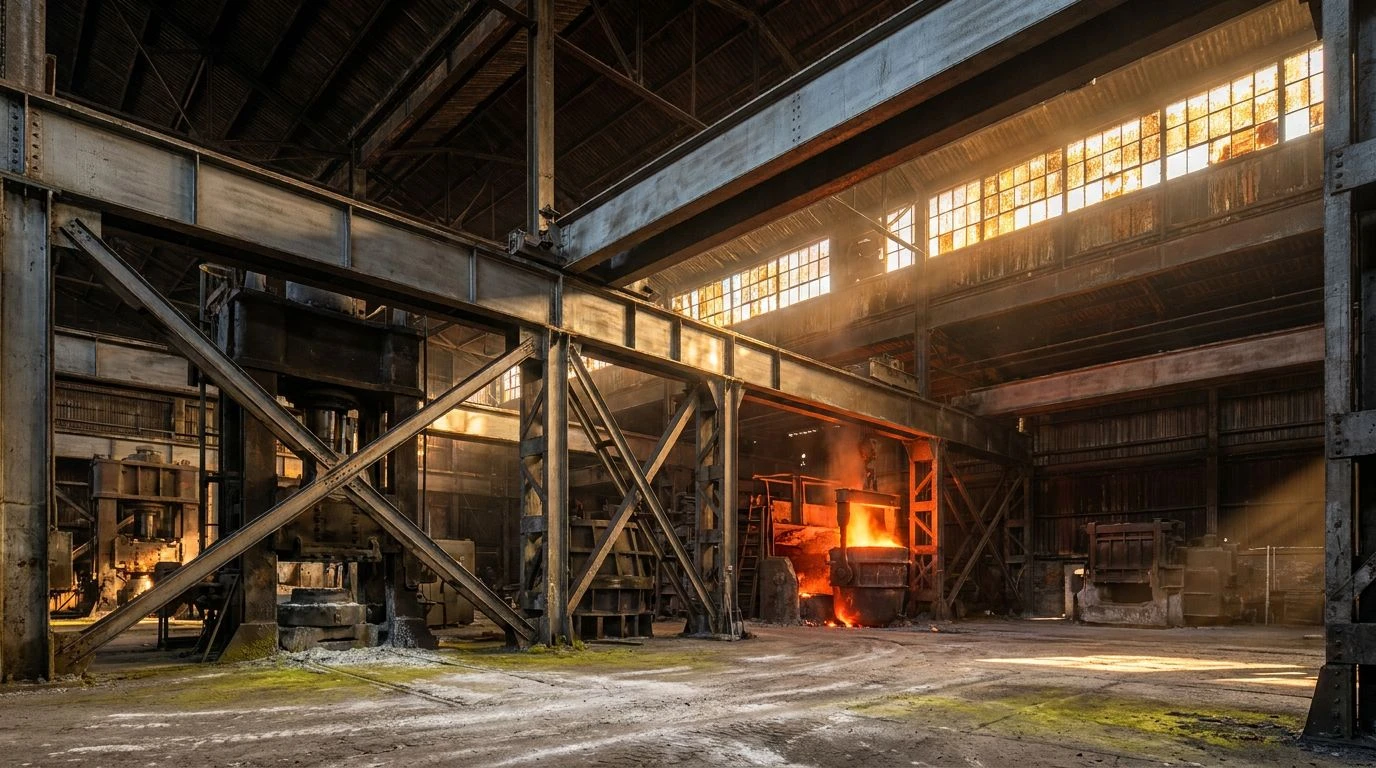
Within the borders of Fluorescent Pulse, we encounter the dizzying sensation of sudden wakefulness in an unfamiliar recovery room. A muted expanse of Fog Grey and Scalpel Silver dominates the field, acting as a soft, almost cloud like barrier that dampens sound and slows time. Pitch Black cuts into the blur, giving a sharp structural outline to the room. The real draw, however, lies in the sudden bloom of Flushed Skin Red and Rust Warning, tones that mimic the living body fighting to regain its strength beneath pale, sterile sheets. Halogen Glare introduces an artificial brightness, mirroring the unblinking lights suspended above a gurney. There is a deeply sensorial narrative at play here, contrasting the artificial quiet of a modern clinic against the vulnerable flush of the patient completely swept into its care. It turns an atmosphere of pure obedience into a quietly thrilling visual experience, celebrating the quiet strength required to heal in a world painted in shades of unyielding metal.
Immaculate Trauma 🏥
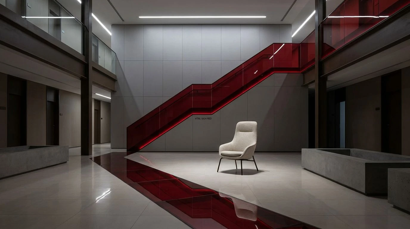
Immaculate Trauma distills the healthcare environment down to its most raw and poetic visual extremes. A vast, unbroken canvas of Bleached Linen and Cold Ceramic provides the ultimate stage for the drama of human survival, mimicking pristine, uninterrupted corridors and freshly laundered scrubs. The tension peaks spectacularly with the introduction of Vital Sign Red. This shade does not ask for permission; it blazes violently against the Ash Uniform greys, an unmistakable signal of crisis, passion, and immediate need. Dried Umber shadows the bright red, serving as a reminder of time passing, of physical reality settling onto the spotless surfaces. This combination removes any sense of comfort, replacing it with sheer, arresting truth. By stripping away all unnecessary color noise, the scheme zeroes in on the exact moment when routine gives way to a fight for survival. The visual treatment insists on clarity, turning a place of profound dread and miracle into an immaculately curated gallery of the human condition.
The visual journey through these contrasting shades forces a radical rethinking of spaces devoted to healing and crisis. Striking reds refuse to be easily ignored, pulsing with undeniable life and urgency against the protective, quiet expanses of grey and silver. By placing the raw reality of the human body directly against architectural indifference, decorators and designers craft environments of profound emotional weight. The interplay moves beyond mere visual appeal, transforming sterile corridors into theaters of survival, courage, and breathtaking clarity. We are left with a design vocabulary that respects the gravity of life saving spaces, finding undeniable beauty in the space between a racing heartbeat and the silent glow of a hospital corridor.