'%3e%3cpath%20fill-rule='evenodd'%20clip-rule='evenodd'%20d='M51.1303%2019.2492C50.7278%2019.913%2050.1346%2020.4426%2049.3508%2020.838C48.5669%2021.2335%2047.6172%2021.4312%2046.5014%2021.4312C44.8208%2021.4312%2043.4367%2021.0216%2042.3492%2020.2025C41.2617%2019.3833%2040.6686%2018.2394%2040.5697%2016.7706H44.4253C44.4818%2017.3355%2044.6831%2017.7804%2045.0291%2018.1052C45.3751%2018.43%2045.8164%2018.5924%2046.3531%2018.5924C46.8192%2018.5924%2047.1864%2018.4653%2047.4547%2018.2111C47.7231%2017.9569%2047.8572%2017.618%2047.8572%2017.1943C47.8572%2016.8129%2047.7337%2016.4952%2047.4865%2016.241C47.2393%2015.9867%2046.9322%2015.7784%2046.565%2015.616C46.1978%2015.4536%2045.6893%2015.2594%2045.0397%2015.0334C44.0934%2014.7086%2043.3202%2014.3944%2042.72%2014.0907C42.1197%2013.7871%2041.6042%2013.3351%2041.1735%2012.7349C40.7427%2012.1347%2040.5273%2011.3544%2040.5273%2010.394C40.5273%209.50418%2040.7533%208.73448%2041.2053%208.08481C41.6572%207.43515%2042.2821%206.93731%2043.0801%206.5913C43.8781%206.24528%2044.7925%206.07227%2045.8235%206.07227C47.49%206.07227%2048.8141%206.46771%2049.7956%207.25861C50.7772%208.04951%2051.3315%209.13698%2051.4586%2010.5211H47.5395C47.4689%2010.0268%2047.2888%209.63483%2046.9993%209.3453C46.7097%209.05578%2046.3178%208.91102%2045.8235%208.91102C45.3998%208.91102%2045.0573%209.024%2044.7961%209.24997C44.5348%209.47594%2044.4041%209.80783%2044.4041%2010.2457C44.4041%2010.5988%2044.5207%2010.8989%2044.7537%2011.146C44.9867%2011.3932%2045.2798%2011.5944%2045.6328%2011.7498C45.9859%2011.9052%2046.4944%2012.1029%2047.1581%2012.343C48.1185%2012.6678%2048.9023%2012.9891%2049.5096%2013.3069C50.1169%2013.6246%2050.6395%2014.0872%2051.0773%2014.6945C51.5151%2015.3018%2051.734%2016.0927%2051.734%2017.0672C51.734%2017.8581%2051.5328%2018.5854%2051.1303%2019.2492ZM59.0242%206.3053V21.2829H55.4016V6.3053H59.0242ZM73.9409%206.3053V9.18642H69.8734V21.2829H66.2296V9.18642H62.2046V6.3053H73.9409ZM80.7438%209.18642V12.3218H85.8069V15.0546H80.7438V18.3806H86.4425V21.2829H77.1212V6.3053H86.4425V9.18642H80.7438ZM99.667%2016.0291V21.2829H96.0444V6.3053H101.913C103.692%206.3053%20105.048%206.74665%20105.98%207.62934C106.912%208.51204%20107.378%209.7019%20107.378%2011.199C107.378%2012.1311%20107.17%2012.9609%20106.753%2013.6882C106.337%2014.4155%20105.719%2014.9875%20104.9%2015.4042C104.08%2015.8208%20103.085%2016.0291%20101.913%2016.0291H99.667ZM103.692%2011.199C103.692%209.8855%20102.965%209.22879%20101.51%209.22879H99.667V13.1268H101.51C102.965%2013.1268%20103.692%2012.4842%20103.692%2011.199ZM120.092%2018.5501H114.478L113.546%2021.2829H109.732L115.219%206.41123H119.393L124.879%2021.2829H121.024L120.092%2018.5501ZM119.16%2015.7961L117.295%2010.2881L115.41%2015.7961H119.16ZM131.555%2018.5077H136.385V21.2829H127.933V6.3053H131.555V18.5077ZM143.337%209.18642V12.3218H148.4V15.0546H143.337V18.3806H149.035V21.2829H139.714V6.3053H149.035V9.18642H143.337ZM163.507%206.3053V9.18642H159.44V21.2829H155.796V9.18642H151.771V6.3053H163.507ZM177.449%206.3053V9.18642H173.382V21.2829H169.738V9.18642H165.713V6.3053H177.449ZM184.252%209.18642V12.3218H189.315V15.0546H184.252V18.3806H189.951V21.2829H180.629V6.3053H189.951V9.18642H184.252Z'%20fill='%23EEF0ED'/%3e%3cmask%20id='mask0_3101_7327'%20style='mask-type:alpha'%20maskUnits='userSpaceOnUse'%20x='0'%20y='0'%20width='27'%20height='28'%3e%3cpath%20d='M23.8328%200.759766H2.64808C1.18559%200.759766%200%201.94535%200%203.40785V24.5925C0%2026.055%201.18559%2027.2406%202.64808%2027.2406H23.8328C25.2952%2027.2406%2026.4808%2026.055%2026.4808%2024.5925V3.40785C26.4808%201.94535%2025.2952%200.759766%2023.8328%200.759766Z'%20fill='white'/%3e%3c/mask%3e%3cg%20mask='url(%23mask0_3101_7327)'%3e%3cpath%20d='M23.8328%200.759766H2.64808C1.18559%200.759766%200%201.94535%200%203.40785V24.5925C0%2026.055%201.18559%2027.2406%202.64808%2027.2406H23.8328C25.2952%2027.2406%2026.4808%2026.055%2026.4808%2024.5925V3.40785C26.4808%201.94535%2025.2952%200.759766%2023.8328%200.759766Z'%20fill='%23D8D8D8'/%3e%3cpath%20d='M13.2404%200.759766H0V14.0001H13.2404V0.759766Z'%20fill='%238C61FF'/%3e%3cpath%20d='M13.2404%2014H0V27.2404H13.2404V14Z'%20fill='%2336C3FE'/%3e%3cpath%20d='M26.4806%2014H13.2402V27.2404H26.4806V14Z'%20fill='%236592FE'/%3e%3cpath%20d='M26.4806%200.759766H13.2402V14.0002H26.4806V0.759766Z'%20fill='%236059F7'/%3e%3c/g%3e%3c/g%3e%3cdefs%3e%3cclipPath%20id='clip0_3101_7327'%3e%3crect%20width='190'%20height='28'%20fill='white'/%3e%3c/clipPath%3e%3c/defs%3e%3c/svg%3e)
'%3e%3cpath%20d='M23.8328%200.759521H2.64808C1.18559%200.759521%200%201.94511%200%203.40761V24.5923C0%2026.0548%201.18559%2027.2404%202.64808%2027.2404H23.8328C25.2952%2027.2404%2026.4808%2026.0548%2026.4808%2024.5923V3.40761C26.4808%201.94511%2025.2952%200.759521%2023.8328%200.759521Z'%20fill='%23D8D8D8'/%3e%3cpath%20d='M13.2404%200.759521H0V13.9999H13.2404V0.759521Z'%20fill='%238C61FF'/%3e%3cpath%20d='M13.2404%2013.9998H0V27.2402H13.2404V13.9998Z'%20fill='%2336C3FE'/%3e%3cpath%20d='M26.4809%2013.9998H13.2405V27.2402H26.4809V13.9998Z'%20fill='%236592FE'/%3e%3cpath%20d='M26.4809%200.759277H13.2405V13.9997H26.4809V0.759277Z'%20fill='%236059F7'/%3e%3c/g%3e%3c/svg%3e)
5 Steel Blue Color Palettes for Winter Interior Design
· 5 min readThere is a specific kind of quiet that arrives in the early weeks of the year, long after the festive lights have been packed away. The air feels thinner, sharper, and the morning light strips indoor spaces back to their absolute bones. Designers often find themselves drawn to this precise sensory space, looking to capture the chill and stillness of mid-winter minimalism. The temperature drops, shadows lengthen across concrete floors, and steel blue emerges as the defining color of this seasonal isolation. It is a shade that feels highly deliberate, rejecting warmth in favor of typographic clarity and architectural calm. Exploring this spectrum reveals how high-contrast tones and icy brights translate the feeling of a solitary morning frost into editorial layouts, stark packaging, and unheated studio spaces.
First Frost Concrete 🌫️
Pitch Shadow and Glacial White establish a rigid, almost brutalist framework that immediately cools down a room. This is the visual equivalent of looking out a high-rise window at dawn when the streets are completely empty. Heavy Fog and Pale Cement provide mid-tones that soften the extreme contrast, pulling the eye across a composition much like flat morning light catching on raw concrete walls. The addition of Tarnished Lead adds a slight, dirty undertone grounded in urban reality. Designers applying these specific greys and icy whites are usually aiming for absolute minimal interference, framing empty space as a luxury rather than a void. It works perfectly for high-end skincare packaging or stark gallery exhibition identities, where the chill feels intentional and highly refined. The absence of proper color creates an atmosphere of total silence.
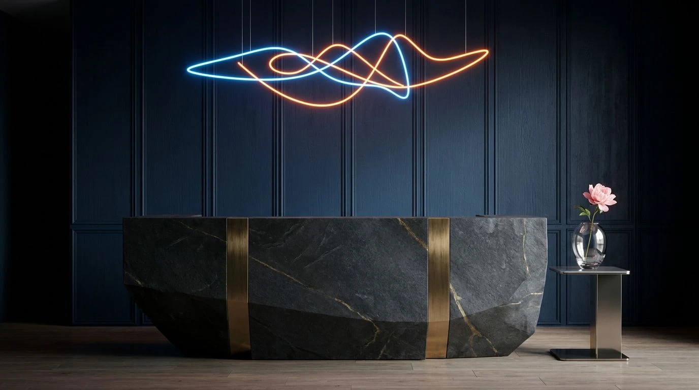
Zero Degrees Editorial 🥶
Introducing violent bolts of Piercing Cyan and Midnight Indigo against an otherwise desolate grayscale foundation completely changes the temperature of a project. Snow Blindness and Overcast Dawn set a chilling stage, recreating a flat, white-out sky just before freezing rain starts to fall. When you place those brilliant, synthetic blues next to Vantablack and Highway Grey, the effect is akin to a glowing screen lighting up a dark, empty room. This high-contrast approach feels distinctly tied to contemporary digital design and avant-garde fashion lookbooks, where artificial light slices through organic shadows. The solitary mood here is less about raw nature and more about urban disconnection, capturing the exact feeling of waiting for an early morning train under fluorescent station lights. It demands attention while remaining completely unapproachable.
Abandoned Ski Lodge 🎿
Most winter scapes lean entirely on cool tones, but introducing a flash of Emergency Red and Oxidized Iron against a range of frigid blues paints a vividly solitary narrative. Winter Sky and Dull Ochre set an outdoor, rugged foundation, resembling dried winter grass poking through a thin layer of snow. The real tension emerges when Frostbitten Teal, Industrial Cerulean, and Depthless Navy collide with those stark, warm interruptions. This specific tension mirrors finding an isolated cabin or a rusted signpost deep in a frozen forest. In spatial design, pairing flat, cold masonry with a single bright red fixture achieves this exact atmospheric isolation. Editorial spreads utilize these opposing temperatures to create a focal point that feels almost urgent, making the surrounding deep blues feel even colder and more expansive by comparison.
Solitary Commute 🚇
The quiet isolation of commuting before the sun rises is perfectly mapped out across these muted, atmospheric tones. There is a specific softness to Faded Brick and Glacial Periwinkle that offsets the heavy, grounding presence of Subway Charcoal and Deep Transit Blue. It feels like looking at passing cityscapes through a fogged-up window. Wet Pavement and Morning Mist wash over the high-contrast elements, turning what could be a harsh layout into something deeply introspective and quiet. Modern editorial branding turns to these muted, industrial pairings when trying to establish a mood of calm contemplation. It is an incredibly interior aesthetic, working beautifully for print magazines and quiet, text-heavy websites. The viewer is invited into a melancholic but peaceful space, insulated from the loud demands of the outside world by a thick layer of frosted glass.
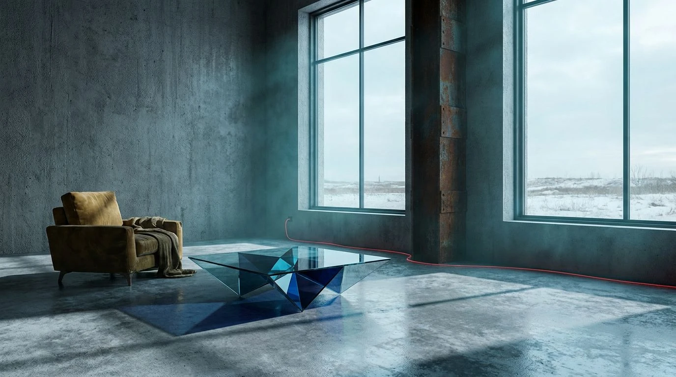
Glacial Interface 🧊
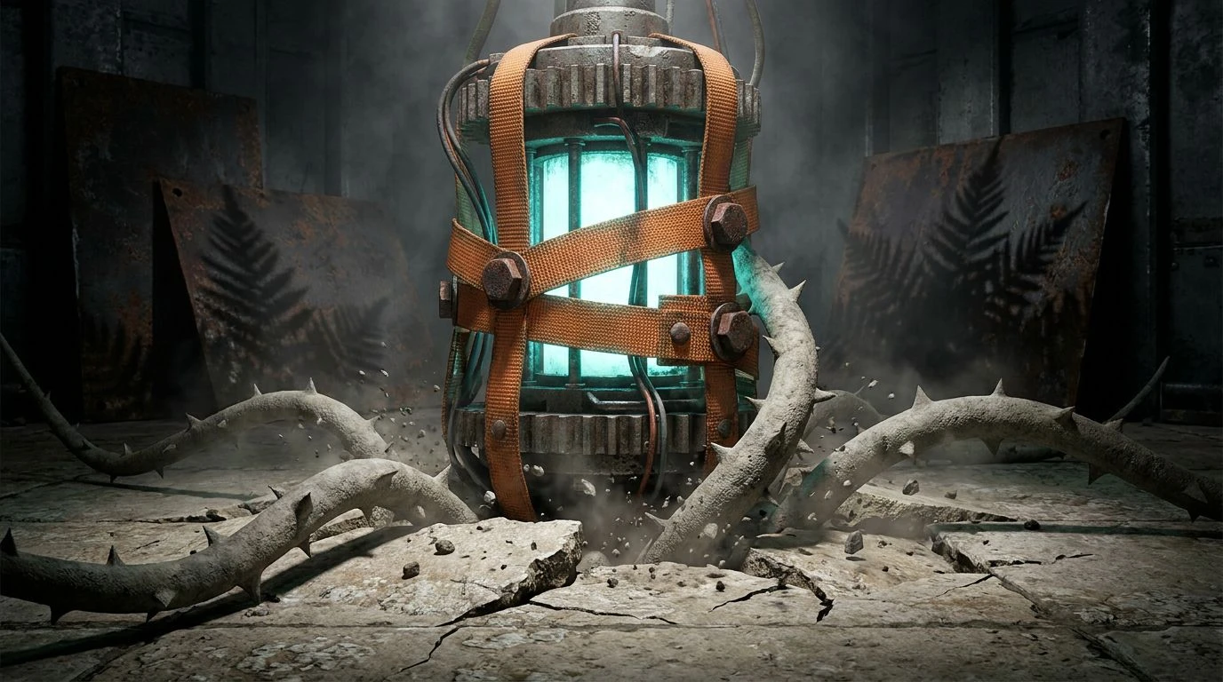
Electric, synthetic blues instantly modernize the winter aesthetic, stripping away all romanticized notions of the season in favor of pure, clinical isolation. Shattered Ice and Obsidian Depth provide the maximum possible contrast, a stark background that lets Arctic Neon and Abyssal Cobalt read like glowing neon tubes in an unlit warehouse. Freezing Slate grounds the sharp neons with a muted, algae-like dark tone, keeping the overall composition from floating away into pure science fiction. This combination feels directly ripped from contemporary tech hardware packaging or cutting-edge sportswear branding, where the focus is on extreme performance in hostile conditions. The mood is solitary, highly technical, and emotionally detached. It turns the traditional idea of mid-winter cold into an architectural statement, celebrating the crisp, severe beauty of dropping temperatures.
There is a distinct power in designing with the explicit goal of capturing loneliness. Rather than trying to warm up the harsh realities of the season, leaning into freezing typography, stark contrasts, and industrial textures provides a highly refined visual vocabulary. These specific combinations of piercing cerulean, heavy concrete grey, and sudden flashes of stark primary color prove that isolation does not have to be empty. Instead, these frosty schemes carve out space for quiet contemplation. Whether applied to an avant-garde fashion layout, a gallery exhibition flyer, or technical sportswear packaging, letting the temperature drop in your design work invites people to appreciate the absolute clarity that only comes from a bitter, undisturbed chill.