'%3e%3cpath%20fill-rule='evenodd'%20clip-rule='evenodd'%20d='M51.1303%2019.2492C50.7278%2019.913%2050.1346%2020.4426%2049.3508%2020.838C48.5669%2021.2335%2047.6172%2021.4312%2046.5014%2021.4312C44.8208%2021.4312%2043.4367%2021.0216%2042.3492%2020.2025C41.2617%2019.3833%2040.6686%2018.2394%2040.5697%2016.7706H44.4253C44.4818%2017.3355%2044.6831%2017.7804%2045.0291%2018.1052C45.3751%2018.43%2045.8164%2018.5924%2046.3531%2018.5924C46.8192%2018.5924%2047.1864%2018.4653%2047.4547%2018.2111C47.7231%2017.9569%2047.8572%2017.618%2047.8572%2017.1943C47.8572%2016.8129%2047.7337%2016.4952%2047.4865%2016.241C47.2393%2015.9867%2046.9322%2015.7784%2046.565%2015.616C46.1978%2015.4536%2045.6893%2015.2594%2045.0397%2015.0334C44.0934%2014.7086%2043.3202%2014.3944%2042.72%2014.0907C42.1197%2013.7871%2041.6042%2013.3351%2041.1735%2012.7349C40.7427%2012.1347%2040.5273%2011.3544%2040.5273%2010.394C40.5273%209.50418%2040.7533%208.73448%2041.2053%208.08481C41.6572%207.43515%2042.2821%206.93731%2043.0801%206.5913C43.8781%206.24528%2044.7925%206.07227%2045.8235%206.07227C47.49%206.07227%2048.8141%206.46771%2049.7956%207.25861C50.7772%208.04951%2051.3315%209.13698%2051.4586%2010.5211H47.5395C47.4689%2010.0268%2047.2888%209.63483%2046.9993%209.3453C46.7097%209.05578%2046.3178%208.91102%2045.8235%208.91102C45.3998%208.91102%2045.0573%209.024%2044.7961%209.24997C44.5348%209.47594%2044.4041%209.80783%2044.4041%2010.2457C44.4041%2010.5988%2044.5207%2010.8989%2044.7537%2011.146C44.9867%2011.3932%2045.2798%2011.5944%2045.6328%2011.7498C45.9859%2011.9052%2046.4944%2012.1029%2047.1581%2012.343C48.1185%2012.6678%2048.9023%2012.9891%2049.5096%2013.3069C50.1169%2013.6246%2050.6395%2014.0872%2051.0773%2014.6945C51.5151%2015.3018%2051.734%2016.0927%2051.734%2017.0672C51.734%2017.8581%2051.5328%2018.5854%2051.1303%2019.2492ZM59.0242%206.3053V21.2829H55.4016V6.3053H59.0242ZM73.9409%206.3053V9.18642H69.8734V21.2829H66.2296V9.18642H62.2046V6.3053H73.9409ZM80.7438%209.18642V12.3218H85.8069V15.0546H80.7438V18.3806H86.4425V21.2829H77.1212V6.3053H86.4425V9.18642H80.7438ZM99.667%2016.0291V21.2829H96.0444V6.3053H101.913C103.692%206.3053%20105.048%206.74665%20105.98%207.62934C106.912%208.51204%20107.378%209.7019%20107.378%2011.199C107.378%2012.1311%20107.17%2012.9609%20106.753%2013.6882C106.337%2014.4155%20105.719%2014.9875%20104.9%2015.4042C104.08%2015.8208%20103.085%2016.0291%20101.913%2016.0291H99.667ZM103.692%2011.199C103.692%209.8855%20102.965%209.22879%20101.51%209.22879H99.667V13.1268H101.51C102.965%2013.1268%20103.692%2012.4842%20103.692%2011.199ZM120.092%2018.5501H114.478L113.546%2021.2829H109.732L115.219%206.41123H119.393L124.879%2021.2829H121.024L120.092%2018.5501ZM119.16%2015.7961L117.295%2010.2881L115.41%2015.7961H119.16ZM131.555%2018.5077H136.385V21.2829H127.933V6.3053H131.555V18.5077ZM143.337%209.18642V12.3218H148.4V15.0546H143.337V18.3806H149.035V21.2829H139.714V6.3053H149.035V9.18642H143.337ZM163.507%206.3053V9.18642H159.44V21.2829H155.796V9.18642H151.771V6.3053H163.507ZM177.449%206.3053V9.18642H173.382V21.2829H169.738V9.18642H165.713V6.3053H177.449ZM184.252%209.18642V12.3218H189.315V15.0546H184.252V18.3806H189.951V21.2829H180.629V6.3053H189.951V9.18642H184.252Z'%20fill='%23EEF0ED'/%3e%3cmask%20id='mask0_3101_7327'%20style='mask-type:alpha'%20maskUnits='userSpaceOnUse'%20x='0'%20y='0'%20width='27'%20height='28'%3e%3cpath%20d='M23.8328%200.759766H2.64808C1.18559%200.759766%200%201.94535%200%203.40785V24.5925C0%2026.055%201.18559%2027.2406%202.64808%2027.2406H23.8328C25.2952%2027.2406%2026.4808%2026.055%2026.4808%2024.5925V3.40785C26.4808%201.94535%2025.2952%200.759766%2023.8328%200.759766Z'%20fill='white'/%3e%3c/mask%3e%3cg%20mask='url(%23mask0_3101_7327)'%3e%3cpath%20d='M23.8328%200.759766H2.64808C1.18559%200.759766%200%201.94535%200%203.40785V24.5925C0%2026.055%201.18559%2027.2406%202.64808%2027.2406H23.8328C25.2952%2027.2406%2026.4808%2026.055%2026.4808%2024.5925V3.40785C26.4808%201.94535%2025.2952%200.759766%2023.8328%200.759766Z'%20fill='%23D8D8D8'/%3e%3cpath%20d='M13.2404%200.759766H0V14.0001H13.2404V0.759766Z'%20fill='%238C61FF'/%3e%3cpath%20d='M13.2404%2014H0V27.2404H13.2404V14Z'%20fill='%2336C3FE'/%3e%3cpath%20d='M26.4806%2014H13.2402V27.2404H26.4806V14Z'%20fill='%236592FE'/%3e%3cpath%20d='M26.4806%200.759766H13.2402V14.0002H26.4806V0.759766Z'%20fill='%236059F7'/%3e%3c/g%3e%3c/g%3e%3cdefs%3e%3cclipPath%20id='clip0_3101_7327'%3e%3crect%20width='190'%20height='28'%20fill='white'/%3e%3c/clipPath%3e%3c/defs%3e%3c/svg%3e)
'%3e%3cpath%20d='M23.8328%200.759521H2.64808C1.18559%200.759521%200%201.94511%200%203.40761V24.5923C0%2026.0548%201.18559%2027.2404%202.64808%2027.2404H23.8328C25.2952%2027.2404%2026.4808%2026.0548%2026.4808%2024.5923V3.40761C26.4808%201.94511%2025.2952%200.759521%2023.8328%200.759521Z'%20fill='%23D8D8D8'/%3e%3cpath%20d='M13.2404%200.759521H0V13.9999H13.2404V0.759521Z'%20fill='%238C61FF'/%3e%3cpath%20d='M13.2404%2013.9998H0V27.2402H13.2404V13.9998Z'%20fill='%2336C3FE'/%3e%3cpath%20d='M26.4809%2013.9998H13.2405V27.2402H26.4809V13.9998Z'%20fill='%236592FE'/%3e%3cpath%20d='M26.4809%200.759277H13.2405V13.9997H26.4809V0.759277Z'%20fill='%236059F7'/%3e%3c/g%3e%3c/svg%3e)
Minimalist Gray Color Palettes for Better Git Design
· 5 min readImagine traversing a vast, uncharted territory where every footstep must be deliberate, and every landmark must secure your bearing. Walking through the historical commits of a complex software environment feels exactly like navigating an ancient, sprawling city before dawn. The architecture of your repository relies on shadows and light to guide the eye. When you paint your screen with a spectrum of stark, contrasting slates against a single, piercing accent hue, you transform a chaotic metropolis of code into a tranquil, easily navigable map. We journey through these distinct topographies of color, discovering how a carefully chosen wash of monochrome, punctuated by sudden bursts of life, can bring direction and striking clarity to the long roads of our daily programming travels.
Alpine Trek Terminal 🏔️
Wandering into the Alpine Trek Terminal feels like stepping onto a high-altitude trail just as the sun begins to rise. The terrain is grounded by Midnight Pine and Weathered Stone, offering a sturdy, reliable foundation for scrolling through endless logs of historical data. Glacial Melt and Mossy Crag wait like rare alpine flora blooming against the rocks, drawing your gaze exactly where it needs to rest among the branches. When you configure your environment with these shades, the deep contrast between Overcast Granite and Twilight Peak creates comfortable stepping stones for the eyes. Reading through your past work becomes less like staring at a sterile monitor and more like breathing in the crisp, cold air of a mountain pass, where every path is clear and the horizon stretches out bathed in Glacier Snow.
Kyoto Bamboo Grove 🎋
The Kyoto Bamboo Grove palette transports you to a quiet, mist-laden morning outside a traditional machiya. Here, the sheer simplicity of Paper Lantern White and Hazy Morning Stone lays down a serene dirt path, clearing away the visual noise that often clutters development screens. Shadowed Temple Wood provides the deep, grounding anchor, much like the ancient timbers holding up heavy tiled roofs. Breaking through this peaceful, greyscale serenity is the sudden, startling shock of Spring Bamboo Shoot. This vivid green acts as a beacon in your working environment, instantly highlighting the most critical additions and modifications without overwhelming the senses. Moving through your daily logs bathed in these shades feels like a meditative stroll through rustling leaves, bringing both a high-contrast crispness and an undeniable warmth to the most technical of tasks.
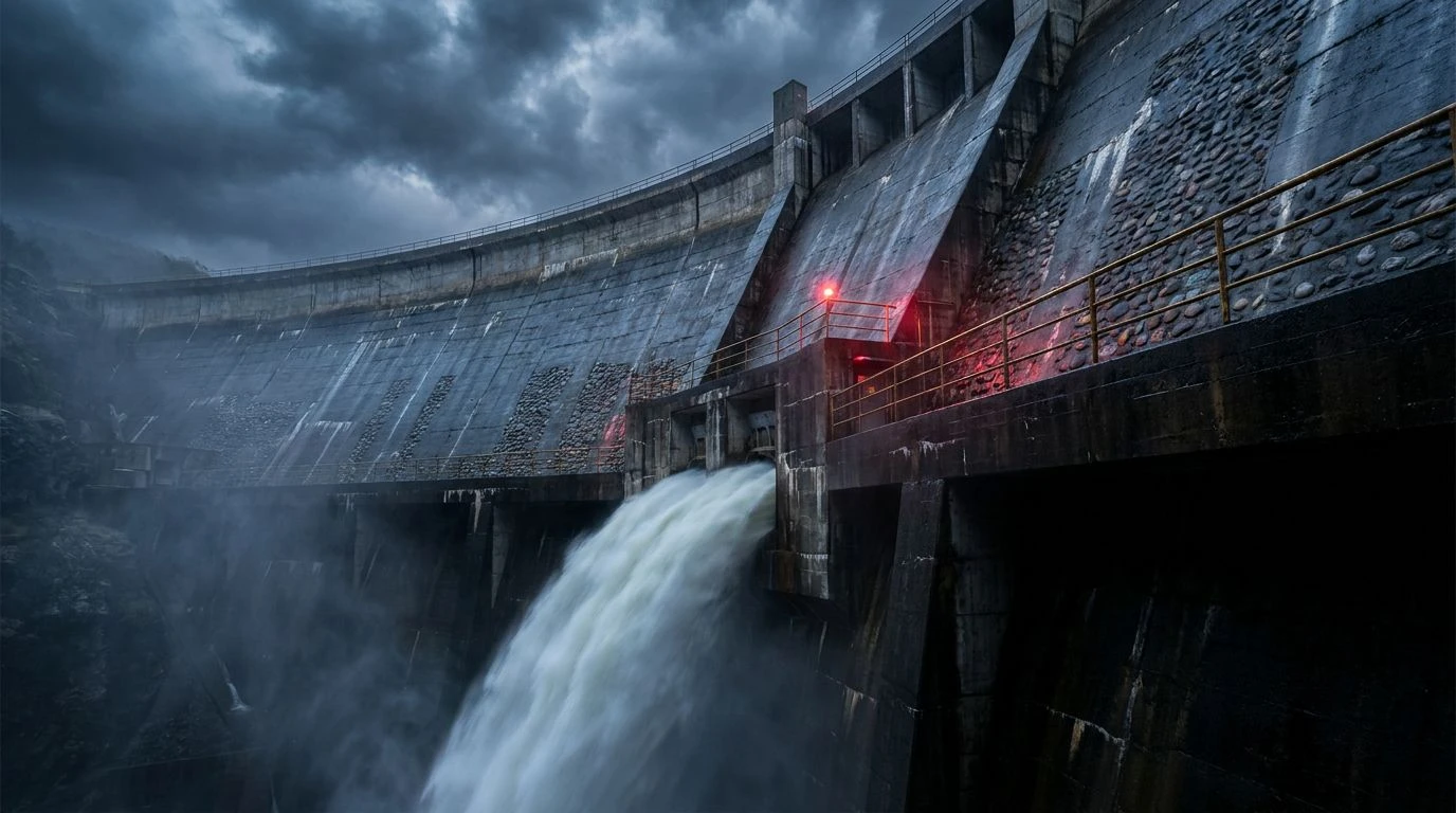
Icelandic Glacier Code 🧊
Flying over the frozen expanses of the Icelandic Glacier Code palette reveals a stark, breathtaking topography sculpted by extreme elements. A deep, endless Black Sand Beach stretches out beneath sheets of Volcanic Ash and Morning Frost, setting a dramatic, moody stage for your terminal window. The gradients of silver and ash mimic the shifting light on a glacier, offering a highly readable expanse for long texts and intricate historical records. Suddenly, the brilliant flash of Blue Lagoon Water catches your eye, standing out against the monochromatic chill like a thermal pool in the ice. This sharp, icy accent injects immediate energy and focus into your workflow, making status tags and updated files pop beautifully against the Arctic Cloud backdrop, ensuring your navigation remains effortless even in the deepest wilderness of your repository.
Tokyo Neon Nights 🗼
Imagine wandering the rain-slicked streets of a sprawling metropolis after midnight, a sensation captured perfectly by Tokyo Neon Nights. The vast architecture of Concrete Pavement and Steel Overpass builds an industrial, highly structured visual landscape. The absolute depths of Midnight Alley swallow any unnecessary glare, making the lighter text shine with pristine legibility. Then, slashing through the monochromatic cityscape, comes the electric pulse of Shinjuku Neon. This bright, hyper-visible green serves as your ultimate guide, pulling your attention to recent changes and critical merges just like a bright storefront calling out to travelers in the dark. Designing your environment around this vivid contrast ensures your daily coding journey remains as thrilling and navigable as a bustling urban street market under a glowing canopy.
Pacific Highway Drift 🌊
Cruising along the Pacific Highway Drift offers a soothing, uninterrupted journey through mists and rolling waves. The steady, reliable surface of Highway Asphalt anchors the lower depths of your interface, while Coastal Fog and Sea Foam Mist wash over the screen to provide a clean, glare-free reading experience for dense, historical text files. It is an environment built for endurance, mirroring long, solitary drives along coastal cliffs. The solitary accent of Deep Ocean Swell brings a touch of maritime chill, gently signaling structural changes and branches without the jarring shock of a neon light. This deeply atmospheric environment wraps your daily technical tasks in a layer of calm, ensuring that every time you review your past progress, you feel the quiet, steady rhythm of the sea guiding you forward to your next destination.
Traveling through these varied landscapes of shadow, fog, and striking light reveals how deeply our environment shapes our daily habits. By stripping away chaotic rainbows and focusing on a disciplined spectrum of stone, ash, and night, we craft serene spaces where the eye can truly rest. The sudden flash of a bright accent becomes a trusted guide rather than a distraction, leading us safely through the densest thickets of historical information. Ultimately, bringing these atmospheric topographies into our working screens ensures our daily journeys remain sharp, warm, and endlessly inspiring, no matter how far back into the past we must travel.