'%3e%3cpath%20fill-rule='evenodd'%20clip-rule='evenodd'%20d='M51.1303%2019.2492C50.7278%2019.913%2050.1346%2020.4426%2049.3508%2020.838C48.5669%2021.2335%2047.6172%2021.4312%2046.5014%2021.4312C44.8208%2021.4312%2043.4367%2021.0216%2042.3492%2020.2025C41.2617%2019.3833%2040.6686%2018.2394%2040.5697%2016.7706H44.4253C44.4818%2017.3355%2044.6831%2017.7804%2045.0291%2018.1052C45.3751%2018.43%2045.8164%2018.5924%2046.3531%2018.5924C46.8192%2018.5924%2047.1864%2018.4653%2047.4547%2018.2111C47.7231%2017.9569%2047.8572%2017.618%2047.8572%2017.1943C47.8572%2016.8129%2047.7337%2016.4952%2047.4865%2016.241C47.2393%2015.9867%2046.9322%2015.7784%2046.565%2015.616C46.1978%2015.4536%2045.6893%2015.2594%2045.0397%2015.0334C44.0934%2014.7086%2043.3202%2014.3944%2042.72%2014.0907C42.1197%2013.7871%2041.6042%2013.3351%2041.1735%2012.7349C40.7427%2012.1347%2040.5273%2011.3544%2040.5273%2010.394C40.5273%209.50418%2040.7533%208.73448%2041.2053%208.08481C41.6572%207.43515%2042.2821%206.93731%2043.0801%206.5913C43.8781%206.24528%2044.7925%206.07227%2045.8235%206.07227C47.49%206.07227%2048.8141%206.46771%2049.7956%207.25861C50.7772%208.04951%2051.3315%209.13698%2051.4586%2010.5211H47.5395C47.4689%2010.0268%2047.2888%209.63483%2046.9993%209.3453C46.7097%209.05578%2046.3178%208.91102%2045.8235%208.91102C45.3998%208.91102%2045.0573%209.024%2044.7961%209.24997C44.5348%209.47594%2044.4041%209.80783%2044.4041%2010.2457C44.4041%2010.5988%2044.5207%2010.8989%2044.7537%2011.146C44.9867%2011.3932%2045.2798%2011.5944%2045.6328%2011.7498C45.9859%2011.9052%2046.4944%2012.1029%2047.1581%2012.343C48.1185%2012.6678%2048.9023%2012.9891%2049.5096%2013.3069C50.1169%2013.6246%2050.6395%2014.0872%2051.0773%2014.6945C51.5151%2015.3018%2051.734%2016.0927%2051.734%2017.0672C51.734%2017.8581%2051.5328%2018.5854%2051.1303%2019.2492ZM59.0242%206.3053V21.2829H55.4016V6.3053H59.0242ZM73.9409%206.3053V9.18642H69.8734V21.2829H66.2296V9.18642H62.2046V6.3053H73.9409ZM80.7438%209.18642V12.3218H85.8069V15.0546H80.7438V18.3806H86.4425V21.2829H77.1212V6.3053H86.4425V9.18642H80.7438ZM99.667%2016.0291V21.2829H96.0444V6.3053H101.913C103.692%206.3053%20105.048%206.74665%20105.98%207.62934C106.912%208.51204%20107.378%209.7019%20107.378%2011.199C107.378%2012.1311%20107.17%2012.9609%20106.753%2013.6882C106.337%2014.4155%20105.719%2014.9875%20104.9%2015.4042C104.08%2015.8208%20103.085%2016.0291%20101.913%2016.0291H99.667ZM103.692%2011.199C103.692%209.8855%20102.965%209.22879%20101.51%209.22879H99.667V13.1268H101.51C102.965%2013.1268%20103.692%2012.4842%20103.692%2011.199ZM120.092%2018.5501H114.478L113.546%2021.2829H109.732L115.219%206.41123H119.393L124.879%2021.2829H121.024L120.092%2018.5501ZM119.16%2015.7961L117.295%2010.2881L115.41%2015.7961H119.16ZM131.555%2018.5077H136.385V21.2829H127.933V6.3053H131.555V18.5077ZM143.337%209.18642V12.3218H148.4V15.0546H143.337V18.3806H149.035V21.2829H139.714V6.3053H149.035V9.18642H143.337ZM163.507%206.3053V9.18642H159.44V21.2829H155.796V9.18642H151.771V6.3053H163.507ZM177.449%206.3053V9.18642H173.382V21.2829H169.738V9.18642H165.713V6.3053H177.449ZM184.252%209.18642V12.3218H189.315V15.0546H184.252V18.3806H189.951V21.2829H180.629V6.3053H189.951V9.18642H184.252Z'%20fill='%23EEF0ED'/%3e%3cmask%20id='mask0_3101_7327'%20style='mask-type:alpha'%20maskUnits='userSpaceOnUse'%20x='0'%20y='0'%20width='27'%20height='28'%3e%3cpath%20d='M23.8328%200.759766H2.64808C1.18559%200.759766%200%201.94535%200%203.40785V24.5925C0%2026.055%201.18559%2027.2406%202.64808%2027.2406H23.8328C25.2952%2027.2406%2026.4808%2026.055%2026.4808%2024.5925V3.40785C26.4808%201.94535%2025.2952%200.759766%2023.8328%200.759766Z'%20fill='white'/%3e%3c/mask%3e%3cg%20mask='url(%23mask0_3101_7327)'%3e%3cpath%20d='M23.8328%200.759766H2.64808C1.18559%200.759766%200%201.94535%200%203.40785V24.5925C0%2026.055%201.18559%2027.2406%202.64808%2027.2406H23.8328C25.2952%2027.2406%2026.4808%2026.055%2026.4808%2024.5925V3.40785C26.4808%201.94535%2025.2952%200.759766%2023.8328%200.759766Z'%20fill='%23D8D8D8'/%3e%3cpath%20d='M13.2404%200.759766H0V14.0001H13.2404V0.759766Z'%20fill='%238C61FF'/%3e%3cpath%20d='M13.2404%2014H0V27.2404H13.2404V14Z'%20fill='%2336C3FE'/%3e%3cpath%20d='M26.4806%2014H13.2402V27.2404H26.4806V14Z'%20fill='%236592FE'/%3e%3cpath%20d='M26.4806%200.759766H13.2402V14.0002H26.4806V0.759766Z'%20fill='%236059F7'/%3e%3c/g%3e%3c/g%3e%3cdefs%3e%3cclipPath%20id='clip0_3101_7327'%3e%3crect%20width='190'%20height='28'%20fill='white'/%3e%3c/clipPath%3e%3c/defs%3e%3c/svg%3e)
'%3e%3cpath%20d='M23.8328%200.759521H2.64808C1.18559%200.759521%200%201.94511%200%203.40761V24.5923C0%2026.0548%201.18559%2027.2404%202.64808%2027.2404H23.8328C25.2952%2027.2404%2026.4808%2026.0548%2026.4808%2024.5923V3.40761C26.4808%201.94511%2025.2952%200.759521%2023.8328%200.759521Z'%20fill='%23D8D8D8'/%3e%3cpath%20d='M13.2404%200.759521H0V13.9999H13.2404V0.759521Z'%20fill='%238C61FF'/%3e%3cpath%20d='M13.2404%2013.9998H0V27.2402H13.2404V13.9998Z'%20fill='%2336C3FE'/%3e%3cpath%20d='M26.4809%2013.9998H13.2405V27.2402H26.4809V13.9998Z'%20fill='%236592FE'/%3e%3cpath%20d='M26.4809%200.759277H13.2405V13.9997H26.4809V0.759277Z'%20fill='%236059F7'/%3e%3c/g%3e%3c/svg%3e)
Copper Color Palettes for Rugged Agricultural App Design
· 5 min readThere is a stubborn disconnect in modern agricultural software. Farmers, ecologists, and agronomists spend their days negotiating with the physical world—pulling wet roots from the ground, calculating soil moisture, tracking incoming squalls over the coast. Yet, when they look down at their screens, they are usually greeted by the same sterile, clinical whites and artificial blues of a banking app. It feels mildly absurd, like wearing a tailored suit to muck out a stable. Bringing tawny brown and copper into these interfaces is less about aesthetic dressing and more about cognitive grounding. When the digital tools used to manage ecology visually acknowledge the dirt, rust, and salt of the actual job, the software stops feeling like an imposition from Silicon Valley and starts feeling like a proper, rugged extension of the tractor cab.
Working the Loam 🧑🌾
Working the Loam firmly rejects the slick, weightless aesthetic beloved by consumer tech. Instead, it offers a grounded, utilitarian experience that points directly to the physical realities of turning the earth. Overcast Mud paired with Chalk Peat creates a heavily textured, legible background that reads beautifully under the harsh glare of a midday sun. There is a deeply pragmatic quality here. The flash of Tractor Green against the absolute void of Deepest Pitch provides an unmistakable cue for critical system alerts or machinery status, cutting through the quieter tones with sharp intent. Pale Sunburst and Dried Sage soften the edges, offering a quiet nod to early morning frost and dried cover crops. Designing an interface with these tones telegraphs a certain respect for the user's intelligence and their environment, treating the screen not as a precious pane of glass, but as a reliable, smear-proof gauge.
Harvested Copper 🍂
The warmth of Harvested Copper provides an immediate sense of biological productivity. It captures that specific late-autumn afternoon feeling, where the dust hangs in the air and everything seems washed in a metallic, heavy light. Rusted Iron anchors the visual hierarchy, offering a dense, unpretentious weight for main navigation bars or heavy data tables, moving firmly away from standard greyscale. Against this, Dust Light and Sturdy Terracotta soften the reading experience, making the screen feel less like a glowing monitor and more like a well-worn ledger. The sudden interjection of Yield Gold and Agrarian Green provides the necessary contrast for tracking healthy crop states or successful data syncs. This is an interface that feels broken-in, comfortable, and highly capable, speaking to generations of agricultural work while running modern ecological models behind the scenes.
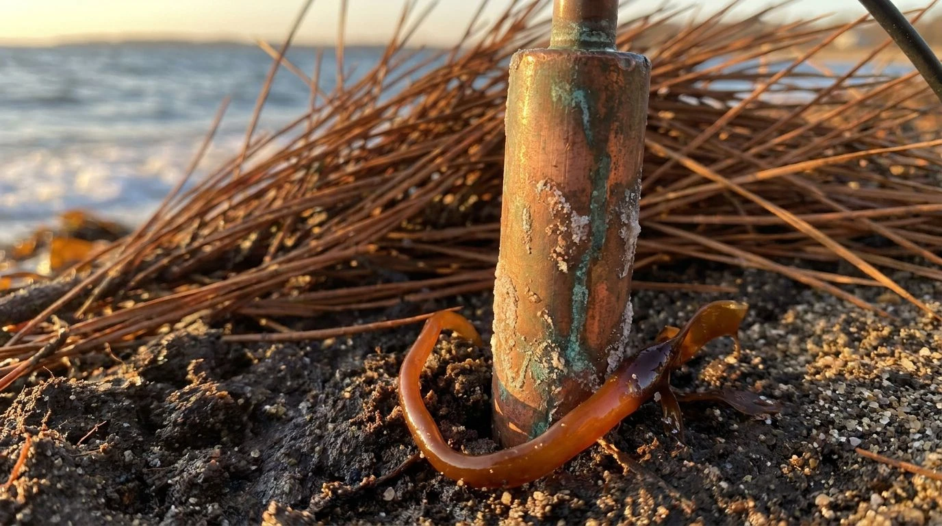
Maritime Timber ⚓
Coastal farming and maritime ecology demand an altogether different visual vocabulary, one where the earth meets the harsh realities of salt and tide. Maritime Timber bridges this gap with surprising agility. The dense, shadowy depth of Pitch Pine and Sunken Copper provides the rugged baseline of ancient dockyards and ship wood, while Weathered Sand offers a highly readable, glare-resistant background for complex meteorological charts. What makes this collection particularly brilliant is the sudden crash of ocean colors. Deep Estuary and Sea Foam introduce a cold, calculating edge, perfect for charting tidal movements or salinity levels, while the bright sting of Seaweed Shoot and Bright Amber flags urgent storm warnings or equipment shifts. The interface becomes a map of the shoreline itself, balancing the warmth of dry land with the cold, unpredictable mechanics of the coastal sea.
Sun on the Silo 🌾
There is a distinct, almost cinematic seriousness baked into Sun on the Silo, yet it entirely side-steps looking like a cheap novelty. It draws from the industrial realities of modern farming, where metal structures dominate the skyline. Stamped Rust and Baling Twine form an incredibly sturdy, physical base layer, grounding the user in materials they handle every day. High Summer Sun and Lemon Chaff bring a severe, unapologetic brightness, highly effective for active toggles and progress indicators that need to be seen from the seat of a combine harvester. Then comes the brilliant twist: Distant Rain and Steel Overcast. These muted, industrial blues introduce a calculating, modern edge to the application, holding the warmer tones in strict check. The visual result is highly productive and deeply focused, acknowledging that contemporary agriculture is equal parts dirt and data, tradition and forecasting.
Orchard Dawn 🍑
Scaling back from the heavy machinery, Orchard Dawn turns toward the quiet, intimate side of growing food. It captures that still, freezing moment just before the sun clears the tree line. Bruised Plum is an exceptionally sophisticated stand-in for traditional dark mode backgrounds, absorbing the harsh glare of a screen and replacing it with a rich, velvety depth. Against this dark ground, Warmed Copper and Soft Apricot act as gentle highlights, ideal for charting the delicate progress of fruit maturation or soil pH balance. Alabaster Frost provides completely legible, crisp typography without the aggressive burn of pure white. Muted Olive sits quietly in the periphery, organizing secondary ecological metrics without demanding attention. It creates an interface that feels profoundly calm and measured, treating agricultural management not as an industrial war against nature, but as a studied, careful partnership with the environment.
Abandoning sterile corporate palettes in favor of earth-bound tones is a remarkably effective way to build trust with users who spend their lives outdoors. When an application trades flat blues and generic grays for heavy coppers, dense muds, and rusted irons, it stops feeling like an administrative burden and becomes a native tool of the trade. These palettes prove that software can be highly technical without losing its visual grounding in the physical world. By speaking the visual language of the coast, the soil, and the harvest, modern agricultural technology can finally look like it actually belongs in the dirt.