'%3e%3cpath%20fill-rule='evenodd'%20clip-rule='evenodd'%20d='M51.1303%2019.2492C50.7278%2019.913%2050.1346%2020.4426%2049.3508%2020.838C48.5669%2021.2335%2047.6172%2021.4312%2046.5014%2021.4312C44.8208%2021.4312%2043.4367%2021.0216%2042.3492%2020.2025C41.2617%2019.3833%2040.6686%2018.2394%2040.5697%2016.7706H44.4253C44.4818%2017.3355%2044.6831%2017.7804%2045.0291%2018.1052C45.3751%2018.43%2045.8164%2018.5924%2046.3531%2018.5924C46.8192%2018.5924%2047.1864%2018.4653%2047.4547%2018.2111C47.7231%2017.9569%2047.8572%2017.618%2047.8572%2017.1943C47.8572%2016.8129%2047.7337%2016.4952%2047.4865%2016.241C47.2393%2015.9867%2046.9322%2015.7784%2046.565%2015.616C46.1978%2015.4536%2045.6893%2015.2594%2045.0397%2015.0334C44.0934%2014.7086%2043.3202%2014.3944%2042.72%2014.0907C42.1197%2013.7871%2041.6042%2013.3351%2041.1735%2012.7349C40.7427%2012.1347%2040.5273%2011.3544%2040.5273%2010.394C40.5273%209.50418%2040.7533%208.73448%2041.2053%208.08481C41.6572%207.43515%2042.2821%206.93731%2043.0801%206.5913C43.8781%206.24528%2044.7925%206.07227%2045.8235%206.07227C47.49%206.07227%2048.8141%206.46771%2049.7956%207.25861C50.7772%208.04951%2051.3315%209.13698%2051.4586%2010.5211H47.5395C47.4689%2010.0268%2047.2888%209.63483%2046.9993%209.3453C46.7097%209.05578%2046.3178%208.91102%2045.8235%208.91102C45.3998%208.91102%2045.0573%209.024%2044.7961%209.24997C44.5348%209.47594%2044.4041%209.80783%2044.4041%2010.2457C44.4041%2010.5988%2044.5207%2010.8989%2044.7537%2011.146C44.9867%2011.3932%2045.2798%2011.5944%2045.6328%2011.7498C45.9859%2011.9052%2046.4944%2012.1029%2047.1581%2012.343C48.1185%2012.6678%2048.9023%2012.9891%2049.5096%2013.3069C50.1169%2013.6246%2050.6395%2014.0872%2051.0773%2014.6945C51.5151%2015.3018%2051.734%2016.0927%2051.734%2017.0672C51.734%2017.8581%2051.5328%2018.5854%2051.1303%2019.2492ZM59.0242%206.3053V21.2829H55.4016V6.3053H59.0242ZM73.9409%206.3053V9.18642H69.8734V21.2829H66.2296V9.18642H62.2046V6.3053H73.9409ZM80.7438%209.18642V12.3218H85.8069V15.0546H80.7438V18.3806H86.4425V21.2829H77.1212V6.3053H86.4425V9.18642H80.7438ZM99.667%2016.0291V21.2829H96.0444V6.3053H101.913C103.692%206.3053%20105.048%206.74665%20105.98%207.62934C106.912%208.51204%20107.378%209.7019%20107.378%2011.199C107.378%2012.1311%20107.17%2012.9609%20106.753%2013.6882C106.337%2014.4155%20105.719%2014.9875%20104.9%2015.4042C104.08%2015.8208%20103.085%2016.0291%20101.913%2016.0291H99.667ZM103.692%2011.199C103.692%209.8855%20102.965%209.22879%20101.51%209.22879H99.667V13.1268H101.51C102.965%2013.1268%20103.692%2012.4842%20103.692%2011.199ZM120.092%2018.5501H114.478L113.546%2021.2829H109.732L115.219%206.41123H119.393L124.879%2021.2829H121.024L120.092%2018.5501ZM119.16%2015.7961L117.295%2010.2881L115.41%2015.7961H119.16ZM131.555%2018.5077H136.385V21.2829H127.933V6.3053H131.555V18.5077ZM143.337%209.18642V12.3218H148.4V15.0546H143.337V18.3806H149.035V21.2829H139.714V6.3053H149.035V9.18642H143.337ZM163.507%206.3053V9.18642H159.44V21.2829H155.796V9.18642H151.771V6.3053H163.507ZM177.449%206.3053V9.18642H173.382V21.2829H169.738V9.18642H165.713V6.3053H177.449ZM184.252%209.18642V12.3218H189.315V15.0546H184.252V18.3806H189.951V21.2829H180.629V6.3053H189.951V9.18642H184.252Z'%20fill='%23EEF0ED'/%3e%3cmask%20id='mask0_3101_7327'%20style='mask-type:alpha'%20maskUnits='userSpaceOnUse'%20x='0'%20y='0'%20width='27'%20height='28'%3e%3cpath%20d='M23.8328%200.759766H2.64808C1.18559%200.759766%200%201.94535%200%203.40785V24.5925C0%2026.055%201.18559%2027.2406%202.64808%2027.2406H23.8328C25.2952%2027.2406%2026.4808%2026.055%2026.4808%2024.5925V3.40785C26.4808%201.94535%2025.2952%200.759766%2023.8328%200.759766Z'%20fill='white'/%3e%3c/mask%3e%3cg%20mask='url(%23mask0_3101_7327)'%3e%3cpath%20d='M23.8328%200.759766H2.64808C1.18559%200.759766%200%201.94535%200%203.40785V24.5925C0%2026.055%201.18559%2027.2406%202.64808%2027.2406H23.8328C25.2952%2027.2406%2026.4808%2026.055%2026.4808%2024.5925V3.40785C26.4808%201.94535%2025.2952%200.759766%2023.8328%200.759766Z'%20fill='%23D8D8D8'/%3e%3cpath%20d='M13.2404%200.759766H0V14.0001H13.2404V0.759766Z'%20fill='%238C61FF'/%3e%3cpath%20d='M13.2404%2014H0V27.2404H13.2404V14Z'%20fill='%2336C3FE'/%3e%3cpath%20d='M26.4806%2014H13.2402V27.2404H26.4806V14Z'%20fill='%236592FE'/%3e%3cpath%20d='M26.4806%200.759766H13.2402V14.0002H26.4806V0.759766Z'%20fill='%236059F7'/%3e%3c/g%3e%3c/g%3e%3cdefs%3e%3cclipPath%20id='clip0_3101_7327'%3e%3crect%20width='190'%20height='28'%20fill='white'/%3e%3c/clipPath%3e%3c/defs%3e%3c/svg%3e)
'%3e%3cpath%20d='M23.8328%200.759521H2.64808C1.18559%200.759521%200%201.94511%200%203.40761V24.5923C0%2026.0548%201.18559%2027.2404%202.64808%2027.2404H23.8328C25.2952%2027.2404%2026.4808%2026.0548%2026.4808%2024.5923V3.40761C26.4808%201.94511%2025.2952%200.759521%2023.8328%200.759521Z'%20fill='%23D8D8D8'/%3e%3cpath%20d='M13.2404%200.759521H0V13.9999H13.2404V0.759521Z'%20fill='%238C61FF'/%3e%3cpath%20d='M13.2404%2013.9998H0V27.2402H13.2404V13.9998Z'%20fill='%2336C3FE'/%3e%3cpath%20d='M26.4809%2013.9998H13.2405V27.2402H26.4809V13.9998Z'%20fill='%236592FE'/%3e%3cpath%20d='M26.4809%200.759277H13.2405V13.9997H26.4809V0.759277Z'%20fill='%236059F7'/%3e%3c/g%3e%3c/svg%3e)
Deep Violet Color Palettes for Science-Backed Sleep Design
· 6 min readModern sleep science often operates within the sterile realm of data points, tracking heart rates and respiratory patterns through cold numerical analysis. Yet, an emerging wave of sleep analytics companies has recognized that preparing the human mind for rest requires more than mere measurement. Recognizing the profound optical triggers of human biology, these technology firms have turned to specific visual frequencies to lower stress levels and encourage a transition toward deep recovery. By employing rich, dense purples and profound navies, they translate the physical properties of evening light into carefully designed restorative environments. The resultant aesthetic acts with the clinical precision of a laboratory and the quiet comfort of an evening retreat, signaling the optical nerve to properly wind down the body. Through carefully chosen tones, the transition from active anxiety to composed stillness becomes an observable phenomenon.
Twilight Observatory 🔭
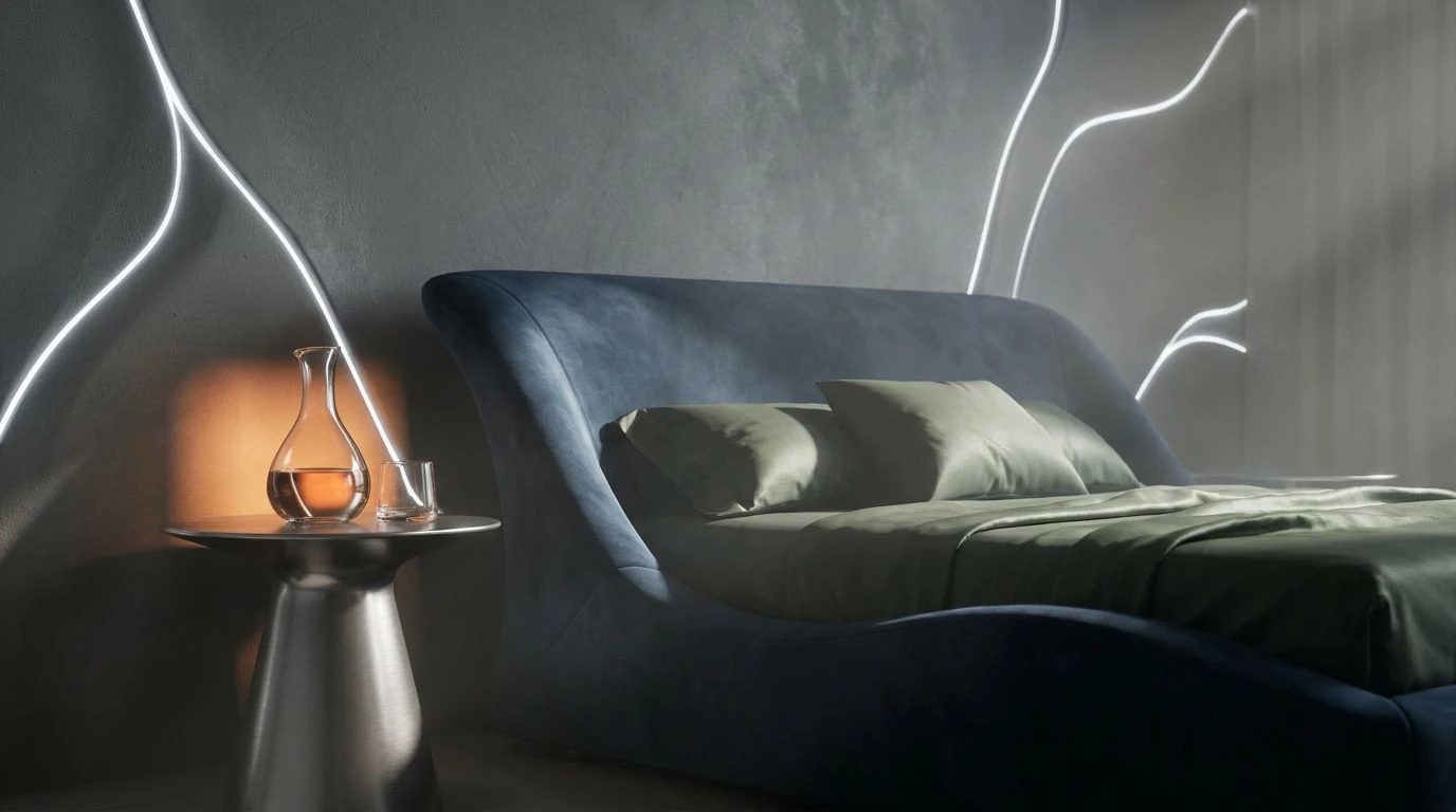
Observing an individual preparing for rest reveals an intricate biological transition. The Twilight Observatory collection reflects this exact biological shift, mirroring the way light drains from a quiet bedroom. Entering the space, the eye immediately registers Midnight Ocean, a tone that mimics the dense hue of a cloudless sky just past dusk. This expansive shade creates a grounding presence, setting an atmosphere of immediate calm. Against this dark backdrop, softer accents perform necessary visual work. Somnolent Peach and Faded Mauve introduce a residual warmth, acting as a gentle reminder of the fading sun, while Lunar Linen offers clean visual breaks reminiscent of crisp, freshly laundered bedding. Mahogany Shadow and Obsidian Night anchor the room, pushing back against the frantic energy of the waking hours. Accented delicately by Steel Slumber, these tones collectively prompt the optical sensors to register that the busy daylight period has conclusively ended, preparing the mind for its necessary descent into recovery.
REM Cycle 🌌
Sleep analytics pioneers have heavily documented the neurological responses triggered by specific wavelengths of deep violet. The REM Cycle array applies these exact scientific observations directly to the physical environment, using specialized tones to manipulate biological timepieces. Luminous Amethyst serves as the primary visual cue, gently guiding the optic nerve away from the harsh glare emitted by consumer electronics. As the user settles into the space, Deep Slumber Violet surrounds them, creating an enveloping atmosphere that significantly lowers the resting heart rate. This transition is further supported by Foggy Heather, offering a softened shade that reduces ocular strain and promotes heavy eyelids. Finally, the inclusion of Void Black removes visual distractions, acting as a definitive boundary against the outside world. Entering a room wrapped in these specific hues feels akin to stepping into a high-end recovery clinic or a luxury retreat, where the mere act of observing the painted walls initiates the biological descent toward profound unconsciousness.
Circadian Rhythms 🌙
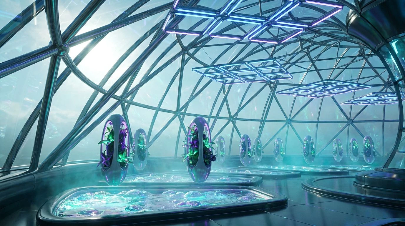
Establishing a regulated resting pattern often requires recreating the elemental environment our ancestors once slept in. Circadian Rhythms achieves this through an earthy, fundamental approach that draws directly from the natural cooling period of the late evening. By utilizing Abyssal Navy as the stabilizing base, the visual field is darkened effectively, simulating the arrival of true night. Quiet Cerulean and Pale Horizon Blue trace the disappearing twilight, providing recessive properties that make walls appear to gently retreat, thereby expanding the perceived space of the clinical bedroom. This lowering of visual heat signals the body to cool itself, a known biological requirement for optimal resting states. Grounding these soothing elements, Earthy Umber and Sandstone Dusk contribute natural warmth, preventing the space from feeling excessively sterile or isolated. Wrapped in the soft restraint of Alabaster Cloud, the room transforms into a sensory deprivation sanctuary. The observer intuitively recognizes the shift in the atmosphere, dropping their guard and allowing their physiological systems to surrender to the demanding requirements of physical repair.
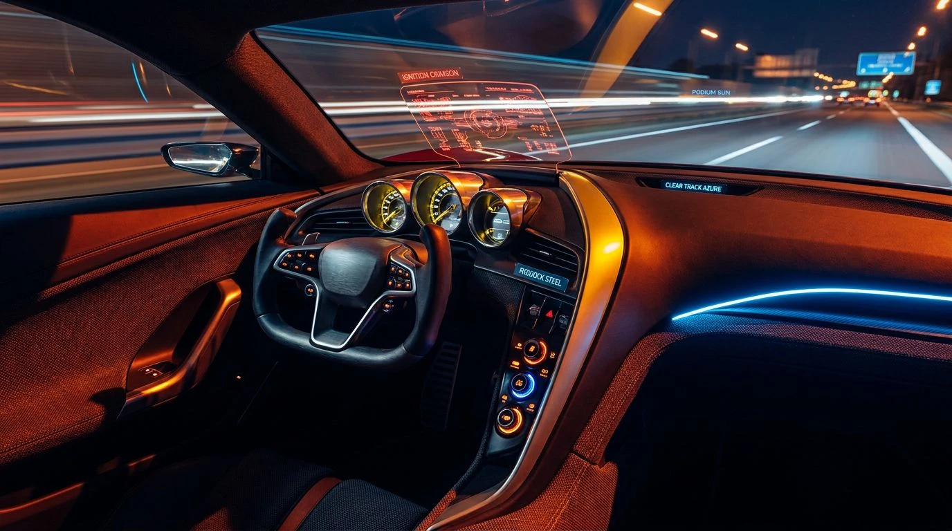
Waking Pulse ⏱️
Data gathered from nocturnal monitoring devices indicates that the transition between sleep stages is rarely a static process. Waking Pulse addresses the dynamic nature of sleep architecture, offering visual anchors for both the descent into sleep and the gradual return to consciousness. Nocturnal Tide provides the essential darkened foundation, weighting the visual field with profound depth and mimicking the deepest and most restorative phases of rest. Surrounding this dark center, Graphite Mist and Ashen Silver deliver a neutral, unchallenging atmosphere that prevents overstimulation during midnight awakenings. Mossy Drift introduces a subtle organic grounding, reminiscent of soft ferns outside a shaded window. Frost White establishes necessary morning markers, catching the first traces of daylight. Notably, Sudden Ember operates as a distinct outlier in this otherwise subdued environment. Used sparingly, it mimics the exact visual trigger of the morning sunrise peeling over the horizon, strategically placed to gently stimulate cortisol production strictly when waking is desired. This controlled environment ensures that resting phases remain undisturbed while providing a biologically appropriate mechanism for awakening.
Cortisol Decline 📉
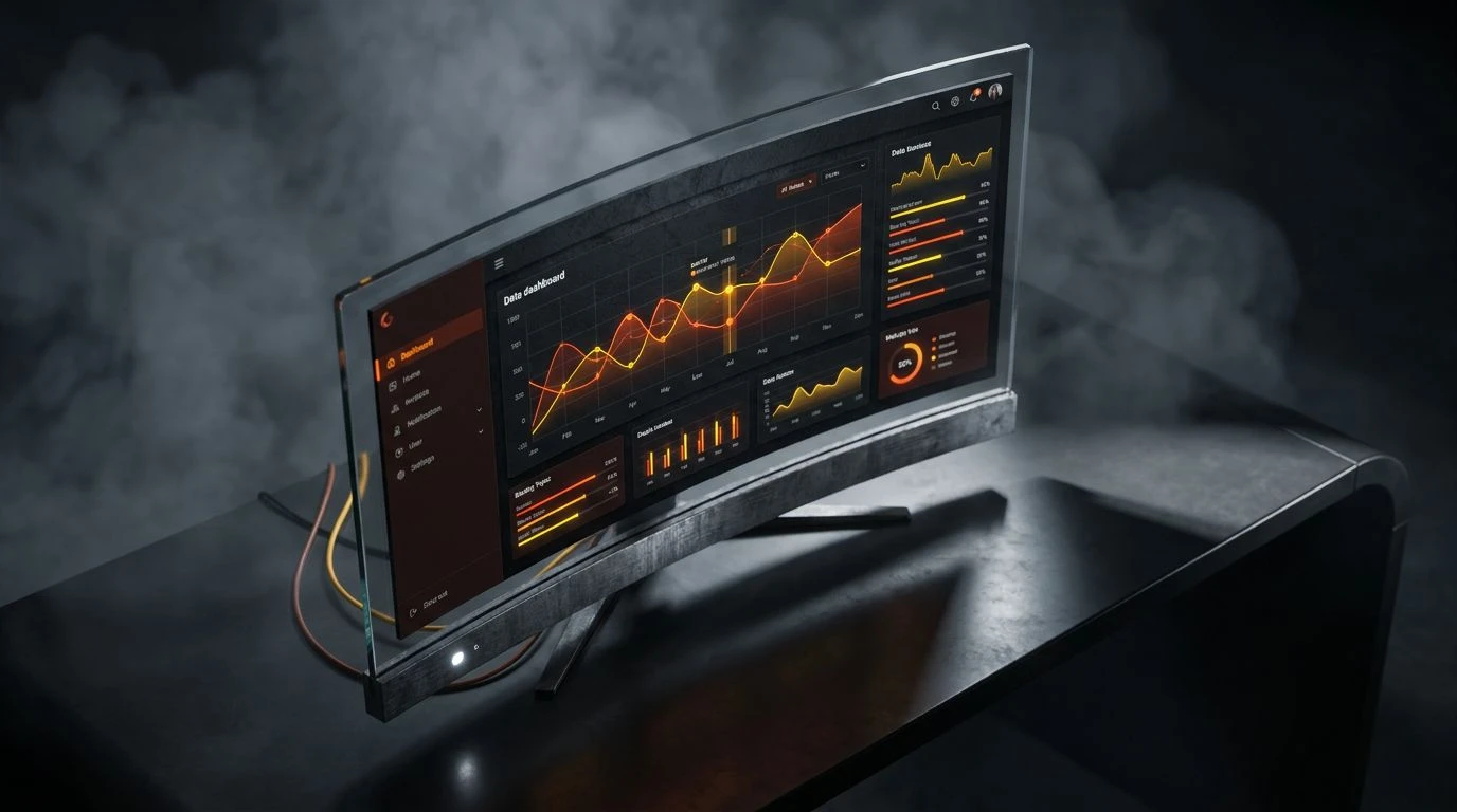
While designing an environment for profound tranquility usually relies on heavy, muted tones, translating biometric data into visual feedback requires a distinct and legible spectrum. Cortisol Decline serves as the visual language for the latest version of tracking software, mapping the progression from wakefulness to absolute rest. In the user interface of these clinical applications, Brainwave Blue tracks moments of restless mental activity, sharply contrasting with the heavy composure of Slate Shadow. As the user reads their sleep report in a softly lit bedroom, periods of disturbed rapid eye movement are marked by Lucid Flare and Awakening Fern, vivid indicators demanding cognitive attention against the otherwise subdued background. However, the ultimate goal of the application is to guide the user back toward stability, represented visually by gentle swathes of Blush Tundra and the grounding reliability of Burnt Sienna. By employing such distinct markers, the software translates invisible biological shifts into a readable narrative, teaching individuals to recognize their own internal rhythms and making the elusive mechanics of a good night completely visible to the conscious mind.
An examination of these visual strategies reveals a sophisticated understanding of human biology. Modern technology companies have realized that merely tracking physical metrics falls strictly short of solving the actual problem of rest. By intentionally deploying specific colors across physical environments and digital interfaces, they actively shape human physiological responses. The deliberate application of profound purples and heavy navies transforms standard architectural spaces into finely tuned instruments for recovery. These considered environments command the nervous system to quiet down, stripping away the artificial stress of modern life. Ultimately, the careful control of the optical field proves just as effective as any pharmaceutical intervention, showing that what the human eye consumes in the final hours of the day definitively dictates the quality of the bodily repair that follows.