'%3e%3cpath%20fill-rule='evenodd'%20clip-rule='evenodd'%20d='M51.1303%2019.2492C50.7278%2019.913%2050.1346%2020.4426%2049.3508%2020.838C48.5669%2021.2335%2047.6172%2021.4312%2046.5014%2021.4312C44.8208%2021.4312%2043.4367%2021.0216%2042.3492%2020.2025C41.2617%2019.3833%2040.6686%2018.2394%2040.5697%2016.7706H44.4253C44.4818%2017.3355%2044.6831%2017.7804%2045.0291%2018.1052C45.3751%2018.43%2045.8164%2018.5924%2046.3531%2018.5924C46.8192%2018.5924%2047.1864%2018.4653%2047.4547%2018.2111C47.7231%2017.9569%2047.8572%2017.618%2047.8572%2017.1943C47.8572%2016.8129%2047.7337%2016.4952%2047.4865%2016.241C47.2393%2015.9867%2046.9322%2015.7784%2046.565%2015.616C46.1978%2015.4536%2045.6893%2015.2594%2045.0397%2015.0334C44.0934%2014.7086%2043.3202%2014.3944%2042.72%2014.0907C42.1197%2013.7871%2041.6042%2013.3351%2041.1735%2012.7349C40.7427%2012.1347%2040.5273%2011.3544%2040.5273%2010.394C40.5273%209.50418%2040.7533%208.73448%2041.2053%208.08481C41.6572%207.43515%2042.2821%206.93731%2043.0801%206.5913C43.8781%206.24528%2044.7925%206.07227%2045.8235%206.07227C47.49%206.07227%2048.8141%206.46771%2049.7956%207.25861C50.7772%208.04951%2051.3315%209.13698%2051.4586%2010.5211H47.5395C47.4689%2010.0268%2047.2888%209.63483%2046.9993%209.3453C46.7097%209.05578%2046.3178%208.91102%2045.8235%208.91102C45.3998%208.91102%2045.0573%209.024%2044.7961%209.24997C44.5348%209.47594%2044.4041%209.80783%2044.4041%2010.2457C44.4041%2010.5988%2044.5207%2010.8989%2044.7537%2011.146C44.9867%2011.3932%2045.2798%2011.5944%2045.6328%2011.7498C45.9859%2011.9052%2046.4944%2012.1029%2047.1581%2012.343C48.1185%2012.6678%2048.9023%2012.9891%2049.5096%2013.3069C50.1169%2013.6246%2050.6395%2014.0872%2051.0773%2014.6945C51.5151%2015.3018%2051.734%2016.0927%2051.734%2017.0672C51.734%2017.8581%2051.5328%2018.5854%2051.1303%2019.2492ZM59.0242%206.3053V21.2829H55.4016V6.3053H59.0242ZM73.9409%206.3053V9.18642H69.8734V21.2829H66.2296V9.18642H62.2046V6.3053H73.9409ZM80.7438%209.18642V12.3218H85.8069V15.0546H80.7438V18.3806H86.4425V21.2829H77.1212V6.3053H86.4425V9.18642H80.7438ZM99.667%2016.0291V21.2829H96.0444V6.3053H101.913C103.692%206.3053%20105.048%206.74665%20105.98%207.62934C106.912%208.51204%20107.378%209.7019%20107.378%2011.199C107.378%2012.1311%20107.17%2012.9609%20106.753%2013.6882C106.337%2014.4155%20105.719%2014.9875%20104.9%2015.4042C104.08%2015.8208%20103.085%2016.0291%20101.913%2016.0291H99.667ZM103.692%2011.199C103.692%209.8855%20102.965%209.22879%20101.51%209.22879H99.667V13.1268H101.51C102.965%2013.1268%20103.692%2012.4842%20103.692%2011.199ZM120.092%2018.5501H114.478L113.546%2021.2829H109.732L115.219%206.41123H119.393L124.879%2021.2829H121.024L120.092%2018.5501ZM119.16%2015.7961L117.295%2010.2881L115.41%2015.7961H119.16ZM131.555%2018.5077H136.385V21.2829H127.933V6.3053H131.555V18.5077ZM143.337%209.18642V12.3218H148.4V15.0546H143.337V18.3806H149.035V21.2829H139.714V6.3053H149.035V9.18642H143.337ZM163.507%206.3053V9.18642H159.44V21.2829H155.796V9.18642H151.771V6.3053H163.507ZM177.449%206.3053V9.18642H173.382V21.2829H169.738V9.18642H165.713V6.3053H177.449ZM184.252%209.18642V12.3218H189.315V15.0546H184.252V18.3806H189.951V21.2829H180.629V6.3053H189.951V9.18642H184.252Z'%20fill='%23EEF0ED'/%3e%3cmask%20id='mask0_3101_7327'%20style='mask-type:alpha'%20maskUnits='userSpaceOnUse'%20x='0'%20y='0'%20width='27'%20height='28'%3e%3cpath%20d='M23.8328%200.759766H2.64808C1.18559%200.759766%200%201.94535%200%203.40785V24.5925C0%2026.055%201.18559%2027.2406%202.64808%2027.2406H23.8328C25.2952%2027.2406%2026.4808%2026.055%2026.4808%2024.5925V3.40785C26.4808%201.94535%2025.2952%200.759766%2023.8328%200.759766Z'%20fill='white'/%3e%3c/mask%3e%3cg%20mask='url(%23mask0_3101_7327)'%3e%3cpath%20d='M23.8328%200.759766H2.64808C1.18559%200.759766%200%201.94535%200%203.40785V24.5925C0%2026.055%201.18559%2027.2406%202.64808%2027.2406H23.8328C25.2952%2027.2406%2026.4808%2026.055%2026.4808%2024.5925V3.40785C26.4808%201.94535%2025.2952%200.759766%2023.8328%200.759766Z'%20fill='%23D8D8D8'/%3e%3cpath%20d='M13.2404%200.759766H0V14.0001H13.2404V0.759766Z'%20fill='%238C61FF'/%3e%3cpath%20d='M13.2404%2014H0V27.2404H13.2404V14Z'%20fill='%2336C3FE'/%3e%3cpath%20d='M26.4806%2014H13.2402V27.2404H26.4806V14Z'%20fill='%236592FE'/%3e%3cpath%20d='M26.4806%200.759766H13.2402V14.0002H26.4806V0.759766Z'%20fill='%236059F7'/%3e%3c/g%3e%3c/g%3e%3cdefs%3e%3cclipPath%20id='clip0_3101_7327'%3e%3crect%20width='190'%20height='28'%20fill='white'/%3e%3c/clipPath%3e%3c/defs%3e%3c/svg%3e)
'%3e%3cpath%20d='M23.8328%200.759521H2.64808C1.18559%200.759521%200%201.94511%200%203.40761V24.5923C0%2026.0548%201.18559%2027.2404%202.64808%2027.2404H23.8328C25.2952%2027.2404%2026.4808%2026.0548%2026.4808%2024.5923V3.40761C26.4808%201.94511%2025.2952%200.759521%2023.8328%200.759521Z'%20fill='%23D8D8D8'/%3e%3cpath%20d='M13.2404%200.759521H0V13.9999H13.2404V0.759521Z'%20fill='%238C61FF'/%3e%3cpath%20d='M13.2404%2013.9998H0V27.2402H13.2404V13.9998Z'%20fill='%2336C3FE'/%3e%3cpath%20d='M26.4809%2013.9998H13.2405V27.2402H26.4809V13.9998Z'%20fill='%236592FE'/%3e%3cpath%20d='M26.4809%200.759277H13.2405V13.9997H26.4809V0.759277Z'%20fill='%236059F7'/%3e%3c/g%3e%3c/svg%3e)
Cerulean and Amber Color Palette Ideas for Calm Interiors
· 6 min readThere is a distinct architectural quietness to an empty glasshouse, where sunlight becomes the primary inhabitant. When that light passes through carefully positioned panes of blue and amber, the space transforms into an instrument of optical weight and warmth. This specific intersection of cool sky tones and rich, sunbaked resins sets a tenor that is simultaneously meditative and alert. Translating this visual experience into interior spaces requires an understanding of how color dictates human rest. A room designed to soothe infants or center adults in a spa setting needs both the grounding earthiness of heated gold and the expansive, breathable quality of clear coastal skies. The resulting atmosphere relies on this careful balancing act, crafting an environment where shadow and brightness are continually in conversation, offering sanctuary without feeling enclosed.
Sunlit Conservatory 🌿
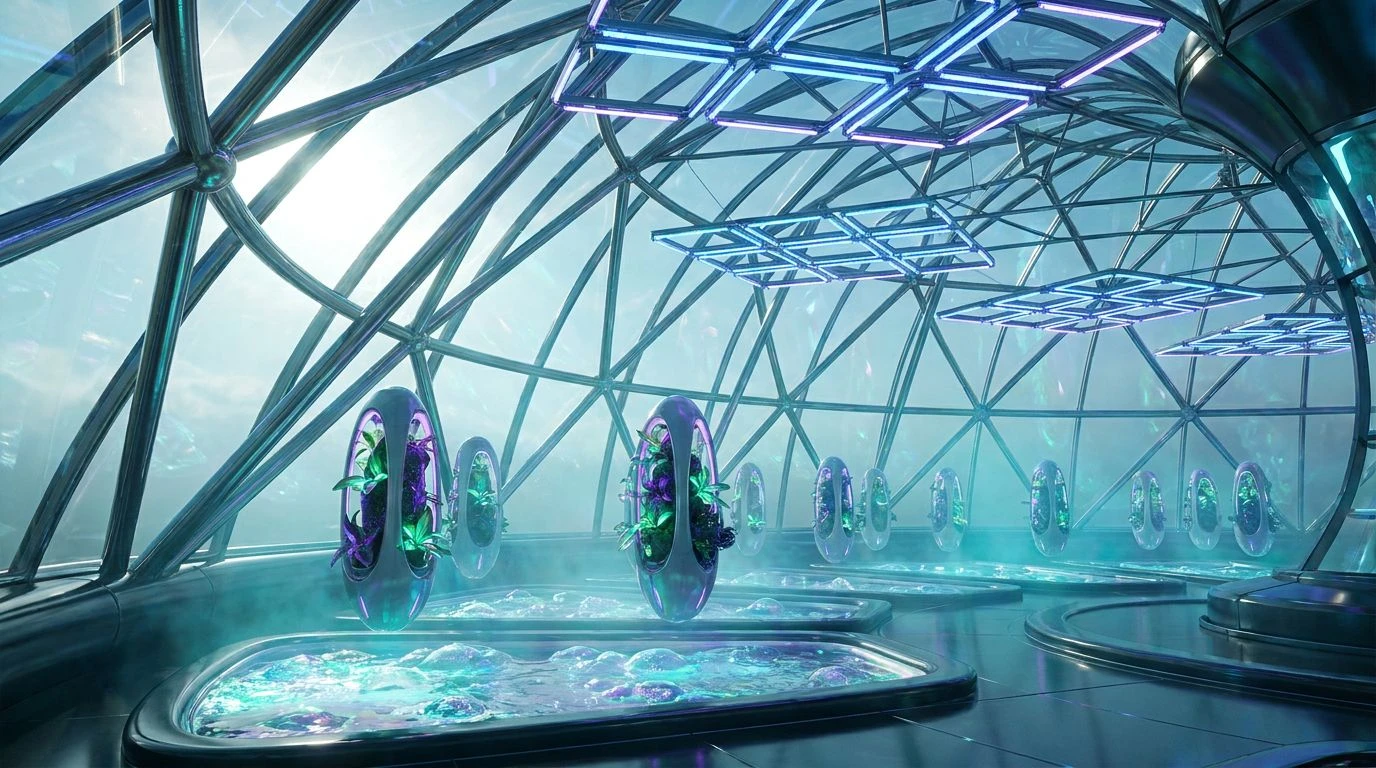
The Sunlit Conservatory collection captures the precise moment mid-morning light strikes terrarium glass, casting warm and cool shadows across a quiet room. By pairing the deep, grounding presence of Burnished Oak with the striking brilliance of Sunbeam Amber, a gentle but pervasive warmth is established. This thermal visual effect is immediately countered by Morning Frost and Clear Cerulean, which introduce a necessary, breathable coolness reminiscent of undisturbed winter skies. The addition of Glasshouse Fern anchors the selection in organic life, suggesting a space dedicated to growth and recovery. In an infant room, this combination provides enough visual stimulation without overwhelming delicate senses, while a wellness retreat might use these tones to create a space that feels both alive and profoundly still. The transition from Fog Stone to Pale Straw mimics the gradual shift of daylight, holding the room in a constant state of peaceful anticipation.
Botanical Shadows 🥀
Botanical Shadows rests on the more theatrical end of the spectrum, drawing its strength from sharp contrasts and unexpected flashes of botanical color. Glazed Terracotta supplies a dense, oven-baked warmth, sitting firmly against the heavy anchor of Midnight Iron. This dark, structural foundation mimics the cast-iron framework of a vintage greenhouse against the night sky. The real tension, however, exists between the oceanic depth of Lapis Pane and the sudden, surprising bloom of Fuchsia Slipper. These tones break through the heavier earth colors like spring blossoms demanding attention. In a space meant for restorative treatments or an upscale quiet lounge, Mist on Twigs and Dried Clay offer neutral, sweeping surfaces that allow the louder colors to act as deliberate accents rather than overwhelming floods. The resulting atmosphere is sophisticated and slightly mysterious, appealing directly to those seeking an environment structured around quiet contemplation and striking visual surprises.
Refracted Tides 🌊
Stripping away heavy earth tones entirely from the equation, Refracted Tides focuses exclusively on the crisp, clean interaction between water and sunlight. Faded Goldfish offers the sole source of heat, functioning almost like a solitary brass fixture in a tiled corridor. The rest of the selection plunges into varying depths of aquatic coolness, moving from the blindingly bright Glacial Reflection through the inviting clarity of Cyan Pool, before settling into the serious, grounding depths of Abyssal Glass. For a modern wellness facility, this arrangement creates a sensory experience that feels clinical yet luxurious, completely divorced from the muddy realities of the outside world. An infant care space utilizing these tones feels pristine and expansive, encouraging calm focus. Shallow Water acts as the ideal bridge across these extremes, softening the jump between the darkest blues and the singular streak of yellow, ensuring the room remains highly stimulating without sacrificing its fundamental mandate to calm the human nervous system.
Antique Vitrine 🏺
Antique Vitrine behaves like a meticulously curated cabinet of curiosities, balancing stark neutrality with brief, intense flashes of pigment. Alabaster Dust and Obsidian Shard provide the ultimate parameters, creating a high-contrast canvas that demands architectural precision. Within these strict boundaries, Scorched Earth introduces a rich, historical weight, grounding the lighter, more ephemeral elements. The true focus becomes the transition between Minted Ice and Vivid Azure, which capture the distinct, sparkling quality of antique apothecary bottles catching the afternoon sunlight. Accompanied by the softer, more recessive Evening Periwinkle and Oxidized Copper, this collection feels uniquely suited for spaces that prioritize intellectual quiet over pure physical rest. In a reading lounge or a specialized care room, the colors encourage the mind to wander rather than simply shut down, fostering a cerebral tranquility. The sharp borders between the light and dark tones demand attention, but the overall effect remains decidedly peaceful and contained.
Twilight Atrium 🌆
Twilight Atrium abandons the bright, primary cheerfulness of daytime colors in favor of the complex, muted tones that arrive just as the sun dips below the horizon. Warming Coral and Faded Rosewood supply a blush of biological life, preventing the space from feeling cold or abandoned, while Rusting Grid gives these softer pinks a necessary, heavily textured grounding. The structural bones of the color story rely on Pitch Canvas and Chalk White to outline the space, allowing Twilight Slate and Clouded Steel to wash over the walls like approaching dusk. This particular arrangement thrives in environments dedicated entirely to lowering the heart rate and preparing the body for sleep. A nursery painted in these shades avoids the usual pastel tropes, opting instead for a mature, restful sophistication. Similarly, a thermal bathhouse would benefit from the hushed, twilight quality of this selection, where the fading light and gentle, muted reds encourage visitors to detach from their daily anxieties and surrender to physical stillness.
The deliberate application of amber and cerulean within a physical space goes far beyond mere decoration matters; it represents a calculated approach to human wellness and atmospheric control. When these rich, opposing colors are filtered through the conceptual lens of a sunlit glasshouse, they provide designers with a sophisticated toolkit for regulating both mood and spatial perception. The warmer tones anchor the body, offering a subtle imitation of direct sunlight that reassures the nervous system. Conversely, the spectrum of blues pushes the walls outward, creating generous, breathable volumes out of otherwise restricted rooms. By carefully adjusting the ratio of these bright, light-catching colors against solid, shadow-drawing neutrals, one can dictate the exact tenor of a room. The resulting environments are finely tuned instruments of calm, proving that the most deeply restorative spaces rely heavily on a rigorous, thoughtful command of the visible spectrum.