'%3e%3cpath%20fill-rule='evenodd'%20clip-rule='evenodd'%20d='M51.1303%2019.2492C50.7278%2019.913%2050.1346%2020.4426%2049.3508%2020.838C48.5669%2021.2335%2047.6172%2021.4312%2046.5014%2021.4312C44.8208%2021.4312%2043.4367%2021.0216%2042.3492%2020.2025C41.2617%2019.3833%2040.6686%2018.2394%2040.5697%2016.7706H44.4253C44.4818%2017.3355%2044.6831%2017.7804%2045.0291%2018.1052C45.3751%2018.43%2045.8164%2018.5924%2046.3531%2018.5924C46.8192%2018.5924%2047.1864%2018.4653%2047.4547%2018.2111C47.7231%2017.9569%2047.8572%2017.618%2047.8572%2017.1943C47.8572%2016.8129%2047.7337%2016.4952%2047.4865%2016.241C47.2393%2015.9867%2046.9322%2015.7784%2046.565%2015.616C46.1978%2015.4536%2045.6893%2015.2594%2045.0397%2015.0334C44.0934%2014.7086%2043.3202%2014.3944%2042.72%2014.0907C42.1197%2013.7871%2041.6042%2013.3351%2041.1735%2012.7349C40.7427%2012.1347%2040.5273%2011.3544%2040.5273%2010.394C40.5273%209.50418%2040.7533%208.73448%2041.2053%208.08481C41.6572%207.43515%2042.2821%206.93731%2043.0801%206.5913C43.8781%206.24528%2044.7925%206.07227%2045.8235%206.07227C47.49%206.07227%2048.8141%206.46771%2049.7956%207.25861C50.7772%208.04951%2051.3315%209.13698%2051.4586%2010.5211H47.5395C47.4689%2010.0268%2047.2888%209.63483%2046.9993%209.3453C46.7097%209.05578%2046.3178%208.91102%2045.8235%208.91102C45.3998%208.91102%2045.0573%209.024%2044.7961%209.24997C44.5348%209.47594%2044.4041%209.80783%2044.4041%2010.2457C44.4041%2010.5988%2044.5207%2010.8989%2044.7537%2011.146C44.9867%2011.3932%2045.2798%2011.5944%2045.6328%2011.7498C45.9859%2011.9052%2046.4944%2012.1029%2047.1581%2012.343C48.1185%2012.6678%2048.9023%2012.9891%2049.5096%2013.3069C50.1169%2013.6246%2050.6395%2014.0872%2051.0773%2014.6945C51.5151%2015.3018%2051.734%2016.0927%2051.734%2017.0672C51.734%2017.8581%2051.5328%2018.5854%2051.1303%2019.2492ZM59.0242%206.3053V21.2829H55.4016V6.3053H59.0242ZM73.9409%206.3053V9.18642H69.8734V21.2829H66.2296V9.18642H62.2046V6.3053H73.9409ZM80.7438%209.18642V12.3218H85.8069V15.0546H80.7438V18.3806H86.4425V21.2829H77.1212V6.3053H86.4425V9.18642H80.7438ZM99.667%2016.0291V21.2829H96.0444V6.3053H101.913C103.692%206.3053%20105.048%206.74665%20105.98%207.62934C106.912%208.51204%20107.378%209.7019%20107.378%2011.199C107.378%2012.1311%20107.17%2012.9609%20106.753%2013.6882C106.337%2014.4155%20105.719%2014.9875%20104.9%2015.4042C104.08%2015.8208%20103.085%2016.0291%20101.913%2016.0291H99.667ZM103.692%2011.199C103.692%209.8855%20102.965%209.22879%20101.51%209.22879H99.667V13.1268H101.51C102.965%2013.1268%20103.692%2012.4842%20103.692%2011.199ZM120.092%2018.5501H114.478L113.546%2021.2829H109.732L115.219%206.41123H119.393L124.879%2021.2829H121.024L120.092%2018.5501ZM119.16%2015.7961L117.295%2010.2881L115.41%2015.7961H119.16ZM131.555%2018.5077H136.385V21.2829H127.933V6.3053H131.555V18.5077ZM143.337%209.18642V12.3218H148.4V15.0546H143.337V18.3806H149.035V21.2829H139.714V6.3053H149.035V9.18642H143.337ZM163.507%206.3053V9.18642H159.44V21.2829H155.796V9.18642H151.771V6.3053H163.507ZM177.449%206.3053V9.18642H173.382V21.2829H169.738V9.18642H165.713V6.3053H177.449ZM184.252%209.18642V12.3218H189.315V15.0546H184.252V18.3806H189.951V21.2829H180.629V6.3053H189.951V9.18642H184.252Z'%20fill='%23EEF0ED'/%3e%3cmask%20id='mask0_3101_7327'%20style='mask-type:alpha'%20maskUnits='userSpaceOnUse'%20x='0'%20y='0'%20width='27'%20height='28'%3e%3cpath%20d='M23.8328%200.759766H2.64808C1.18559%200.759766%200%201.94535%200%203.40785V24.5925C0%2026.055%201.18559%2027.2406%202.64808%2027.2406H23.8328C25.2952%2027.2406%2026.4808%2026.055%2026.4808%2024.5925V3.40785C26.4808%201.94535%2025.2952%200.759766%2023.8328%200.759766Z'%20fill='white'/%3e%3c/mask%3e%3cg%20mask='url(%23mask0_3101_7327)'%3e%3cpath%20d='M23.8328%200.759766H2.64808C1.18559%200.759766%200%201.94535%200%203.40785V24.5925C0%2026.055%201.18559%2027.2406%202.64808%2027.2406H23.8328C25.2952%2027.2406%2026.4808%2026.055%2026.4808%2024.5925V3.40785C26.4808%201.94535%2025.2952%200.759766%2023.8328%200.759766Z'%20fill='%23D8D8D8'/%3e%3cpath%20d='M13.2404%200.759766H0V14.0001H13.2404V0.759766Z'%20fill='%238C61FF'/%3e%3cpath%20d='M13.2404%2014H0V27.2404H13.2404V14Z'%20fill='%2336C3FE'/%3e%3cpath%20d='M26.4806%2014H13.2402V27.2404H26.4806V14Z'%20fill='%236592FE'/%3e%3cpath%20d='M26.4806%200.759766H13.2402V14.0002H26.4806V0.759766Z'%20fill='%236059F7'/%3e%3c/g%3e%3c/g%3e%3cdefs%3e%3cclipPath%20id='clip0_3101_7327'%3e%3crect%20width='190'%20height='28'%20fill='white'/%3e%3c/clipPath%3e%3c/defs%3e%3c/svg%3e)
'%3e%3cpath%20d='M23.8328%200.759521H2.64808C1.18559%200.759521%200%201.94511%200%203.40761V24.5923C0%2026.0548%201.18559%2027.2404%202.64808%2027.2404H23.8328C25.2952%2027.2404%2026.4808%2026.0548%2026.4808%2024.5923V3.40761C26.4808%201.94511%2025.2952%200.759521%2023.8328%200.759521Z'%20fill='%23D8D8D8'/%3e%3cpath%20d='M13.2404%200.759521H0V13.9999H13.2404V0.759521Z'%20fill='%238C61FF'/%3e%3cpath%20d='M13.2404%2013.9998H0V27.2402H13.2404V13.9998Z'%20fill='%2336C3FE'/%3e%3cpath%20d='M26.4809%2013.9998H13.2405V27.2402H26.4809V13.9998Z'%20fill='%236592FE'/%3e%3cpath%20d='M26.4809%200.759277H13.2405V13.9997H26.4809V0.759277Z'%20fill='%236059F7'/%3e%3c/g%3e%3c/svg%3e)
Boost Coding Focus with Peach and Charcoal Color Palettes
· 5 min readWhen programmers stare at lines of syntax for hours, their visual processing centers must constantly negotiate high-contrast signals. The traditional approach relies on aggressive neons cutting through pitch-black backgrounds, a sensory barrage that frequently leads to optical fatigue. Retinal ganglion cells become overstimulated, turning the act of reading logic into an endurance test. By adjusting the mathematical distance between background and foreground frequencies, we find an unlikely physiological optimization: the pairing of soft, warm frequencies with deep, light-absorbing darks. This specific visual calibration respects human biology. Rather than forcing the eye to wrestle with intense stimulation, carefully formulated tones calm the nervous system while preserving strict legibility. This allows the brain to direct its computational power entirely toward solving structural logic problems.
Kinetic Warmth 🍑
The interaction between Solar Peach and Graphite Shadow provides a fascinating case study in optical relief. By anchoring the visual field with a medium dark tone like Graphite Shadow, the human pupil remains in a relaxed, widened state. Against this, Solar Peach functions as a highly visible but low-fatigue highlighter for critical syntax elements, striking the exact frequency required to catch the eye without triggering the harsh glare of a pure white or neon red. When lines of code are accented by Fluorescent Isotope and Deep Violet Wave, they create a distinct visual hierarchy that the brain categorizes instantly based on hue recognition geometry. Oxidized Silver and Alabaster Dust serve as structural reading texts, offering sufficient reflection for legibility while preventing the early onset of screen blindness. Mossy Node acts as a secondary anchor, grounding the more active, energetic colors. The physiological result is a sense of sustained wakefulness and capability, allowing the coder to traverse complex logic trees for hours without sensory exhaustion.
Crimson Frequency 🔋
Shifting the background to a profound darkness using Obsidian Void completely alters the physics of the screen, absorbing stray light and allowing brighter syntax to stand out precisely. The eye detects Goldenrod Ray and Menthol Flare as crisp, well-defined boundaries against the dark expanse, minimizing chromatic aberration at the edges of text characters. Arterial Red and Crimson Oxide act as specialized alerts, firing specific retinal receptors to command immediate attention for errors or critical warnings without bleeding into adjacent lines of text. Glacial White draws the basic string structures, while Lunar Ash and Basalt Strata recede into the background to handle comments and inactive code, lowering the required processing power for the visual cortex. This careful stratification of light intensity prevents the overwhelming flood of photons typical in raw contrast themes, replacing it with a mathematically sound interface that promotes alertness and an enduring sense of control over the digital workspace.
Bioluminescent Depths 🌊
Operating within a much cooler section of the visible spectrum, this arrangement relies heavily on the calming properties of short-wavelength light. Oceanic Trench swallows the ambient glare entirely, simulating the serene pressure of deep water where only specific light forms survive. Against this profound black-blue terrain, Phosphor Mint provides an exceptionally sharp syntactical signpost, its green-blue frequency resting exactly where human night vision is most acute. This means the developer requires far less physical luminance to perfectly read an active function or variable. Cobalt Signal and Ionized Periwinkle map the structural logic, guiding the gaze through nested loops and mathematical operators with a steady, cooling presence. Slate Haze acts to quiet the supplementary text, ensuring background comments never fight for ocular dominance. The biological reaction is a lowering of a programmer resting heart rate, transforming a demanding debugging process into a steady, methodical, and profoundly commanding state of flow.
Atmospheric Optics 🔭
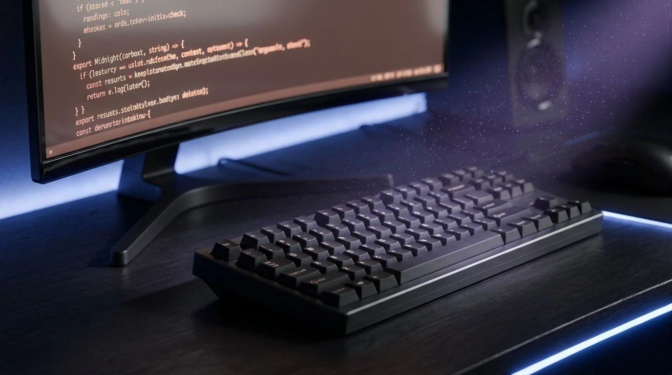
The relationship between Midnight Carbon and Stratospheric Blue illustrates a phenomenon known as simultaneous contrast, where the perceived brilliance of a hue shifts based on its surroundings. Midnight Carbon provides a highly stable, non-reflective base that allows the eye to completely relax its ciliary muscles. From this quiet foundation, Stratospheric Blue emerges to articulate key code syntax, appearing extraordinarily vivid despite emitting relatively few actual photons from the monitor. This efficiency is critical for prolonged cognitive stamina. Ultraviolet Dust operates on a neighboring frequency, labeling secondary syntax structures without causing the visual noise that often accompanies competing primary colors. Anodized Iron and Clouded Platinum manage the standard text and annotations, maintaining a strict distinction between primary logic and background notes. By keeping the entire spectrum contained within these specific, neighboring temperature bands, the layout prevents optical fatigue and instills a deep psychological confidence.
Quantum Canopy 🌿
Exploring the physiological benefits of middle-spectrum greens, this selection draws directly upon our evolutionary sensitivity to natural environments. Carbon Lattice sets a deeply absorbing backdrop that entirely eliminates screen glare, a vital starting point for long-term optical health. The introduction of Malachite Spark to highlight functional code takes advantage of the eye peak sensitivity to green light, allowing the programmer to read complex structures with absolute minimal effort. Pine Shadow works in tandem, offering a darker companion hue that builds a natural depth of field, making layers of code appear physically distinct from one another. Cerulean Isotope brings a necessary thermal shift, marking exceptions or secondary logic states with a crisp, cool energy that cleanly separates from the surrounding greenery. Pure Photon remains strictly for active cursor lines or vital structural bounds, while Palladium Dust softens the remaining text. The resulting visual climate is remarkably refreshing, promoting a sense of natural capability and sustained intellectual stamina.
Examining human reactions to digital environments reveals how deeply our optical neurology dictates endurance and focus. We are biologically wired to process certain frequencies more comfortably over long durations. The spaces between deep, light-absorbing darks and carefully calibrated accents dictate how easily we parse strings of variables and functions. When developers replace harsh, fatiguing contrasts with considered, physiologically sound alternatives, the screen transforms from a source of strain into a terrain of sustained mental clarity. The precise calibration of light and space physically alters how developers experience their daily work, proving that aesthetics are fundamentally married to biological function and cognitive endurance.