'%3e%3cpath%20fill-rule='evenodd'%20clip-rule='evenodd'%20d='M51.1303%2019.2492C50.7278%2019.913%2050.1346%2020.4426%2049.3508%2020.838C48.5669%2021.2335%2047.6172%2021.4312%2046.5014%2021.4312C44.8208%2021.4312%2043.4367%2021.0216%2042.3492%2020.2025C41.2617%2019.3833%2040.6686%2018.2394%2040.5697%2016.7706H44.4253C44.4818%2017.3355%2044.6831%2017.7804%2045.0291%2018.1052C45.3751%2018.43%2045.8164%2018.5924%2046.3531%2018.5924C46.8192%2018.5924%2047.1864%2018.4653%2047.4547%2018.2111C47.7231%2017.9569%2047.8572%2017.618%2047.8572%2017.1943C47.8572%2016.8129%2047.7337%2016.4952%2047.4865%2016.241C47.2393%2015.9867%2046.9322%2015.7784%2046.565%2015.616C46.1978%2015.4536%2045.6893%2015.2594%2045.0397%2015.0334C44.0934%2014.7086%2043.3202%2014.3944%2042.72%2014.0907C42.1197%2013.7871%2041.6042%2013.3351%2041.1735%2012.7349C40.7427%2012.1347%2040.5273%2011.3544%2040.5273%2010.394C40.5273%209.50418%2040.7533%208.73448%2041.2053%208.08481C41.6572%207.43515%2042.2821%206.93731%2043.0801%206.5913C43.8781%206.24528%2044.7925%206.07227%2045.8235%206.07227C47.49%206.07227%2048.8141%206.46771%2049.7956%207.25861C50.7772%208.04951%2051.3315%209.13698%2051.4586%2010.5211H47.5395C47.4689%2010.0268%2047.2888%209.63483%2046.9993%209.3453C46.7097%209.05578%2046.3178%208.91102%2045.8235%208.91102C45.3998%208.91102%2045.0573%209.024%2044.7961%209.24997C44.5348%209.47594%2044.4041%209.80783%2044.4041%2010.2457C44.4041%2010.5988%2044.5207%2010.8989%2044.7537%2011.146C44.9867%2011.3932%2045.2798%2011.5944%2045.6328%2011.7498C45.9859%2011.9052%2046.4944%2012.1029%2047.1581%2012.343C48.1185%2012.6678%2048.9023%2012.9891%2049.5096%2013.3069C50.1169%2013.6246%2050.6395%2014.0872%2051.0773%2014.6945C51.5151%2015.3018%2051.734%2016.0927%2051.734%2017.0672C51.734%2017.8581%2051.5328%2018.5854%2051.1303%2019.2492ZM59.0242%206.3053V21.2829H55.4016V6.3053H59.0242ZM73.9409%206.3053V9.18642H69.8734V21.2829H66.2296V9.18642H62.2046V6.3053H73.9409ZM80.7438%209.18642V12.3218H85.8069V15.0546H80.7438V18.3806H86.4425V21.2829H77.1212V6.3053H86.4425V9.18642H80.7438ZM99.667%2016.0291V21.2829H96.0444V6.3053H101.913C103.692%206.3053%20105.048%206.74665%20105.98%207.62934C106.912%208.51204%20107.378%209.7019%20107.378%2011.199C107.378%2012.1311%20107.17%2012.9609%20106.753%2013.6882C106.337%2014.4155%20105.719%2014.9875%20104.9%2015.4042C104.08%2015.8208%20103.085%2016.0291%20101.913%2016.0291H99.667ZM103.692%2011.199C103.692%209.8855%20102.965%209.22879%20101.51%209.22879H99.667V13.1268H101.51C102.965%2013.1268%20103.692%2012.4842%20103.692%2011.199ZM120.092%2018.5501H114.478L113.546%2021.2829H109.732L115.219%206.41123H119.393L124.879%2021.2829H121.024L120.092%2018.5501ZM119.16%2015.7961L117.295%2010.2881L115.41%2015.7961H119.16ZM131.555%2018.5077H136.385V21.2829H127.933V6.3053H131.555V18.5077ZM143.337%209.18642V12.3218H148.4V15.0546H143.337V18.3806H149.035V21.2829H139.714V6.3053H149.035V9.18642H143.337ZM163.507%206.3053V9.18642H159.44V21.2829H155.796V9.18642H151.771V6.3053H163.507ZM177.449%206.3053V9.18642H173.382V21.2829H169.738V9.18642H165.713V6.3053H177.449ZM184.252%209.18642V12.3218H189.315V15.0546H184.252V18.3806H189.951V21.2829H180.629V6.3053H189.951V9.18642H184.252Z'%20fill='%23EEF0ED'/%3e%3cmask%20id='mask0_3101_7327'%20style='mask-type:alpha'%20maskUnits='userSpaceOnUse'%20x='0'%20y='0'%20width='27'%20height='28'%3e%3cpath%20d='M23.8328%200.759766H2.64808C1.18559%200.759766%200%201.94535%200%203.40785V24.5925C0%2026.055%201.18559%2027.2406%202.64808%2027.2406H23.8328C25.2952%2027.2406%2026.4808%2026.055%2026.4808%2024.5925V3.40785C26.4808%201.94535%2025.2952%200.759766%2023.8328%200.759766Z'%20fill='white'/%3e%3c/mask%3e%3cg%20mask='url(%23mask0_3101_7327)'%3e%3cpath%20d='M23.8328%200.759766H2.64808C1.18559%200.759766%200%201.94535%200%203.40785V24.5925C0%2026.055%201.18559%2027.2406%202.64808%2027.2406H23.8328C25.2952%2027.2406%2026.4808%2026.055%2026.4808%2024.5925V3.40785C26.4808%201.94535%2025.2952%200.759766%2023.8328%200.759766Z'%20fill='%23D8D8D8'/%3e%3cpath%20d='M13.2404%200.759766H0V14.0001H13.2404V0.759766Z'%20fill='%238C61FF'/%3e%3cpath%20d='M13.2404%2014H0V27.2404H13.2404V14Z'%20fill='%2336C3FE'/%3e%3cpath%20d='M26.4806%2014H13.2402V27.2404H26.4806V14Z'%20fill='%236592FE'/%3e%3cpath%20d='M26.4806%200.759766H13.2402V14.0002H26.4806V0.759766Z'%20fill='%236059F7'/%3e%3c/g%3e%3c/g%3e%3cdefs%3e%3cclipPath%20id='clip0_3101_7327'%3e%3crect%20width='190'%20height='28'%20fill='white'/%3e%3c/clipPath%3e%3c/defs%3e%3c/svg%3e)
'%3e%3cpath%20d='M23.8328%200.759521H2.64808C1.18559%200.759521%200%201.94511%200%203.40761V24.5923C0%2026.0548%201.18559%2027.2404%202.64808%2027.2404H23.8328C25.2952%2027.2404%2026.4808%2026.0548%2026.4808%2024.5923V3.40761C26.4808%201.94511%2025.2952%200.759521%2023.8328%200.759521Z'%20fill='%23D8D8D8'/%3e%3cpath%20d='M13.2404%200.759521H0V13.9999H13.2404V0.759521Z'%20fill='%238C61FF'/%3e%3cpath%20d='M13.2404%2013.9998H0V27.2402H13.2404V13.9998Z'%20fill='%2336C3FE'/%3e%3cpath%20d='M26.4809%2013.9998H13.2405V27.2402H26.4809V13.9998Z'%20fill='%236592FE'/%3e%3cpath%20d='M26.4809%200.759277H13.2405V13.9997H26.4809V0.759277Z'%20fill='%236059F7'/%3e%3c/g%3e%3c/svg%3e)
Milan Color Palettes: Heavy Wool Meets Fluorescent Prints
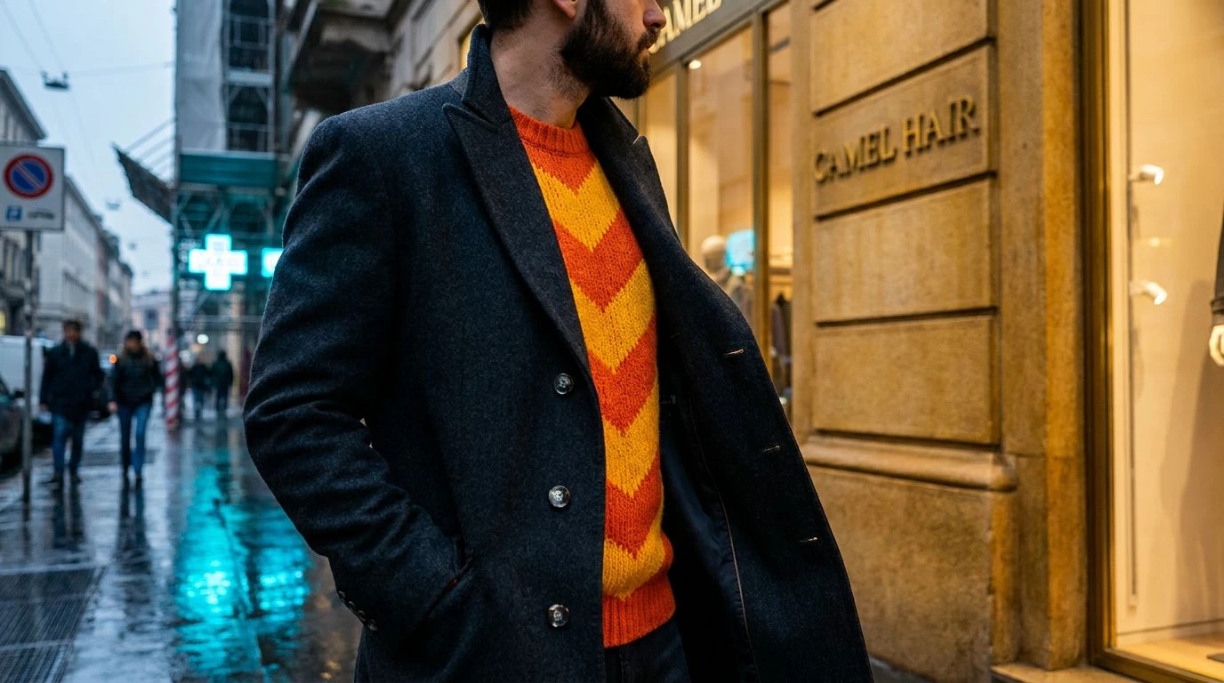
· 5 min readMilan has never been a city to suffer fools or sloppy tailoring. When November weather rolls off the Alps, the uniform defaults to impenetrable charcoal wool and cashmere heavy enough to deflect a Vespa. Yet a stroll down Via Mentana reveals a recent rebellion against this sartorial austerity. Underneath the impeccably cut overcoats, flashes of aggressively modern streetwear are breaking through the gloom. We are seeing electric highlighter tones slicing across grayscale herringbone, challenging the old guard with unabashedly loud graphic prints. It is a visual clash that speaks to a city caught between its history of quiet luxury and a restless, youthful desire to be seen from space. This tension plays out most vividly in the street style choices of locals, where severe winter layers peel back to expose jolts of unapologetic, chemical color.
Via Tortona Acid Track 🪩
There is a certain arrogance required to wear Electric Lime in the dead of a Lombardy winter, but the Via Tortona crowd pulls it off without breaking a sweat. This collection of shades captures the exact moment a sharply tailored True Pitch Black coat swings open to reveal an aggressively bright, oversized streetwear hoodie. The foundation remains respectful of northern Italian sensibilities, leaning heavily on Pavement Grey and Optical White to anchor the look. Yet the sudden, startling shock of that green paired with a faint Faded Spritz orange print feels like a deliberate provocation. It recalls vintage rave flyers stuffed into the pockets of a luxury blazer. Muted Olive grounds the brighter tones, keeping the whole affair from tipping into pure costume. It suggests someone who knows the rules of tailoring well enough to deliberately, joyfully break them with a splash of high-visibility graphics.
Piazza del Duomo Pop 🚏
Navigating the scaffolding of ongoing public works requires a wardrobe that can handle both dust and critique. Here, the traditional Camel Hair and Charcoal Melton wools that defined mid-century menswear clash loudly with shades ripped straight from construction sites. Warning Yellow and Safety Orange operate as visual sirens against the muted Overcast Grey skies of the city. We see this play out in chunky knit beanies or the bold typography of an oversized scarf thrown over a rigidly structured double-breasted suit. Scaffolding Cyan and Royal Cobalt add an icy, synthetic edge that feels entirely removed from organic textiles. The resulting aesthetic looks like a hazard sign wrapped in six-ply cashmere. This tension between premium warmth and industrial starkness creates an undeniable swagger, favored by graphic designers who treat their morning commute as an impromptu runway.
Porta Venezia Punk 🚇
Under the glow of streetlamps, the classic monochrome silhouette takes a violent left turn into neon territory. The heavy, protective layers of Soot Black and Peat Brown offer a familiar, weather-resistant armor against the damp chill. But it is the sudden intrusion of Shocking Fuchsia and Bubblegum Acid that changes the narrative entirely. These aggressive pinks appear as screen-printed slogans on oversized streetwear pullovers or as heavy rubber soles on combat boots. Tarnished Brass and Faded Denim act as neutral mediators, stopping the brighter colors from overwhelming the senses. Concrete Slate and Morning Fog offer the necessary breathing room to appreciate the sheer audacity of wearing rave-ready pinks alongside legacy wool. The look is defiant, slightly cynical, and perfectly suited for those late-night art crowds puffing cigarettes outside temporary galleries in the colder districts.
Quadrilatero Shockwave ⚡
Stripped of the usual heavy blacks and browns, this surprisingly tight selection relies entirely on the shock value of pure, unfiltered pigment against metal. Radioactive Citron and Glitch Cyan abandon any pretense of restraint, mirroring the glowing screens and digital billboards that increasingly dominate the historic center. Paired with Lapis Lazuli, these tones recall the nylon ripstop jackets and tech-fleece layers currently infiltrating high-end boutiques. Moss Webbing and Matte Steel provide just enough utilitarian grit to keep the palette tethered to the street rather than floating off into cyberspace. When applied to thick knitwear or the lining of a trench coat, these synthetic hues scream premium streetwear with a technical, almost clinical edge. It is a look adopted by locals who view traditional tailoring as merely a blank canvas for modern visual disruptions, proving that heavy fabrics can indeed carry a lightweight, aggressive charge.
Navigli Night Bus 🚌
Waiting for the last tram across slick cobblestones demands outerwear that performs without looking like hiking gear. The weighty, enveloping presence of Bitter Espresso and Asphalt Black acts as the foundational defense against the elements. Against this dark backdrop, Streetlamp Amber and Sulfur Flash burst forward like halogen headlights cutting through the fog. This combination frequently materializes as a stark, graphic logo printed on the back of a rigid canvas jacket or a flash of Acid Mustard lining inside a heavy wool collar. Worn Greige and Wet Pavement ground these hyper-visible tones in the gritty reality of urban transit. Added to the mix is Oxidized Copper, injecting a cool structural element that breaks up the warmth of the yellows. It is an aesthetic built for the observant commuter, a sharp take on modern utility that values the stark contrast between ancient stone architecture and the abrasive glare of traffic lights.
What we witness on these streets is far from a careless collision of styles. It is a highly calculated negotiation between the crushing weight of menswear history and the frantic pace of contemporary graphic design. The severe charcoal wools and impenetrable greys fulfill their practical duties, defending the wearer against the biting northern wind. Yet the sudden slashes of electric lime, safety orange, and chemical cyan offer a crucial release valve for all that stifling good taste. By allowing these synthetic, disruptive tones to crash into traditional fabrics, the current crop of designers and fashion civilians alike are rewriting the rules of winter dressing. They prove that you can respect the old-world craftsmanship of a perfectly cut overcoat while simultaneously signaling an allegiance to the fast, loud, and uncompromising visual language of the present.