'%3e%3cpath%20fill-rule='evenodd'%20clip-rule='evenodd'%20d='M51.1303%2019.2492C50.7278%2019.913%2050.1346%2020.4426%2049.3508%2020.838C48.5669%2021.2335%2047.6172%2021.4312%2046.5014%2021.4312C44.8208%2021.4312%2043.4367%2021.0216%2042.3492%2020.2025C41.2617%2019.3833%2040.6686%2018.2394%2040.5697%2016.7706H44.4253C44.4818%2017.3355%2044.6831%2017.7804%2045.0291%2018.1052C45.3751%2018.43%2045.8164%2018.5924%2046.3531%2018.5924C46.8192%2018.5924%2047.1864%2018.4653%2047.4547%2018.2111C47.7231%2017.9569%2047.8572%2017.618%2047.8572%2017.1943C47.8572%2016.8129%2047.7337%2016.4952%2047.4865%2016.241C47.2393%2015.9867%2046.9322%2015.7784%2046.565%2015.616C46.1978%2015.4536%2045.6893%2015.2594%2045.0397%2015.0334C44.0934%2014.7086%2043.3202%2014.3944%2042.72%2014.0907C42.1197%2013.7871%2041.6042%2013.3351%2041.1735%2012.7349C40.7427%2012.1347%2040.5273%2011.3544%2040.5273%2010.394C40.5273%209.50418%2040.7533%208.73448%2041.2053%208.08481C41.6572%207.43515%2042.2821%206.93731%2043.0801%206.5913C43.8781%206.24528%2044.7925%206.07227%2045.8235%206.07227C47.49%206.07227%2048.8141%206.46771%2049.7956%207.25861C50.7772%208.04951%2051.3315%209.13698%2051.4586%2010.5211H47.5395C47.4689%2010.0268%2047.2888%209.63483%2046.9993%209.3453C46.7097%209.05578%2046.3178%208.91102%2045.8235%208.91102C45.3998%208.91102%2045.0573%209.024%2044.7961%209.24997C44.5348%209.47594%2044.4041%209.80783%2044.4041%2010.2457C44.4041%2010.5988%2044.5207%2010.8989%2044.7537%2011.146C44.9867%2011.3932%2045.2798%2011.5944%2045.6328%2011.7498C45.9859%2011.9052%2046.4944%2012.1029%2047.1581%2012.343C48.1185%2012.6678%2048.9023%2012.9891%2049.5096%2013.3069C50.1169%2013.6246%2050.6395%2014.0872%2051.0773%2014.6945C51.5151%2015.3018%2051.734%2016.0927%2051.734%2017.0672C51.734%2017.8581%2051.5328%2018.5854%2051.1303%2019.2492ZM59.0242%206.3053V21.2829H55.4016V6.3053H59.0242ZM73.9409%206.3053V9.18642H69.8734V21.2829H66.2296V9.18642H62.2046V6.3053H73.9409ZM80.7438%209.18642V12.3218H85.8069V15.0546H80.7438V18.3806H86.4425V21.2829H77.1212V6.3053H86.4425V9.18642H80.7438ZM99.667%2016.0291V21.2829H96.0444V6.3053H101.913C103.692%206.3053%20105.048%206.74665%20105.98%207.62934C106.912%208.51204%20107.378%209.7019%20107.378%2011.199C107.378%2012.1311%20107.17%2012.9609%20106.753%2013.6882C106.337%2014.4155%20105.719%2014.9875%20104.9%2015.4042C104.08%2015.8208%20103.085%2016.0291%20101.913%2016.0291H99.667ZM103.692%2011.199C103.692%209.8855%20102.965%209.22879%20101.51%209.22879H99.667V13.1268H101.51C102.965%2013.1268%20103.692%2012.4842%20103.692%2011.199ZM120.092%2018.5501H114.478L113.546%2021.2829H109.732L115.219%206.41123H119.393L124.879%2021.2829H121.024L120.092%2018.5501ZM119.16%2015.7961L117.295%2010.2881L115.41%2015.7961H119.16ZM131.555%2018.5077H136.385V21.2829H127.933V6.3053H131.555V18.5077ZM143.337%209.18642V12.3218H148.4V15.0546H143.337V18.3806H149.035V21.2829H139.714V6.3053H149.035V9.18642H143.337ZM163.507%206.3053V9.18642H159.44V21.2829H155.796V9.18642H151.771V6.3053H163.507ZM177.449%206.3053V9.18642H173.382V21.2829H169.738V9.18642H165.713V6.3053H177.449ZM184.252%209.18642V12.3218H189.315V15.0546H184.252V18.3806H189.951V21.2829H180.629V6.3053H189.951V9.18642H184.252Z'%20fill='%23EEF0ED'/%3e%3cmask%20id='mask0_3101_7327'%20style='mask-type:alpha'%20maskUnits='userSpaceOnUse'%20x='0'%20y='0'%20width='27'%20height='28'%3e%3cpath%20d='M23.8328%200.759766H2.64808C1.18559%200.759766%200%201.94535%200%203.40785V24.5925C0%2026.055%201.18559%2027.2406%202.64808%2027.2406H23.8328C25.2952%2027.2406%2026.4808%2026.055%2026.4808%2024.5925V3.40785C26.4808%201.94535%2025.2952%200.759766%2023.8328%200.759766Z'%20fill='white'/%3e%3c/mask%3e%3cg%20mask='url(%23mask0_3101_7327)'%3e%3cpath%20d='M23.8328%200.759766H2.64808C1.18559%200.759766%200%201.94535%200%203.40785V24.5925C0%2026.055%201.18559%2027.2406%202.64808%2027.2406H23.8328C25.2952%2027.2406%2026.4808%2026.055%2026.4808%2024.5925V3.40785C26.4808%201.94535%2025.2952%200.759766%2023.8328%200.759766Z'%20fill='%23D8D8D8'/%3e%3cpath%20d='M13.2404%200.759766H0V14.0001H13.2404V0.759766Z'%20fill='%238C61FF'/%3e%3cpath%20d='M13.2404%2014H0V27.2404H13.2404V14Z'%20fill='%2336C3FE'/%3e%3cpath%20d='M26.4806%2014H13.2402V27.2404H26.4806V14Z'%20fill='%236592FE'/%3e%3cpath%20d='M26.4806%200.759766H13.2402V14.0002H26.4806V0.759766Z'%20fill='%236059F7'/%3e%3c/g%3e%3c/g%3e%3cdefs%3e%3cclipPath%20id='clip0_3101_7327'%3e%3crect%20width='190'%20height='28'%20fill='white'/%3e%3c/clipPath%3e%3c/defs%3e%3c/svg%3e)
'%3e%3cpath%20d='M23.8328%200.759521H2.64808C1.18559%200.759521%200%201.94511%200%203.40761V24.5923C0%2026.0548%201.18559%2027.2404%202.64808%2027.2404H23.8328C25.2952%2027.2404%2026.4808%2026.0548%2026.4808%2024.5923V3.40761C26.4808%201.94511%2025.2952%200.759521%2023.8328%200.759521Z'%20fill='%23D8D8D8'/%3e%3cpath%20d='M13.2404%200.759521H0V13.9999H13.2404V0.759521Z'%20fill='%238C61FF'/%3e%3cpath%20d='M13.2404%2013.9998H0V27.2402H13.2404V13.9998Z'%20fill='%2336C3FE'/%3e%3cpath%20d='M26.4809%2013.9998H13.2405V27.2402H26.4809V13.9998Z'%20fill='%236592FE'/%3e%3cpath%20d='M26.4809%200.759277H13.2405V13.9997H26.4809V0.759277Z'%20fill='%236059F7'/%3e%3c/g%3e%3c/svg%3e)
Korean Royalty Color Palettes in Modern Luxury Design
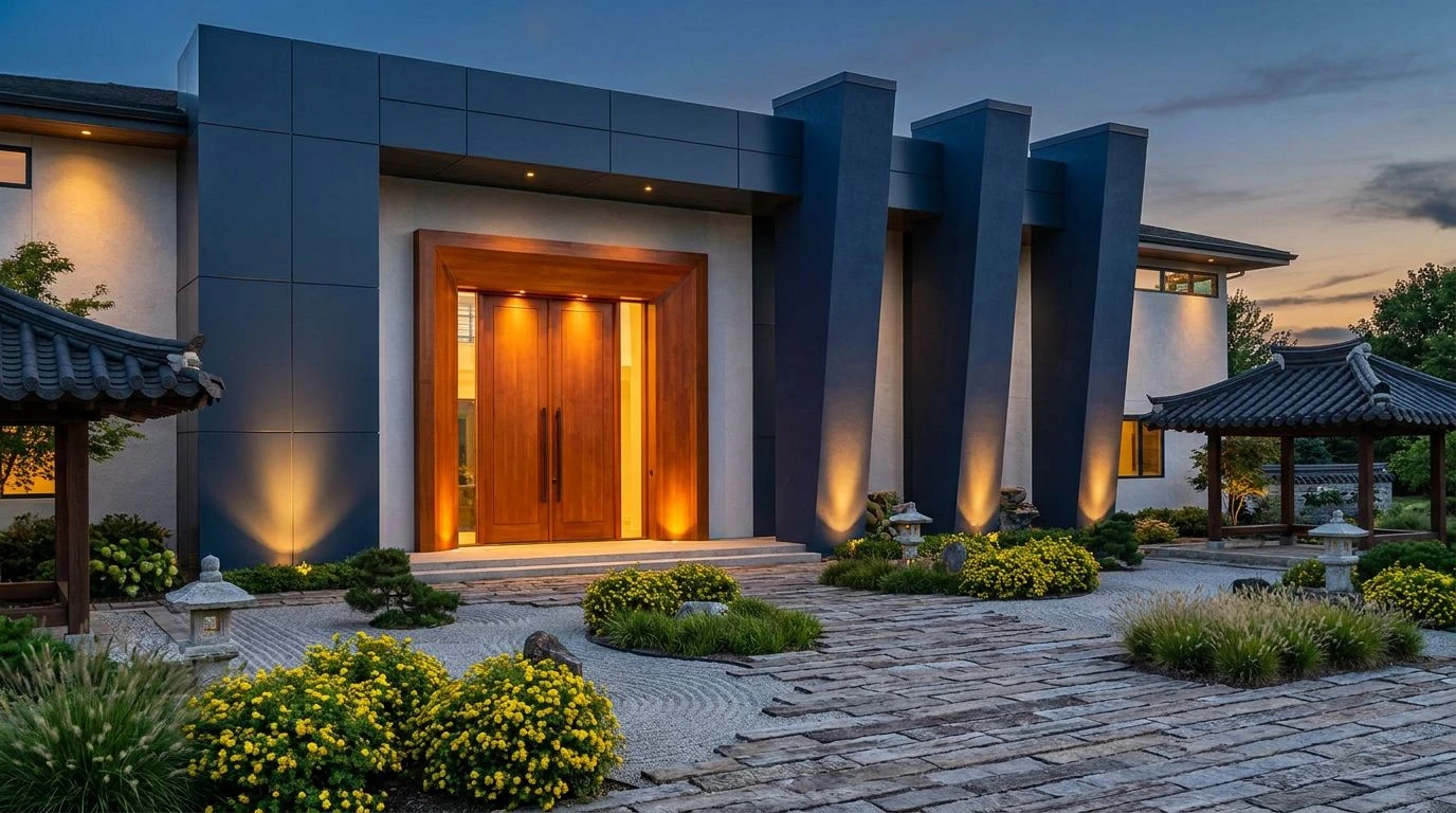
· 6 min readDrive past the usual array of sprawling suburban luxury homes, and you will inevitably confront a sea of beige stucco and polite grey siding. It is the visual equivalent of an apologetic throat-clearing. But recently, a bolder aesthetic ambition has begun quietly disrupting this safe landscape. By borrowing the severe, dignified palettes traditionally reserved for Korean royalty, suburban architecture firms are performing a fascinating sleight of hand. The injection of deep, blood-rich reds and authoritative, bottomless navies transforms otherwise standard local developments into monuments of undeniable weight. It asks a simple question: what happens when you treat a quiet cul-de-sac as if it were a centuries-old dynastic courtyard? The answer appears to be an immediate air of superiority and lasting permanence, tricking the eye into seeing timeless excellence where there was once only modern convenience.
Royal Courtier 🏛️
There is a distinct, quiet arrogance in Royal Courtier that feels perfectly suited for a firm trying to pitch visionary concepts to a cautious zoning committee. The foundation leans heavily on Chalk Dust and Weathered Reed, providing safe, familiar ground for anyone accustomed to polite residential tracts. But the true architectural theatre happens with the sudden intervention of Dynasty Navy and Wrought Steel Blue, immediately pulling the eye upward toward vaulted ceilings and sharp rooflines. These deep tones carry the historical weight of ancient ceremonial robes, instantly bestowing a quiet, unshakeable authority upon an otherwise newly constructed build. When Imperial Ochre and Primrose Yellow are introduced as minor accents perhaps in custom millwork or bespoke lighting fixtures the sheer visual confidence is staggering. It takes the sprawling, empty promise of a domestic blueprint and grounds it in a deeply rooted, ancestral seriousness, forcing onlookers to treat the property not merely as a house, but as an estate with a pedigree.
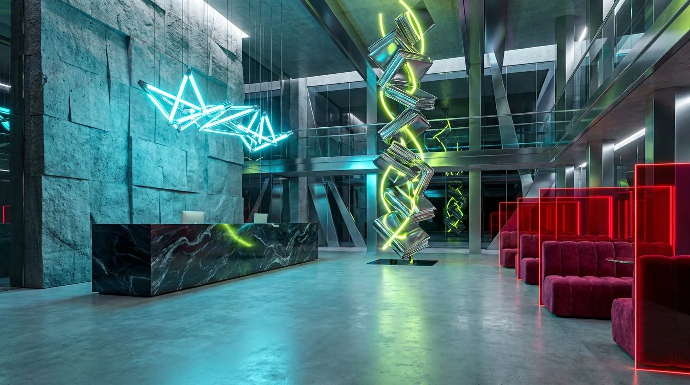
Jade & Cobalt Revival 🎐
Rather than relying entirely on somber, heavy tones, Jade & Cobalt Revival introduces a bright, almost startling vitality into the luxury housing conversation. The deeply traditional Charcoal Ink and Burnished Walnut establish a heavy, serious foundation, the kind of robust anchors a designer needs when convincing clients of a building's longevity. Yet, it entirely upends the expected suburban playbook by slashing those dark bases with brilliant Hanbok Jade and Cobalt Heritage. These electric, historically vivid tones recall the painted wooden eave brackets of classical Korean palaces, demanding attention without ever seeming desperate for it. Placing a Gilded Crest or Soft Peach Wall detail alongside the quiet restraint of a Slate Roof feels less like interior decoration and more like curatorial brilliance. An architecture firm wielding these specific, high-contrast colors signals an absolute refusal to be boring, practically daring their wealthy local clientele to abandon their beige safety nets in favor of something genuinely unapologetic.
Dancheong Blueprint 🏯
Taking a direct page from the intricate, saturated woodwork of ancient temples, Dancheong Blueprint is an exercise in managing maximalist dignity. The sheer power of Vermilion Seal set against Obsidian and Dark Mahogany creates an immediate, almost intimidating sense of permanence. This is the color of heavy, immovable wooden gates closing out the chaotic world beyond. A firm utilizing this range is practically telegraphing that their structures will outlast the paved roads leading up to them. Yet, what keeps it perfectly balanced for high-end residential applications is the surprising coolness of Spring Celadon and Frost Mint. These airy, breathable counterpoints prevent the heavy woods and Dusk Indigo from feeling oppressive, acting like open courtyards within a fortified compound. By laying Pale Saffron and Antique Brass into the mix, the entire scheme feels remarkably expensive. It offers suburban buyers the distinct illusion that they are purchasing into an ancient, unbroken lineage rather than securing a very nice mortgage in a recently cleared subdivision.
Archival Red 📜
Archival Red plays a brilliant, subtle game of psychological warfare against the standard-issue luxury home. Most upscale housing relies on bright, empty spaces to simulate grandeur, but this color collection leans into the grave, shadowy weight of Oxblood Lacquer and Pitch Black. It immediately suggests a space built for serious people making serious decisions behind closed doors. Against the clinical cold of Bleached Ash and the rugged, unforgiving Granite Plinth, those deep reds shift away from being merely decorative and become intensely structural. Even the lighter touches of Muted Lemon, Tarnished Crown, and Faded Terracotta feel weathered and worldly, rather than fresh or newly manufactured. A firm brave enough to pitch this to a local developer is making a clear statement about ambition. They are rejecting the flimsy, transient nature of contemporary domestic builds and opting instead for a heavy, aristocratic mood that commands respect the very moment a prospective buyer crosses the threshold.
Heirloom Elevation 🧧
Stripping back all unnecessary decoration, Heirloom Elevation focuses strictly on the most potent, culturally significant colors available to an architect. The visual exchange here is fiercely economical, relying almost entirely on the shocking contrast between Alabaster, Midnight Shadow, and Monarch Crimson. This is power dressing translated into brick, mortar, and steel. The crimson acts as an undeniable focal point, carrying the historical associations of regal authority directly onto the facade of a newly minted suburban fortress. Grounding this aggressive red with Burnt Clay and Bittersweet Cacao ensures the resulting structure never feels garish or overly theatrical. Instead, it seems deeply rooted in the earth, offering a tactile, heavy warmth that minimal modernism often lacks. Utilizing such a severe and concentrated color profile allows a local firm to punch significantly above its weight class. It turns simple geometric living spaces into commanding assertions of taste, proving that true visionary design relies primarily on knowing exactly when to let a single, blood-red wall do all the talking.
The calculated application of these historically dense, aristocratic colors proves that suburban domestic architecture need not remain a wasteland of timid neutrals. When an ambitious firm adopts the heavy, commanding navies and assertive, blood-rich reds native to Korean dynastic traditions, they perform a brilliant act of cultural translation. They take the visual language of unquestionable authority and map it directly onto local luxury markets. The result is a profound, almost deceptive sense of enduring quality. By replacing polite taupes with unapologetic midnight tones and regal crimsons, these architects manage to trick the suburban eye entirely. They deliver structures that feel less like recently developed real estate and remarkably more like inherited estates holding steady guard against the passing centuries.