'%3e%3cpath%20fill-rule='evenodd'%20clip-rule='evenodd'%20d='M51.1303%2019.2492C50.7278%2019.913%2050.1346%2020.4426%2049.3508%2020.838C48.5669%2021.2335%2047.6172%2021.4312%2046.5014%2021.4312C44.8208%2021.4312%2043.4367%2021.0216%2042.3492%2020.2025C41.2617%2019.3833%2040.6686%2018.2394%2040.5697%2016.7706H44.4253C44.4818%2017.3355%2044.6831%2017.7804%2045.0291%2018.1052C45.3751%2018.43%2045.8164%2018.5924%2046.3531%2018.5924C46.8192%2018.5924%2047.1864%2018.4653%2047.4547%2018.2111C47.7231%2017.9569%2047.8572%2017.618%2047.8572%2017.1943C47.8572%2016.8129%2047.7337%2016.4952%2047.4865%2016.241C47.2393%2015.9867%2046.9322%2015.7784%2046.565%2015.616C46.1978%2015.4536%2045.6893%2015.2594%2045.0397%2015.0334C44.0934%2014.7086%2043.3202%2014.3944%2042.72%2014.0907C42.1197%2013.7871%2041.6042%2013.3351%2041.1735%2012.7349C40.7427%2012.1347%2040.5273%2011.3544%2040.5273%2010.394C40.5273%209.50418%2040.7533%208.73448%2041.2053%208.08481C41.6572%207.43515%2042.2821%206.93731%2043.0801%206.5913C43.8781%206.24528%2044.7925%206.07227%2045.8235%206.07227C47.49%206.07227%2048.8141%206.46771%2049.7956%207.25861C50.7772%208.04951%2051.3315%209.13698%2051.4586%2010.5211H47.5395C47.4689%2010.0268%2047.2888%209.63483%2046.9993%209.3453C46.7097%209.05578%2046.3178%208.91102%2045.8235%208.91102C45.3998%208.91102%2045.0573%209.024%2044.7961%209.24997C44.5348%209.47594%2044.4041%209.80783%2044.4041%2010.2457C44.4041%2010.5988%2044.5207%2010.8989%2044.7537%2011.146C44.9867%2011.3932%2045.2798%2011.5944%2045.6328%2011.7498C45.9859%2011.9052%2046.4944%2012.1029%2047.1581%2012.343C48.1185%2012.6678%2048.9023%2012.9891%2049.5096%2013.3069C50.1169%2013.6246%2050.6395%2014.0872%2051.0773%2014.6945C51.5151%2015.3018%2051.734%2016.0927%2051.734%2017.0672C51.734%2017.8581%2051.5328%2018.5854%2051.1303%2019.2492ZM59.0242%206.3053V21.2829H55.4016V6.3053H59.0242ZM73.9409%206.3053V9.18642H69.8734V21.2829H66.2296V9.18642H62.2046V6.3053H73.9409ZM80.7438%209.18642V12.3218H85.8069V15.0546H80.7438V18.3806H86.4425V21.2829H77.1212V6.3053H86.4425V9.18642H80.7438ZM99.667%2016.0291V21.2829H96.0444V6.3053H101.913C103.692%206.3053%20105.048%206.74665%20105.98%207.62934C106.912%208.51204%20107.378%209.7019%20107.378%2011.199C107.378%2012.1311%20107.17%2012.9609%20106.753%2013.6882C106.337%2014.4155%20105.719%2014.9875%20104.9%2015.4042C104.08%2015.8208%20103.085%2016.0291%20101.913%2016.0291H99.667ZM103.692%2011.199C103.692%209.8855%20102.965%209.22879%20101.51%209.22879H99.667V13.1268H101.51C102.965%2013.1268%20103.692%2012.4842%20103.692%2011.199ZM120.092%2018.5501H114.478L113.546%2021.2829H109.732L115.219%206.41123H119.393L124.879%2021.2829H121.024L120.092%2018.5501ZM119.16%2015.7961L117.295%2010.2881L115.41%2015.7961H119.16ZM131.555%2018.5077H136.385V21.2829H127.933V6.3053H131.555V18.5077ZM143.337%209.18642V12.3218H148.4V15.0546H143.337V18.3806H149.035V21.2829H139.714V6.3053H149.035V9.18642H143.337ZM163.507%206.3053V9.18642H159.44V21.2829H155.796V9.18642H151.771V6.3053H163.507ZM177.449%206.3053V9.18642H173.382V21.2829H169.738V9.18642H165.713V6.3053H177.449ZM184.252%209.18642V12.3218H189.315V15.0546H184.252V18.3806H189.951V21.2829H180.629V6.3053H189.951V9.18642H184.252Z'%20fill='%23EEF0ED'/%3e%3cmask%20id='mask0_3101_7327'%20style='mask-type:alpha'%20maskUnits='userSpaceOnUse'%20x='0'%20y='0'%20width='27'%20height='28'%3e%3cpath%20d='M23.8328%200.759766H2.64808C1.18559%200.759766%200%201.94535%200%203.40785V24.5925C0%2026.055%201.18559%2027.2406%202.64808%2027.2406H23.8328C25.2952%2027.2406%2026.4808%2026.055%2026.4808%2024.5925V3.40785C26.4808%201.94535%2025.2952%200.759766%2023.8328%200.759766Z'%20fill='white'/%3e%3c/mask%3e%3cg%20mask='url(%23mask0_3101_7327)'%3e%3cpath%20d='M23.8328%200.759766H2.64808C1.18559%200.759766%200%201.94535%200%203.40785V24.5925C0%2026.055%201.18559%2027.2406%202.64808%2027.2406H23.8328C25.2952%2027.2406%2026.4808%2026.055%2026.4808%2024.5925V3.40785C26.4808%201.94535%2025.2952%200.759766%2023.8328%200.759766Z'%20fill='%23D8D8D8'/%3e%3cpath%20d='M13.2404%200.759766H0V14.0001H13.2404V0.759766Z'%20fill='%238C61FF'/%3e%3cpath%20d='M13.2404%2014H0V27.2404H13.2404V14Z'%20fill='%2336C3FE'/%3e%3cpath%20d='M26.4806%2014H13.2402V27.2404H26.4806V14Z'%20fill='%236592FE'/%3e%3cpath%20d='M26.4806%200.759766H13.2402V14.0002H26.4806V0.759766Z'%20fill='%236059F7'/%3e%3c/g%3e%3c/g%3e%3cdefs%3e%3cclipPath%20id='clip0_3101_7327'%3e%3crect%20width='190'%20height='28'%20fill='white'/%3e%3c/clipPath%3e%3c/defs%3e%3c/svg%3e)
'%3e%3cpath%20d='M23.8328%200.759521H2.64808C1.18559%200.759521%200%201.94511%200%203.40761V24.5923C0%2026.0548%201.18559%2027.2404%202.64808%2027.2404H23.8328C25.2952%2027.2404%2026.4808%2026.0548%2026.4808%2024.5923V3.40761C26.4808%201.94511%2025.2952%200.759521%2023.8328%200.759521Z'%20fill='%23D8D8D8'/%3e%3cpath%20d='M13.2404%200.759521H0V13.9999H13.2404V0.759521Z'%20fill='%238C61FF'/%3e%3cpath%20d='M13.2404%2013.9998H0V27.2402H13.2404V13.9998Z'%20fill='%2336C3FE'/%3e%3cpath%20d='M26.4809%2013.9998H13.2405V27.2402H26.4809V13.9998Z'%20fill='%236592FE'/%3e%3cpath%20d='M26.4809%200.759277H13.2405V13.9997H26.4809V0.759277Z'%20fill='%236059F7'/%3e%3c/g%3e%3c/svg%3e)
2026 Tech Color Palettes: Brutalist Design & Deep Tones
· 6 min readThe cold, utilitarian interfaces of early supply chain management have quietly matured into spaces of quiet authority. Look at the dashboards controlling global shipping routes today, and you will notice a distinct shift away from pure, harsh brutalism toward something heavier and far more confident. This is the brutalist afterglow of 2026 tech branding. It relies on the visual weight of concrete and steel, softened just enough by rich, authoritative tones to declare control rather than mere efficiency. Driving this aesthetic shift is a strict adherence to the Ruler archetype, relying heavily on slate gray as an architectural foundation and deep burgundy as a marker of power. These color choices transform complex software environments into digital boardrooms. By softening the aggressive edges of industrial design with these noble, grounded pigments, modern logistics platforms command trust and project an unshakeable stability across oceans and continents.
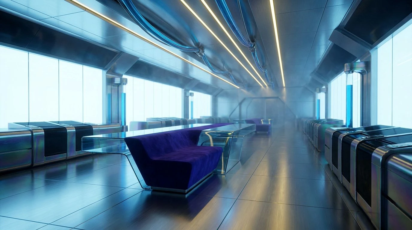
Monolithic Dispatch 🏗️
When designing the visual language for automated trucking fleets, designers are reaching for color selections exactly like Monolithic Dispatch to establish immediate trust. The layout begins with vast expanses of Industrial Slate, creating a heavy, concrete-like background that feels impenetrable. Structural borders set in Carbon Void provide the highly contrasted legibility required to monitor thousand-truck operations in real-time. Instead of jarring emergency reds, Faded Brick steps in as a mature, restrained notification signal. It demands attention without causing panic, operating with the calm command characteristic of the Ruler archetype. Secondary tracking lines and route highlights pop in Hyperlink Blue, sharply cutting through the darker tones to guide the user across dense topological maps. The addition of Oxidized Teal grounds the interface, acting as a secondary background for minor panels. This creates an environment that feels less like a sterile database and more like a high-end control room designed for absolute predictability.
Maritime Authority 🚢
Shipping fleets require interfaces that manage overwhelming amounts of global routing variables without looking visually stressful. Maritime Authority successfully organizes this chaos into an iron-clad hierarchy. The aesthetic leans entirely on the weight of deep tones, using Abyssal Blue and Port Navy to build massive navigation drawers reminiscent of stacked metal containers. The Ruler archetype rules this environment, projecting total control over international commerce. Critical status updates and priority alerts are delivered in Command Crimson, a rich dark red that carries the physical weight of a wax seal on a legal document. To prevent the layout from becoming physically oppressive, sweeping data visualizations use Transit Sky and Steel Fog, ensuring clarity and calm legibility against the heavier background blocks. Signal Green flashes quietly to confirm successful dockings or cleared customs. Finally, accents of Oiled Bronze and Terminal Gray line the borders of the dashboard modules, giving the overall design a grounded presence akin to vintage marine instrumentation brought into modern screens.
Neon Freight 🛢️
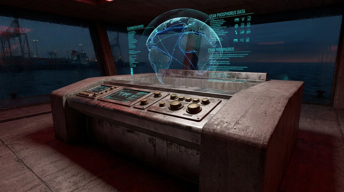
The brutalist afterglow finds its most striking expression in control rooms that monitor nighttime transit networks. Neon Freight strips away all unnecessary interface decoration, dropping the user immediately into a stark world of Absolute Pitch and Asphalt Gray. This creates a theatre-like staging ground for shipping data. The commanding presence of Dried Oxblood serves as the defining architectural element here, used in thick, unyielding header bars that anchor the entire screen. This burgundian shade claims ownership of the space, acting as the digital equivalent of a mahogany desk in an executive suite. To highlight active shipping lanes sliding across darkened digital globes, Cyan Phosphorus offers a sharp contrast that instantly directs the eye without looking like a retro arcade game. Tarnished Brass adds a touch of worldly wealth to currency conversions and tariff counters, while Clearwater Route and Deep Oceanic fill in the comparative bar charts. The result is a dashboard that feels secretive, powerful, and deeply tethered to the physical movement of heavy goods across midnight highways.
Archive Vault 🗄️
Sometimes the display of sheer capability requires the absolute removal of excess. Archive Vault strips software down to its raw structural bones. The base of the interface is flooded with Parchment White, offering a vast, open layout that mimics the sparse look of a printed manifesto or a legal contract. Typography and strict grid lines are set heavily in Midnight Ink, drawing an unrelenting framework that leaves no room for ambiguity. This color grouping rejects the playful tech aesthetics of the previous decade entirely. Instead, it relies on Concrete Dust and Iron Pillar to build shallow drop shadows, inactive tabs, and secondary data tables. The application of these varying gray tones produces an effect similar to cast shadows on a rough building facade, adding physical depth to a flat display. The Ruler archetype is communicated purely through this rigid discipline. A user looking closely at these inventory management systems feels the unyielding nature of the grid, perfectly engineered for overseeing massive warehouse inventories without a single pixel wasted on decoration or distraction.
Executive Ledger 📎
High-level corporate procurement portals are moving toward a highly editorial, almost printed look. Executive Ledger provides the exact terminology for this visual transition. Vast margins of Stark White dominate the layout, ensuring that the interface feels meticulously curated and highly legible. The brutalist influence remains visible in the heavy, unvarnished use of Structural Gray and Milled Aluminum for the framing devices, sidebars, and divider lines. These tones hold the grid together with mechanical precision. The mood shifts away from mere machinery with the introduction of Dark Roast, an almost black-brown used for primary typography that brings a distinctly organic, executive weight to the screen. The authoritative flourish comes from bold buttons and urgent notifications swiped in Pressed Rose. This muted red-pink tone serves as the visual signature of the brand, standing in for traditional burgundy but carrying the same regal weight. It asserts dominance across the dashboard, transforming everyday supply chain approvals into actions that feel ceremonious and final.
The trajectory of interface design for heavy industries clearly points toward spaces that demand respect. By leaving behind the hyper-minimalist and overly friendly visuals of the recent past, these software platforms successfully project an aura of total mastery. The strategic application of heavy slate and regal burgundy constructs digital environments that mirror the physical permanence of shipping ports and concrete warehouses. Every block of color serves a deliberate structural purpose, ensuring calm readability and asserting unquestioned authority. The resulting aesthetic stands as a monument to precision, proving that industrial tooling can look incredibly sophisticated while maintaining a firm grip on global operations. The Ruler archetype thrives precisely because these color stories command the screen with quiet, steady power, leaving operators with a profound sense of stability.