'%3e%3cpath%20fill-rule='evenodd'%20clip-rule='evenodd'%20d='M51.1303%2019.2492C50.7278%2019.913%2050.1346%2020.4426%2049.3508%2020.838C48.5669%2021.2335%2047.6172%2021.4312%2046.5014%2021.4312C44.8208%2021.4312%2043.4367%2021.0216%2042.3492%2020.2025C41.2617%2019.3833%2040.6686%2018.2394%2040.5697%2016.7706H44.4253C44.4818%2017.3355%2044.6831%2017.7804%2045.0291%2018.1052C45.3751%2018.43%2045.8164%2018.5924%2046.3531%2018.5924C46.8192%2018.5924%2047.1864%2018.4653%2047.4547%2018.2111C47.7231%2017.9569%2047.8572%2017.618%2047.8572%2017.1943C47.8572%2016.8129%2047.7337%2016.4952%2047.4865%2016.241C47.2393%2015.9867%2046.9322%2015.7784%2046.565%2015.616C46.1978%2015.4536%2045.6893%2015.2594%2045.0397%2015.0334C44.0934%2014.7086%2043.3202%2014.3944%2042.72%2014.0907C42.1197%2013.7871%2041.6042%2013.3351%2041.1735%2012.7349C40.7427%2012.1347%2040.5273%2011.3544%2040.5273%2010.394C40.5273%209.50418%2040.7533%208.73448%2041.2053%208.08481C41.6572%207.43515%2042.2821%206.93731%2043.0801%206.5913C43.8781%206.24528%2044.7925%206.07227%2045.8235%206.07227C47.49%206.07227%2048.8141%206.46771%2049.7956%207.25861C50.7772%208.04951%2051.3315%209.13698%2051.4586%2010.5211H47.5395C47.4689%2010.0268%2047.2888%209.63483%2046.9993%209.3453C46.7097%209.05578%2046.3178%208.91102%2045.8235%208.91102C45.3998%208.91102%2045.0573%209.024%2044.7961%209.24997C44.5348%209.47594%2044.4041%209.80783%2044.4041%2010.2457C44.4041%2010.5988%2044.5207%2010.8989%2044.7537%2011.146C44.9867%2011.3932%2045.2798%2011.5944%2045.6328%2011.7498C45.9859%2011.9052%2046.4944%2012.1029%2047.1581%2012.343C48.1185%2012.6678%2048.9023%2012.9891%2049.5096%2013.3069C50.1169%2013.6246%2050.6395%2014.0872%2051.0773%2014.6945C51.5151%2015.3018%2051.734%2016.0927%2051.734%2017.0672C51.734%2017.8581%2051.5328%2018.5854%2051.1303%2019.2492ZM59.0242%206.3053V21.2829H55.4016V6.3053H59.0242ZM73.9409%206.3053V9.18642H69.8734V21.2829H66.2296V9.18642H62.2046V6.3053H73.9409ZM80.7438%209.18642V12.3218H85.8069V15.0546H80.7438V18.3806H86.4425V21.2829H77.1212V6.3053H86.4425V9.18642H80.7438ZM99.667%2016.0291V21.2829H96.0444V6.3053H101.913C103.692%206.3053%20105.048%206.74665%20105.98%207.62934C106.912%208.51204%20107.378%209.7019%20107.378%2011.199C107.378%2012.1311%20107.17%2012.9609%20106.753%2013.6882C106.337%2014.4155%20105.719%2014.9875%20104.9%2015.4042C104.08%2015.8208%20103.085%2016.0291%20101.913%2016.0291H99.667ZM103.692%2011.199C103.692%209.8855%20102.965%209.22879%20101.51%209.22879H99.667V13.1268H101.51C102.965%2013.1268%20103.692%2012.4842%20103.692%2011.199ZM120.092%2018.5501H114.478L113.546%2021.2829H109.732L115.219%206.41123H119.393L124.879%2021.2829H121.024L120.092%2018.5501ZM119.16%2015.7961L117.295%2010.2881L115.41%2015.7961H119.16ZM131.555%2018.5077H136.385V21.2829H127.933V6.3053H131.555V18.5077ZM143.337%209.18642V12.3218H148.4V15.0546H143.337V18.3806H149.035V21.2829H139.714V6.3053H149.035V9.18642H143.337ZM163.507%206.3053V9.18642H159.44V21.2829H155.796V9.18642H151.771V6.3053H163.507ZM177.449%206.3053V9.18642H173.382V21.2829H169.738V9.18642H165.713V6.3053H177.449ZM184.252%209.18642V12.3218H189.315V15.0546H184.252V18.3806H189.951V21.2829H180.629V6.3053H189.951V9.18642H184.252Z'%20fill='%23EEF0ED'/%3e%3cmask%20id='mask0_3101_7327'%20style='mask-type:alpha'%20maskUnits='userSpaceOnUse'%20x='0'%20y='0'%20width='27'%20height='28'%3e%3cpath%20d='M23.8328%200.759766H2.64808C1.18559%200.759766%200%201.94535%200%203.40785V24.5925C0%2026.055%201.18559%2027.2406%202.64808%2027.2406H23.8328C25.2952%2027.2406%2026.4808%2026.055%2026.4808%2024.5925V3.40785C26.4808%201.94535%2025.2952%200.759766%2023.8328%200.759766Z'%20fill='white'/%3e%3c/mask%3e%3cg%20mask='url(%23mask0_3101_7327)'%3e%3cpath%20d='M23.8328%200.759766H2.64808C1.18559%200.759766%200%201.94535%200%203.40785V24.5925C0%2026.055%201.18559%2027.2406%202.64808%2027.2406H23.8328C25.2952%2027.2406%2026.4808%2026.055%2026.4808%2024.5925V3.40785C26.4808%201.94535%2025.2952%200.759766%2023.8328%200.759766Z'%20fill='%23D8D8D8'/%3e%3cpath%20d='M13.2404%200.759766H0V14.0001H13.2404V0.759766Z'%20fill='%238C61FF'/%3e%3cpath%20d='M13.2404%2014H0V27.2404H13.2404V14Z'%20fill='%2336C3FE'/%3e%3cpath%20d='M26.4806%2014H13.2402V27.2404H26.4806V14Z'%20fill='%236592FE'/%3e%3cpath%20d='M26.4806%200.759766H13.2402V14.0002H26.4806V0.759766Z'%20fill='%236059F7'/%3e%3c/g%3e%3c/g%3e%3cdefs%3e%3cclipPath%20id='clip0_3101_7327'%3e%3crect%20width='190'%20height='28'%20fill='white'/%3e%3c/clipPath%3e%3c/defs%3e%3c/svg%3e)
'%3e%3cpath%20d='M23.8328%200.759521H2.64808C1.18559%200.759521%200%201.94511%200%203.40761V24.5923C0%2026.0548%201.18559%2027.2404%202.64808%2027.2404H23.8328C25.2952%2027.2404%2026.4808%2026.0548%2026.4808%2024.5923V3.40761C26.4808%201.94511%2025.2952%200.759521%2023.8328%200.759521Z'%20fill='%23D8D8D8'/%3e%3cpath%20d='M13.2404%200.759521H0V13.9999H13.2404V0.759521Z'%20fill='%238C61FF'/%3e%3cpath%20d='M13.2404%2013.9998H0V27.2402H13.2404V13.9998Z'%20fill='%2336C3FE'/%3e%3cpath%20d='M26.4809%2013.9998H13.2405V27.2402H26.4809V13.9998Z'%20fill='%236592FE'/%3e%3cpath%20d='M26.4809%200.759277H13.2405V13.9997H26.4809V0.759277Z'%20fill='%236059F7'/%3e%3c/g%3e%3c/svg%3e)
Warm Home Decor Color Palettes for Corporate Interfaces
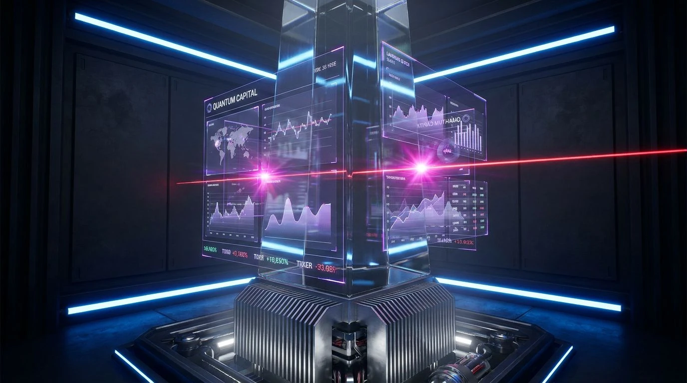
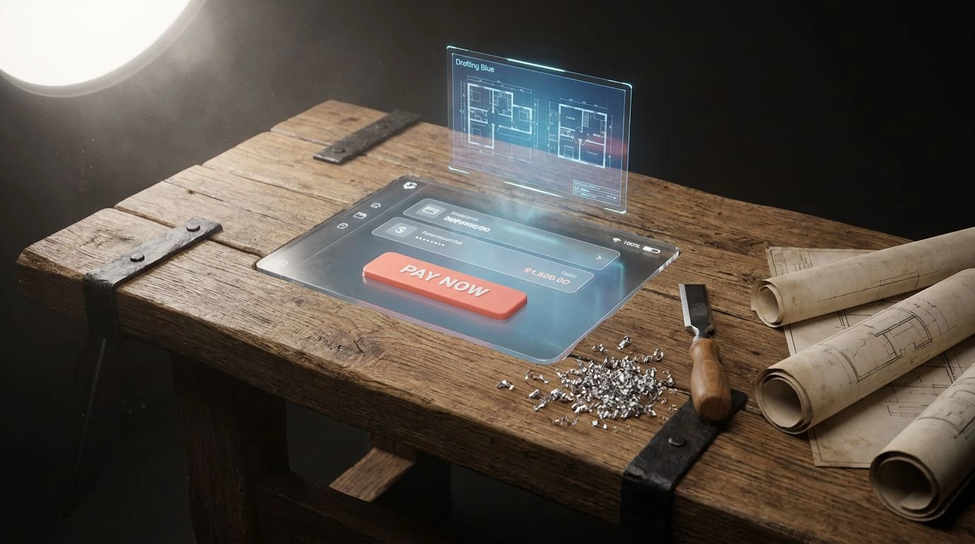
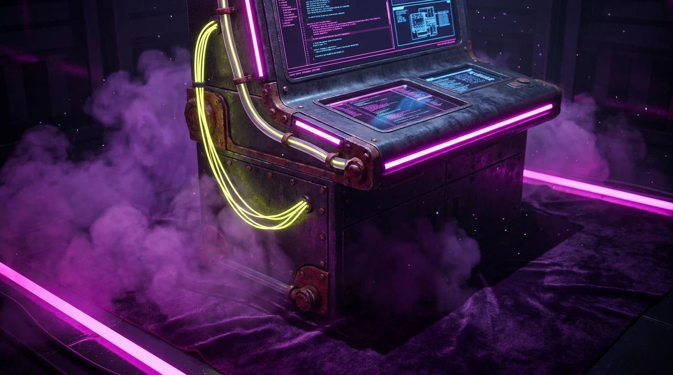
· 5 min readCorporate dashboards notoriously suffer from an aesthetic deep freeze. Interfaces laden with predictive analytics and heavy data loads default to clinical blues and sterile greys, projecting an austere authority that creates distance rather than trust. To humanize these systems, designers are introducing elemental warmth, treating metallic earth tones as an active ingredient against the prevailing chill. It is an exercise in balancing temperatures. While deep, structured navies ensure the interface remains grounded and reliable, strategic hits of oxidized earth and bright, energetic magentas inject a sense of professional optimism. The result is a platform that feels less like an imposing supercomputer and more like a capable, responsive partner, transforming dense information retrieval into a highly inviting, tactile experience.
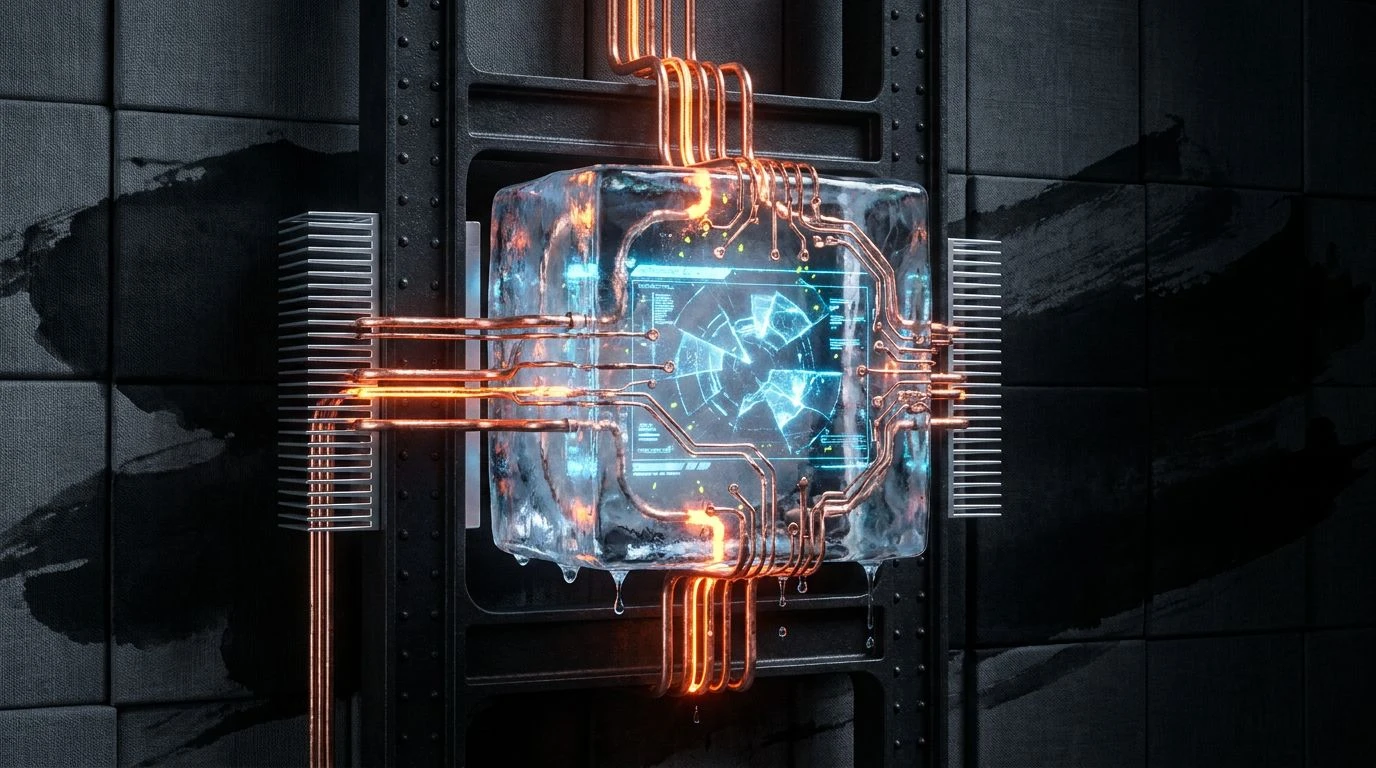
Synthetic Frost 🧊
Synthetic Frost provides an immediate jolt to cold enterprise screens. The foundation relies heavily on Midnight Terminal and Frosted Steel, delivering the expected corporate gravity required for managing dense intelligence feeds. These shades form the structural grid. Instead of warming the interface with earthy metals, this selection turns up the temperature through pure, unadulterated electric heat. Ultraviolet Shock and Digital Fuchsia act as striking wayfinding markers. When user pathways or critical alerts are bathed in these saturated tones, the interface sheds its stoic nature. Digital Fuchsia slices through Glacial Dust backgrounds, ensuring an alert or an interactive visualization grabs attention with a sharp, optimistic presence rather than a frantic red warning. This approach cultivates a highly engineered, forward-looking aesthetic where trust is built on sheer responsiveness.
Gilded Algorithm 🧭
Navigating complex metric ecosystems requires visual anchors that feel both reliable and human. Gilded Algorithm relies on Oceanic Vault and Oxidized Iron to establish a serious, structured baseline for the interface, framing modules with quiet authority. It introduces unexpected warmth through Sovereign Gold and Burnished Amber, breaking the visual monotony typical of heavy business portals. These golden tones act as the heat source, drawing the eye toward primary actions or key predictive insights. Palomino Dust offers a soft alternative for secondary highlights. Muted Fern steps in as an earthy grounding element, pairing with Obsidian Base to give text and borders a solid foundation. The inclusion of Winter Skyline ensures the layout retains enough breathing room to feel organized. By leaning into these rich, organic tones, the design shifts from a sterile terminal to a welcoming workspace, offering a distinct sense of professional optimism.
Oxidized Framework ⚙️
Oxidized Framework introduces a raw, industrial aesthetic to intelligence reporting. The palette uses Pure Linen and Ink Wash to create stark, high-contrast layouts, giving charts and typography sharp readability. The chill of Milled Aluminum and Cast Iron sets a neutral, utilitarian stage for the data. To prevent the dashboard from feeling clinical, Raw Copper provides an earthy, conductive warmth that acts exactly like its physical namesake, connecting different sections of the UI with an appealing glow. This metallic hue transforms state changes and active tabs into inviting focal points. Rose Gold Solder softens the heavier tones, making micro-interactions feel considered and gentle. An unexpected strike of Neon Sulfur combined with Engineer Blue guarantees that primary commands and critical notifications stand out instantly. This arrangement achieves a technical trust that feels confidently human, replacing cold efficiency with an assured, optimistic presence.
Brass Terminal 🗄️
There is a distinct, mid-century intelligence implied in the tones of Brass Terminal. Deep Stratosphere builds an immediate sense of endless depth, providing a secure backdrop for sensitive corporate statistics. Concrete Pillar cools the design, acting as an unobtrusive siding for menus and navigation bars. The layout relies on Antique Bronze and Patina Brass to inject a sophisticated, historical weight. These warm, burnished tones apply beautifully to visualization graphs, removing the sterile factory setting of standard dashboards and making the information feel valuable and curated. Optic White keeps the text highly legible, while Lemon Wash creates soft bounding boxes for secondary information. When immediate attention is required, Signal Yellow acts as a precise highlighter, cutting through the shadows. The application of these aged metallic tones against a stark, deep blue creates a highly polished workspace that feels both wildly capable and historically secure.
Thermal Blueprint 🌡️
Thermal Blueprint pushes the boundaries of heat against typical reporting software. It anchors the interface using Ocean Trench, a deep shadow that gives the layout an unyielding and robust structure. Blueprint Cobalt and Clear Cyan form the expected professional layer, communicating technical reliability across primary navigation and standard displays. However, the system actively resists feeling frozen by applying bold, earth-driven heat. Smelted Copper brings an unexpected, tactile warmth to complex interface components. Roasted Clay supports this by adding a darker, rich grounding shade for interactive hover states or secondary buttons. Emergency Vermilion takes the highest priority, serving as an absolute focal point for urgent notifications or critical trend shifts. Utilizing these high-temperature colors against an icy blue framework forces an intentional friction, transforming a passive reading experience into an alert, optimistic, and highly active session.
Approaching data-heavy structures with carefully selected earth tones and vivid jolts of heat completely reframes how users interact with corporate intelligence. Moving away from exclusively cold, clinical palettes invites a level of human connection without sacrificing professional authority. Navies and greys will always supply the structural backbone necessary for processing vast amounts of information. Yet, treating coppers, bright yellows, and magentas as strategic tools allows these dashboards to shift from imposing archives into interactive, supportive tools. This method proves that technical interfaces do not have to be devoid of emotion, turning routine analysis into an engaging and highly tactile visual experience.