'%3e%3cpath%20fill-rule='evenodd'%20clip-rule='evenodd'%20d='M51.1303%2019.2492C50.7278%2019.913%2050.1346%2020.4426%2049.3508%2020.838C48.5669%2021.2335%2047.6172%2021.4312%2046.5014%2021.4312C44.8208%2021.4312%2043.4367%2021.0216%2042.3492%2020.2025C41.2617%2019.3833%2040.6686%2018.2394%2040.5697%2016.7706H44.4253C44.4818%2017.3355%2044.6831%2017.7804%2045.0291%2018.1052C45.3751%2018.43%2045.8164%2018.5924%2046.3531%2018.5924C46.8192%2018.5924%2047.1864%2018.4653%2047.4547%2018.2111C47.7231%2017.9569%2047.8572%2017.618%2047.8572%2017.1943C47.8572%2016.8129%2047.7337%2016.4952%2047.4865%2016.241C47.2393%2015.9867%2046.9322%2015.7784%2046.565%2015.616C46.1978%2015.4536%2045.6893%2015.2594%2045.0397%2015.0334C44.0934%2014.7086%2043.3202%2014.3944%2042.72%2014.0907C42.1197%2013.7871%2041.6042%2013.3351%2041.1735%2012.7349C40.7427%2012.1347%2040.5273%2011.3544%2040.5273%2010.394C40.5273%209.50418%2040.7533%208.73448%2041.2053%208.08481C41.6572%207.43515%2042.2821%206.93731%2043.0801%206.5913C43.8781%206.24528%2044.7925%206.07227%2045.8235%206.07227C47.49%206.07227%2048.8141%206.46771%2049.7956%207.25861C50.7772%208.04951%2051.3315%209.13698%2051.4586%2010.5211H47.5395C47.4689%2010.0268%2047.2888%209.63483%2046.9993%209.3453C46.7097%209.05578%2046.3178%208.91102%2045.8235%208.91102C45.3998%208.91102%2045.0573%209.024%2044.7961%209.24997C44.5348%209.47594%2044.4041%209.80783%2044.4041%2010.2457C44.4041%2010.5988%2044.5207%2010.8989%2044.7537%2011.146C44.9867%2011.3932%2045.2798%2011.5944%2045.6328%2011.7498C45.9859%2011.9052%2046.4944%2012.1029%2047.1581%2012.343C48.1185%2012.6678%2048.9023%2012.9891%2049.5096%2013.3069C50.1169%2013.6246%2050.6395%2014.0872%2051.0773%2014.6945C51.5151%2015.3018%2051.734%2016.0927%2051.734%2017.0672C51.734%2017.8581%2051.5328%2018.5854%2051.1303%2019.2492ZM59.0242%206.3053V21.2829H55.4016V6.3053H59.0242ZM73.9409%206.3053V9.18642H69.8734V21.2829H66.2296V9.18642H62.2046V6.3053H73.9409ZM80.7438%209.18642V12.3218H85.8069V15.0546H80.7438V18.3806H86.4425V21.2829H77.1212V6.3053H86.4425V9.18642H80.7438ZM99.667%2016.0291V21.2829H96.0444V6.3053H101.913C103.692%206.3053%20105.048%206.74665%20105.98%207.62934C106.912%208.51204%20107.378%209.7019%20107.378%2011.199C107.378%2012.1311%20107.17%2012.9609%20106.753%2013.6882C106.337%2014.4155%20105.719%2014.9875%20104.9%2015.4042C104.08%2015.8208%20103.085%2016.0291%20101.913%2016.0291H99.667ZM103.692%2011.199C103.692%209.8855%20102.965%209.22879%20101.51%209.22879H99.667V13.1268H101.51C102.965%2013.1268%20103.692%2012.4842%20103.692%2011.199ZM120.092%2018.5501H114.478L113.546%2021.2829H109.732L115.219%206.41123H119.393L124.879%2021.2829H121.024L120.092%2018.5501ZM119.16%2015.7961L117.295%2010.2881L115.41%2015.7961H119.16ZM131.555%2018.5077H136.385V21.2829H127.933V6.3053H131.555V18.5077ZM143.337%209.18642V12.3218H148.4V15.0546H143.337V18.3806H149.035V21.2829H139.714V6.3053H149.035V9.18642H143.337ZM163.507%206.3053V9.18642H159.44V21.2829H155.796V9.18642H151.771V6.3053H163.507ZM177.449%206.3053V9.18642H173.382V21.2829H169.738V9.18642H165.713V6.3053H177.449ZM184.252%209.18642V12.3218H189.315V15.0546H184.252V18.3806H189.951V21.2829H180.629V6.3053H189.951V9.18642H184.252Z'%20fill='%23EEF0ED'/%3e%3cmask%20id='mask0_3101_7327'%20style='mask-type:alpha'%20maskUnits='userSpaceOnUse'%20x='0'%20y='0'%20width='27'%20height='28'%3e%3cpath%20d='M23.8328%200.759766H2.64808C1.18559%200.759766%200%201.94535%200%203.40785V24.5925C0%2026.055%201.18559%2027.2406%202.64808%2027.2406H23.8328C25.2952%2027.2406%2026.4808%2026.055%2026.4808%2024.5925V3.40785C26.4808%201.94535%2025.2952%200.759766%2023.8328%200.759766Z'%20fill='white'/%3e%3c/mask%3e%3cg%20mask='url(%23mask0_3101_7327)'%3e%3cpath%20d='M23.8328%200.759766H2.64808C1.18559%200.759766%200%201.94535%200%203.40785V24.5925C0%2026.055%201.18559%2027.2406%202.64808%2027.2406H23.8328C25.2952%2027.2406%2026.4808%2026.055%2026.4808%2024.5925V3.40785C26.4808%201.94535%2025.2952%200.759766%2023.8328%200.759766Z'%20fill='%23D8D8D8'/%3e%3cpath%20d='M13.2404%200.759766H0V14.0001H13.2404V0.759766Z'%20fill='%238C61FF'/%3e%3cpath%20d='M13.2404%2014H0V27.2404H13.2404V14Z'%20fill='%2336C3FE'/%3e%3cpath%20d='M26.4806%2014H13.2402V27.2404H26.4806V14Z'%20fill='%236592FE'/%3e%3cpath%20d='M26.4806%200.759766H13.2402V14.0002H26.4806V0.759766Z'%20fill='%236059F7'/%3e%3c/g%3e%3c/g%3e%3cdefs%3e%3cclipPath%20id='clip0_3101_7327'%3e%3crect%20width='190'%20height='28'%20fill='white'/%3e%3c/clipPath%3e%3c/defs%3e%3c/svg%3e)
'%3e%3cpath%20d='M23.8328%200.759521H2.64808C1.18559%200.759521%200%201.94511%200%203.40761V24.5923C0%2026.0548%201.18559%2027.2404%202.64808%2027.2404H23.8328C25.2952%2027.2404%2026.4808%2026.0548%2026.4808%2024.5923V3.40761C26.4808%201.94511%2025.2952%200.759521%2023.8328%200.759521Z'%20fill='%23D8D8D8'/%3e%3cpath%20d='M13.2404%200.759521H0V13.9999H13.2404V0.759521Z'%20fill='%238C61FF'/%3e%3cpath%20d='M13.2404%2013.9998H0V27.2402H13.2404V13.9998Z'%20fill='%2336C3FE'/%3e%3cpath%20d='M26.4809%2013.9998H13.2405V27.2402H26.4809V13.9998Z'%20fill='%236592FE'/%3e%3cpath%20d='M26.4809%200.759277H13.2405V13.9997H26.4809V0.759277Z'%20fill='%236059F7'/%3e%3c/g%3e%3c/svg%3e)
Fintech Color Palettes: Humanizing Apps With Deep Tones
· 5 min readFinancial technology has long communicated through a visual vocabulary of sterile blues, bright neons, and stark minimalism, prioritizing an aesthetic of frictionless speed. While this approach effectively conveys technological capability, it often fails to build the emotional foundation necessary for long-term financial relationships. As consumers increasingly view wealth not merely as a numerical accumulation but as an extension of their security, values, and future legacy, the interface through which they manage these assets requires a more grounded approach. Moving away from the clinical detachment of conventional corporate design, the introduction of earthbound pigments and deep, contemplative tones suggests an alternative path. By applying shades that draw from ancient human history and natural landscapes, banking applications can cultivate an environment that feels less like a transient transactional terminal and more like a permanent institution worthy of lasting psychological investment.
Deep Oceanic Trust 🌊
Midnight Kelp sets a contemplative foundation for Deep Oceanic Trust, pulling away from the artificial brightness typical of modern financial interfaces. This selection relies heavily on deep aquatic tones, where Deep Ocean Current and Lapis Lazuli establish an atmosphere of profound calm and steady reliability. Rather than rushing the user toward an immediate transaction, these shades slow the visual pace, inviting deliberate thought and careful financial planning. The lighter touches of Cyan Shallows and Periwinkle Mist provide necessary navigational clarity against the darker backgrounds, preventing the interface from feeling heavy or oppressive. Anchored by the stark neutrality of Salt Crystal, the color system creates a digital environment that mirrors the steady, reassuring depths of nature. Users interacting with their savings or investment portfolios are met with a psychological stability similar to looking out over open water, transforming the act of reviewing wealth into a moment of quiet, enduring security.
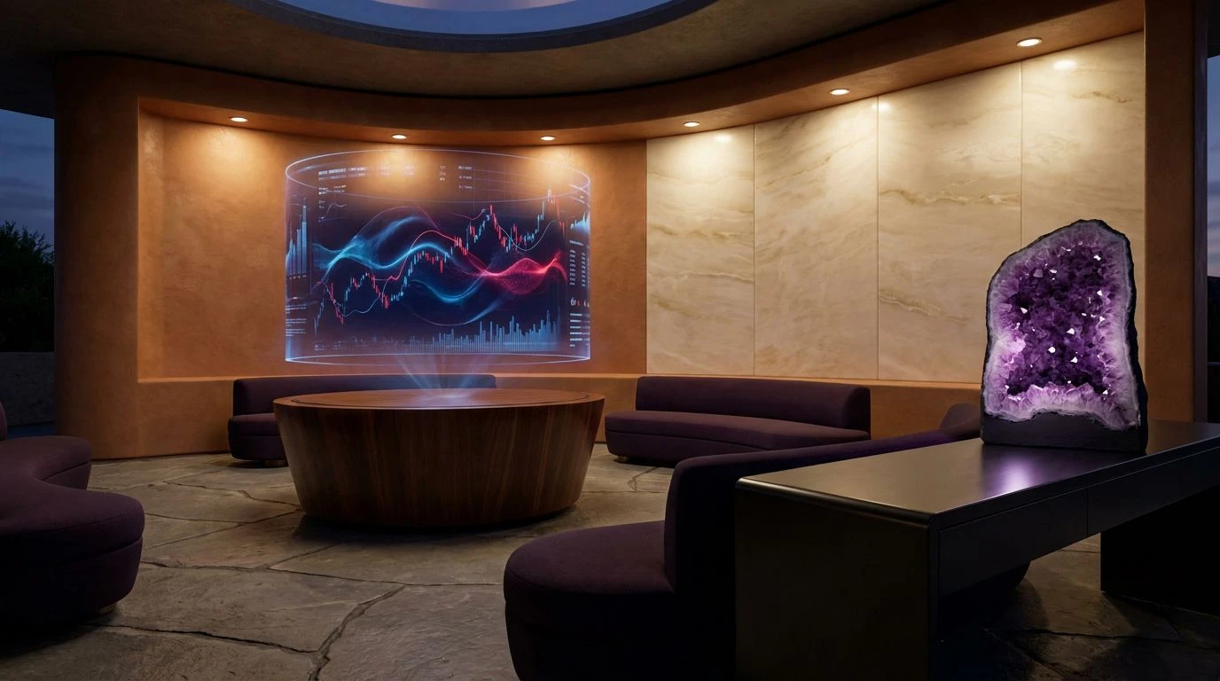
Earthen Alchemy 🏺
Earthen Alchemy shifts the financial conversation from clinical screens to the physical reality of raw materials and historical commerce. Obsidian Dust grounds the collection, allowing the rich warmth of Iron Oxide and Terracotta Clay to emerge as symbols of tangible, terrestrial wealth. These are the pigments of early currency and trade, bringing an unconscious familiarity to the modern digital exchange. The unexpected inclusion of Ancient Teal provides a cooling counterpoint to the warm soils, mimicking the natural equilibrium found in oxidized metals and weathered monuments. Sunlit Straw adds a glimmer of optimism, representing future prosperity without relying on the aggressive alerts of modern app notifications. Supported by Petrichor Plum, Weathered Slate, and Chalk White, the resulting design language speaks to durability. It tells the user that their assets are held within an architecture designed for the ages, replacing the fleeting nature of everyday software with the gravity of historical wealth preservation.
Ritual Wealth 🪔
The deliberate pairing of Raw Ochre and Midnight Aubergine within Ritual Wealth signals a departure from familiar corporate austerity, reaching instead for historical associations of prestige. Raw Ochre introduces a warm, deeply human element, reflecting the golden hue of ancient artifacts and enduring value. This earthy yellow operates as a stabilizing force, making the interface feel established rather than newly minted. The spiritual weight of the collection is carried by Amethyst Geode and Crushed Carmine, which together supply a quiet, authoritative gravity. Azure Pigment works to keep the interface legible and contemporary, spanning the gap between historical grandeur and modern usability. Surrounded by Alabaster, the intense pigments are given the space to breathe, ensuring the digital banking experience remains polished. The overall effect creates a sense of stewardship, suggesting that the user is not merely moving numbers across a screen, but participating in a long-standing tradition of mindful asset management.
Sanctum of Commerce 🏛️
Sanctum of Commerce offers an exercise in restraint, focusing on a minimal but profoundly organic aesthetic that calms the anxieties often associated with money management. Pure Linen provides a clean, expansive backdrop that avoids the harsh glare of standard digital whites, allowing the softer, restorative tones to take precedence. Bisque Clay and Burnt Sienna anchor the user experience in the warmth of natural elements, establishing a sense of safety and permanence that synthetic grays cannot achieve. The psychological pivot occurs with the introduction of Patina Teal and Steely Aqua, which bring the cooling, restorative properties of water and aged copper into the financial dialogue. This specific relationship between earthen warmth and aquatic calm creates a space for reflection. Rather than treating banking as a series of stressful tasks, these colors present financial planning as a natural, grounding habit, turning an everyday application into a steady, reliable space for personal growth.
Gilded Horizon 🌅
Gilded Horizon directly answers the need for humanized digital banking by masterfully pairing Golden Ochre with Shadowed Pine, representing the exact intersection of natural wealth and profound depth. Bleached Canvas and Sterling Silver form a sophisticated, neutral stage where the primary narrative between earth and depth can play out smoothly. Aged Bronze provides a transitional warmth, leading the eye gently toward the striking vibrance of the ochre tones. Here, the golden earth pigment speaks directly to organic growth, harvest, and long-term accumulation, breaking down the mechanical barriers of traditional fintech. Shadowed Pine acts as the deep teal counterpart, supplying the necessary professional gravitas while maintaining a connection to old-growth forests and enduring natural structures. Finished with a touch of Clear Firmament, this color system effectively rewrites the banking interface, proposing a visual identity where technological efficiency submits to a deeply reassuring, human-centric philosophy of wealth.
The strategic application of deep earthen pigments and profound aquatic tones offers a necessary corrective to the sterile aesthetic that has dominated financial technology. By moving beyond functional minimalism, designers can cultivate spaces that acknowledge the emotional weight of personal finance. These colors communicate durability, acting as visual anchors in an otherwise immediate and transient digital landscape. They reflect an understanding that wealth is fundamentally a human concern, requiring an interface that values quiet authority and natural permanence over sheer speed. Ultimately, adopting such historically grounded visual language allows digital banking to shed its impersonal shell, creating enduring institutions that users can genuinely trust over the course of their lives.